- by New Deal democrat
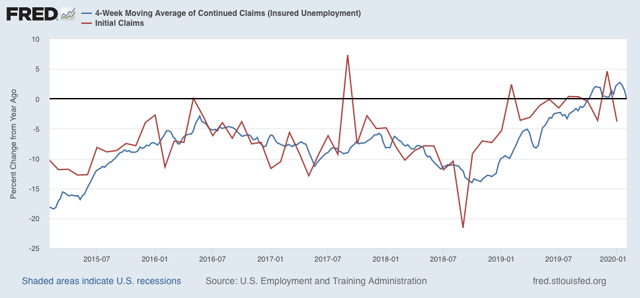
As an initial matter, this morning’s initial and continuing jobless claims report were positive as to all metrics by which I judge them. They are near the bottom of their recent ranges and/or are lower YoY (lower being good). I’ll add a graph once the info is available at FRED. UPDATE: Here it is:
Here is something I haven’t updated in a couple of months: given recent gains in labor force participation and declines in unemployment, have we finally, by at least by some measures, arrived at “full employment”?
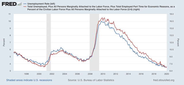
At 3.6% in January, the unemployment rate is only 0.1% above its November and December 65 year low (except for a few months in 1968-69). The underemployment rate, at 6.9%, is only 0.2% above its series low from December:
At 3.6% in January, the unemployment rate is only 0.1% above its November and December 65 year low (except for a few months in 1968-69). The underemployment rate, at 6.9%, is only 0.2% above its series low from December:
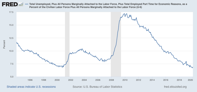
Similarly, even beyond that, when we add in those who aren’t even in the labor force, but say they want a job now, December remains the lowest level of all:
Further, among the prime age group, both participation in the labor force (blue in the graph below) and the employment/population ratio (red) jumped by a stunning +1.0% and 1.1%, respectively, just in the past six months! In the graph, the current levels for both are normed at the zero level, to show how the present level compares with earlier expansions (prior to 1987, the levels were never as high as presently):
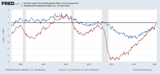
Prime age EPOP is now above its levels at the peak of the 1980s and 2000s expansions. Only during the 1997-2001 boom was it higher. This is even more important than labor force participation, which is “(employment + unemployment)/population.” Unless you think that the 1997-2001 levels should be the norm, it certainly looks like we are at or very close to “full employment.”
Next, here is a look at the YoY percent change in the prime age EPOP ratio compared with the YoY% growth in nominal wages (-3% for easier comparison):
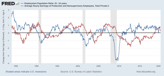
There are two things I want you to pull out from this graph. The first is that wage growth very much lags employment. In terms of the economy, it is a “long lagging” indicator. Secondly, note that wage growth tends to be suppressed the bigger the entry into labor market participation. The biggest increases in participation, in the 1970s and 1980s, led to outright declines in average nominal wages. Conversely, the late 1990s, when there was both a strong economy and little movement into the labor force from the sidelines, was the one time since the 1960s that real wage growth really boomed. I suspect the slowdown in wage growth in the past few months is a result of the big surge of entrants into the labor market in the past six months.
Finally, although CPI came in at only +0.1% for January, that is still higher than its 0.0% reading last January, so YoY inflation slightly accelerated. This means that real wage growth after inflation was flat. [I’ll add the graph once the data is available on FRED]. UPDATE: Here it is:
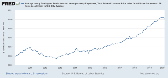
This means that real average wages for non-supervisory workers have not increased since September. Stalls like this have happened several times before during this expansion, so its not terrible, but it’s certainly not a positive either, since it tends to correlate down the line with consumer spending.
This means that real average wages for non-supervisory workers have not increased since September. Stalls like this have happened several times before during this expansion, so its not terrible, but it’s certainly not a positive either, since it tends to correlate down the line with consumer spending.