- by New Deal democrat
The other day the Joint Center for Housing Studies, a privately funded think tank affiliated with Harvard, made something of a splash with a study showing that rents are increasingly unaffordable.
Since the study only went through 2014, and I've been covering "median asking rent" quarterly as the information is updated, I'm going to wait for the 3rd quarter data to be released next month before commenting.
But one important point about housing affordability has gone completely unnoticed: the narrow basis for price increases in single family homes.
Here is the graph from the study showing that the market for low-end housing has all but collapsed, and hasn't really recovered at all:

Put a slightly different way, it is primarily higher-end housing that is driving new single family home prices.
Just as importantly, the study includes a chart showing the number of square feet in the median new home built, in addition to the median price:

I'll come back to the information in this chart shortly.
In the last couple of years, there has been commentary in various quarters about the existence of a "second housing bubble." Here is a graph showing the median price of new houses (blue) and existing houses (red):

As an aside, I have repeated pointed out that prices follow sales. Thus the flatlining of sales in much of 2014 should show up by now. And here is the same graph showing YoY% changes in the prices of new and existing homes:

Averaged over the last 4 months, YoY prices for new houses have turned negative, while that of existing homes has paused.
But back to the main point. Here is the same graph of median prices, normed by usual weekly pay (the most stagnant of all of the measures of compensation):
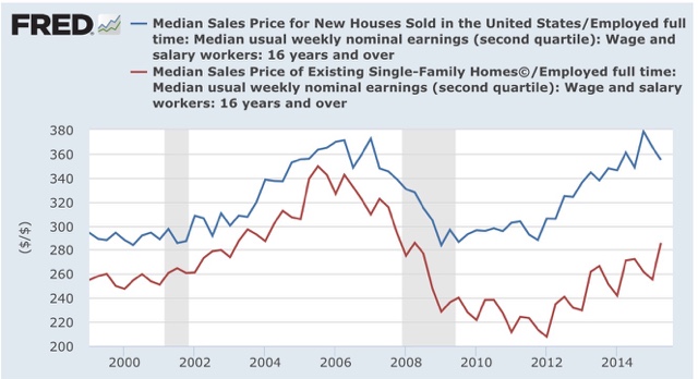
Real, compensation adjusted prices for existing homes are nowhere near where they were at the peak of the housing bubble, while those of new homes have returned and briefly exceeded that level.
Now let's turn back to the information in the chart from the Joint Housing Center study. The median price and median square footage information allows us to calculate the price of housing per square foot.
Let's show the median price (1st column), the median square footage (2nd), and price per square foot (3rd) at the peak of the housing bubble in 2005, and 5 years prior in 2000:
2005 $292,000 2227 $131.1
2000 $232,300 2057 $112.9
Now let's measure over an identical 5 year period from the bottom of the housing bust in 2009 through the latest data in 2014:
2014 $282,800 2414 $117.1
2009 $239,100 2103 $113.7
Prices rose by 16.1% per square foot in the 5 years leading up to the peak of the housing bubble. By contrast, in the last 5 years they have only risen 3%. Prices per square foot now are 12% lower than they were at the peak of the bubble.
In summary, the latest study by the Joint Housing Center tells us that new houses are currently being built primarily for the affluent. And in real terms, those prices are not anywhere close to their bubble peak. In other words, this is further evidence that there is no "housing bubble 2.0."
In the last couple of years, there has been commentary in various quarters about the existence of a "second housing bubble." Here is a graph showing the median price of new houses (blue) and existing houses (red):
As an aside, I have repeated pointed out that prices follow sales. Thus the flatlining of sales in much of 2014 should show up by now. And here is the same graph showing YoY% changes in the prices of new and existing homes:
Averaged over the last 4 months, YoY prices for new houses have turned negative, while that of existing homes has paused.
But back to the main point. Here is the same graph of median prices, normed by usual weekly pay (the most stagnant of all of the measures of compensation):
Real, compensation adjusted prices for existing homes are nowhere near where they were at the peak of the housing bubble, while those of new homes have returned and briefly exceeded that level.
Now let's turn back to the information in the chart from the Joint Housing Center study. The median price and median square footage information allows us to calculate the price of housing per square foot.
Let's show the median price (1st column), the median square footage (2nd), and price per square foot (3rd) at the peak of the housing bubble in 2005, and 5 years prior in 2000:
2005 $292,000 2227 $131.1
2000 $232,300 2057 $112.9
Now let's measure over an identical 5 year period from the bottom of the housing bust in 2009 through the latest data in 2014:
2014 $282,800 2414 $117.1
2009 $239,100 2103 $113.7
Prices rose by 16.1% per square foot in the 5 years leading up to the peak of the housing bubble. By contrast, in the last 5 years they have only risen 3%. Prices per square foot now are 12% lower than they were at the peak of the bubble.
In summary, the latest study by the Joint Housing Center tells us that new houses are currently being built primarily for the affluent. And in real terms, those prices are not anywhere close to their bubble peak. In other words, this is further evidence that there is no "housing bubble 2.0."