- by New Deal democrat
The weekly lull after last Friday’s employment report will end tomorrow. In the meantime, let’s take a deeper dive into a few important trends in that report.
First, the unemployment rate rose 0.3% to 3.8% - which is totally not surprising at all.
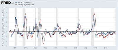
As I wrote last Thursday, initial jobless claims have a nearly flawless 60+ year record for forecasting the trend in the unemployment rate. Here’s the supporting graph:
The red line (the unemployment rate measured YoY) follows the blue line (initial jobless claims) almost like clockwork.
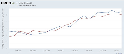
Here’s the past two years of the same graph:
Initial jobless claims turned higher YoY in March. The unemployment rate has followed. With jobless claims up about 10% YoY, an increase from 3.5% to 3.8% or 3.9% (i.e., 1.1*3.5%) was right in line with the forecast.
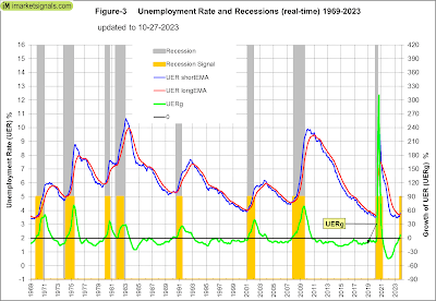
Although it would take several months of a 4.0% or higher unemployment rate to trigger the Sahm recession Rule, one similar unemployment rate-based metric has been triggered, which compares the short term monthly average of the unemployment rate with its 12 month average. If both are rising, and the former turns higher than the latter, in the past 50 years that has *always* signaled a recession, with *zero* false positives or false negatives:
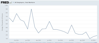
Meanwhile, the deceleration in monthly jobs gains, on average about -20,000 per month, has continued for 2 years now:
If this trend continues, we will get actual job losses in about 9 to 12 months.
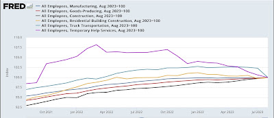
In general, goods employment turns south before a recession begins, while services employment only follows later, and may never turn negative YoY. I track a variety of leading jobs sectors in my monthly blurb. Here’s what total goods employment (red) looks like compared with a number of other leading sectors, all normed to 100 as of August:
You can see that several - temporary jobs, residential construction, and trucking - have already turned down. Manufacturing jobs are flat. Only total construction jobs are still rising strongly.
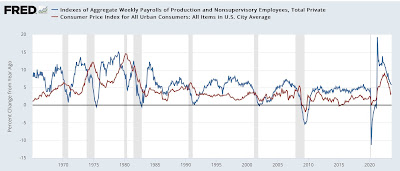
Finally, as I’ve frequently noted, real aggregate payrolls are an excellent coincident recession indicator. When working and middle class households earn less money in real terms, they have always cut back spending, and this marks the onset of recessions. Here’s the long term comparison of total payrolls YoY (blue) vs. CPI YoY (red):
There are no false negatives, and only one arguable false positive (2002, a near miss) in the past 60+ years.
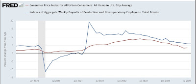
Here is a close-up on the last four years:
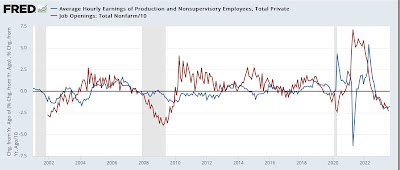
The YoY% change in wage gains is a long lagging indicator, starting up only after unemployment and underemployment decline, and also after the rate of job openings (red in the graph below) increases:
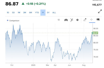
With job openings continuing to decline, the YoY% of wage gains (a component of aggregate payrolls) is likely to continue decelerating. But, as a number of writers including myself have pointed out in the past several months, gas prices have resumed increasing (spiking over $90/barrel yesterday):
making it more likely that the CPI YoY will increase.
Decelerating wage gains and increasing CPI means it is more likely that real aggregate payrolls will turn negative in the coming months, signaling recession.
And what should be of special concern is that a US recession in 2024 that causes Biden to lose and Trump to return to power is just about the #1 foreign policy priority of both Russia and Saudi Arabia, both of which have announced curtailment of their oil output in the past several weeks.
