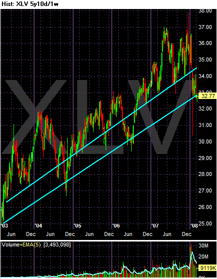
There are two obvious trends lines with this chart. The first connects a large number of bottoms over the last 5 years, while the second (the lower one) connects the more extreme price fluctuations. While prices have broken through the first trend line, they are resting a bit above the second (see the chart below).

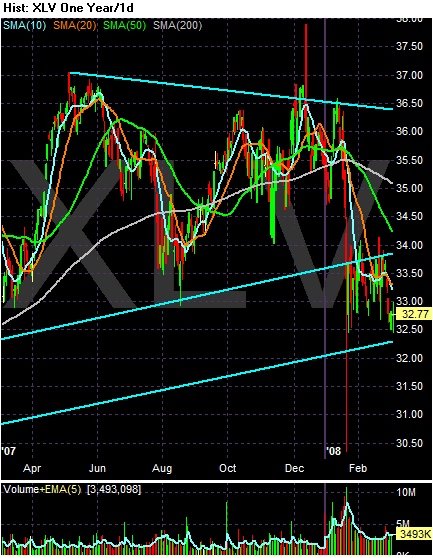
One the yearly chart, there is a pretty clear triangle consolidation which would serve as a reversal formation.

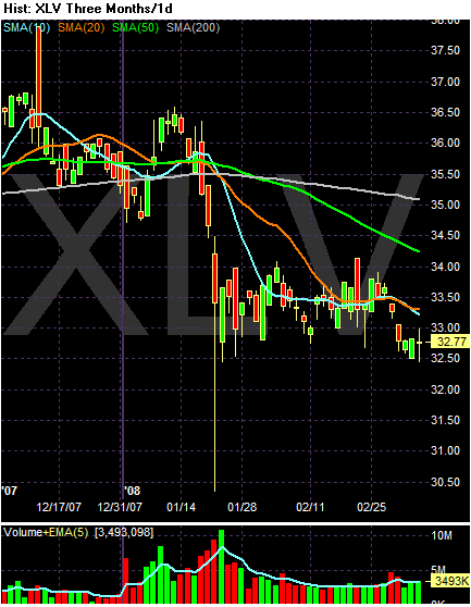
With the SMA chart, notice the following:
-- Prices are below the 200 day SMA, indicating a bear market.
-- The longer SMAs -- the 200 and 50 day SMA -- are moving lower.
-- The shorter SMAs and prices are bunched up together and have been for about a month, indicating a lack of meaningful direction in the market.
-- Price movements have been non-existent for the last month or so.