Friday, July 14, 2023

The American working class is doing better, thank you very much


 - by New Deal democrat

With the release of the CPI report earlier this week, I can update several measures of average middle class American income.


Real average hourly wages increased 0.2% in June, and are up 1.6% from one year ago:


Real aggregate payrolls for the entire spectrum of nonsupervisory American workers increased  0.3% in June and are up 3.1% from one year ago:


This is an excellent coincident marker of an expanding economy vs. recession. It tells us that, mainly thanks to declining gas price since June 2022, average American workers and their households have had a significant increase in their ability to buy things. A very good positive sign.

Finally, one last note about various measures of inflation. A few commentators highlighted the still-high +5.9% YoY increase in “sticking price” inflation. But as shown below, the 1 month and 3 month average changes in even that metric have declined sharply, to close to the Fed’s target range:


By any reasonable measure, inflation is no longer a major problem.

Thursday, July 13, 2023

Initial claims move closer to red flag recession warning


 - by New Deal democrat


Initial jobless claims declined -12,000 last week to 237,000. The four week average declined -6,750 to 246,750. With a one week delay, continuing claims increased 11,000 to 1,729,000:


More importantly for forecasting purposes, the YoY% increases were 7.2% for the weekly number, 14.5% for the 4 week average, and 31.6% for continuing claims respectively:


This is the 4th week in a row that the 4 week average has been higher YoY by more than 12.5%. If this continues for several more weeks, that would be sufficient to trigger a red flag recession warning from this series.

Finally, since initial claims have a long-established history of leading the unemployment rate, here is the comparison of YoY claims averaged monthly (blue) as well as the 4 week average, compared with the YoY% change in the unemployment rate (gold):


Note importantly that the graph above measures the change in the unemployment rate as a “percent of a percent,” so for example a 10% increase from 3.6% would be just below 4.0%. To trigger the Sahm rule, we would need a 0.5% increase in the actual rate from the 3 month average of the lowest unemployment rate in the past year. To put it plainly: for forecasting purposes, we’re not there yet. But since the Sahm rule tells us retroactively when we have started a recession, it doesn’t affect my own forecasting analysis.

Wednesday, July 12, 2023

June inflation almost non-existent except for the fictitious measures of shelter


 - by New Deal democrat


 The message of this morning’s consumer inflation report was the same for almost everything except for the fictitious measures of shelter: sharp deceleration everywhere.


Let’s take a look:

Headline CPI up 0.2% m/m and 3.1% YoY (lowest since March 2021)
Core CPI up 0.2% m/m and 4.9% YoY (lowest since October 2021):


CPI less shelter up +0.2% and 0.7% YoY (lowest since February 2021):


New and Used vehicles: 0.0% and down -0.5% respectively m/m, and up +4.1% and down -5.2% YoY respectively:


Food up 0.1% m/m and 5.7% YoY:


But food is only up 0.3% in the 4 months since February:


Transportation services (replacement parts, repairs etc.) has also been a hot spot, and has also decelerated, up 0.4% m/m and up 8.2% YoY (but down from a peak of 15.2% YoY last October:


Finally, Owners Equivalent Rent up 0.4% m/m:


and 7.8% YoY (down from all time YoY high of 8.1% YoY in April):


Here’s what it looks like in comparison with house prices as measured by the Case Shiller national index YoY (/2.5 for scale):


Since the beginning of this year, monthly increases in OER have declined from 0.8% to 0.45%. YoY OER is probably going to be below 4.0% and maybe below 3.0% by the end of next winter.

To sum up: except for the fictitious measure of shelter, the only other remaining “hot spots” for inflation are new vehicles (but resolving as the supply chain issues have finally resolved) and transportation services. Food inflation has basically stopped in the past 4 months. 

And if actual new rent increase and house prices were substituted for the fictitious OER measure and the 12 month average used for leases, headline inflatioin would only be up about 0.8% YoY, and core inflation up 3.0%.

But I’m sure there’s some sticky price blah blah blah somewhere that will justify the Fed’s continued hawkishness.


Tuesday, July 11, 2023

Scenes from the employment report: important leading and coincident indicators of recession


 - by New Deal democrat


Here’s another detailed look at some significant data from last Friday’s employment report.  In this post I’ll look at some leading and coincident indicators.


First, about the unemployment rate. This is a lagging indicator coming out of recessions, but a leading one on the way in. While it is interesting that it declined -0.1% for the month, for forecasting purposes the YoY change is more important.

Here’s another look at the “jobless claims lead the unemployment rate” metric. The below graphs measure the YoY% change in jobless claims, averaged monthly, /10 for scale (blue). The red line is the change in the unemployment rate YoY, from which I subtract -0.1% for reasons I’ll explain after these first two graphs:


What these show is that, going back 50+ years, initial claims always turn higher YoY first, while the unemployment rate turns higher by +0.2% or more within 6 months before to 2 months after the the onset of recessions. There are only two exceptions: one month in 1985, and the near “double-dip” of 2002.

Here is the same graph for the past 24 months:


The unemployment rate was +0.1% higher YoY in May, and unchanged YoY in June. This is close to but not yet signalling the onset of a recession. But if jobless claims remain as elevated YoY in July and August as they were in June, that would almost certainly indicate that the unemployment rate trigger is shortly to follow.

Next, let’s take a look at two leading job sectors that haven’t quite turned yet, because of supply logjams in the Fed’s interest rate transmission mechanism.

Motor vehicle production had severe supply constraints all the way into 2022. As a result (not shown), only in the first half of this year did sales routinely meet or exceed 15 million on an annualized basis.

As a result, employment in vehicle manufacturing (blue in the graph below) has continued to increase sharply. Normally manufacturing employment (red) turns down well before a recession begins. But while it has flattened, it has not turned down:


As shown above, vehicle manufacturing employment is about 5-8% of all manufacturing employment.

This next graph below compares total manufacturing employment, with manufacturing employment excluding motor vehicles (blue):


Ex-motor vehicles, manufacturing employment has indeed turned down since the beginning of this year.

There’s a similar situation in housing construction. The first graph below compares housing units under construction (red) with residential construction employment (blue). Unsurprisingly the former leads the latter:


Since housing under construction is only down slightly from peak, residential construction employment has barely turned down at all.

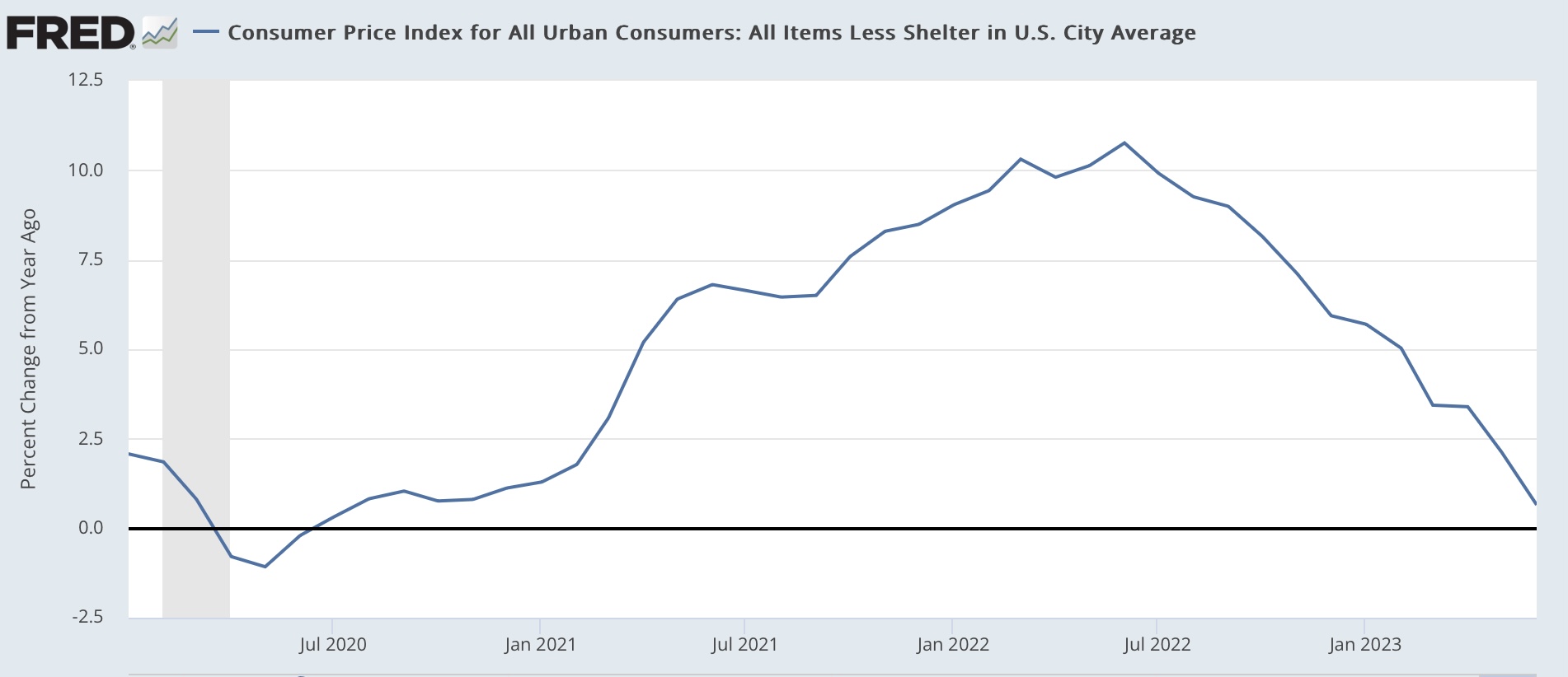
Finally, let’s update one of my big coincident indicators of recession, the YoY% change in real aggregate payrolls. Below I’ve divided it into nominal payrolls (blue) vs. CPI (red), which hasn’t been reported yet for June:


You can see that, going back 50+ years, whenever YoY inflation exceeds YoY nominal payroll growth, a recession is just beginning.

Here’s the same graph since the onset of the pandemic:


Nominal payroll growth, while decelerating, has done slightly more slowly than inflation, meaning that real aggregate payrolls have continued to increase. Meaning more buying power for average Americans. 

An important issue is whether, with YoY comparisons now including gas prices that were declining from $5 (meaning they are less positive), the serendipitous comparison between payrolls and inflation will continue. And a big part of that issue is also, now that the supply bottlenecks in vehicle production and housing have abated, those two sectors of employment will finally roll over.

Monday, July 10, 2023

Scenes from the June employment report: consumption leads employment, goods vs. services edition


 - by New Deal democrat


No big new economic news today, so let’s take a more in-depth look at some of the information from Friday’s employment report. Today I’m going to focus on the division between goods and services.


As I’ve written many times in the past, consumption leads employment. Typically I have shown that via real retail sales. The variation I am going to use today is employing real personal spending on goods vs. services, and how consumption leads employment for each.

As a refresher, here is real personal spending on goods YoY (blue) vs. services (red), up until the pandemic:


Note that spending on goods is much more volatile than spending on services (in fact I’ve divided the result for goods by 1.5 so that services spending doesn’t just show up as squiggles). Most importantly, it tuns down YoY generally coincidently with the onset of recessions, whereas growth in services spending usually just decelerates. Also, while the two moved coincidently from 1960-90, since then spending on goods has usually led spending on services somewhat.

Here’s the same information since the pandemic (omitting the year of huge distortions):


Goods spending did fall below zero during much of 2022, and is only slightly above zero YoY now, while spending on services is much stronger.

Now let’s compare real spending on goods (blue) with employment in the goods sector (red) YoY, pre-pandemic:


With two exceptions (the mid 1980’s and late 1990’s) goods consumption leads goods employment. Note that this holds true even though due to globalization and offshoring, goods employment never rose nearly as much as goods consumption beginning with the 1980’s.

The same leading/lagging relationship holds true for consumption of services (blue) vs. employment in services (red):


Now let’s look at each post-pandemic. First, here is goods consumption vs. employment:


Goods spending recently peaked YoY in summer 2021, while as we should expect based on past history, goods employment did not peak until spring 2022. Goods spending rebounded somewhat as spending power increased with the decline in gas prices from $5 to $3/gallon in late 2022. Goods employment is still decelerating, and is only up 0.3% since February, or roughly at a 1% annual rate.

Here is services consumption vs. employment:


Both consumption and employment in the services sector have been much stronger than in the goods sector, and while both have been decelerating since the spring 2021 stimulus spree, consumption has decelerated faster compared with late 2021.

Since gas prices have been pretty stable this year, the tailwind for goods spending is subsiding. I expect goods spending to decelerate further YoY, and probably turn negative again, with goods employment following. My best guess is this will occur by the end of this year, possibly earlier.

As per past history, the deceleration in both consumption and employment in the goods sector is likely to be slower, but will follow goods spending and employment with lower growth if not an outright decline.