Friday, January 14, 2011

Weekly Indicators: Seasonality is a b#$%! Edition

- by New Deal democrat

This week started out slow, with no significant data. Then yesterday and today we had a surprise negative initial jobless claims reading (more on that below), both producer and consumer prices surged (the PPI up 0.8%, the CPI up 0.5%), largely because of gasoline. Nomial Retail sales were strong at 0.6, but real, inflation adjusted retail sales were the weakest in 6 months, up only 0.1. Still, real retail sales are up 3.9% in that 6 month period, a very strong showing. Industrial production and capacity utilization both were also up strongly, with industrial production up 0.8, it's best showing in the last 6 months. Consumer sentiment about the present unexpectedly fell, but expectations about the future were up slightly (expectations are a small component of the LEI).

Now here is this week's high frequency data:

Gas at the pump went up 2 more cents to $3.09 a gallon last week, and Oil climbed back above the $90 a barrel mark to $90.21 Friday morning. Gasoline usage was slightly above (1%) last year's levels.

The Mortgage Bankers' Association reported a net decrease of -3.1% in seasonally adjusted mortgage applications. This number has declined slightly in the last month, but has been in a uptrend since bottoming in July, athough it is still -12.3% lower YoY . Refinancing increased about 4.1% but is still at low levels equal to many bottoms in the last 5 years. This is likely to impact consumer spending down the road. (btw, click on the link for a cool new interactive graph).

The ICSC reported that same store sales for the week ending January 8 increased 3.5% YoY, although they were down -3/2% week over week. Shoppertrak did not report for the week, but said that the 2010 holiday season as a whole was up 4.0% YoY. There was a negative spin place on this some quarters, with the opinion that high end stores did extremely well, midrange stores did OK, and low end stores did badly YoY, therefore we are Doomed. This is garbage analysis. Since Wal-Mart doesn't report, the truth is that we don't know how low end stores did. Were the poor sales across the board, or did Wal-Mart eat its direct competitors' lunch? Also, last year, when midrange stores did poorly compared with low end stores, we were told that was because midlevel shoppers were forced to trade down. In other words, those midrange shoppers may have moved back up the ladder this year - a good story! I don't know which it is, and neither do the Doomorons.

Railfax tells the same story as it has for over a month. It declined in all areas last week again, for seasonal reasons. It nevertheless remained steady in its comparative improvement over last year. Shipments of waste and scrap metal and auto shipments are no better than last year's levels.

The American Staffing Association Index fell 11.7% to 81 for the week ending January 2, entirely for seasonal reasons. This was still 17% above a year ago, but about a similar percentage below 2006 and 2007 levels. This index will probably bounce substantially next week, again for seasonal reasons, but it will be still one more week before it again gives reliable information.

The BLS reported initial jobless claims of 445,000. The 4 week moving average rose to 415,000. It is important to note that the first full week in January is typically by far the highest number for NON-seasonally adjusted claims all year. Thus the seasonal adjustment is major, and it is easy - and common - for this adjustment to be "off." The best way to deal with this is to treat it as the mirror image of the positive 388,000 claims of several weeks ago. The average comes to about 420,000, which is probably the truer picture. Some of the new claims may be state and municipal layoffs (layoffs at the end of the year are more common for government employees where there are budget problems, and have shown up 1 or 2 years after the bottom of more severe recessions in the past). Bottom line: I won't be concerned unless we see 430,000+ continuing for a couple more weeks.

M1 was up 2% for the week, down -0.4% month over month, and up 7%+ yoY, meaning "Real M1" was up 6%. M2 was up +0.16% for the week, +0.24% month over month, and +3.2% YoY, meaning "Real M2" was up ~2.2%. These numbers have told the same story for months on end. Real M1 is up sharply, Real M2 can't seem to improve above the red zone of +2.5%.

Weekly BAA commercial bond rates rose .02% to 6.09%. This was equal to the .02% increase in the yields of 10 year treasuries. There remains no sign of deflationary fear amound B grade corporate bonds.

Income tax withholding comparisons are going to be a mess this year, because of the tax cut in Social Security payments, and the simultaneous ending of the "make work pay" tax credit. Fortunately, Matt Trivisonno has already estimated the math. So, pending further refinements, I will add 1.07% to withholding data this year to compare with last year as a best estimate. With that in mind, the Daily Treasury Statement showed adjusted receipts in the first 8 reporting days of January of $66.8 B vs. $66.7 B a year ago, for a gain of $0.1 B. Over the last 20 reporting days, this year shows $160.0 B collected vs. $159.1 B one year ago. This is a very slight improvement - it may mark a slowdown, or it may be the adjustments for the tax credit are off the mark.

We have a similar mantra as we have had for several months now: almost all of the data is moving in the right direction, with the very conspicuous exception of commodities, especially Oil. There will be consequences.

In the meantime, have a nice weekend!
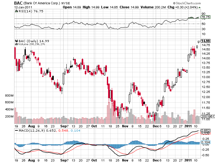
P.S. The answer to yesterday's Quiz is, December 1, one day after B of A stock made its low for the year. Had you acted the opposite of the Pied Piper's prediction, you would be up about 50% now.

Bonddad's New Book

And now in completely, non-related, non-economic news ....

In real life, I am a tax lawyer who has just completed a book titled U.S. Captive Insurance Law. I've spend the least few years writing and editing it, and now you can buy it at the previously posted link. In addition, if you want to learn more about the topic, you can go to this link.

And now, back to your regularly scheduled economic wonkery ....

China Raises Reserve Ratios

From Bloomberg:

China told banks to set aside more deposits as reserves for the fourth time in two months, stepping up efforts to rein in liquidity after foreign-exchange holdings rose by a record and lending exceeded targets.

Reserve ratios will increase 50 basis points starting Jan. 20, the People’s Bank of China said on its website today. One basis point is 0.01 percentage point.

Today’s move, adding to the Christmas Day interest-rate increase, underscores Premier Wen Jiabao’s determination to tame inflation that may trigger social unrest. Officials may front- load monetary tightening to the first half of the year after deciding to shift to a “prudent” monetary policy, according to JPMorgan Chase & Co. and Morgan Stanley.

“With surging foreign-exchange inflows late last year and a possible rebound in bank lending in January, the central bank needs to ratchet up the reserve ratio to soak up liquidity,” Ken Peng, a Beijing-based economist at Citigroup Inc., said before today’s announcement. Inflation may quicken in January after easing in December from the fastest pace in more than two years, according to Peng.


China is leading the world economy out of the recession. As such, this is an important development.

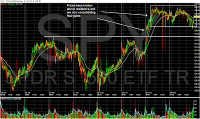
Yesterday's Market

Click on all images for a larger image


Thursday, January 13, 2011

Special Bonddad blog graph-reading Quiz!

- by New Deal democrat

Here is an easy test to see how well you can read a graph.

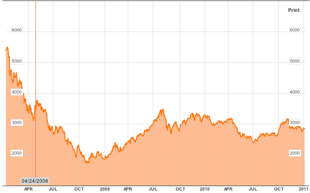
Below is a graph of the stock price of Bank of America, which made a new 6 month high yesterday at $14.99.

Study the graph carefully, and then answer the question below:


Question: On what day did the DK Pied Piper of Doom say:
(you probably will start noticing it in the MSM soon, if not this morning), it appears that over the past 18 hours our country's largest bank, Bank of America, may have entered into the final stage(s) of a fairly swift implosion.
You may only take one guess.

Jobless Claims Up 35,000

From Marketwatch:

The number of U.S. workers who filed new applications for jobless benefits jumped 35,000 last week to 445,000, the highest level in more than two months, as a government official attributed the sharp increase largely to administrative backlogs.

Still, the sharp rise in new claims, which had fallen steadily since last summer, is likely to put investors on guard following a disappointing December employment report last week.

I'm always suspicious of the "administrative backlog" claim. However, we'll have to wait and see next weeks number to know for sure.


Beige Book Shows Moderate Growth

From the Federal Reserve:

Reports from the twelve Federal Reserve Districts suggest that economic activity continued to expand moderately from November through December. Conditions were said to be improving in the Boston, New York, Philadelphia, and Richmond Districts. Activity increased modestly to moderately in the Cleveland, Atlanta, Chicago, St. Louis, Kansas City, and Dallas Districts. The economy of the Minneapolis District "continued its moderate recovery," while that of the San Francisco District "firmed further" in the reporting period leading up to the close of 2010. Conditions were generally said to be better in Districts' manufacturing, retail, and nonfinancial services sectors than in financial services or real estate.

Contacts in the manufacturing sector in all Districts reported that activity continued to recover, with the Richmond and Chicago Districts citing especially solid gains in orders. However, the Boston, Atlanta, and Dallas Districts noted that business remained weak for manufacturers selling into the construction sector. Retailers in all Districts indicated that sales appeared to be higher in this holiday season than in 2009 and, in some cases, better than expectations. Nonfinancial service-sector contacts in the Boston, New York, Philadelphia, Richmond, Chicago, St. Louis, Minneapolis, Kansas City, Dallas, and San Francisco Districts cited demand increases ranging from slight to "relatively strong." Transportation services were more mixed, with the Cleveland, Atlanta, and Kansas City Districts noting stable to slowing shipping volumes. Financial conditions were mixed across the Districts reporting on it, with overall loan demand slowly improving in Philadelphia and Richmond and weaker in St. Louis and Dallas. The Atlanta, Minneapolis, Kansas City, Dallas, and San Francisco Districts cited increased activity in the energy sector, while energy production in the Cleveland District was stable.

Residential real estate markets remained weak across all Districts. Commercial construction was described as subdued or slow, while commercial leasing activity reportedly increased in the Richmond, Chicago, Minneapolis, and Kansas City Districts.

Most District reports cited comments by both retailers and manufacturers that costs were rising, but indicated that competitive pressures had led to only modest pass-through into final prices. Labor markets appeared to be firming somewhat in most Districts, as some modest hiring beyond replacement was said to have occurred and/or was planned in a variety of sectors. At the same time, however, upward pressure on wages was reportedly very limited.

Most Districts indicated that business contacts were positive about the outlook, although still generally cautious. The Dallas District noted modest increases in optimism and positive outlooks across a range of sectors, Chicago stated that contacts were cautiously optimistic about the 2011 outlook, and New York cited widespread optimism about the near-term outlook; The St. Louis, Minneapolis, Kansas City, and San Francisco Districts all pointed to planned increases in hiring by their contacts as evidence of expected strengthening in business activity in 2011. Contacts in the Philadelphia District foresaw "improving economic conditions in 2011, but … not strong growth."

I'll be digging deeper into this report over the next few days.

Yesterday's Market

Click on all images for a larger image


Wednesday, January 12, 2011

Thoughts on Financial Institutions and Money Supply

Over the last two weeks, I've taken an in-depth look at both U.S. financial institutions and the overall money supply situation. Here are some thoughts, in no order of importance:
  • Regardless of size, banks are still hurting. The overall return on assets and equity are near 20 year lows and the interest spread is very low as well. On the other side of the coin, we have loans, on which we see increases in losses and loan loss reserves. Basically, banks are getting squeezed from both sides of the balance sheet right now which partially explains why we haven't seen a large increase in loan growth.
  • I don't think it can be conclusively said we are at the end of the problems regarding loans. Spikes in non-performing loans and loan loss reserves are still near highs; in only one or two cases have we seen decreases from highs. In addition, with lower interest rate spreads, it will take longer for banks to replenish their diminished earnings.
  • The entire argument of inflationary pressures in the monetary system is a complete and total farce. At no point in any of the data do we see spikes or increases that in any way should be alarming.
  • The recent increase in the savings rate has been mirrored by the increase in demand deposits.
  • MZM may not be the best indicator of money supply, because of its use of money market funds.
  • The velocity and amount of funds in M1 -- especially in check deposits -- is encouraging and at a level that would support growth.

A Closer Look At Money Supply; M2

Let's finish our look at the current situation with the money supply by focusing on M2, which is

A category within the money supply that includes M1 in addition to all time-related deposits, savings deposits, and non-institutional money-market funds.


In other words, we're looking at a broader definition of money supply that includes less liquid forms of money, most importantly savings deposits. While these are still liquid -- that is, they are still available pretty quickly -- they are considered the "second line" of spending (people will spend these funds after spending more liquid funds).


Overall, the year over year percentage change in M2 is exceedingly low. In addition, it has dropped sharply after the spike at the end of the recession.


Remember that M2 includes M1. This chart shows that the non-M1 components of M2 are the reason for the drop.


The real reason for M2s drop is above: since money market funds are yielding next to nothing right now, people are pulling their money out of these funds.


Notice that savings deposits have increased strongly. This correlates with the increase in the savings rate the we've seen since the end of the recession.


Velocity has dropped, but a fair amount of that has been caused by the drop in money market funds.

2011: The race between Deleveraging and Deflation

- by New Deal democrat

[Note: this is the second part of my 2011 outlook]

In the final months of 2010, there has been a palpable sense in the data - in the continuous decline of initial jobless claims, in the increase in consumer spending at Christmas, in the increase in car purchases, in the renewed vigor of manufacturing - of an economy that is trying to accelerate to lift-off. Indeed, I have noted several times recently that measuring the savings rate in real, inflation adjusted terms (blue in the graph below), seems to be an excellent precursor to economic growth several years after (red), and in that regard, there is an awful lot of tinder available to start the fire of a self-sustaining recovery:


Yet it is a telling statement about economic and political blogs, and the media in general, that when I attempted a Google Trend search for the term "self sustaining recovery," there weren't even enough references to generate a graph! - even though the term "double dip recession" still generates a steady stream of hits.

While I have been among the most optimistic of observers for over a year and a half, and while the K.I.S.S. forecast (relying on the LEI and the yield curve) suggests continued growth in 2011, if the economy fails to achieve lift-off this year -- if it fails to generate a self-sustaining recovery, then I fear the consequences going into 2012. For there are two forces in a race to determine which will by then be the dominant determinant of the direction of the economy as it affects average Americans - namely, deleveraging and deflation.

Per Housing Wire, the New York Fed just updated its report on household behavior during the Great Recession, finding that
Consumers were pessimistic about the availability and tightening of credit during the [Great Recession, and ...]

Consumers responded to the economic stresses of the recession by curbing spending, reducing contributions to retirement accounts and paying off debt.
The savings rate during the recession largely reflects a decline in debt as households paid down mortgages and is not reflective of increased contributions to retirement or savings accounts.
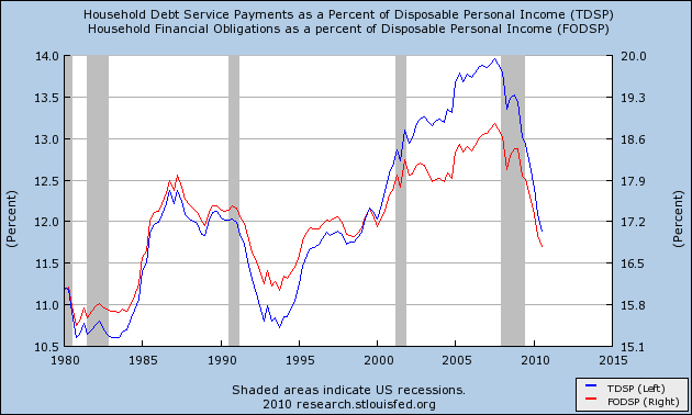
The result has been the greatest deleveraging by households in the history of the series of household debt service tracked by the Federal Reserve:


Note that the data has only been reported through the 3rd Quarter of 2010. If the trend holds up, by the end of 2011, households will have debt service as low a percentage of disposable income as any time in the last 30 years. While there is nothing magical about that particular level, it certainly would bode well for the consumer continuing to power a self-sustaining recovery, in line with the first graph of the relationship between the "real personal savings rate" and GDP above. [N.B.: This is also not inconsistent with data showing that much of the decline in consumer indebtedness being caused by writeoffs and tighter lending standards.]

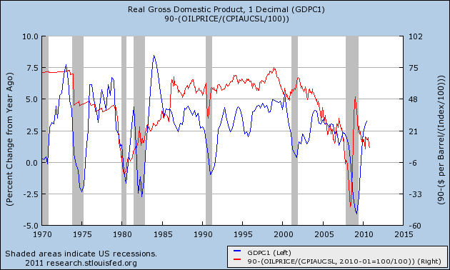
Against that, as has been widely noted in the last few weeks, there is the "choke collar" of energy prices. For the second time in less than a year, as the economy starts to accelerate, so do Oil prices, biting into consumer demand and creating a drag. Whenever Oil prices have hit 4% of GDP, which in 2010 was about $90 a barrel (inflation adjusted, in blue and inverted in the graph below), there has been a slowdown in the economy (red), and a recession if the overshoot is too sudden or too much:


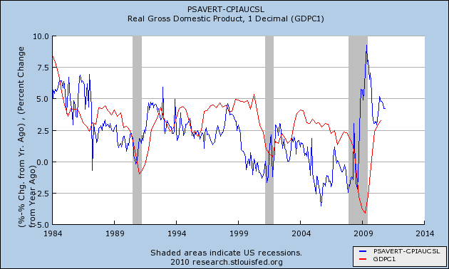
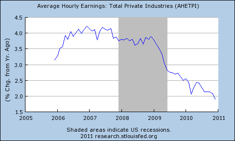
While that threatens several quarters of growth deceleration, the true and growing danger is that of outright wage and salary deflation. Specifically, as Professor Paul Krugman has pointed out any number of times, YoY wage growth continue to edge closer and closer to zero, and outright deflation:


During the Great Depression, of course, wage deflation was part of a vicious spiral, as lower wages meant ever less ability to service previously contracted debt. It has been a saving grace of this economy that, unlike then, wages have not tipped over into outright deflation. Thus with near zero percent interest rates, and one percent inflation, consumers have been able to refinance debt at lower percentage rates, lowering their monthly debt payments, and even 2% wage growth has been sufficient to increase the "real" disposable income of consumers, in however small a fashion.

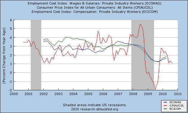
With unemployment still close to 10%, and not projected to drop quickly, there is an awful lot of slack in the system, applying tremendous deflationary pressure on wages and salaries. Should wage and salary deflation hit, even 1% inflation would, in real terms, mean a decline in consumers' actual purchasing power. As shown in the graph below, that is exactly what happened during last summer's slowdown:


When real income increases again outpaced inflation, consumer spending went up again.

It is hard to imagine a self-sustaining recovery - or any at all - should wage deflation actually start. At its present rate, this trend looks like it will also reach the tipping point in about a year or two.

If we are lucky, consumer deleveraging will reach bottom first, and the fire in the engines of the economy will be lit sufficiently for it to achieve lift-off before we reach the point where wage and salary growth goes all the way to zero and beyond.

Keep your fingers crossed.

Yesterday's Market


Click on all images for a larger image


Tuesday, January 11, 2011

A Closer Look At Money Supply: MZM

Let's continue our look at money supply, with a look at MZM, which is

A measure of the liquid money supply within an economy. MZM represents all money in M2 less the time deposits, plus all money market funds.

MZM has become one of the preferred measures of money supply because it better represents money readily available within the economy for spending and consumption. This measurement derives its name from its mixture of all the liquid and zero maturity money found within the three "M's."


At this point, it's important to define M2 as well, which is:

A category within the money supply that includes M1 in addition to all time-related deposits, savings deposits, and non-institutional money-market funds.

M2 is a broader classification of money than M1. Economists use M2 when looking to quantify the amount of money in circulation and trying to explain different economic monetary conditions.

So what we have is the money supply between M1 and M2. Let's take a look at the numbers.


First, note the year over year percentage change in MZM was slightly negative a bit ago, although it has just turned positive.


In addition, note the velocity has been decreasing for the last decade.

So -- why is this happening to MZM in comparison to M1? The answer is money market funds. MZM includes money market funds on the assumption that people use these funds as a bank account of sorts (which they do). However, short term rates have been incredibly low for the last decade, making money market funds very unattractive. Here is a chart of total money market funds:

2011: Self sustaining recovery vs. Political idiocy (and Oil)

- by New Deal democrat

I'm dividing up my 2011 forecast into two parts: I. The K.I.S.S. method Forecast, and II. The substantive background. This post is part I.

I. The K.I.S.S. method

If I were a Wall Street pundit, my career plan would be summarized as follows:

1. study latest readings of the Leading Economic Indicators
2. without ever once mentioning them, write convoluted and graph-heavy forecasts that just so happen to justify coming to the exact same conclusion as what the LEI suggest
3. cash multi-bazillion dollar paychecks and bonuses.

You see, even though the LEI are the statistic most denigrated by Wall Street forecasters, they have the inconvenient habit of being right more often than the highly-paid punditocracy, especially at turning points.

Since I'm not a highly paid Wall Street pundit, I use the K.I.S.S. method -- simply rely upon the LEI for the short term, and the yield curve for the longer term with the caveat of watching out for deflation. The simple fact is, if real M1 and M2 are positive, and the yield curve 12 months ago was positive, the economy has always been in expansion. When real money supply is negative, and the yield curve was inverted 12 months ago, the economy has always been in contraction. The caveat is that the yield curve does not help to project the economy 12-16 months later if the economy at that later date is in deflation - as it was in 1930-32 and late 2008 through early 2009 - which will feature a negative real money supply.

The above led me to a pretty good forecast for 2010, with the exception that the ending of the $8000 housing stimulus, and the Euro currency crisis helped accelerate a brief deflationary episode at midyear. Thus this year's forecast will include looking at those items - and the political landscape in particular does affect the forecast.

1. The first quarter - good growth is likely

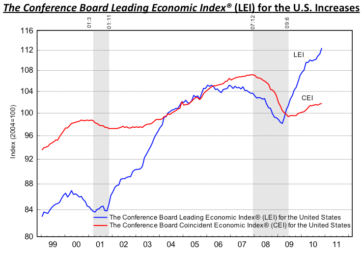
The LEI give us a good look at the next 3 months, and some help up to 6 months. After period of flatness at midyear 2010, from September on the LEI have been positive. December's LEI looks almost certain to also print positive, given initial claims declines, stock market growth, a strongly positive yield curve, a modest increase in real money supply, and improved customer sentiment, and flat manufacturing hours. The decrease in ISM vendor deliveries will subtract from this, but unless there are disasters in factory orders, durable goods, and housing permits - very unlikely - December will be positive.

Here is the Conference Board's graph showing the recent re-acceleration of the LEI:


Given the backdrop of consumer spending fueled by the recent increase in the real personal savings rate, Q1 2011 looks like a good bet for above trend economic growth. So would the second quarter, except ...

2. The second and third quarters - beware political idiocy (and Oil)

While it is a near 100% certainty that Congress will not pass any economic stimulus packages, the real problem is whether they can simply leave the recovery alone. This crew gives every sign that they will not.

At some point in March or April, a debt ceiling increase will have to be passed. This Congress gives every indication of preparing for first class brinksmanship and idiocy on that score - meaning that either a government shutdown and/or default will actually occur, or dimwitted austerity measures will pass. So much for the second quarter.

A second episode of idiocy will occur in June when the last of fiscal aid to the states ends. I see zero chance for any extension, and thus renewed budget cuts and layoffs visited by the "50 little Hoovers." So much for the third quarter.

Against this is the backdrop of $90 Oil, which we once again saw in December. I should point out that the inflection point - Oil at 4% of GDP - given general inflation and GDP growth, is probably now more like $94 a barrel. But continuing expansion in Q1 should push us there. As with 2010, the effect of the price of Oil depends on how far and for how long it overshoots that mark. At this point I do not anticipate much of an overshoot, but combined with Congressional idiocy, this should be enough to restart fears of a double-dip in the April-July window, as a brief deflationary spurt again appears as Oil kills some demand are retreats in price.

Last year I also highlighted 5 other harbingers of the midsummer stall in the economy. Several of those are flashing yellow at this point, but not red. Those are:

the Shanghai stock index, which hit a year high in October and has fallen 10% since then:


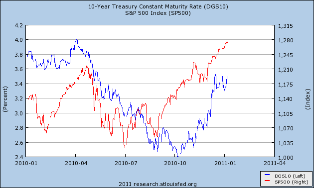
and the fact that stocks and bond yields are once again moving in the same direction, although as mirror images of one another (much as they did in the 2003-07 expansion, but unlike the 1982-2000 secular bull market) is at least a cautionary signal:


LIBOR has also increased slightly, but not significantly as of this writing.

All in all, there is an excellent chance for deceleration, although probably not outright decline, in the second quarter and over the summer.

3. The fourth quarter - the yield curve reasserts itself

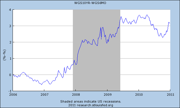
Congressional idiocy probably will not recur after midyear until the end of 2011. The decleration discussed above should cause Oil once again to back off. Under these circumstances, with deflation off the table or over with, the yield curve, which has been relentlessly and increasingly positive, as seen in this graph:


will likely reassert itself. As I do not see the Fed becoming senile and decreasing real money supply, this should signal re-accelerating growth from about Labor Day until year's end.

In short, the K.I.S.S. method suggests continued economic growth all year, but Oil will once again serve as a choke collar on that growth. As the price of Oil briefly declines, there may be a brief deflationary episode, but like last year this will not be enough to overcome the signal of the steeply positive yield curve. The real joker in the deck is the issue of whether political idiocy will deliver several negative jolts. If that happens, it seems most likely to be in the March-July window.

Whether our good fortune in escaping more than a brief episode of slight deflation is likely to continue is the subject of Part 2.

Yesterday's Market

Click on all images for a larger image


Monday, January 10, 2011

A Closer Look at M1

This week, I'm going to take a closer look at money supply, starting with M1, which is:

A category of the money supply that includes all physical money such as coins and currency; it also includes demand deposits, which are checking accounts, and Negotiable Order of Withdrawal (NOW) Accounts.

Physical currency is used in everyday transactions; it's what we use when we buy anything at a retailer. Notice it includes physical coin (which is on its way out) and checking accounts (which are directly accessed more and more as consumers use debit cards/electronic transfers on a far more regular basis).


There was a tremendous spike in M1 on a YOY basis at the end of the last recession. However, notice that things have definitely calmed down since then and we are now well within the traditional YOY rate of change.


Breaking M1 down into its two primary components, check deposits experienced a large spike, but are now within normal parameters, as is


physical currency. In fact, physical currency is fairly low by historical measures.


Finally, we have velocity, which shows that M1 is clearly shows that money is moving through the economy at a solid rate.

In short, M1 appears to be in line with an expansion. In addition, aside from the spike at the end of the recession, there does not appear to be a reason to be concerned about an inflationary expansion of the M1 money supply.

2010: My report card

- by New Deal democrat

A year ago I posted a preview of the year, 2010: Gilded Recovery, or Double Dip? (and Oil). With the year over, let's look back. How did I do?

To begin with, in late 2009, I also made a specific prediction that Jobs would start to be added in the December 2009/January 2010 timeframe +/- one month. Although initial payroll reports were negative through February 2010, after revisions my jobs prediction turned out to be spot on, as December 2009 was the bottom. (Mind you, this gold could turn back into dross once the BLS releases its annual revisions next month, but for the next few weeks, I can continue to pat myself on the back).

At the same time, contrary to every other econoblogger who ventured an opinion, I wrote that "In the case of the recoveries from [severe] recessions, payrolls started to grow as the ievel of initial jobless claims crossed 500,000, not 400,000." In fact, in this recovery payrolls turned positive at about the 480,000 level on initial claims.

Next, let's recap the highlights of last year's preview:
- the biggest issue before us is whether on the one hand the "Gilded Recovery" of the 2nd half of 2009 which was driven by spending by the top 10% income-earners broadens out, or does the economy sink into a new contraction, or double-dip.

- The Near Term - Strong growth is likely

The simple fact is, the first 3-6 months of 2010 are probably going to show growth, and indeed more strong growth than few dared to hope for in 2009.

....Keep in mind that under "Okun's law", really just a rule of thumb that economists use, we need to see at least 2% YoY GDP growth(some would say as high as 3%) to be consistent with job growth. We're probably going to reach that this quarter,

- The Long term - K.I.S.S. vs. Oil

I call [the yield curve] the K.I.S.S. indicator. If you look at only one indicator and nothing else, this is the one to observe. Needless to say, the strongly positive yield curve now foretells strong economic growth throughout the entirety of next year - provided there is no deflation.

....[B]oth Prof. Paul Krugman and Calculated Risk are calling the likely good [4Q 2009] GDP reading that we are about to see a "blip" that can be attributed to inventory restocking.... I agree that GDP is likely to subside, but disagree with the analogy.... strongly positive GDP will subside as inventory restocking fades, but that by no means foretells a double-dip.

In summary, if consumers once again have to pay over $3 a gallon for gas (which ~$90 Oil would give us), it will have a psychological as well as economic impact on consumers, and I would expect them to cut back in other areas. This looks likely to be the case.

Whether $90+ Oil will lead to a full-blown double-dip economic contraction, or just a slowdown later in the year, is almost impossible to gauge. It depends upon how far over $90 Oil shoots, and how long it stays there. If there is a dramatic overshooting a la 2007, there will be a double-dip. If there is a gradual increase over $90 that does not last that long before consumers cut back and the feedback loop causes price declines, then there may just be a slowdown, or if there is a contraction, it may be shallow and only last a quarter or two -- which is my best guess, and only a guess, at this point.

- Conclusion: The Gilded Recovery

IN CONCLUSION, 2010 looks like it will be a year very much in two halves. The first half will feature growth, and much stronger growth than most anticipate. Depending upon the behavior of Oil, the second half may just show us somewhat more tepid growth or by the fourth quarter there may actually be some contraction, although there is no sign whatsoever at this point at least of a repeat of "cliff-diving."
The year 2010 did unfold pretty much as I thought, with one important exception. The first quarter in particular did feature strong economic growth, ultimately recorded at +3.6%, higher than most expectations. There was a subsequent slowdown in part due to Oil hitting $90 a barrel in April. But it did not cause a double dip - it did only last a couple of quarters - and once Oil prices hit bottom at about $70, the yield curve accurately foretold the stronger growth that seems to have come through again at the end.

But instead of unfolding in halves, 2010 unfolded in thirds. Not only did Oil hit $90 in April, but the BP Oil catastrophe in the Gulf, the Euro crisis, and the ending of the $8000 housing credit all hit almost simultaneously, seeming to put the economy back into a tailspin.

What I missed in my preview were (1) the dramatic and immediate impact of the end of a specific and significant government program, and (2) the LEI's didn't do a good job picking up the early harbingers of a currency crisis. All of these above items created a Pavlovian fear of a repeat of 2008's meltdown that froze consumers and employers alike for about three months in mid-year. With strong European political measures, Oil falling back under $70 a barrel, and perhaps more than anything the emotional relief of seeing the capping of the Oil volcano at the bottom of the Gulf of Mexico, there was a palpable sense of relief, and the spigots of spending and to a lesser extent hiring opened again.

Looking ahead to 2011, if you are thinking I could write almost the exact same column again now, you are pretty close to the truth. I'll post that preview shortly.

The Employment Report and the Disappointment Syndrome

- by New Deal democrat

On Friday I noted the near-universal use of the word "disappointing" to describe the December jobs report. In fact, with no more than three exceptions, every initial report on nonfarm payrolls in 2010 has been "disappointing." Two months later, after upward revisions, they have usually been in line with initial expectations. But by that time the econo-punditocracy has moved on to disappointment with the newly-current initial nonfarm payrolls report.

What happened with November's jobs report is typical. Expectations were raised by good ADP and TrimTabs estimates - Private payrolls on the order of 90,000 or even higher were expected. Yet the initial report was a "devastating" 39,000. The following Monday, after painstakingly picking apart the report, I wrote that it was likely to be revised considerably higher, and that in particular the retail hiring portion of the report was probably an outlier that would get raised.

One month later and November has been revised higher by 31,000. Further, retail hiring for both October and November has been revised higher in particular, to the point where the combined October and November numbers aren't "disappointing" at all.

Let's start with the monthly jobs numbers (in thousands), excluding census, for all of 2010:

MonthJob gains
Jan+5
Feb+23
Mar+160
Apr+247
May+21
Jun+50
Jul+77
Aug+113
Sep+53
Oct+210
Nov+70(p)
Dec+103(p)

Every single 2010 jobs number was positive.

Next, here is the change between initial and final jobs report for each month of 2010, with the net change (including census jobs, which have no impact on the result):

MonthInitialFinalnet change
Jan-20+14+34
Feb-36+39+75
Mar+162+208+46
Apr+250+313+63
May+431+432+1
Jun-125-175-50
Jul-131-66+75
Aug-54-1+53
Sep-95-24+71
Oct+151 +210+59
Nov+39(p)+70(p)+31(p)
Dec+103(p)


(p)=preliminary

Every single initial jobs report in 2010 except one has been revised higher. The median final revision of the Jan-Oct initial reports has been +49,500.

Turning now to the issue of how big (or not) a role revisions to the "retail trade" number was in the overall 2010 revisions, and in particular November, here are the initial vs. final revised number for that item from the BLS's Schedule B to the December report:

MonthInitialFinalnet change
Jan42.149.1+7.0
Feb-0.4+7.1+7.5
Mar14.922.7+7.8
Apr12.414.4+2.0
May-6.6-5.8+0.8
Jun-6.6-16.2-10.2
Jul6.711.2+4.5
Aug-4.9+6.4+11.3
Sep5.7-3.9-9.6
Oct27.9 38.2+10.3
Nov-28.1-19.4(p)+8.7(p)

The median change for the "retail trade" series in the Jan-Oct 2010 revisions was +6.0 thousand, meaning that the November initial report did indeed have a substantial miss on retail positions in its initial estimate.

As I also pointed out last month, adjusting for seasonal retail hiring was the problem. Retailers hire a lot of temporary help for the holiday season. It is a known factor and so is automatically seasonally adjusted. In November, the BLS "expected" employers to hire +328,900 retail employees, but in the initial report they were estimated to have hired +300,800, so the inital Seasonally Adjusted number was -28,100. With December's revision, the second estimate is that +317,600 retail workers were hired in November. This is over half of the shortfall, and October's number was also revised higher.

Nevertheless, since - incongruously, given the otherwise solid data for the month - November is still the "gloomiest" absolute retail hiring number of the year - so don't be surprised at further revisions.

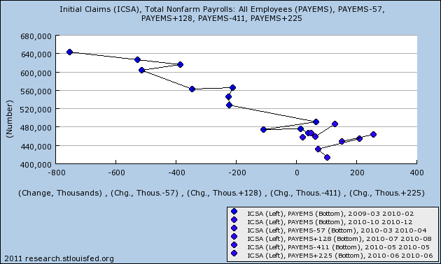
Turning to several other indicators for nonfarm payrolls, to begin with, here is the updated scatter graph of initial claims vs. nonfarm payrolls ex-census:


With the latest revisions, November, although closer to the lower end of the trend, is no longer an outlier. Even the initial December report is well within the variance of the trend.

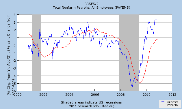
Next, I always call real retail sales the "holy grail" of future job growth. Here is the updated graph of YoY real retail sales (divided by 2 to better show the correlation) and jobs:


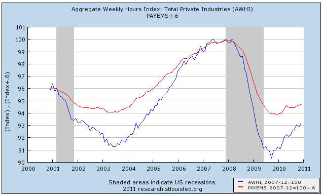
This is still low for this graph, but is moving in the right direction. One likely reason for the temporary divergence is the huge loss of hours worked during the recession. Hours are still being added at a rate faster than jobs, as shown in this graph where December 2007 is normed to 100%:


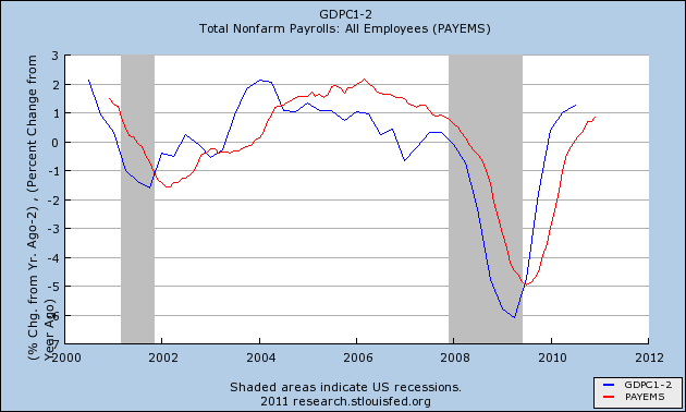
Now here is GDP vs. jobs. Typically it takes about 2% YoY GDP growth to correlate with jobs growth, so in this graph 2% is subtracted from the YoY GDP number:


This correlation is holding up quite well.

One final caveat: Next month the BLS will be publishing its annual revisions, covering March 2009 through March 2010. We already know that the average payrolls number for that 12 months period will be revised downward nearly 30,000. What we don't know is what will happen with the positive reports that began in November 2009. For example, last year, despite over 800,000 jobs being subtracted from the prior year's numbers, November 2009's number was actually revised upward.

So, whether these numbers will look better or worse is impossible to say. But they will look different!