Saturday, October 2, 2021

Weekly Indicators for September 27 - October 1 at Seeking Alpha


 - by New Deal democrat


My Weekly Indicators post is up at Seeking Alpha.

Commodity prices and transportation cost continue to soar, and there are even signs of further acceleration. If you go by the regional Fed reports, it is beginning to affect manufacturing. If you go by the ISM, not even a little bit.


As usual, clicking over and reading brings you up to the economic moment, and rewards me a little bit for my efforts.

Friday, October 1, 2021

Manufactuing remains white hot, while construction spending is mixed


 - by New Deal democrat

As usual, we started out the month with the forward-looking ISM manufacturing report for September, as well as construction spending for August.


Let’s take the ISM report first, since it is an important short leading indicator for the production sector. And here, the news was good, as the overall index improved to 61.1, among its highest numbers in several decades (but not quite as high as several readings earlier this year). The more leading new orders subindex held steady at a white-hot 66.7:


There is not a hint of a manufacturing slowdown in this number, despite the well-documented problems in the supply chain.

Turning to construction, overall spending including all types of construction was unchanged, while spending on the leading residential sector increased 0.4% at or making new all time highs:


Adjusting for price changes in construction materials, “real” construction spending declined -0.1%, while “real” residential construction spending increased 0.2% m/m:


In absolute terms, “real” construction spending declined sharply earlier this year, but now appears to have bottomed out:


So the leading aspects of both reports were positive, although price issues in construction materials remain problematic.

Real spending increases, real income declines in August


 - by New Deal democrat


(Note: I’ll report separately on construction spending and the ISM manufacturing index later.)

Real personal income and spending held up well throughout the pandemic, due to a vigorous government response. This morning these were reported for the last full month of any assistance. 

In nominal terms, personal income rose 0.2%, and spending rose 0.8% (but with a downward revision of -0.4% to July).

But in real terms, personal income (blue) declined -0.2%, while real personal spending rose 0.4%. Real income (blue) is 4.1% above where it was in February 2020, and real personal spending (red) is still 2.8% above its immediate pre-pandemic level:


The trend for the last for months for both has been essentially flat.

Meanwhile, the “cushion” in personal savings due to the emergency pandemic programs continues, as the savings rate remains significantly above where it was before the pandemic. In February 2020 the rate was 8.3%. In August it was 9.4%:


Real personal spending is basically the other side of the coin compared with real retail sales, since they cover the seller and buyer of consumer transactions, which is over 2/3’s of the entire economy:


Both of these have returned to basically normal levels m/m, and both increased 0.4% in August. Needless to say, this is positive.

With the total expiration of emergency measures, the next few months will be much more challenging.

Thursday, September 30, 2021

New jobless claims increase: exit Delta, enter supply chain chokepoints?


 - by New Deal democrat

This week jobless claims were higher for the third week in a row, and the 4 week average also rose slightly. Initial claims rose 11,000 to 362,000, and the 4 week average rose 4,250 to 340,000, from last week’s pandemic low:


Meanwhile, continuing claims declined 18,000 to 2,802,000, but remain above the pandemic low of 2,715,000 of two weeks ago:


It appears that the ending of all of the emergency pandemic assistance programs have had very little effect on continuing claims.

With infections from the Delta wave now down almost 1/3rd from their peak one month ago, we can safely say that the increase in new claims in the past few weeks is not due to COVID. It may just be noise. It’s also possible that the bottlenecks in the supply chain have led to some cutbacks downstream, as the ability to manufacture or sell goods is constrained by what is available. The next jobs report, which will be issued a week from tomorrow, should give us further insight as we can look to see where if anywhere there have been job losses.

Wednesday, September 29, 2021

Coronavirus dashboard for September 29: the demographics of disease and death


 - by New Deal democrat

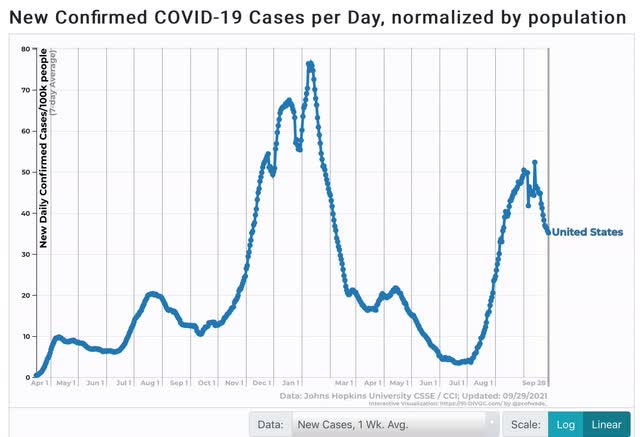
First, let’s start with the good news. The Delta wave continues to roll out just about as swiftly as in rolled in. Cases are down almost 33% nationwide, including in all 4 regions: 


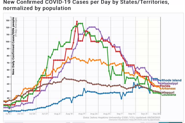
And all 5 States that were the worst hit at the outset - AR, FL, LA, MO, and MS - are all continuing to decline. Below I show them, plus RI, which is #25 among the 25 lowest States + DC. In other words, all the early poster children for Delta are now in the bottom half of all States for new infections:


Only 5 States are in any kind of uptrend at all - AK, MI, MN, ND, and NE:


Note that all of them are near or at the northern border with Canada, and 3 of them are also among the Trumpiest. To drive the point home, here is Canada itself, plus MI and MN:


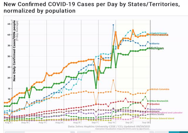
Alberta in particular is likened by Canadians to Texas in the US. So you have two of the (even) colder provinces, which are also the “libertarian” conservative provinces, having the worst records.

In other words, Delta continues to migrate north, and continues to hit the least vaccinated areas the hardest.

I hasten to add, however, that even with this relatively “good” news, the number of case is still far higher than at any point during the worst of the spring or summer 2020 waves:


 Now to the demographics issue. Let me start with this graph of mortality by age for COVID vs. the Spanish Flu:


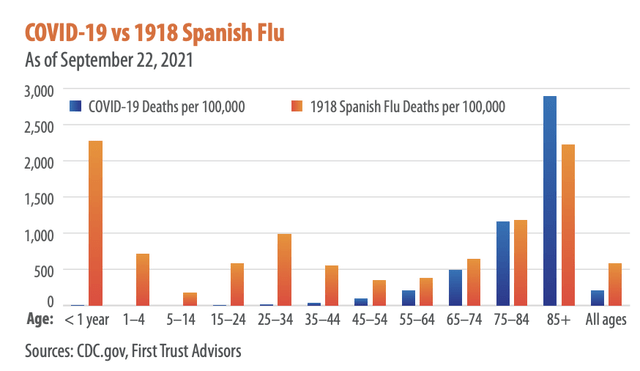
The graph comes from Brian Wesbury, a financial analyst whose twitter feed strongly indicates he is a devotee of Hayek and Ayn Rand. But don’t dismiss it - I went to the CDC site itself to verify the numbers for COVID, and here they are:


As of one week ago, there had been only 544 deaths from COVID among children since the beginning of the pandemic.

In other words, measured per capita, COVID (so far) has caused only 1/3rd the percentage of deaths compared with the 1918 Flu; and among the young, it has been far, far less deadly (so far, according to one graph I have seen, it is roughly equivalent to the number of children who die from influenza each year).

But haven’t we heard that Delta has been attacking the young at a much higher rate than the original strain of the disease? Yes, we have, and yes, according to the below graph it is true:


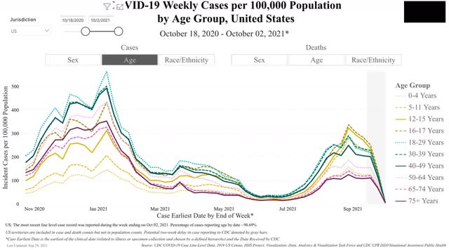
You can see that, per capita, Delta has attacked those two ages the most, followed right behind by the 12-15 demographic, and then the 5-12, 18-29, and 30-39 demographics virtually in a tie.  Note that by contrast, children were among the least hit by the original strain last autumn and winter.

Now let’s turn to deaths. And it’s a completely different story:


Delta continues to kill at the highest rate the oldest demographics in reverse chronological order. But because there are far fewer people over age 75, and also fewer in the 65-74 demographic, the raw *number* of people under 65 killed by Delta is larger, giving us fatalities of about 2000/day.

But this is still a vaccine success story, because over 80% of people over 65 are fully vaccinated. Deaths among the 65-74 demographic are only about 1/3rd of what they were last winter, and deaths among those over 75 are less than 1/5th what they were!