- by New Deal democrat
Monthly data ended 2011 on a mixed note. The Case Shiller home index for October showed further declines in home sale prices, while consumer confidence has now regained virtually all the ground it lost during the debt ceiling debacle in July. Meanwhile, some of the high frequency weekly indicators continue to be affected by seasonality, but almost all ended 2011 with good showings.
Turning first to jobs, all three weekly indicators were good:
The BLS reported that Initial jobless claims rose by 17,000 to 381,000. The four week average declined by 5250 to 375,000, the lowest level in 3 1/2 years. Seasonality is still significant, so extra caution is warranted, but even if the numbers are slightly overcompensating for seasonal factors, the trend remains very good.
The American Staffing Association Index rose by one to 93 last week. This series will plummet in the next couple of weeks due entirely to seasonality. It is now equal to last year's levels, after stagnating earlier this year.
Adjusting +1.07% due to the 2011 tax compromise, the Daily Treasury Statement showed that withholding for the first 19 days of December stood at $144.2 B vs. $143.7B a year ago for a gain of $0.5 B. For the last 20 reporting days, $151.8 B was collected vs. $147.0 B a year ago, a gain of $4.8 B or +3.3%.
Housing continued to show promise:
For the fifth week in a row, YoY weekly median asking house prices from 54 metropolitan areas at Housing Tracker were positive, up +1.7% YoY. For the first time, an absolute majority of metro areas -- 29 -- had YoY price increases. Chicago remained the only area with a 10% YoY price decrease.
The Mortgage Bankers' Association did not report this week. Reports will resume next week.
Retail same store sales continued their year-long strength, and also reflected seasonal swings. The ICSC reported that same store sales for the week ending December 24 increased 4.5% YoY, and were also up 0.9% week over week. Shoppertrak reported that YoY sales increased 14.8% YoY and were also up 37.8% week over week (no, those are not misprints).
The biggest bang of all was rail traffic. The American Association of Railroads reported that total carloads increased 16.4% YoY, up about 71,200 carloads YoY to 505,100. Intermodal traffic (a proxy for imports and exports) was up 40,700 carloads, or 22.9% YoY. The remaining baseline plus cyclical traffic increased 30,500 carloads or 11.9% YoY. Total rail traffic has staged an impressive rebound in the last 3 months.
Several sectors gave mixed readings:
Money supply has been flat or down since its Euro crisis induced tsunami of several months ago. M1 was flat last week, and declined -0.1% month over month. It is now up 17.5% YoY, so Real M1 remains up 14.1%. This is about 7% under its peak YoY gain several months ago. M2 fell -0.1% w/w but was up +0.4% month over month. It remains up 9.7% YoY, so Real M2 was up 6.3%. This is also significantly less than its YoY reading at the crest of the tsunami.
Oil closed at $99.11 a barrel on Friday. This slightly above the recession-trigger level calculated by analyst Steve Kopits. Gas at the pump rose $.03 a gallon to $3.26. Measured this way, we are just about at the 2008 recession trigger level. Gasoline usage, at 8923 M gallons vs. 9399 M a year ago, was off -5.1%. The 4 week moving average is off -5.6%. Since March the YoY comparisons have been almost uniformly negative, and substantially so since July.
Only credit spreads showed continued weakness. Weekly BAA commercial bond rates increased .04% to 5.24%. Yields on 10 year treasury bonds increased rose .01% 1.95%. Spreads continue to widen, representing increasing weakness.
In 2011, the weekly mark-to-reality approach of the high frequency indicators continued to reap benefits. Initial signs of a growth slowdown started to appear in February, and continued throughout the spring and summer, reaching a climax with actual contraction in many parts of the economy in August and September. Since that time, there has been a sustained and gathering re-acceleration of growth. Throughout the year, consumers dipped into the savings they had accumulated during the recession and so sales remained uniformly positive. Meanwhile, they appeared to embrace a sustained approach to conserving energy, as gasoline usage showed a significant and continuing decline from prior years' levels.
Have a happy and safe new year!
Saturday, December 31, 2011
Friday, December 30, 2011
Bonddad Linkfest
- Cities cutting street light service to save money
- Commodities decline for first year since 2008
- Treasuries have best year since 2008
- Corn traders extend bullish bets
- Initial claims rise 15,000
- Chicago PMI decreases slightly
- China's PMI falls for second month
- US economy enters new year on good footing
- Gold hits six-month low
- The importance of liquidity for haven currencies
1951: Investment
This post is part of the Bonddad economic history project.

The above chart shows the contributions investment made to GDP in 1951. The big story above is the massive inventory draw down that occurred throughout the year. Remember, that in 1950 we saw a massive inventory build as businesses stockpiled items in anticipation of the Korean war demand. Also note the drop in residential investment, which was caused by the Fed tightening money supply and raising reserve requirements during the year.

The above chart from the 1952 Economic Report to the President puts the investment situation into perspective. The dotted line at the bottom shows the huge drop in inventories. Also note the drop in new construction. However, there is an increase in producer's durable equipment, which shows businesses upping their industrial plant in anticipation of war purchasing.

The above chart shows the overall increase in plant and equipment on the part of business during 1951. Most of this was war related spending, as businesses anticipated the war effort would increase demand for heavy goods. This explains the large increase in primary metals, machinery and non-auto transportation equipment.
2011 Year in Review: Employment
The employment situation has done OK, this year, but there are still some incredibly negative developments. First, the bad news:

The unemployment rate is still very high at 8.6%. However, it has dropped over a percentage point over the year.

The 4-week average of initial unemployment claims spent most of the year above the important 400,000 mark. However, it has dropped over the last few months. But we don't have enough data or a long-enough trend to call this a real trend yet.

Notice the economy has added a decent number of jobs -- over 1.5 million -- this year.

Goods producing industries have added some jobs -- a little over 300,000. But their contribution slowed at the end of the summer, and now this employment segment is treading water.

Service sector jobs accounted for the bulk of the gains, contributing over 1 million jobs.

But we've lost about 250,000 government jobs over the year, which is probably a big reason for initial unemployment claims remaining above 400,000 for most of the year.
The above charts show there has been some progress; just not enough.
Morning Market -- The Break-Out Is Still Wanting


The above four charts show the IWMs, IYTs, QQQs and SPYs. All are still waiting for a breakout. Notice that none of the charts have printed a strong, bullish candle over the last week, and only one or two over the last two. The bottom line is we're just not seeing a strong move from these levels yet.

The IEF daily charts shows that prices have bounced from the 50 day EMA and are moving higher.

Thursday, December 29, 2011
1951 PCEs, Income and Savings

The above chart shows PCEs contribution of overall economic growth during 1951 and the contributions of each sub-part of PCEs to overall PCE growth. The first quarter saw a tremendous surge as consumers anticipated shortages caused by the Korean war effort. In essence, these purchases pulled purchases ahead to the first quarter, which explains the huge drop-off in purchases during the second quarter. During quarters three and four we see a return to more normal contributions of overall growth.
Let's look at these figures from a few other perspectives:

PCEs grew at a strong seasonally adjusted annual rate in the first quarter, contracted in the second quarter and returned to more normal rates of growth in the third and fourth quarter.

Or, the year over year percentage change was sharply higher in the first quarter, but leveled off in the second through fourth quarter.

A big part of the fuel for the PCE growth came from the increase in real disposable personal income. The above chart shows that this increased every quarter in 1951, and increased at a very strong rate in the second quarter and a decent rate in the third quarter.

The real YOY increase in DPI was also very strong, indicating the increases were consistent.


The charts above are from the Economic Report to the President in 1952, The top figure shows income and its sources and the second shows average hourly and weekly manufacturing wages. The top figure shows a large jump in savings in the latter part of the year, as consumers slowed their pace of consumption. As the second chart shows, inflation took a big bite out of wage growth for manufacturing employment during the year.

The above chart shows the importance to durable goods purchases to consumer spending during 1951. It also shows the incredible level of pent-up demand that was unleashed on the economy in the post-WWII years.
An examination of the model for ECRI's black box
- by New Deal democrat
Two weeks ago, an article I wrote, A Peek inside ECRI's black box gained considerable traction. There I examined a number of data series which likely generated ECRI's recession warning in September, using as my starting point the work of ECRI's founder, Prof. Geoffrey Moore, who in a 1961 manuscript set forth a number of leading indicators that predicted recessions and recoveries both before and after World War 2. A commenter at Seeking Alpha, dlamba, suggested reading Prof. Moore's later work, "Leading Indicators for the 1990's" (1991) in which he laid out in considerable detail his 1980's research into both Long and Short leading indicators, and also suggested a high-frequency Weekly Leading Index which, while slightly less reliable, could be updated in a much more timely and frequent fashion.
The book itself describes the research and the results thereof, as well as setting forth the methods by which values for each indicator were computed. A description of all of that, and the present values of each indicator, are beyond the scope of this post. Instead, let me simply describe the data that as of 1990, Moore recommended for each index.
Moore proposed 4 Long Leading Indicators:
Real M2
Dow Jones Bond Average
Housing Permits
The ratio of price to unit labor cost in manufacturing
These turn negative at least 12 months before the onset of recession, and on average 14 months before, and turn positive on average about 11 months before the end of a recession.
He also proposed 11 Short Leading Indicators:
S&P 500 stock price index
Average workweek in manufacturing
Layoff rate under 5 weeks
Initial claims for unemployment insurance
ISM manufacturing vendor performance
ISM manufacturing inventory change
Journal of Commerce change in commodity prices
Change in deflated nonfinancial debt
New orders for consumer goods and materials
Dun and Bradstreet change in business population
Contracts and orders for plant and equipment
On average these turn negative about 8 months before the onset of recession and turn positive 2 months before the end of a recession
Finally, he proposed a Weekly Leading Index made up of indicators whose values could be computed weekly, or if monthly were reported at the beginning of the next month. While this index would be a little less reliable than the two others, it would have the advantage of being more timely. It's components are:
Real M2
Dow Jones Bond Average
S&P 500 stock price index
Average workweek in manufacturing
Layoff rate under 5 weeks
Initial claims for unemployment insurance
ISM manufacturing vendor performance
ISM manufacturing inventory change
Journal of Commerce change in commodity prices
Dun and Bradstreet new business formation and large business failure
Real estate loans, deflated, growth rate
Many of these are the same as on the Long and Short Leading Indicator list, but are calculated weekly for purpose of the weekly index. On average these turn 12 months before the onset of a recession and turn positive three months before the end of a recession
Prof. Moore also set forth a series of signals that could be used to predict recessions and recoveries (p. 76):
"The first signal of recession occurs when the six-month smoothed growth rate in the leading index first declines below 2.3%. The second signal requires the leading index growth rate to fall below -1.0% and the coincident index to fall below 2.3%. The third signal is set off when the leading rate is below zero and the coincident below -1.0%. ... [T]he first signal of recovery ... is set off when the six month smoothed rate of change in the leading composite first goes above +1.0%."
In case it isn't clear from the above quote, in a recent interview Lakshman Achuthan explicitly stated that it is a decline in the coincident indicators -- nonfarm payrolls, industrial production, real income, and real retail sales -- rather than a decline in GDP, that defines a recession for them.
At its website, ECRI maintains that it "refined" the above indicators throughout the 1990's both before and after its founding in 1995. My examination of the Long Leading Indicators in the above list, for example, strongly suggests that at least one of those has subsequently been replaced.
I will examine the forecasting record, up to the present, made by each of the 3 above indexes, in future posts.
Anecdotal Thoughts On the Houston Economy
I live in Houston, Texas in a neighborhood called the Heights. Over the last 4-6 weeks, I've seen the following, which you should consider as nothing more than anecdotal information in a limited geographic area:
1.) An old apartment building (as in at least 40 years old) that sat on five residential lots just down the street has been torn down.
2.) An entire row of other row houses has been cleared and there is a rumor in the neighborhood that the area has been set for some kind of retail development.
3.) There are at least 4 other houses going up in the neighborhood.
4.) Over Christmas, as I drove by malls, it looked like the parking lots were packed. The day after Christmas, I saw the same thing. And IKEA was literally overflowing with people. I have no idea if they purchased anything, mind you, but they were there.
5.) There is a four story multi-use building going up in the neighborhood.
6.) A lot on San Felipe (a fairly major street near the Galleria in Houston) has been cleared and major construction equipment is moving on site.
Again -- this is anecdotal, non-fact based observation. But it sure seems like more is going on in the city.
Morning Market -- Break-Out Denied (so far) Edition


The above charts show that none of the equity average broke out yesterday -- in fact, we see a general retreat for recent gains. The SPYs are now below their previous resistance lines and the QQQs and IWMs are retreating from their respective upper trend lines. In short, the confirmation of the breakout has yet to happen -- which is one of my concerns with a rally that is caused by low beta market sectors. Also consider these two charts:


Both the XLIs and XLFs -- which are the two more aggressive market sectors that were closest to rallying -- are retreating from their respective upper trend lines as well.
So, we don't really have a decent confirmation of last week's break-out yet. In fact, we have a retreat from the break-out position.
In addition, consider the following charts:

Gold has dropped below lows established in September. All the EMAs are moving lower and the 10 day EMA has now crossed below the 200 day EMA. The MACD is declining and negative.

The above 60 minute chart of gold shows the overall weakness in this ETF. Prices gapped lower at the beginning of the week starting December 12. Prices declined for the rest of the week. We saw a counter-rally last week, but the rally was very timid. There isn't a lot of upward momentum to the chart and prices were stalled at the 50 minute EMA. Since hitting that resistance, prices have retreated again and have moved below the prices established mid-December.

On the weekly chart, we see that gold has moved below important trend lines.
So, gold is quickly losing its luster
Wednesday, December 28, 2011
Bonddad Linkfest
- Italian interest rates drop
- Obama to ask for debt ceiling increase
- Conference Board's Consumer Confidence release
- US declines to name China a currency manipulator
- Treasuries will sell-off next year as economy strengthens
- Japan industrial output falls
- Deposits at ECB hit high
- Two new Fed nominees
- Gold (and GLD) losing its appeal
- Calculated Risk on House Prices
Ricardian Equivalence is a Crap Theory
From Wikipedia

From January 1981 to December 1989, the government continually increased the amount of money it spent.

They financed this by increasing the amount of debt they took on. Notice that we increased total federal debt outstanding from under $1 trillion to a little over $2.8 trillion.
Given the above facts, we would expect to see either a decrease in PCEs or an increase in savings. Yet the exact opposite happened:

Throughout the 1980s, people increased their spending, and

decreased their savings.
I'm sure that Ricardian equivalence makes perfect sense in the theoretical world of graduate level economics departments -- which also happen to not deal in reality.
In its simplest terms: governments can raise money either through taxes or by issuing bonds. Since bonds are loans, they must eventually be repaid—presumably by raising taxes in the future. The choice is therefore "tax now or tax later."So, in the 1980s, we see a massive deficit financed government expansion that was also financed by a tax cut. Let's look at the data:
Suppose that the government finances some extra spending through deficits; i.e. it chooses to tax later. This action might suggest to taxpayers that they will have to pay higher tax in future. Taxpayers would put aside savings to pay the future tax rise; i.e. they would willingly buy the bonds issued by the government, and would reduce their current consumption to do so. The effect on aggregate demand would be the same as if the government had chosen to tax now.
David Ricardo was the first to propose this possibility in the early nineteenth century; however, he was unconvinced of it.[2] Antonio De Viti De Marco elaborated on Ricardian equivalence starting in the 1890s.[3] Robert J. Barro took the question up independently in the 1970s, in an attempt to give the proposition a firm theoretical foundation.[4][5] The proposition remains controversial

From January 1981 to December 1989, the government continually increased the amount of money it spent.

They financed this by increasing the amount of debt they took on. Notice that we increased total federal debt outstanding from under $1 trillion to a little over $2.8 trillion.
Given the above facts, we would expect to see either a decrease in PCEs or an increase in savings. Yet the exact opposite happened:

Throughout the 1980s, people increased their spending, and

decreased their savings.
I'm sure that Ricardian equivalence makes perfect sense in the theoretical world of graduate level economics departments -- which also happen to not deal in reality.
1951: GDP
Moving forward from 1950 and into 1951, we'll see the government spending -- in the form of war spending for the Korean War -- can indeed create economic growth. In fact, it can be the primary driver for overall economic growth.

The above chart is of total GDP growth, along with the contributions of each sector of the economy to growth. Notice that for each quarter of 1951, government spending (the blue line) is very high. In fact, the only other column as high are PCEs in the first quarter. This chart shows that government spending can indeed drive economic growth.
1951 saw three quarters of very strong growth, with a very large slowdown in the fourth quarter. Consumer spending was strong in the first quarter, contracted in the second and then returned to more normal rates of growth in the third and fourth quarter. Investment was a remarkably huge drag for all but the second quarter. Exports contributed some to growth, but the real story is the huge input of government spending, which basically drove growth for the entire year.

We'll start to look in detail at the various sub-components of growth over the coming week or so.
Morning Market

After bouncing off the Fibonacci fans, prices have now moved through resistance, priting a fairly strong bar to do so. Also note the technicals are giving a buy signal (MACD has given a buy signal, CMF has turned positive and the A/D line is advancing). The EMA picutre is a bit blurred, however.
Moving on, remember we're looking for a confirmation from other averages or more aggressive market sectors to see if the SPY break-out is for "real."

After advancing in the AM in a very strong rally, prices retreated and could not quite make it back to the days highs. In addition, prices could not maintain their momentum going into the close, falling in the final half hour.
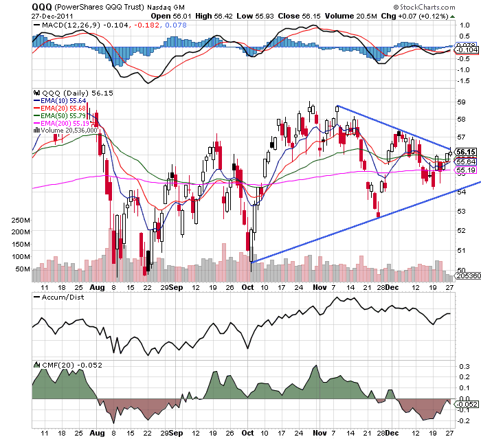
The QQQs are still in their range. Yesterday's candle broached resistance, but could not close above that level.

The IWMs could not break through resistance yesterday, either.


And the XLIs and XLFs are still in their trading ranges as well. And finally,

the IYTs are range bound as well.
In short, yesterday did not confirm the SPYs break-out on Friday.
Tuesday, December 27, 2011
Bonddad Linkfest
- Rental properties helping to boost housing
- Monetary policy week in review
- Volcker rule comment period extended
- Census' durable goods report
- Russia cuts refi rate
- Gap between lawmakers and citizens increases
- Lawmakers increase incomes in last 6 years
- Crude oil and energy stocks
- US is now a net exporter of petroleum products
- The bond market isn't concerned with US borrowing
2011 Year In Review: The Consumer
Let's continue looking at the year in review by looking at the consumer's health:

Real PCEs rose in the second quarter, but then leveled off for the next 5-7 months. However, over the last three months we've seen a nice increase.

Service expenditures -- which account for about 65% of PCEs, have for the most part risen all year. But the rate of increase has slowed over the last few months.

Non-durable goods have been moving sideways for the entire year.

Real durable goods sales -- which had stalled for the first three quarters -- have been a big reason for the increase these last three months.

Light auto sales -- which are a big part of durable goods sales -- are still at very low historical levels. In fact,I would argue we won't see the levels of the 2000s for some time -- perhaps not the next 5 years or so.

The yearly chart for auto sales shows they took a sharp drop in the summer, but have since rebounded.

Overall retail sales stalled for the better part of the year, but have rebounded the last three months

Overall sentiment is still incredibly low by historical standards.

And on an annual basis, we're about where we were at the beginning of the year, sentiment wise.

Real disposable income -- the fuel of consumer spending, is actually slightly lower then its position at the beginning of the year. In fact, overall DPI has dropped from increases seen in the first few quarters of the year. As a result

the increase in consumer spending is coming from savings.
Overall, the last three months of the year have made up for a fairly weak consumer year. However, it has come with a cost: instead of increased earnings fueling the end of the year purchases, consumer shave been dipping into savings to make purchases. Low DPI is expected when unemployment is 8.6%; however, increases in consumer spending can't continue if their only source of funds is savings -- especially when consumer sentiment is already very low.
Subscribe to:
Posts (Atom)