Saturday, May 22, 2021

Weekly Indicators for May 17 - 21 at Seeking Alpha


 - by New Deal democrat

My Weekly Indicators post is up at Seeking Alpha.

The theme of a supply-constrained economic Boom continues, with the addition this past week of the national average of gas prices going over $3 a gallon for the first time since 2014, probably in part to the Colonial Pipeline snafu.

As usual, clicking over and reading will bring you right up to date on the state of the economy, and bring me a little pocket change for gas money.

Friday, May 21, 2021

Existing vs. new home sales: sales have peaked, expect prices to soon


 - by New Deal democrat

I normally don’t pay much attention to existing home sales. Even though they constitute about 90% of the housing market, they have much less impact on the economy overall than new home sales (because all of the economic activity involved in building the house, and then landscaping the outside and furnishing the inside).


But they can be a comparison with new home sales, particularly as they are a competing product. And the procession of data is the same: interest rates lead sales, which in turn lead prices, which in turn lead inventory.

Existing home sales for April confirmed what we have already seen with new home sales: the market peaked at the turn of the year. Sales declined 2.7%, seasonally adjusted, compared with March, to 5.85 million units annualized. That is the lowest number since last July’s 5.90 million. It is about -12% below the January peak of 6.66 million. Below I show both new (blue) and existing (red) home sales for the past year:


Earlier this week we saw that housing permits and starts are both also off of their highest point of December and January.

Median prices, however, continued to climb to a new all time high of $341,600, a YoY gain of 19.1%, the highest YoY gain on record.  Inventory continued to decline, to less than 2 months’.

I fully expect prices to reverse in the coming months, and I also expect inventory to increase.

Thursday, May 20, 2021

Big decline in new jobless claims continues, while decline in continuing claims has stalled


 - by New Deal democrat

New jobless claims continue to be the most important weekly economic datapoint, as increasing numbers of vaccinated people and outdoor activities have led to an abatement of the pandemic - both new infections and deaths are near their lowest points in a year. 

We have hit my objective for new claims to be under 500,000 by Memorial Day. My second objective is for them to be below 400,000 by Labor Day. 

NOTE: Given the unprecedented scope of layoffs during the earliest phase of the pandemic, I have given heightened importance to the non-seasonally adjusted numbers. Once May is over, their importance recedes and I expect to discontinue tracking them.

New jobless claims declined 34,000 to 444,000. On a unadjusted basis, new jobless claims declined 37,395 to 454,634. The 4 week average of claims also declined by 30,500 to 504,750. All of these were new pandemic lows.


At the peak of the pandemic lockdowns, new claims were running 6 million to 7 million per week. Here is the trend since the beginning of last August:


The current level of claims are at levels consistent with either a mild recessions or early in the recovery from a recession in the prior 50 years prior:


Continuing claims, which are reported with a one week lag, and lag the trend of initial claims typically by a few weeks to several months, declined 111,000 to 3,751,000, (blue). The bad news is that they are 111,000 above their pandemic low. The good news is that the data has been revised - last week was the new pandemic low! On an unadjusted basis (gold) , they declined 10,323 to 3,68408:


The long term perspective again shows that these are equivalent to the worst levels of most previous recessions:


Finally, the average change in initial claims during the last 4 weeks - the weeks that will coincide with the May jobs report - declined -151,000 from the previous 4 weeks! That is simply unprecedented outside of the pandemic. Since, as I wrote yesterday, March’s employment gains may have been more of an outlier than April’s, and if we simply averaged the 2 months together that would be an average jobs gain of 518,000, then the continued big decline in initial claims would give us a May jobs gain of over 500,000 when that report is issued in 2 weeks.

I continue to think initial jobless claims will continue their recent strong decline, while the failure of continuing claims to make meaningful new lows in the past 6 weeks or so is genuine concern (and I’m working on a historical post on that subject).

Wednesday, May 19, 2021

Further considerations on the disappointing April jobs report. Consider the averages!


 - by New Deal democrat

I’ve been threatening for a couple of weeks to run some extended comments on the big miss in the April jobs report. As there’s no economic news of note today, here goes . . . .


1. It’s possible March was the outlier rather than April.

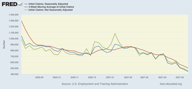
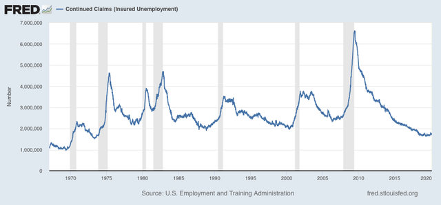
The original report for March was that 916,000 jobs were added. In this month’s report it was revised down to 770,000. Below is a graph of “civilian employment” from the household report (blue), “employment” from the establishment report (which is the commonly reported number (red), and the monthly change in initial jobless claims (green, inverted so that a decline shows as a positive, /100 for scale):


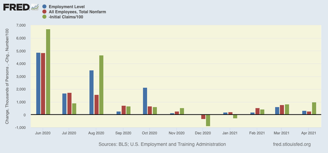
Note that in general - but not always! - the change in jobless claims correlates well with the change in both of the jobs numbers. Note also that the April change in jobless claims was the largest since early on in the pandemic. 

That being said, there have been *only* about a dozen previous times in the last 50+ years when initial claims declined as much as they did in April, but before the pandemic, the median change was about +350,000 for such changes. That’s a very small sample, so a large variance can easily be expected.

In any event, the 2 month change for March and April in the jobs report was +1,036,000 as currently revised, or 518,000/month. The comparable “civilian employment” 2 month number from the household survey was 937,000, or 468,500/month. The household report # now looks very close to the establishment survey’s number. In other words, the original establishment report of 916,000 for March may have been the outlier, and maybe we should have expected #s closer to the 350,000 median that was correlated with similar improvement in the jobless claims numbers.

2. But the likelihood of big job gains isn’t over - and may be missed by the establishment survey

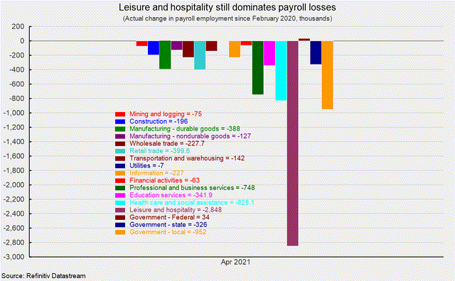
There are still a ton of closed businesses and laid off employees out there. Fortunately, I’ve been saved the intensive work of sorting out those losses by jobs categories, because it’s already been done by the American Institute of Economic Research, which produced the below two graphs, first of the raw numbers of current pandemic job losses in each sector:


And the same expressed as a percentage of pre-pandemic jobs:


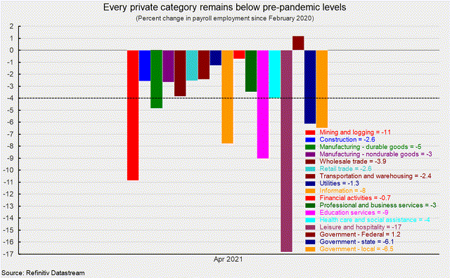
In leisure and hospitality in particular, there remain almost 3,000,000 lost jobs, or nearly 20% of the pre-pandemic total in that sector. There are also large losses in local government, professional and business services, and social assistance.

Once the US reaches herd immunity, which I believe will be sometime this summer, I would expect most of those positions to open back up. Which means more big employment gains.

Also, anecdotally, I was in a neighboring metro with some friends last weekend, and we came across the site of one of our favorite restaurants that had “permanently” closed last spring as the pandemic lockdowns hit. And - surprise! - it had just opened back up in the same location. I wonder how many other landlords and former tenants are making similar arrangements? If this is happening a lot, the only way it would show up in the establishment jobs report is via the “birth/death adjustment” which estimates how many new businesses have just opened, and haven’t been around long enough to be picked up by the survey. If this adjustment is off in these nearly unprecedented times, then the only place we might see these jobs being picked up is in the household report, where people report whether or not they have jobs.

3. The best evidence is that enhanced unemployment benefits have not been a big drag on hiring.

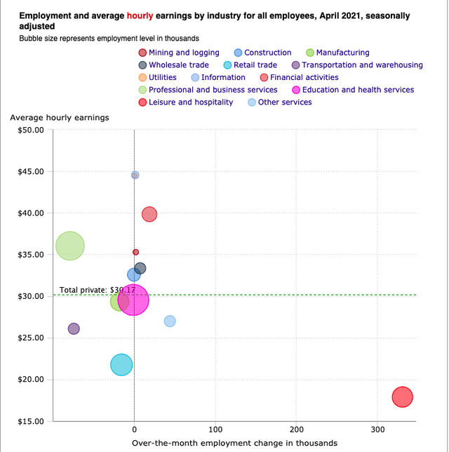
Two separate sources took a look at where the big job gains were (and weren’t) in the April report, separated out by where those jobs typically fit on the wage scale.

If enhanced unemployment benefits were the big driver of the disappointing report, then we would expect the impact to show up most in low-paying jobs.

It didn’t. Here is a dot-plot:


And here is an easier-to-interpret line graph, with labels:


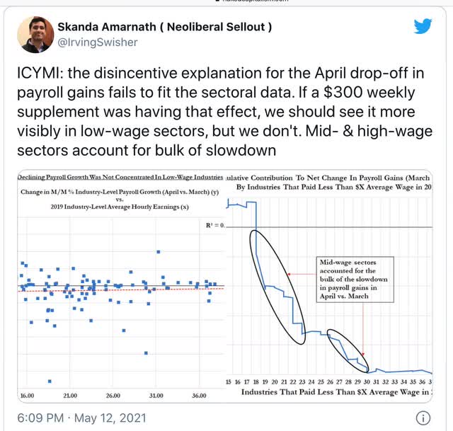
The conclusion in both is that mid-level wage jobs were the source of the big slowdown. That’s not due to $300 added jobless benefits!

So, my considered best guess is, discount the blockbuster March report more than the relatively tepid April report, average the gains in the two months out, don’t fret about enhanced unemployment benefits, and don’t assume that the time of big job gains is over.

Tuesday, May 18, 2021

April housing permits and starts: a pullback from peak, but no recessionary signal UPDATED


 - by New Deal democrat

The monthly statistics on housing permits and starts, reported this morning, were mixed, as permits increased slightly and starts declined:


The less volatile single family permits also declined slightly.

On the one hand, a high level of construction activity is continuing. But the three month moving average of both single family and total permits, as well as starts, all declined from their highs in the December-January period. To be recessionary, I would need to see at least a 10% decline in total permits; the actual decline from peak is about 6%, so well within the range of a little pullback during an expansion.

I’ll have more to say once the data is posted at FRED, probably later today.

UPDATE: Here is the comparison of single family permits (red, right scale) - the least volatile of the measures - with total permits (blue) and starts (green) - which are about twice as volatile as permits and typically lag by a month or so:


The December 2020 - January 2021 peak is evident.

And here is the YoY change in mortgage rates (red), inverted so that up = economic positive, and down = economic negative, compared with total permits (blue)/10 for scale:


As I have said many times before, mortgage rates lead permits and starts. The artifact of comparisons with the pandemic lockdown months will end in June, at which time I expect permits to be only about 5% ahead of summer 2020 (= .5% on the graph).

Monday, May 17, 2021

Coronavirus dashboard: entering the home stretch?


 - by New Deal democrat

G*d willing, I will only feel the need to update this information for another month or two. The US is simply making great progress on all fronts, and there are no new outbreaks in any of the States.


Close to 40% of the entire US population is totally vaccinated, and almost 50% has received at least one dose:


As a result, both cases and deaths are lower than their troughs last summer, and are at 10 to 11 month lows. Deaths are down about 85% from peak, and cases down 88%:


At their current trajectory, there will be fewer cases than at any time since March 2020 in about 2 weeks. Deaths, which are declining at a much slower trajectory, may be there in 4 to 6 weeks.

And there are no States with rising caseloads. The 4 I showed last week - Colorado, Maine, Oregon, and Washington State - all are now in decline. And Michigan, which had a severe outbreak about 3 months ago, has seen a decline of 80% since then:


With some luck, I will be able to put up my last Coronavirus post, celebrating independence from the virus, on the 4th of July!