Saturday, December 4, 2021

Weekly Indicators for November 29 - December 3 at Seeking Alpha


 - by New Deal democrat

My “Weekly Indicators” post is up at Seeking Alpha.

After a long time of very few if any weekly changes among the indicators, there were three changes this week, and several other indicators that are close to changing as well.

Or, as the title to this week’s post says, there are “changes afoot.”

As usual, not only will clicking over and reading bring you up to the virtual moment as to what those changes are and what they might mean, but it will also reward me a little bit for the efforts I put in to bring you that information in an organized format.

Friday, December 3, 2021

November jobs report: the only thing keeping the jobs market completely recovering to pre-pandemic levels, is the pandemic itself


 - by New Deal democrat

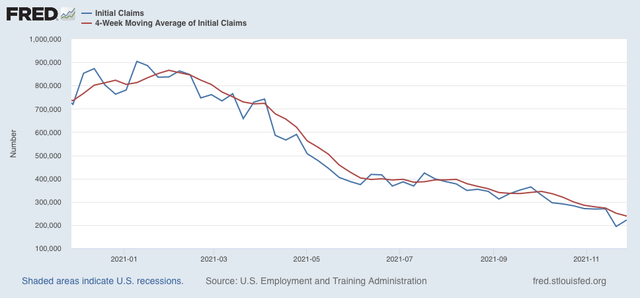
One month ago, we got very large upward revisions to previous data. This month the big questions I had were whether that would continue, and whether the bulge decrease in new jobless claims to a half century low would translate to another big top line number in the jobs report. Additionally, in view of the recent inflation numbers, I wanted to see if wage growth would hold up. 

The 6 month average of monthly gains as of now is 612,000: less than one month ago, but still very goodnot bad. But we still have 3.9 million jobs to go to equal the number of employees in February 2020 just before the pandemic hit. The largest share of this is in jobs that employees and/or their potential customers consider still to be unsafe.

Here’s my synopsis of the report:

HEADLINES:
  • 210,000 jobs added. Private sector jobs increased 235,000, but government shed -25,000 jobs. The alternate, and more volatile measure in the household report indicated a HUGE gain of 1,136,000 jobs, which factors into the unemployment and underemployment rates below.
  • The total number of employed is still -3,912,000, or -2.6% below its pre-pandemic peak.  At this rate jobs have grown in the past 6 months (which have averaged 612,000 per month), it will take another 6 or 7 months for employment to completely recover.
  • U3 unemployment rate declined -0.4% to 4.2%, compared with the January 2020 low of 3.5%.
  • U6 underemployment rate declined -0.5% to 7.8%, compared with the January 2020 low of 6.9%.
  • Those not in the labor force at all, but who want a job now, declined 119,000 to 5.859 million, compared with 5.010 million in February 2020.
  • Those on temporary layoff decreased -255,000 to 801,000.
  • Permanent job losers declined -205,000 to 1,921,000.
  • September was revised upward by 67,000, while October was revised upward by 15,000, for a net gain of 82,000 jobs compared with previous reports.
Leading employment indicators of a slowdown or recession

These are leading sectors for the economy overall, and will help us gauge how strong the rebound from the pandemic will be.  These were positive:
  • the average manufacturing workweek, one of the 10 components of the Index of Leading Indicators, rose 0.1 hour to 40.4 hours.
  • Manufacturing jobs increased 31,000. Since the beginning of the pandemic, manufacturing has still lost -253,000 jobs, or -2.0% of the total.
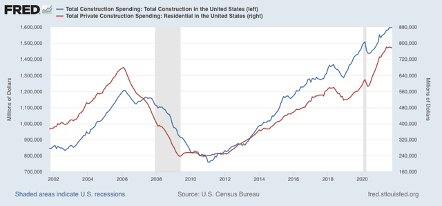
  • Construction jobs increased 31,000. Since the beginning of the pandemic, -115,000 construction jobs have been lost, or -1.5% of the total.
  • Residential construction jobs, which are even more leading, rose by 4,100. Since the beginning of the pandemic, 49,100 jobs have been *gained* in this sector, or +5.8%.
  • temporary jobs rose by 6,200. Since the beginning of the pandemic, there have still been 153,000 jobs lost, or -5.2% of all temporary jobs.
  • the number of people unemployed for 5 weeks or less decreased by -113,000 to 1,972,000, which is now *lower* than just before the pandemic hit.
  • Professional and business employment increased by 90,000, which is still -69,000, or about -0.3%, below its pre-pandemic peak.

Wages of non-managerial workers
  • Average Hourly Earnings for Production and Nonsupervisory Personnel: rose $0.12 to $26.40, which is a 5.9% YoY gain. This continues to be excellent news, considering that a huge number of low-wage workers have finally been recalled to work. 

Aggregate hours and wages:
  • the index of aggregate hours worked for non-managerial workers rose by 0.2%, which is a  loss of -2.3% since just before the pandemic.
  •  the index of aggregate payrolls for non-managerial workers rose by 0.6%, which is a gain of 7.3% (before inflation) since just before the pandemic.

Other significant data:
  • Leisure and hospitality jobs, which were the most hard-hit during the pandemic, gained 23,000 jobs, but are still -1,334,000, or -7.9% below their pre-pandemic peak.
  • Within the leisure and hospitality sector, food and drink establishments gained 11,000 jobs, and is still -756,600, or -6.1% below their pre-pandemic peak.
  • Full time jobs increased 954,000 in the household report.
  • Part time jobs increased 42,000 in the household report.
  • The number of job holders who were part time for economic reasons declined by -137,000 to 4,286,000, which is a *decrease* of -112,000 since before the pandemic began.

SUMMARY

Once again this month was a tale of two very different reports: a lackluster establishment report and a blockbuster household report! I will go out on a limb and state with great confidence that over the next two months the relatively poor establishment number is going to be revised considerably higher, just as the original lackluster reports of August and September were - and like almost every other report this year has been to some extent.

The biggest part of the disappointment in the establishment report was that food and drink, and more broadly leisure and hospitality, added almost no jobs, in contrast with the huge gains earlier this year. Temporary job gains were also lackluster. By contrast, gains in professional and business jobs and construction jobs were par for the last 12 months, while gains in manufacturing were a little light.

But the declines in the unemployment and underemployment rates were stellar, with the former only 0.7% above its pre-pandemic low and the latter only 1.0% above its pre-pandemic low as well. The even broader metric of those who are not in the labor force but want a job now is only about 1 million above its pre-pandemic low as well.

Wages continue to increase sharply. Aggregate payrolls are excellent compared with pre-pandemic levels.

As I wrote yesterday in connection with jobless claims, at this point the *only* thing keeping employment from exceeding its pre-pandemic highs is the pandemic itself. With nearly 30% of American adults absolutely refusing to get vaccinated, congested indoor activities - especially unmasked ones like dining - continue to be viewed as unsafe by most other Americans. The final pieces of the employment picture will not resolve until the pandemic is resolved, and that won’t happen with a population of nearly 100,000,000 COVIDiots.


Thursday, December 2, 2021

Continuing jobless claims fall below 2 million


 - by New Deal democrat


The star of the show this week was continuing claims, which finally declined below 2,000,000, as they recorded a new pandemic low of 1,956,000: 


Since 1974, only two weeks in the late 1980s, and the last 3 years of the last expansion were below this number:

Meanwhile, Initial claims as expected had a post-Thanksgiving seasonal-distortions-driven rebound of 28,000 to 222,000. The 4 week average declined -12,250 to 238,750, the lowest since 1973 except for late 2017 through February 2020:

There simply is no getting around that we are in a labor market Boom at this point. The only thing holding back a full recovery in employment to its pre-COVID level is the continued pandemic itself. 

Wednesday, December 1, 2021

Manufacturing still red hot; construction still very cool


 - by New Deal democrat

Our first November data is out this morning with the forward-looking ISM manufacturing report for October, as well as construction spending for October.


Let’s take the ISM report first, since it is an important short leading indicator for the production sector, and in particular its new orders subindex. In November the index rose slightly from 60.8 to 61.1, as did the more leading new orders subindex, which rose from 59.8 to 61.5 (note the breakeven point between expansion and contraction is 50):


Both the total index and the new orders subindex have been running extremely hot almost all year, and there is simply no sign of a significant softening yet. This forecasts a strong production side of the economy through mid year 2022.

Turning to construction, during October in nominal terms overall spending including all types of construction rose 0.2%, from an upwardly revised -0.1% for September, while spending on the leading residential sector declined  -0.5%,  and is off -0.8% from its June peak:


Adjusting for price changes in construction materials, which jumped by 1.2% in October, “real” construction spending declined -1.0%m/m, and “real” residential construction spending declined -1.7%. In absolute terms, “real” construction spending has declined sharply - by -18.4%) - since its peak in November 2020,  while “real” residential construction spending has declined -15.5% since its post-recession peak in January of this year:


While total construction spending declined by more than it had before the Great Recession, the decline in residential construction spending, while increasingly substantial, remains nowhere near the big decline it suffered before the end of 2007, in this series that only dates from 1993. Comparing it with single family permits:


Confirms the slowdown, but no recession level decline, shown by the latter.

Tuesday, November 30, 2021

Clear signs of *deceleration* in house price increases, but no sign of actual declines yet


 - by New Deal democrat

The veritable explosive increase in house prices has been one of the biggest economic stories of the past year. And because it feeds into “owner’s equivalent rent” with a lag, is likely to have a big effect on consumer inflation readings in next year as well.

This morning both the FHFA and Case Shiller house price indexes were reported for September, and both showed a slight deceleration in the increases in house prices.

As a preliminary matter, both the FHFA and CaseShiller indexes have risen almost an identical 250% since January 1991, when the FHFA index began:


During that time, usually the FHFA index has decelerated, and made a peak or trough a month or two before the Case Shiller index (note for example, 1994, 2006, 2009, 2010, and 2013). 

With that in mind, here are the YoY% change in house prices as measured by both indexes, plus that of new home prices (gold) zoomed in on the last 5 years (again, note that the FHFA index turned slightly ahead of the Case Shiller index in 2018 and 2020):


Last month I noted that price gains in the FHFA index had decelerated at least slightly, but that the Case Shiller Index hadn’t followed suit yet. This month the YoY% increase in prices as measured by the Case Shiller index did decelerate slightly (-0.3%) to 19.5%, while the deceleration in the FHFA Index continued, down -0.8% to 17.7%, and from the peak two months ago of 19.3% YoY.


In the last two months I have also noted that median existing house prices as reported by Realtor.com decelerated from a 23% YoY gain to 13%, likely indicating the peak in actual prices had either just happened or was imminent. Neither the FHFA nor Case Shiller indexes are confirming that, but there is now persuasive evidence of a *slowdown* in price increases which, if it continues at its current rate of deceleration, would result in an actual peak about 6 months from now.

P.S. It is important to add that while house prices in real terms have set multiple new records this year, average monthly mortgage payments deflated by average wages are nowhere near their 2006 peak, courtesy of 3% vs. 6.5% mortgage rates.

The Debut of the Deranged DOOOMers, 2021 edition: No, the strong advance of the Index of Leading Indicators is not forecasting a recession


 - by New Deal democrat

Five to ten years ago, I used to have a lot of fun taking the hide off DOOOMers. You know, the pundits who always find some new statistic or other that absolutely shows (for today only! Until the statistic goes the other way, in which case there’s radio silence) that the economy is DOOOMed!!!

Well, I am delighted to tell you (because I have a sadistic, warped sense of humor) that they’re ba-ack! 

Via Mike Sherlock, here is today’s DOOOMer, Lance Roberts, formerly (iirc) of Time’s “Real Clear Markets”: 

Large deviations of the #Leading #Economic index from the #Coincident index have been a good leading indicator of #recessions. Watch for the #LEI to begin to contract for a signal.”

And supplies the following graph from the Conference Board:


Now, the first thing to notice about those “large deviations” to the upside of the Leading Index is just how early they diverged in the last two expansions: by early 2004 in the 2001-07 expansion (i.e., nearly 4 years before the next recession began, and - as depicted in the graph - by the end of 2018 in the last expansion. And then you can see just the tail end of the 1990s expansion, where by 1998 - over two years before the next recession - there is already a big “deviation.”

So, you might want to know, how exactly did this alleged “good leading indicator” of the “large deviation” of the LEI work in longer expansions (like the 1990s)?  Roberts doesn’t show you, so I noodled around and found the information courtesy of Edward Yardeni.

Unlike Roberts, Yardeni shows the same information over and over and over, each time it is updated. In other words, he doesn’t show bias in when he does or does not highlight any particular data series.

So here is what a 60+ year graph of what Roberts highlighted looks like:


Now we can see that the “large deviation” happened by 1994 in the 1990s expansion, and by 1984 in the 1980s expansion - in both cases, well before the midpoint of each expansion, and roughly 6 to 7 years before the next recession.

Oh.

And then cast your eye at the 1960s, in which even though the raw value of the LEI is less than the CEI, the Leading Index is clearly accelerating higher than the Coincident Index as early as 1962, 8 years before the next recession!

Oh dear, it looks like that “large deviation” is such a leading signal that it misses over half of most expansions!

And that isn’t the end of it, because the index levels (i.e., at what point is each index normed to 100) is more or less arbitrary. It’s the “large deviation” in the growth of the LEI vs. the CEI that is the alleged indicator.

So now look at the 2010s expansion again. The “large deviation” didn’t actually start only in 2019, it actually started by 2010! The only reason the LEI line overtakes the CEI line in 2019 is because of the arbitrary placement of the “100” index value.

In short, Roberts touts a “leading indicator” of the next recession that is a lot closer to a lagging indicator of the last one!

What *is* a legitimate indicator is when the ratio of the LEI vs. the CEI (i.e., both may be increasing, but the former is increasing less than the latter). The now-retired Doug Short used to follow this, and Ed Yardeni includes this as his very next graph:


A significant downturn in the ratio of the LEI to the CEI has more often than not indeed presaged a recession. 

And it is not the situation at all at present. 

This is the kind of analysis that would cause the late Jeff Miller to credit me with the even late-r “silver bullet” award. Ah, just like the good old days!

Monday, November 29, 2021

Coronavirus dashboard for November 29: half of what you read about Omicron is wrong, but you won’t know which half for weeks


 - by New Deal democrat

As with any “Breaking News!” event, about half of what you read will be wrong. The problem is, nobody knows which item falls in which half. Recognizing that you need to step back a little bit and “wait a week” to see how the more breathless commentary plays out can save a lot of aggravation.


In that vein, here are a few items I read with interest over the weekend, that are slightly contrarian to the large majority of main stream media stories. Remember, almost certainly one is wrong! But there’s a pretty good chance one is right as well.

Plus - afterward - a few noteworthy graphs, one of which, on the demographics of vaccination, I have been wanting to see for months! 

To begin . . . Via Prof. Peter Hotez, here is  Dr. Jorge Caballero on why you should take stories about Omicron already being detected more or less all over the world with many grains of salt:

“Let’s discuss what S-gene target failure (SGTF) is/isn’t, and why it’s being used to screen for #Omicron cases . . .”

“you’ve probably seen scary looking graphs that look something like these but if you look at the fine print, you’ll note that they’re not actually measuring the variant— they’re measuring S-gene target failure (SGTF) and assuming that they’re due to #Omicron 

“Here’s the problem with that assumption: SGTF isn’t unique to #Omicron— the mutation that gives rise to SGTF has been found in 1 out of every 5 viral genomes sequenced (globally) since the start of the pandemic (1 in 7 U.S. genomes sequenced)”

He goes on to say that cases originally thought to be Omicron in Italy were actually Alpha that had this mutation.

In short, until you know that the tests conducted were specifically tailored to Omicron (which seems almost impossible at this moment), they may just be finding the above pre-existing Alpha variant.

Next, Dr. Scott Gottlieb who has been too sanguine at times, but also firmly rebutted claims that the vaccines were not (or were no longer) effective.


"There's a possibility when you look at the data--that they oversampled an initial early cluster," says @ScottGottliebMD on South Africa data of Omicron. "They’re presuming that is very new when in fact it might have been circulating for quite some time."

This is similar to what I’ve read in several other places, which is that it’s possible that the Omicron episode is a single superspreader event that is only responsible for a few hundred cases. Not sure about this, because in this  morning I also saw the below graph of virus found in the Johannesburg, S.A. wastewater:


I don’t think a single superspreader even would create a metropolitan-wide spike equivalent to the worst of Delta.

Next, last week I saw the below graph of the percentage of people in each of the EU countries who have been fully vaccinated vs. the death rate from COVID in each country:


It looks like there is an inflection point at roughly 75% fully vaccinated, at or above which the death rate becomes very low, on the order of 2 people per 100,000 per day on average.

Canada is also a little past the 75% fully vaccinated mark. It’s death rate is 1 per 2,000,000:


Most of New England is also very close to that 75% mark, and the rest of the Northeastern US Census region is not too far behind. Here’s what that region’s vaccination vs. death rates look like (1 death per roughly 400,000 per day):


Finally, here is a graph that I have been wanting to see for months. Because whenever I look at my county or State data, what I mainly see is that over 80% of people older than 65 are fully vaccinated (despite the fact that many more than 20% of them are GOPers), and the least vaccinated are the Young Invulnerables (who skew much more heavily to the progressive side). So which factor is more important: political leaning or age? At last there is a graph that answers the question:


Political leaning is a much stronger indicator than age. The most vaccinated age group of GOPers is equivalent to the least vaccinated age group of Democrats.

Again, remember that half of what you read about Omicron now or for the next several weeks is going to be wrong or mistaken. But you won’t know that until later on. Accept that, wait a week before making any firm sort of conclusions, and continue with your personal safety protocols.

Sunday, November 28, 2021

Weekly Indicators for November 22 - 26 at Seeking Alpha


 - by New Deal democrat

My Weekly Indicators post is up at Seeking Alpha.

Despite the roiling of the financial waters (on thin trading, with all of the A-list movers and shakers away from their desks) on Friday, the underlying indicators for the economy in all timeframes remain generally positive.

As usual, clicking over and reading will bring you up to the virtual moment about conditions in the economy, and reward me a little bit for putting in the time and effort to bring you that information.