Saturday, April 2, 2022

Weekly Indicators for March 28 - April 1 at Seeking Alpha


 - by New Deal democrat

My Weekly Indicators post is up at Seeking Alpha.

The big news of the week was the spreading yield curve inversion in the Treasury market.* Needless to say, that puts another bullet in the body of the long leading forecast - but it’s still not negative.

As usual, clicking over and reading will bring you up to the virtual moment on the economic data, and my forecast both the short and long term, and I’ll get rewarded with a penny or two.


*Not to get into too much detail here, but just how negative an indicator a yield curve inversion is depends on (1) how long along the yield curve does it extend? (2) how deep is it? And (3) how long does it last.

Well, it just happened, and it’s pretty shallow for now. But it has definitely spread out along the yield curve. The entire curve from the 3 to 10 year maturity is inverted. The 2 to 10 year spread inverted yesterday. The 2 through 7 year maturities are even inverted vs. the 30 year.

Friday, April 1, 2022

March jobs report: yet another strong showing for jobs and unemployment; while strong wage growth nevertheless likely lags inflation


 - by New Deal democrat

Here are the three main trends I was most interested in this month:

1. Is the pace of job growth beginning to decelerate? 
2. Is wage growth holding up? Is it accelerating?
3. Are the leading indicators in the report beginning to flag?

The answers were:
1. The 6 month average of monthly gains, which was running at 585,000 in the prior 6 months, increased by 2,000 in March to 587,000, although, pending revisions - which have almost all been upward in the past year - this month’s number was the lowest in the last 6 months.
2. Wage growth, which averaged 5.9% in the 2nd half of 2021, for the 2nd month in a row has been up 6.7% YoY. Aside from April 2020, this is the highest wage growth in *40 years.* 
3. A majority of the leading indicators within the report were positive. There is no sign yet of any major impending slowdown in the economy, particularly in the goods producing sector.

We still have 1.579 million jobs to go, or 1.0%, to equal the number of employees in February 2020 just before the pandemic hit. At the current average rate for the past 6 months, that’s 3 more months.

Here’s my in depth synopsis of the report:

HEADLINES:
  • 431,000 jobs added. Private sector jobs increased 426,000. Government jobs increased by 5,000 jobs. The alternate, and more volatile measure in the household report indicated a gain of 736,000 jobs, which factors into the unemployment and underemployment rates below.
  • U3 unemployment rate declined -0.2% to 3.6%, just 0.1% above the January 2020 low of 3.5%.
  • U6 underemployment rate declined -0.3% to 6.9%, equaling the January 2020 low of 6.9%.
  • Those not in the labor force at all, but who want a job now, rose 382,000 to 5.737 million, compared with 4.996 million in February 2020.
  • Those on temporary layoff declined -101,000 to 787,000.
  • Permanent job losers declined -191,000 to 1,392,000.
  • January was revised upward by 23,000. February was also revised upward by 72,000, for a net gain of 95,000 jobs compared with previous reports.
Leading employment indicators of a slowdown or recession

These are leading sectors for the economy overall, and will help us gauge whether the strong rebound from the pandemic will continue.  These were mainly positive:
  • the average manufacturing workweek, one of the 10 components of the Index of Leading Indicators, rose +0.1 hours to 41.7 hours.
  • Manufacturing jobs increased 38,000. Since the beginning of the pandemic, manufacturing has still lost -128,000 jobs, or -1.0% of the total.
  • Construction jobs increased 19,000. All of the jobs lost during the pandemic, plus another 4,000, have now been made up. 
  • Residential construction jobs, which are even more leading, fell by 2,600. Since the beginning of the pandemic over 50,000 jobs have been gained in this sector.
  • temporary jobs rose by 4,900. Since the beginning of the pandemic, almost 250,000 jobs have been gained.
  • the number of people unemployed for 5 weeks or less increased by 158,000 to 2,289,000, which is 164,000 higher than just before the pandemic hit.
  • Professional and business employment increased by 102,000, which is about 700,000 above its pre-pandemic peak.

Wages of non-managerial workers
  • Average Hourly Earnings for Production and Nonsupervisory Personnel: rose $0.11 to $27.06, which is a 6.7% YoY gain. 

Aggregate hours and wages:
  • the index of aggregate hours worked for non-managerial workers rose by 0.1%, which is a  loss of -0.7% since just before the pandemic.
  •  the index of aggregate payrolls for non-managerial workers rose by 0.5%, which is a gain of 11.7% (before inflation) since just before the pandemic.

Other significant data:
  • Leisure and hospitality jobs, which were the most hard-hit during the pandemic, rose 112,000, but are still -1,474,000, or -8.7% below their pre-pandemic peak.
  • Within the leisure and hospitality sector, food and drink establishments added 61,300 jobs, and is still -819,900, or -6.6% below their pre-pandemic peak.
  • Full time jobs increased 912,000 in the household report.
  • Part time jobs increased 101,000 in the household report.
  • The number of job holders who were part time for economic reasons increased by 35,000 to 4,170,000, which is still below their level before the pandemic began.

SUMMARY

This was another very good jobs report. There is no sign of any significant slowdown in hiring at this point. Leading sectors like manufacturing, construction, and temporary help continued to improve. Also, wage gains among non-supervisory workers continued to rise sharply. Aside from 3 months in 2019 and 2020, the unemployment rate was the lowest (or equal to it) in over 50 years. Similarly, the underemployment rate was the lowest for its entire 28 year history except for two months.

There were a few blemishes, most notably the decrease in residential construction jobs (more evidence of a housing slowdown) and the likely real, inflation-adjusted decline in aggregate payrolls, which means that probably real aggregate payrolls for the American working class have only risen by 1% or less in the last year in total.

Two months ago I wrote that “Because real sales and income have not improved in over half a year, I expect the pace of job gains to slow considerably in the coming months.” For the second month in a row, I have been wrong - and happily so! But I continue to think job gains will slow (but not reverse) shortly.


Thursday, March 31, 2022

Consumer spending continues OK, while income continues its seemingly relentless decline


 - by New Deal democrat


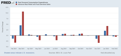
Nominally personal income rose 0.5%, and spending rose 0.2% in February. That’s the good news. 

The bad news is the personal consumption deflator, i.e., the relevant measure of inflation, rose 0.6%, so real income declined -01%, and real personal spending declined -0.4%.

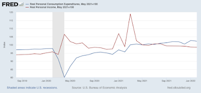
While both real income and spending are well above their pre-pandemic levels, I have stopped comparing them with that, but instead with their level after last winter’s round of stimulus. Accordingly, the below graph is normed to 100 as of May 2021: 


Since then spending is up 2.3%, while income has declined -1.4%.

Comparing real personal consumption expenditures with real retail sales for February (essentially, both sides of the consumption coin) reveals small declines in each:


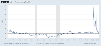
Meanwhile, the personal saving rate increased 0.2% to 6.3% in February. The below graph of the last 30 years subtracts 6.3% from all months, so that the current reading is shown as 0 (before then all values were higher than 6.3%): 


Note that the savings rate has tended to decrease as expansions grow longer, leaving consumers more vulnerable to shocks (e.g., vehicle and gas prices). The current value is the lowest since 2013 (when a different stimulus program ended). In other words, so far consumes are making up shortfalls by digging into savings or tapping a source of credit.

One of my recession models - the “consumer nowcast” - is based on such a shock that is unable to be made up from increased real income, or an increased source of wealth to be cashed in. Income has clearly faltered, and stocks have not made a new high in almost three months. That leaves housing equity. Whenever the housing price spiral ends, unless something reverses, consumers are in trouble.


Jobless claims continue near or at record lows


- by New Deal democrat


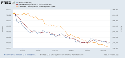
Initial claims (blue) rose to 14,000 to 202,000, just above last week’s 50 year low. The 4 week average (red) declined 3, 500 to 208,500 (vs. the pandemic low of 199,750 on December 25). Continuing claims (gold, right scale) declined 35,000 to  1,307,000, the lowest number since December 1969:


With Omicron in the rear view mirror, and BA.2 more of a ripple so far, we are having a COVID respite, and basically nobody is getting laid off. 


As once again demonstrated in the February JOLTS report released earlier this week, the number of jobs available relative to the number of applicants remains tight, meaning there will be continuing upward pressure on wages.


Wednesday, March 30, 2022

The Camel’s Nose is in the Tent


 - by New Deal democrat

I have a new post up at Seeking Alpha.

The US Treasury yield curve is fully inverted between the 3 and 10 year maturities.

And you probably have an idea what that means, dearest readers.

As usual, clicking over and reading should be educational for you (if nothing else, by teaching you what the title saying means!) and help inform you of what is likely ahead at some point in 2023. 

And reward me with a penny or two for my troubles.

Tuesday, March 29, 2022

February JOLTS report: the game of musical chairs in the jobs market goes on


 - by New Deal democrat


This morning’s Census Bureau JOLTS report for February shows that the game of musical job chairs continues.  

As a refresher, several months ago I introduced the idea of a game similar to musical chairs, where employers added or took away chairs, and employees tried to best allocate themselves among the chairs. Because of the pandemic, there are several million fewer players trying to sit in those chairs, leaving many empty. As a result, wages have continued to increase sharply, as employers attempt to attract potential employees to sit in the empty chairs.

This pattern has continued, indicating if anything a general plateauing of all the numbers.

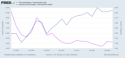
Layoffs and discharges (violet, right scale in the graph below) declined 17,000 to 1.386 million, slightly above their record low of 1.262 in December. Total separations (blue) rose 48,000 to 6.092 million (graph starts in June 2020 for reasons of scale):


Layoffs continue to be extremely rare.

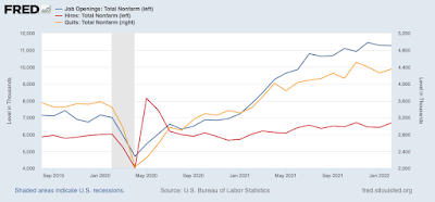
Meanwhile, job openings (blue in the graph below) declined 17,000 to 11.266 million, a small decline from their record peak of 11.448 million in December. Openings had been gradually increasing to repeated record highs in the previous 6 months, but now appear to have leveled off. Voluntary quits (the “great resignation,” gold, right scale) rose 94,000 to 4.352 million, 158,000 below November’s record high, and again, possibly leveling off. Actual hires (red) rose 263,000, to 6.689 million, only 16,000 below November’s record high of 6.705 million:


In summary, we continue to have near-record high job openings, hires, and quits, together with near-record low layoffs - but we now see evidence that the numbers are no longer increasing or decreasing. Little progress is being made towards establishing a new equilibrium, but on the other hand, the situation is not getting more *out* of equilibrium.

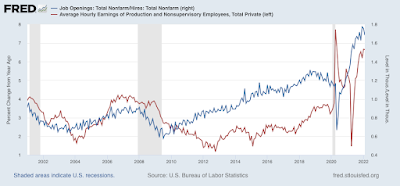
Finally - again as I have been pointing out for the last few months - because of the continuing yawning gap in job-takers vs. job openings, wages have continued to soar. Below is a graph of job openings divided by actual hires (blue, right scale). This gives the rate at which openings are above or below hires, where 1.0 represents the level at which the number of openings and hires are equal. As you can see, this rate increases as expansions go on, and in the last 18 months has repeatedly made new all-time high, the last of which was in December.

YoY wage gains for non-managerial workers (red, left scale) are a “long lagging” indicator, typically turning up well after an expansion is underway, and typically when the U-6 underemployment rate falls below about 9.0% (currently at 7.2%, the lowest except for the year 2000 at the end of the tech boom, the last 8 months before the pandemic, and in February):


In short, wage growth has responded to the favorable game of employment musical chairs by spiking to 6.7% YoY. I expect wages to continue to rise at this strong rate until potential employers can no longer make any profit from hiring potential employees.

I expect strong wage gains to continue until we see a *significant* decline in the ratio of openings to hires; and at the same time, or shortly thereafter, a significant decline in voluntary quits. As indicated above, while the situation is no longer getting more extreme, it isn’t getting any less extreme yet either. So the game of musical chairs in the jobs market continues.
Monday, March 28, 2022

Coronavirus dashboard for March 28: I’ll take the “under” for the severity of any BA.2 wave


 - by New Deal democrat


Very few US States reported over the weekend. The decline in new cases has stalled at roughly 30,000 per day. Deaths are still declining, and currently just below 800 per day.

Since the BA.2 variant continues to generate new headlines, with just about everybody warning of a new wave in the US, let’s take a look at what actually happened in Europe (and remember: there was no new BA.2 wave in South Africa, the Philippines, India, and a number of EU countries where BA.2 took over from BA.1 early).

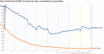
BA.2 started a new wave in Europe beginning in the last week of February through the first week of March:


A week or two ago, the poster children for Europe’s big outbreak included countries like the UK, Germany, Belgium, Austria, the Netherlands, and Greece. Here’s what they (plus the other major countries of Italy and Spain, plus Portugal), look like now:

Declines everywhere. Italy just peaked earlier during last week, and the UK probably did as well (there was a data dump last Monday which will go out of the average tomorrow).

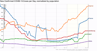
Here is where BA.2 is still increasing in Europe:


In short, four weeks after Europe’s BA.2 wave started, cases are already declining everywhere except France, Ireland, Luxembourg, Cyprus, and Malta. The last 4 countries have a combined population of 6.5 million. There may be a few small countries I’ve missed, but they wouldn’t materially affect the result.

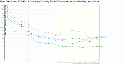
Last Tuesday, the CDC reported that the BA.2 variant was a majority of new cases in the Northeastern Census region, 40% along the West coast and the upper Midwest, and 30% or below everywhere else. Here’s what cases in the US Census regions look like as of now:

Remember that the appropriate comparison with the CDC report is cases one week ago. Since then, the percentage of BA.2 infections has probably risen by about 15% (but we won’t know until at least tomorrow). One week ago cases were flat to declining everywhere except for the Northeast, where they were up 10%. Cases are still declining in the West, flat in the Midwest, and rising in the South and Northeast now.

For the EU as a whole, cases rose 50% from their bottom since then, and appear to have peaked in the last week. In the US, that would translate to 45,000 cases per day in about 2.5-3 weeks. The worst case countries saw their cases roughly double, which in the US would be 60,000. I’m more inclined to go with the former estimate than the latter.

And since, as of now, there is no new variant on the horizon, I expect a fast decline from peak just as we are seeing in the European countries now.