Saturday, August 10, 2013

Weekly indicators: consumer spending breaks on through to the other side edition


 - by New Deal democrat

This may have been the slowest week for monthly data ever. The only item of note was the ISM services report, which improved to 56.0.

So let's get right to this week's look at the high frequency weekly indicators. This is probably a good week to remind readers that the purpose of looking at these numbers is that they are as close to an up-to-the minute look at the economy as we can get. They can be noisy, but if there is an important turn in the economy, it will show up here before it shows up in the monthly numbers. For example, two years ago the Gallup Daily Consumer Spending report showed that consumers were continuing to spend during the debt ceiling debacle, despite the monthly numbers hitting an air pocket. The conclusion and the title are the last things I write, after I've recorded the numbers. And the post is designed so that the conclusion is after the numbers, so you can form your own opinion freely.

Anyway, let's start this week with conusmer spending, because Gallup consumer spending turns out to be the star of the show again.

Consumer spending Gallup's 14 day average of consumer spending went over $100 this week for the first time since the financial crisis of September 2008, almost 5 years ago. At least as consumers are reporting it, back to school shopping is on a tear. The ICSC varied between +1.5% and +4.5% YoY in 2012, while Johnson Redbook was generally below +3%. The ICSC had a good week this week as well, and Johnson Redbook remains close to the high end of its range.

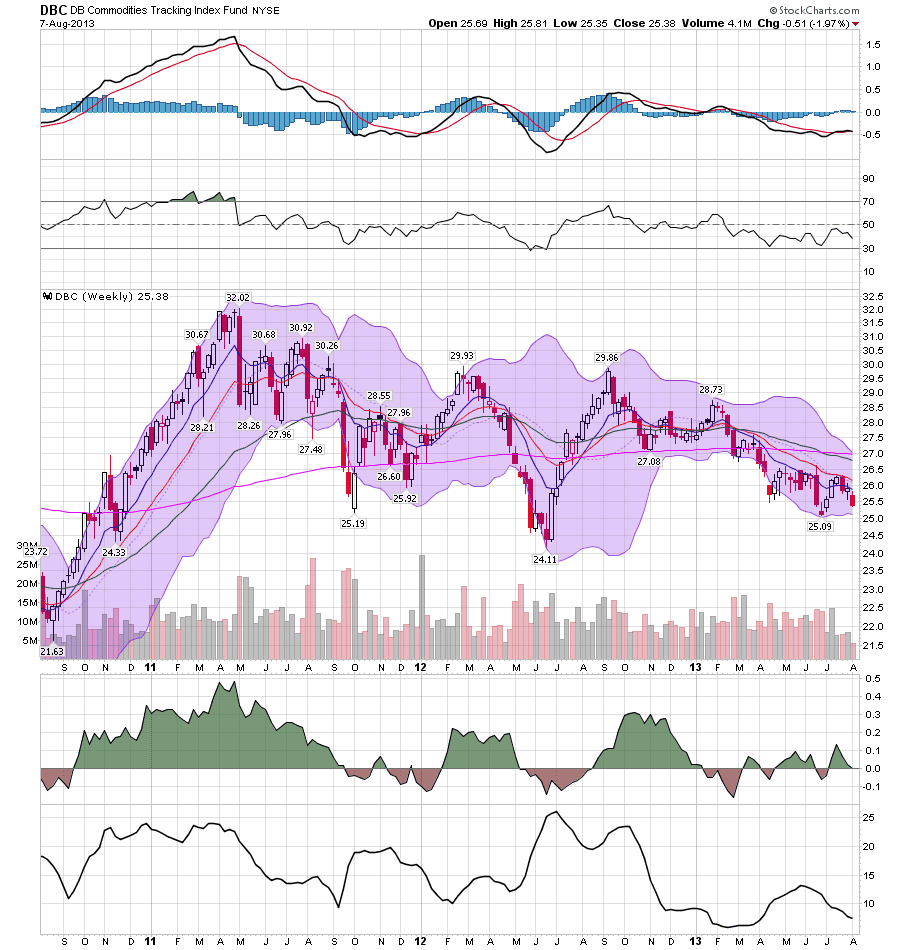
Oil prices and usage
  • Oil down -$0.97 to $105.97 w/w

  • Gas $3.63 down -0.01 w/w

  • Usage 4 week average YoY up +3.2%
The price of Oil remained near its 52 week high. The 4 week average for gas usage was, for the fifth week in a row after a long streak to the contrary, up YoY.

Interest rates and credit spreads
  •  5.32% BAA corporate bonds up +0.07%

  • 2.64% 10 year treasury bonds also up +0.07%

  • 2.68% credit spread between corporates and treasuries unchanged
Interest rates for corporate bonds had been falling since being just above 6% in January 2011, hitting a low of 4.46% in November 2012. Treasuries previously were at a 2.4% high in late 2011, falling to a low of 1.47% in July 2012, but remain back above that high. Spreads remained at their new 52 week low this week. Their recent high was over 3.4% in June 2011.

Housing metrics

Mortgage applications from the Mortgage Bankers Association:
  • +1% w/w purchase applications

  • +8% YoY purchase applications

  • unchanged% w/w refinance applications
Refinancing applications have decreased sharply in the last 11 weeks due to higher interest rates to a two year low. Purchase applications have also declined from their multiyear highs in April. Both purchases and refinance applications stabilized this week.

Housing prices
  • YoY this week +8.8%
Housing prices bottomed at the end of November 2011 on Housing Tracker, and averaged an increase of +2.0% to +2.5% YoY during 2012. This weeks's YoY increase is still close to a 7 year record.

Real estate loans, from the FRB H8 report:
  • unchanged w/w

  • +0.3% YoY

  • +1.9% from its bottom
Loans turned up at the end of 2011 and averaged about 1% gains YoY through most of 2012.  Over the last few months, the comparisons have completely stalled.

Money supply

M1
  • +0.1% w/w

  • +1.9% m/m

  • +8.1% YoY Real M1

M2
  • +0.4% w/w

  • +1.2% m/m

  • +5.2% YoY Real M2
Real M1 made a YoY high of about 20% in January 2012 and eased off thereafter. Earlier this year it increased again but has backed off its highs significantly.  Real M2 also made a YoY high of about 10.5% in January 2012.  Its subsequent low was 4.5% in August 2012. It increased slightly in the first few months of this year and has generally stabilized since, although it has declined slightly in the past few weeks.

Employment metrics

The American Staffing Association Index rose 1 to 96. It is up +3.2% YoY

Initial jobless claims
  •   333,000 up 7,000

  •   4 week average 335,500 down -5750
Tax Withholding
  • $50.5 B for the first 6 days of August vs. $50.0 B last year, up +0.5 B or +1.0%

  • $146.1 B for the last 20 reporting days vs. $133.4 B last year, up +12.7 B or +9.5%

Daily tax withholding has improved to the middle part of its YoY range compared with its YoY average comparison in the last 7 months. Initial claims remain within their recent range of between 325,000 to 375,000, and have flattened out just as they have in the last 3 springs and summers. The 4 week moving average, however, made a new post-recession low this week.

Transport

Railroad transport from the AAR
  • -1200 carloads down -0.4% YoY

  • +4600 carloads or +2.8% ex-coal

  • +11,700 or +4.8% intermodal units

  • +11,300 or +2.0% YoY total loads
Shipping transport Rail transport has been both positive and negative YoY in the last several months. This week it was positive once again. The Harpex index had been improving slowly from its January 1 low of 352, but has flattened out in the last 8 weeks. The Baltic Dry Index has retreated from its recent 52 week high. In the larger picture, both the Baltic Dry Index and the Harpex declined sharply since the onset of the recession, and have been in a range near their bottom for about 2 years, but have stopped falling.

Bank lending rates The TED spread is still near the low end of its 3 year range, and has fallen back from its slight rise in the last month.  LIBOR established yeat another new 3 year low.

JoC ECRI Commodity prices
  • down -0.03 to 123.76 w/w

  • +3.91 YoY
The one and only negative this week was the increase in interest rates. For the week, mortgage applications and gas prices joined shipping rates as neutral.

Everything else was positive. Rail had a positive week, oil and gas prices were slightly lower, gas usage was higher, interest rate spreads remained at a 1 year plus low, house prices were very positive, bank rates were very positive, money supply remained positive, the 4 week average of initial jobless claims made a new post-recession low, temporary jobs have turned positive again, and most of all, consumer spending was strong, especially as measured by Gallup.

The American consumer is truly a wonder to behold. Have a nice weekend.

Friday, August 9, 2013

Weekend Weimar, Beagle and Pit Bull


I'll be back on Monday; NDD will be here tomorrow.

Until then, relax.  

US GDP Growth Since 2009; Investment


The above chart shows the quarter to quarter percentage change in GDP and the contribution from investment.  Here we see a somewhat spottier contribution rate.  There are five quarters where investment contracted-- obviously slowing growth -- and several quarters where investment's contribution was a fairly small. 


The above chart shows the percentage contribution of non-residential (business) investment.  Commercial real estate (dark blue) was negative until 2Q10.  However, once it turned positive it still didn't add much to overall growth.  Equipment (gold) added a great deal to growth for 6 of the 7 quarters mid-way through the expansion.  However, this type of investment dropped off in the last 6-7 quarters.  IP added a touch, but very little overall.

Residential investment can be broken down into two periods.  For the first half of the recovery we see a strong contraction for obvious reasons.  However, for the last seven quarters we see a decent amount of growth in this area.

Overall investment,  as shown in the top chart, has been fair this recovery.  All of the various components have done their part.  However, the overall level is still a bit low at the macro level. 

An Overview Of the World Economic Situation

From the Reserve Bank of India:

Since early May when the Reserve Bank issued its Monetary Policy Statement for 2013-14, global growth has been uneven and slower than initially expected. The tail risks to global recovery had eased in the early part of the year, but that improvement was overtaken by the turmoil in financial markets because of the ‘announcement effect’ of the likely tapering of quantitative easing (QE) by the US Fed. In advanced economies (AEs), activity has weakened. Emerging and developing economies (EDEs) are slowing, and are also experiencing sell-offs in their financial markets, largely due to the safe haven flight of capital. Market expectations of QE taper and the consequent increase in real interest rates in the US have translated into a rapid appreciation of the US dollar and consequent depreciation of EDE currencies. Commodity prices have generally softened, but the price of crude remains elevated. Although the inflation outlook in AEs is still benign, upside risks remain in several EDEs.

Sober Look at the Markets has this chart to spotlight the issue:


We can break the world down into to distinct groups:

1.) the south south trade -- countries that benefited from a rapidly growth Chinese economy by selling raw materials to them  T
2.) The non-S/S trade: countries that were largely purchasers of Chinese goods, namely the US and the EU.

Put differently, for the last 10-20 years, China has acted as the economic go between, effectively linking the developing world with the developed world.

Let's turn to some charts to highlight the above:


The BRIC ETF has moved through support at the 32.5 level in June falling to ~29.  Over July it rallied to the 32.5 level bit hit resistance.  Also note the potential double top at this price level.  While the MACD has been rising, it's just advanced into positive territory and is about to give a sell signal.  And while the CMF is positive, it is just barely so.


Taking a broader look at the developing world, we see the emerging market ETF is trading at two sets of fib levels -- those established in the sell-off from 2011 and those from the rally from mid-2012 to early 2013.  Price also broke support established by the rally latest rally (red line) earlier this year and have been moving lower since.


Overall, commodities are still very moderately priced, largely because of overall depressed world demand.  The EU is coming out of a recession and the US has low demand.  This has led to a decline in Chinese output, lowering commodity demand.  And while the DBC is a bit too heavily weighted to oil, that overweight is actually keeping the ETF at higher levels as agricultural commodities are trading at low levels.


Ag prices have been dropping since early 2011, with a quick rise in the summer of 2012 that quickly petered out.

In contrast, we have Europe:


The Europe 350 ETF has been rallying since the beginning of the year, and recently broke through resistance a little over 42.   The market is bullishly oriented with price above the shorter EMAs, and a rising MACD/CMF position.


The weekly SPY chart shows a market that has been rallying since mid-2011.  We see tree periods of consolidation -- the spring of 2012, the fall of 2012 and the spring of 2013.  Pay particular attention to the MACD as it may by signaling the really is getting a bit long in the tooth and in need of further consolidation or at least a rest.

Going forward, we have the following questions.

1.) Is the EU really getting ready to grow again?
2.) Will we see continued growth in the US?
3.) What of China -- what will happen there?
4.) The status of the EDEs
5.) The other BRICs.

I'll touch base on all of those next week.


Thursday, August 8, 2013

Will the Second Half Print Strong Growth?

There's a lot of very conflicting information on the US economy right now.  On the negative side we have the sequester and the potential for yet another government shutdown or threat thereof.  Wage growth is weak, higher interest rates are hurting the housing recovery and the employment situation is marginal at best.

But two reports last week hint at a far stronger economic environment in the second half.  Let's start with the ISM manufacturing report.

The PMI™ registered 55.4 percent, an increase of 4.5 percentage points from June's reading of 50.9 percent. June's PMI™ reading, the highest of the year, indicates expansion in the manufacturing sector for the second consecutive month. The New Orders Index increased in July by 6.4 percentage points to 58.3 percent, and the Production Index increased by 11.6 percentage points to 65 percent. The Employment Index registered 54.4 percent, an increase of 5.7 percentage points compared to June's reading of 48.7 percent. The Prices Index registered 49 percent, decreasing 3.5 percentage points from June, indicating that overall raw materials prices decreased from last month. Comments from the panel generally indicate stable demand and slowly improving business conditions."

What is particularly encouraging here are the internals; new orders jumped 6.4 points and the overall production index increased 11.6 points.  Usually these numbers increase in far smaller increments. Also of importance is the fact that 13 of 18 industries are reporting an higher activity.  Let's take a look at the anecdotal comments from the report:
  • "Business conditions remain stable, possibly improving somewhat in future months." (Miscellaneous Manufacturing)
  • "Housing market continues to improve, leading to increased demand in product." (Electrical Equipment, Appliances & Components)
  • "Overall conditions remain steady and slightly above prior year." (Paper Products)
  • "Sales are holding steady. Business is good." (Furniture & Related Products)
  • "Business is slow compared to previous years." (Computer & Electronic Products)
  • "First half [of 2013] is better than last year — steady, slow improvement." (Printing & Related Support Activities)
  • "Leading indicators continue to show stagnant-to-gradual improvement, and sales across the board continue to be flat." (Machinery)
  • "Economy continues to be relatively flat. Growth in China is holding. Europe staying at a low level, and U.S. just flat." (Transportation Equipment)
  • "We see gluten-free industry to be strong and it continues to grow. We also see the need for capacity in blending operations." (Food, Beverage & Tobacco Products)
  • "Business remains flat. Looking for some seasonal bump as we come to the beginning of our 'busy' time." (Chemical Products)
The vast majority of the comments are positive; only computer and electronic parts, transportation equipment and chemical products are slow.

Here's a graph of the overall data:


 The chart above shows the overall trend for manufacturing was decreasing for about a year, with several recent readings below the 50 line the delineates between expansion and contraction.  However, the latest reading is incredibly strong relative to the recent trend. 

Let's turn to the services index:

"The NMI™ registered 56 percent in July, 3.8 percentage points higher than the 52.2 percent registered in June. This indicates continued growth at a faster rate in the non-manufacturing sector. The Non-Manufacturing Business Activity Index increased substantially to 60.4 percent, which is 8.7 percentage points higher than the 51.7 percent reported in June, reflecting growth for the 48th consecutive month. The New Orders Index increased significantly by 6.9 percentage points to 57.7 percent, and the Employment Index decreased 1.5 percentage points to 53.2 percent, indicating growth in employment for the 12th consecutive month. The Prices Index increased 7.6 percentage points to 60.1 percent, indicating prices increased at a significantly faster rate in July when compared to June. According to the NMI™, 16 non-manufacturing industries reported growth in July. Respondents' comments are mostly positive about business conditions and the overall economy."

As with the manufacturing index, we see large increases in the internals with large jumps in overall activity and new orders.  Employment did drop, but it was still in positive territory.  And the breadth of the increase is impressive with 16 industries reporting growth.

Let's turn to the anecdotal part of the report:
  • "The economy seems to be getting stronger with commodity prices increasing." (Information)
  • "Sequestration and healthcare reform causing uncertainty and lower revenues." (Health Care & Social Assistance)
  • "Business orders continue to grow, but at a slow pace. We are seeing growth in areas where we have been flat for many months. Economy seems to be stabilizing in some areas and heating up in others." (Professional, Scientific & Technical Services)
  • "The auto industry continues to be strong, and we expect it to continue throughout 2013." (Retail Trade)
  • "Competitive environment remains challenging." (Accommodation & Food Services)
  • "Local business continues at same pace as last year. Capital investment continues to be positive." (Wholesale Trade)
As with the manufacturing report, the overall tenor of most comments is positive. We see a negative contribution from political and regulatory developments along with concerns related specifically to the hotel and restaurant industry.

Here's a graph of the data:


The service industry has been far steadier over the last few years, consistently printing numbers above 50 with little indication of a move into contraction.  However, the latest print is very strong.

Let's combine the above information with this statement from Dr. Ed:

My “Second Recovery” scenario is playing out nicely this year as rising auto and new home sales boost manufacturing and the overall economy. Railcar loadings of motor vehicles rose to another cyclical high in mid-July. This series is highly correlated with auto sales. The same goes for railcar loadings of lumber and wood products, which is highly correlated with housing starts. 

Auto sales numbers have flown below the headlines for the last few years, but the overall pace has been continually increasing:


Now auto sales are just below the average level they maintained during the last expansion.

The housing story may be starting to fade as higher interest rates may be slowing sales of both new and existing homes.

In reality, I remain very sanguine about the economy.  Every time it looks like we're about to kick into a higher gear, we see an extraneous event perpetrated by the the Republicans in Congress that hinders growth.  It started with the near default of US debt two years ago followed by the S&P downgrade, was followed by last year's sequester and will probably continue this year with yet more high level conservative budget stupidity.   And while the recent ISM numbers are very encouraging, they are in fact only one month worth of data and need to be understood as just that.  It's just as possible that next month we'll be disappointed with a far weaker than anticipated read. 

However, the numbers printed above highlight that -- yet again -- the economy appears to really want to grow faster.  Both primary sectors of the economy are printing strong numbers and auto sales are solid, indicating there is a certain level of consumer confidence in the market.  And while housing may be weakening due to higher interest rates, it's highly doubtful it will crater anytime some.  It's also possible that as the market adjusts to the new "higher" levels, they'll realize they aren't in fact that high and will still attract buyers in the market.  And finally, with the UK mending and the EU probably coming out of recession, it's likely that we'll see a rise in export orders which will obviously help the US economy, albeit it around the fringes. 

But, frankly, I'm expecting another round of Washington stupidity after the August recess that will put the kabash on the whole thing. 


Market/Econoimc Analysis: India; Still in Questionable Shape For New Central Bank Head


The above five charts show the central problems facing the India economy.  The biggest is a declining GDP growth rate (top chart).  The annual rate of growth has slowed from 9.4% in 2010 to 4.8% in the latest reading.  In this situation, one would expect the Reserve Bank of India to lower interest rates, which they have done as shown in the second chart.  However the downward movement of rates is clearly limited by inflation (third chart).  While that has dropped from readings between 7% and 8% for most of the last year to recent reading of just shy of 5%, the level is still high.  Just as importantly, the rupee has dropped sharply over the part three months (fourth chart), which has led the Indian Central Bank to take extraordinary actions and also limits the ability to lower rates to stimulate the economy.  And finally, there is the increasing current account deficit (fifth chart), which has been increasing as a percent of GDP -- a statistic that further contains central bank action.

It is this world that the new head of India's Central Bank walks into.  Perhaps the bast thing about him is we wrote the paper which questioned the overall impact of financial liberalization and deregulation that led Larry Summers to label him a luddite.  I don't envy his job given the above.

Let's take a look at the ETFs:


The Indian ETF had support at ~52, 54 and 56 over the last years -- levels which prices fell through over the last two months.  After the initial break, prices ralled to the 200 day EMA, only to it resistance and fall back to the 50 level.  Notice the higher volume of the most recent sell-off, along with the EMA drop and weak CMF reading.  This is a very weak market, with a price target of at least 45.


The weekly chart of the rupee shows that prices are now at long-term, multi-year support.  Last week, prices moved through support, only to bounce back.  

This is still an economy that is trying to find its feet.  I'd be more a seller than a buyer here.


Wednesday, August 7, 2013

Headline of the day


- by New Deal democrat

From Will Bunch of the blog Atty-tood at philly.com:

Anyone know the dial-in code for the next al-Qaeda conference call?

Too funny.

US GDP Growth Since June 2009; PCEs


According to the NBER, the recession ended in June 2009.  The above graph shows the quarterly percentage change in growth since 2009 and also shows how personal consumption expenditures have added to that growth.  What we see is a fairly consistent pattern of PCEs adding to GDP growth since 3Q09.

Let's look at the components of PCEs:


Above is a chart that shows the percentage change in the three main PCE components: durable goods (blue), non-durable goods (gold) and services (light green).  Service consumption (which accounts for about 65% of PCEs overall) has been strong since 1Q2010 while durables (which account for about 10% of PCEs) have been strong for five of the last six quarters.  Non-durables have been pretty weak throughout.  


The Rising Yuan And Slowing Chinese Growth


Above is a weekly chart of the yuan ETF over a three year period.  In the 2H09 and most of 2010 we see a relative level of stability, save for the quick rally in 3Q10.  However, starting in 2011, continuing into 2012 and on through this year we see a continual and gradual increase in the yuan's overall value.  While the overall rise is only about 6%, the overall trend is very clear: it's moving up.  And with it, we see a decrease in Chinese growth as shown in this chart:


In 2Q10 the annual rate of GDP growth printed at 11.9% .  But since then the overall rate of growth has been decreasing, finally falling to a 7.4%-7.9% clip over the last few quarters. 

In reality, there are a lot of reasons for China's slowdown.  But massive exports were central to China's overall growth, exports which are now more expensive thanks to the yuan's appreciation. 

Market/Economic Analysis: Australia Stabilizing At Slower Growth Levels

Let's start with with this chart of overall Australian GDP:


The annual growth rate peaked at 4.3% five quarters ago and has been falling ever since.  Remember that ultimately Australia is going through a re-balancing; as China reorients its economy to one driven more by consumer demand rather than export growth, countries that sent raw materials to China's manufacturers will also see slower growth.  Australia has been a prime economic beneficiary of China's boom and is therefore having to readjust.


First note that interest rates in Australia are still quite high relative to other countries.  The RBA of Australia lowered interest rates last Spring to 2.75% in an attempt to increase growth, but they still have a great deal of room overall (they lowered rates to 2.5% which is not reflected on this chart).

From the latest central bank minutes:

The national accounts for the March quarter were released the day after the June Board meeting and confirmed the Bank's expectation that GDP had continued to grow at a pace a bit below trend in recent quarters. Members noted that consumption was weaker than had been implied by the relatively strong pick-up in retail sales in the March quarter, while business investment declined and dwelling investment was flat. Exports increased further in the quarter, particularly resources, while imports fell sharply in line with the decline in mining investment. 

This has been the case with Australia for the last year: below trend growth.  This is to be expected as the economy reorients itself.

Survey-based measures of business conditions improved in May, but were still a little below long-run average levels. Over the past few months, measures of sentiment had improved for some industries, including construction and business services, and declined slightly for other industries, most notably mining and manufacturing. While the volume of resources exports had risen further, and was expected to continue to grow with the addition of new capacity for bulk commodities, the decline in commodity prices over the past year or so had weighed on the resources sector. Members noted that while mining investment remained at a high level, planning and development work related to future projects had declined significantly since the previous year. Even so, given the considerable volume of firmly committed work, mining investment was likely to remain high for some quarters. 

Members were briefed that the Bank's liaison suggested that the near-term outlook for non-mining business investment remained modest, in line with a range of other indicators and survey measures. At the same time, however, the depreciation of the exchange rate over the past two months was expected to provide more supportive conditions for the tradable sector. 

Labour market conditions remained somewhat subdued. While changes in employment had been volatile from month to month, year-ended growth, at a little over 1 per cent, continued to be below population growth. Overall, unemployment had been on a gradual upward trend over the past year or so, even though the unemployment rate ticked down to 5.5 per cent in May. Average hours worked declined further in May and were at a two-year low. Over the past few months, employment growth had been strongest in New South Wales and South Australia. Employment had been flat to declining in Queensland and Western Australia, consistent with a decline in demand associated with mining-related activity in those states. Forward-looking indicators of labour demand implied only modest growth in employment in the months ahead.

The comments above still point to an economy that is changing its basic composition.  While investment from raw materials firms is still strong, there is a every indication that investment will drop in the near future.  This weakness is bleeding through to other parts of the economy, leading to "modest" growth overall.

The greatest concern is the rising unemployment rate, which has increased from 5.2% last June to 5.7% in the most recent report.  This has led to a moderate reading in consumer confidence, which, while positive, is just barely so.

It has also contributed to weaker retail sales over the last 12 months.  These stalled in the 2H12 and have just barely grown over the last three months.  
It is this slow pace of economic growth that led the Reserve Bank of Australia to drop interest rates 25 basis points this week:

At its meeting today, the Board decided to lower the cash rate by 25 basis points to 2.5 per cent, effective 7 August 2013.  

.....

In Australia, the economy has been growing a bit below trend over the past year. This is expected to continue in the near term as the economy adjusts to lower levels of mining investment. The unemployment rate has edged higher. Recent data confirm that inflation has been consistent with the medium-term target. With growth in labour costs moderating, this is expected to remain the case over the next one to two years, even with the effects of the recent depreciation of the exchange rate.

Let's turn to the Australian ETFs.


The Australian ETF strating dropping in May, eventually hitting the 38.2% Fib level (from the June-May rally) for support.  Now prices are consolidating between the 38.2% and 61.8% fib level.  The overall magnitude of the drop from peak to trough was a little over 20%.  The move also brought prices below the 200 day EMA.


The Australian dollar ETF has also fallen about 17% and is currently right below key long-term support levels.  Prices are also below the 200 week EMA with all the shorter EMAs moving lower.  The underlying technicals are also weak, with a negative MACD and CMF reading.

Going forward, there is little to suggest a pick-up in economic activity.  The real threat to the economy is from the downside as the re-balancing weighs on growth.


Tuesday, August 6, 2013

Oil Remains Elevated


The chart above shows that the price of oil remains in the 104-108 area, and has been holding this level for the last month or so.  The good news is the 108 handle appears to be containing prices for how.  The bad news is oil remains over 100/bbl.


So far, this is having a muted effect on gas prices.  The 2012-2013 line shows that national prices are slightly about the $3.60 level. 

On the plus side, we're winding down from the "summer driving season" which usually ends around the labor day weekend.  However, there is still the middle east situation hanging over our heads.

As NDD notes, at some point the oil choke collar will start to tighten on the recovery, negatively impacting consumer spending.  


Yes the Sequester and Federal Policy Is Hurting Growth

Let's review some basic economics.  The GDP equation is C+I+X+G=GDP, where C=consumer spending, I=investment, X=net exports and G=government spending.  Therefore, according to basic math government spending is a component and a necessary component to the economy.  And no, it's not a call for a return to a totalitarian state economy where all decisions are handed down in a 1970s style Soviet state.  But it is a simple acknowledgement that government policy can and usually does play a positive role in economic development.

Jeff Frankel:

GDP growth has fallen well below 2% in the last three quarters.   But I think we know the reason for that:  dysfunctional fiscal policy.  Washington has been the obstacle to a normal robust recovery, through a combination of such factors as spending cuts since 2011, the expiration of the payroll tax holiday in January 2013, the sequester in March, and now business uncertainty arising from new time-bombs in the next two months, once again the needless result of partisan deadlock over passing a budget and raising the debt ceiling.  Given all that, it is surprising that private consumption and investment have held up as well as they have.

Let's look at the data.


As the chart above shows, government spending added to growth in 2009 and 2010.  While some will may note the contribution was small, it's important to remember that the actual amount of the stimulus was in fact small; of the $800 billion total , approximately half was tax cuts while the other half was actual spending increases.  In fact, the stimulus was in fact too small given the size of the contraction.  Professor Krugman:

In practice, it was even worse, because one of the key elements of the plan — aid to state and local governments — was cut back sharply in the Senate. We ended up with only about $600 billion of real stimulus over that two-year period.

So this wasn’t a test of fiscal stimulus, even though it has played out that way in the political arena: the whole thing was obviously underpowered from the start.

Let's fast forward to 3Q11 when we start to see incredibly stupid budget shenanigans occur in Washington followed by the implementation of the sequester in 4Q12.  Notice for these quarters we see the federal government's contribution take away from overall growth.  And as Frankel points out, for the last three quarters the real effects of the sequester really start to bite in a statistically significant way.


Debunking the "we're only creating part time jobs" canard


- by New Deal democrat

OK, first things first: my co-blogger Bonddad posted the wrong comparison yesterday in criticizing an article about part-time jobs. It is, in fact, correct that according the household survey that if you measure from the beginning of the year through July, 97% of the net jobs created were part time. But it is an extremely misleading comparison, and especially as it has been used to argue over the longer term data. If Bonddad made a mistake, at least the data he used showed the real trend, and he didn't resort to dishonest, misleading comparisons like the post he was criticizing.

Employment bottomed in December 2009. From that time through the end of 2012, a three year period, according to the household survey, 5,339,000 jobs were created. Of those, 5,299,000 were full time. A grand total of 40,000 were part time. That's not a typo. During the three year period ending last December, on net 99%+ of all jobs created were full time. Here's the graph, comparing the total number of jobs created from the establishment survey (red) with the net full time minus part time jobs number (blue) from the household survey.


If you don't believe me, the raw data on full time and part time jobs can be found here and here

Through May, there were still many more full time (370,000) than part time (197,000) jobs created in 2013. Then, in June, the bottom dropped out, as 240,000 full time jobs were lost, while 360,000 part time jobs were created. It is entirely because of that one month that full time vs. part time jobs comparison looks so poor measured from the beginning of this year.

Beyond that, even though the household numbers are seasonally adjusted, it looks like there is some unaccounted seasonality still left in the numbers. As you can see in the chart below, there has been a pattern ever since the recession whereby full time jobs ramp up through May, and then decline (or at least decelerate) through August, before rising again. In fact, through August of 2011, full time jobs were actually negative as measured from the first of the year (all numbers in 1,000's):

Month 2010
Full/part
2011
Full/part
2012
Full/part
2013
full/part
through May +1,999/-795 +377/-14 +480/+941 +370/+197
May - August -796/+1,117 -406/+17 +192/-346 -148/+534*
August - December +277/-389 +1,808/-272 +1,376/-209 ---
*through July

There is really no significant difference this year from 2010 or 2011. In fact, you could have run the same type of headline, measured from the first of the year, with a negative percentage.

But that still leaves us with understanding why there was a drop in full time jobs but an increase in part time jobs in June of this year. It's at least possible that some businesses cut back employees' hours becuase of the impending deadline for insurance under Obamacare. But on the other hand, we know for sure that a large number of federal employees had their hours cut from full time to part time because of the Sequester. The first estimate of these cutbacks was in the neighborhood of 100,000, but Spencer England of Angry Bear has calculated that the Sequester-related cutbacks in the hours of federal employees may have been responsible for all of the losses in full time jobs, and gain in part time jobs, for June.

In other words, far from being an indictment of the economy or of Obama, the 97% figure is most likely actually an indictment of the Sequester.

I'd be remiss if I didn't address several egregiously misleading claims being made about part time jobs. In particular, the Hot Air article by Ed Morrissey criticized by Bonddad yeterday reprints the below graph that Chris Conover of Forbes used to support his claims:


Conover/Morriseey say that:
Because the monthly Current Population Survey are so volatile, it is easier to see what is going on by calculating an average monthly figure for each calendar year to get a sense of whether the number of PT or FT is rising or falling. We only have six months of data for 2013, but this method allows us to compare the average monthly count for the year to date with the average monthly count from prior years on an apples-to-apples basis. We can then calculate the ratio of new PT workers in an average month to new FT workers in an average month. Obviously this ratio will turn negative in years that either FT or PT workers have declined on average. So over the past decade, there’s only 4 other years with which to compare the 2013 experience.
In fact, the graph is as misleading as could be. It compares the full years up through 2012 with the first 6 months of 2013. It then dismisses the negative comparisons from the recession years and even 2010 through 2012 I've discussed above as "not applicable."

There is, in fact, an easy way to do a YoY comparison right up to this month that really is an apples-to-apples comparison, and that is to measure July to July. When we do that, look what happens (again, all numbers in 1,000's):

2009-10
Full/part
2010-11
Full/part
2011-12
Full/part
2012-13
full/part
-176/-658 -182/+572 +1,337/+360 +1,612/+343


When we do the actual apples to apples July to July comparison, lo and behold, not only is the full time job situation better than the part time job situation in 3 of 4 years, but in 2012 and 2013 the positive trend towards full time jobs is actually accelerating!

Ultimately, Morrissey/Conover cite the above "evidence" to support their preposterous claim that
[T]here seem to be a lot of people arguing that Obamacare has little or nothing to do with the rise in part-time employment... but if we systematically review the available empirical evidence in an even-handed fashion, the conclusion seems inescapable: Obamacare is accelerating a disturbing trend towards “a nation of part-timers.” This is not good news for America.
Not only does the actual trend refute their claims, but since Obamacare was passed in Summer 2010, unless Obama had a wayback machine with which to scare businesspeople, it couldn't possibly have been responsible for the 3,076,000 rise in part time jobs from October 2007 until July 2009. That was mainly on George W. Bush's watch.

Market/Economic Analysis: Is the EU Recession Ending?

I've been very bearish on the EU for the last 6-12 months.  However, recent reports indicate the EU's recession may be ending.  Let's take a look at the data.

From Markit:

The seasonally adjusted Markit Eurozone Manufacturing PMI® rose to a two-year high of 50.3 in July, up from 48.8 in June and above the neutral 50.0 mark for the first time since July 2011. The PMI was also above the earlier flash estimate of 50.1.

.....

Eurozone manufacturing production rose for the first time since February 2012, underpinned by the first growth in new order volumes for over two years. New export orders also posted a slight increase following June’s marginal decline.

Here's a chart of the data:


Note that with the exception of Greece (the brown line), all the other PMUs are near 50 and in an uptrend.  Note especially the sharp upturn in Italy (the red line) and Spain (the light Green line).  Here are the one month readings:

Ireland   51.0   5-month high
Netherlands   50.8   24-month high
Germany 50.7   (flash 50.3)   18-month high
Italy   50.4   26-month high
Spain   49.8   2-month low
France   49.7   (flash 49.8)   17-month high
Austria   49.1   8-month high
Greece   47.0   43-month high

Two of the larger countries appear to be stabilizing.  From Markit's Spain report:

Business conditions in the Spanish manufacturing sector remained broadly stable in July, as had been the case in June. Output fell slightly over the month, while a marginal rise in new orders was recorded. Meanwhile, lower metals prices led to a further decline in input costs.
 

The seasonally adjusted Markit Purchasing Managers’ Index® (PMI®) – a composite indicator designed to measure the performance of the manufacturing economy – dipped back below the 50.0 no-change mark in July, posting 49.8 from 50.0 in June. That said, the index leading still signalled a general stabilisation of business conditions in the sector.

Overall, the Spanish economy appears to be healing, although the expected recovery will be weak:

The Spanish economy may finally be about to turn the corner, with official estimates showing that gross domestic product fell by just 0.1 per cent in the second quarter – the slowest rate of decline in almost two years.

.....

“The recession is over but the crisis continues,” said Edward Hugh, a Barcelona-based economist and blogger. “Spain’s deep-seated problems are not going to go away because you have a few decimal percentage points of growth,” he added.
Italy also appears to be on the mend:

At 50.4 in July, the seasonally adjusted Markit/ADACI Italy Manufacturing Purchasing Managers’ Index® (PMI®) signalled an improvement in the overall health of the Italian manufacturing sector at the start of the third quarter. Up from 49.1 in June, the headline index was at its highest level since May 2011, boosted by growth in output and new orders, and also slower declines in both employment and stocks of purchases. Firms meanwhile benefitted from a further, albeit slower, decrease in input costs, with output prices also falling at a moderated pace on the month.

And France -- another economy that I've been bearish on -- appears to be at least stabilizing:

The headline Purchasing Managers’ Index® (PMI®) – a seasonally adjusted index designed to measure the performance of the manufacturing economy – posted 49.7 in July, up from 48.4 in June. The latest reading signalled only a marginal deterioration in overall business conditions in the French manufacturing sector.

Although July’s increase in production was modest, it was nevertheless the sharpest in just over two years. Growth of output was broad-based across the consumer, intermediate and investment goods sectors.

Also of importance is the EU unemployment rate remained stable in its latest reading, which the rate for the EU 27 declined:


All of these readings involve one month worth of data, so it's important to take it with a grain of salt.  However, also note the data involves manufacturing, which strongly correlates to overall economic growth and unemployment, which is a lagging indicator.


Monday, August 5, 2013

Random Thoughts On the Employment Report and the Employment Situation

First, thanks to NDD for covering the employment report on Friday.  I want to add my inflation-adjusted two cents to the conversation.

As I noted last week, the overall employment situation is still weak.  Aside from the leading indicators (which are strong) confidence is low, employers are tentative in their actions and the labor force is horribly underutilized.

This report adds to the overall impression that we are still in an economic malaise.

First we have the downward revisions for the preceding two months, totaling 26,000.  While this is not a vast amount of people, it is still a downward move, which is never good news.

The decrease in hours and pay is also troubling.  Some of this is to be expected as the economy is expanding so slowly as to indicate fairly depressed overall demand. Also adding downward pressure to wages is the still high unemployment rate, indicating employees just don't have much negotiating leverage.

Let's look at some inner details of US employment growth since the end of the recession:


The above graph shows goods producing (with a left side scale) and service jobs  (with the right side scale).  Notice the overall of trajectory of both has been more or less the same, that is, if we were the measure the slope of both the numbers would be pretty close.  There is a vast difference in the actual amount of the increases; the goods producing has added about 900,000 while the service sector has added about 5.6 million jobs.  This shouldn't be surprising, as the manufacturing sector is now far more automated, thereby needing few workers.

Let's turn to the government sector employment numbers:


Total Federal employees have decreased from a little over 2.8 million to about 2.75 million.


State government employment has also dropped from about 5.140 million to 5.040 million.


The biggest drop in government employment has occurred at the local level, where we've seen a loss of about 500,000 jobs.

Put in a different way, the shedding of government jobs has been a big reason for the drop in employment during this recession

Finally, what most concerns me is the lack of any concern for this situation on the part of policymakers.  There is simply no effort to do a single ting to increase jobs in a meaningful way. 

The Economic Stupidity of Ed Morissey and Hot Air Continues

I swear to God, Conservative economic blogging is without a doubt one of the most intellectually bereft fields of endeavor.  According to Ed Morissey at Hot Air, 97% of all employment created in 2013 is temporary.

Bullshit.

Let's look at the data from the Bureau of Labor Statistics establishment series.

In January 2013, there were 134,839,000 establishment jobs.  In the latest report there were 136,038,000 for a net gain of 1,199,000.

In January 2013, there were 2,580,000 temporary jobs.  In the latest jobs report, the total was 2,699,000 for a net gain of 119,000.

119,000/1,199,000 is 10% of all job growth. 

Now, let's turn to the household survey.

In the latest report, total employment was 144,285,000 while in January that number was 143,322,000 for a net gain of 963,000.

The number of people who were part time for economic reasons over the same period were 8,245,000 and 7,973,000 for a net gain of 28.24%.

I realize that expecting anything resembling intelligence from Morissey is always a lost cause.  But this is just amazing.


Seniors in the workforce: it's primarily about longevity, not DOOM


- by New Deal democrat

One of the latest Doomer arguments is that the increase in people age 65 and over in the workforce proves that retirement age workers are under great stress. There is a significant element of truth to this: as we'll see below, there is evidence of that stress in the data. Indeed, I personally know of a number of older workers who would have very much liked to be retired by now, but haven't because their plans took a huge hit in the great recession. Others are still employed because they and/or their spouse isn't yet eligible for Medicare, and so they are working strictly for the medical insurance.

But in my discussions with these people, once I scratch beneath the surface I also find that there is another dynamic: many will admit that they actually could retire if they wanted to, but want to hit a particular financial target, and it is simply hard as a psychological matter to step away permanently from the continuing income. Furthermore, they are healthy, their work is intellectually engaging, it is a means by which to interact socially with people all day long, and it keeps them from being with their spouse 24/7 and the discord that frequently results.

In short, they continue to work because they can.

Usually, when the Doomer argument about older people working is trotted out, it is accompanied by graphs that start at about the onset of the great recession, showing how there has been a marked increase in those 65+ still in the workforce. While unfortunately a lot of the data about those 65+ in the workforce only begins in the last 5 or so years, there's enough longer term data to debunk the argument that the great recession is the cause, or at least the primary cause, for the increase. I should emphasize that there's no "smoking gun," but the data looks persuasive.

Let's start with a graph of those employed at age 55 and over. This data series goes back over 60 years:


Note that the first Boomer didn't hit age 55 until the year 2000, and yet the big increase in the trend started over half a decade before then. Since the big upturn started in the early 1990's, the number of those 55 and over in the workforce has more than doubled. And it includes the era of the tech boom in the late 1990's so it certainly wasn't about financial privation then.

Another set of data from the Census Bureau that goes back to the 1980's, breaks down the workforce by age over 55. If a person is continuing to work after 65 due to financial setbacks, then as time goes on we would expect an increasing percentage of those people to retire as they finally make their target, at age 67, or 70, or 72.

Instead, the opposite is the case. All of those participation rates started to rise before 1990, but the relatively younger cohorts started first. Here's what has happened since (h/t Doug Short):


Almost perfectly, the older the 5 year cohort, the bigger the percentage increase in the participation rate (if we measured from the mid 1990's, when the over 75 cohort first started to meaningfully grow, that would show much higher relative growth than any other group). This is the opposite of people finally hitting their financial target and retiring. While there is no smoking gun, this certainly appears to support that thesis that the primary driver is improved healthy longevity.

As well it should. As explained by, e.g., Prof. Dora Costa (2010) in the journal Genus:
Life expectancy at older ages rose very slowly at the beginning of the twentieth century and then accelerated sharply toward the end of the century. Between 1970 and the end of the twentieth century life expectancy at age 65 increased by 4 years in Sweden and France and by 3 years in England and Wales and in the United States.... The life expectancy pattern at age 85 is even more striking. Life expectancy at age 85 rose by almost 2 years in all four countries between 1960 and the end of the twentieth century after having risen by only about 1 year between 1900 and 1960.
Finally, if the over 65 age contingent is increasing primarily because of an increase in healthy life expectancy, we would expect to see that the participation of people with no disability is increasing more than that of people with a disability. On the other hand, if privation were not an issue, then we might not see any increase at all among those over 65 with a disability continuing to work (some might still work for social reasons). If the two increase at similar rates, that would suggest that financial privation is the primary driver. So if we could break down what percentage of people over 65 are working with or without a disability, that should give us a good indication how much of the increase is because of financial privation, and how much is due to increased healthy longevity.

And as it happens, the BLS does exactly that, although unfortunately the data only begins during the great recession, so it is not as persuasive as it might otherwise be, because we don't have any "control" period. Here it is (normed to zero for comparison purposes at the recession bottom, which does not affect the slope at all. Also, since the data is not seasonally adjusted and is noisy month over month, I have averaged it quarterly):


The graph shows that, through June 2013, the percentage of people working at over age 65, even with a disability, has increased by about 1%. But the percentage of workers over age 65 without a disability has increased by about 2%. This is more evidence that while there has been an increase in older workers in the workforce due to financial setbacks, the primary driver is longevity.

In closing, I should note that there is nothing inconsistent about an increased percentage of 65+ aged workers, and a decreasing overall participation rate. The Boomer demographic simply swamps that of the Silent Generation that preceded it, and of Gen X that followed it. Even with an increasing participation rate, the large majority of Boomers are retiring by age 66. Because this large majority of a bulging demographic is retiring, it is driving the overall participation rate down, even though its own participation rate is increasing.

Market/Economic Analysis: US; A Mixed Bag Of News

Let's start by looking at the economic news from last week;

The Good

Texas manufacturing continued to expand, albeit at a slower pace:

Texas factory activity continued to expand in July, according to business executives responding to the Texas Manufacturing Outlook Survey. The production index, a key measure of state manufacturing conditions, fell from 17.1 to 11.4, suggesting output growth continued but at a slower pace than in June.

The Case Schiller home price index continued to move higher, as shown in these two charts


The year over year percentage change continues to move higher, coming in at a 12% clip in the latest reading.


However, the overall level of prices is still contained.

GDP increased 1.7%.  This is a just barely positive number, as overall growth has been weak for the last three quarters.  I'll touch more on this number this week.

While vehicle sales were down 1.8%, they are still coming in at a very strong clip. 

The ISM purchasing managers index showed a strong gain.  This was probably the best number to be printed this week:

"The PMI™ registered 55.4 percent, an increase of 4.5 percentage points from June's reading of 50.9 percent. June's PMI™ reading, the highest of the year, indicates expansion in the manufacturing sector for the second consecutive month. The New Orders Index increased in July by 6.4 percentage points to 58.3 percent, and the Production Index increased by 11.6 percentage points to 65 percent. The Employment Index registered 54.4 percent, an increase of 5.7 percentage points compared to June's reading of 48.7 percent. The Prices Index registered 49 percent, decreasing 3.5 percentage points from June, indicating that overall raw materials prices decreased from last month. Comments from the panel generally indicate stable demand and slowly improving business conditions."

The employment report was good as it showed an increase of 162,000.  However, the internals were not encouraging.  Now, this could have simply been a bad month, as this data series is very noisy.  But there were enough question marks in the report to raise some red flags.


The Neutral

Consumer confidence dropped a touch, moving from 82.1 to 80.3.  I'm placing this reading in the neutral column not only for the drop, but because of the very low historical reading this data series has displayed for the duration of the expansion.

The Bad

Construction spending dropped .6%.  More importantly, public construction is at its lowest level since 2006.  Consider this chart from Calculated Risk which shows that regardless of the rebound in residential real estate, overall construction spending is still at very low levels:


Real disposable personal income decreased .1% in June.  This number has grown at weak levels for the last three months coming in at .2% in April and .2% in May.  At some point we need this number to improve in order to increase PCEs and provide consumers with the fuel they need to continue buying "stuff."

Conclusion: For obvious reasons, the employment report was the big attention grabber last week, raising questions about the health of the recovery.  Adding to the concern was the weak reading in DPI, the third straight quarter of very weak GDP growth, and the low level of construction spending.  But on the good side, US manufacturing printed a very strong number, which may be a harbinger of better numbers in the third quarter.  Also note that auto sales are still strong, proving the US consumer is still resilient.

Let's turn to the markets:


Last week's SPYs were really the tale of two different trading ranges.  On Monday-Wednesday prices traded between a range 168-170, while on Thursday and Friday prices inched higher and traded between 170 and 171.


On the daily chart prices continue to move higher, although on weaker volume.  This is to be expected in August.  Also note the declining volatility and weakening MACD reading.


The IEFs are still consolidating after the post Fed tapering announcement.  The 100-103 level still holds for the recent consolidation range.


The dollar is still trading in a range.

The week ahead: we're entering the first full week of August, so barring a cataclysmic economic development, I'm not expecting much to happen.