Friday, October 23, 2009

Joining the Weimar and Beagle...

In the Invictus household...is this guy:

Having a wife and two young kids, I was obviously overruled in my quest for an actual dog. You know, a manly dog. Having said that, this guy is already growing on me. Very sweet and lovable. It's all good. When he's fully grown, I think it's still safe to say that I've eaten bigger steaks.

Weekend Weimar and Beagle

It's that time of the week. We'll be back first thing Monday morning. Until then ....


Weekly Indicators

There were some good and some bad signs out this week.

Housing starts and permits were generally flat, but existing home sales increased. Inventory fell to 3.63 million, and months of supply decreased to 7.8 months. This is more evidence that the bottom in the housing market in terms of sales, but not prices, is in. Additionally, the September Leading Economic Indicators continued to point toward future strength.

Initial jobless claims rose by 11,000 to 531,000 last week, from a revised 520,000 a week previously; however, the four-week moving average of initial claims fell to 532,250 last week from 533,000.

ShopperTrak reported sales for the week ending October 17th were down -0.9 percent as compared to last year, while weekly sales increased 7.5 percent versus the previous seven-day period ending October 10th. This is the best YoY comparison for mall retail sales in quite a while, although it has still not turned positive.

On the other hand, the ICSC's same store sales report showed continued improvement, as shown in this chart of the last 5 weeks:

WEEK INDEX YoY% WK/wk%
Oct 17 490.3 2.8 0.2
Oct 10 489.4 1.0 0.6
Oct 3 486.5 1.0 0.3
Sep 26 485.0 0.9 0.1
Sep 19 484.6 0.6 -2.0

The continued weekly and Year-over-year improving comparisons are definitely bullish.

As for projected holiday sales, ShopperTrak predicted Tuesday that total holiday sales will rise 1.6 percent compared with a year ago, while the National Retail Federation predicted a 1.5% decline.

Rail traffic generally neither increased nor decreased on a seasonally adjusted basis in the week ending October 17. Weekly numbers should decline from now through early January for cyclical reasons. On a 4 week and 13 week average basis, rail traffic is holding steady to improving slowly. YoY comparisons in most areas, especially intermodal and cyclical traffic, are improving dramatically – but these YoY comparisons are very, very lagging.

Ominously, however, the Price of Oil moved above $80 and stayed there for most of the week.

My take: the improvement in actual retail sales bodes well as a data point for the jobs picture soon. Oil over $80 bodes ill for continued improvement, however, unless it is temporary.

Getting it wrong about Oil and the Dollar

by New Deal democrat

From CNBC to the big blogs to cocksure doomers, everybody "knows" that the price of Oil and the US Dollar are linked, right?

Wrong.

Professor Stephen Gordon of the Laval University, who blogs at Worthwhile Canadian Initiative, has periodically posted a graph that serves to debunk that claim. I asked him earlier this week if he could update his graph, so I could see if it was still the case, and he graciously obliged. Here it is:


Since March, Oil in dollars has risen 130%, in Yen 120%, in Euros and Loonies 90%. So about 2/3 of the rise in the latter has been about Oil itself, not the dollar -- and in the case of the Yen, over 90%. About 90% of the move since June in Euros and Loonies has been about Oil. And since the Chinese government has made sure that the Yuan hasn't budged against the dollar this year, it's up 230% in their currency too.

The price of Oil: It's about the Dollar ... and the Yen ... and the Euro ... and the Loonie. It's about "stuff" vs. "currency", NOT about Oil vs. the dollar.

Copper Breaks Higher


A.) Copper had found extensive resistance in the ~40-41 price area. Prices tried to move through this area for about a month to no avail.

B.) Prices moved higher on Wednesday on a strong volume surge.


Note the momentum indicator is in a great place for the beginning of another move higher.

Forex Fridays


Click for a larger image

There are a few important points on the weekly chart.

1.) Prices have been lower.

2.) The relative strength of prices is currently very weak

3.) There is little to no momentum

4.) We wee a very bearish orientation -- all the EMAs are moving lower, the shorter EMAs are below the longer EMAs and prices are below all the EMAs.


Click for a larger image

The dollar has returned to its status of a great chart to show bearish behavior. Notice how the chart continues to print lower lows (points 1, 2, 3, 4) and lower highs (points A, B, C). There are also two downward sloping trend lines that connect the high points of the downward move.

In addition note the bearish orientation of the EMAs (D). All are moving lower, the shorter are below the lower and prices are below all of them.

Thursday, October 22, 2009

Today's Market


Click for a larger image

A.) Prices opened a bit lower; they were also below all the EMAs. Prices broke through the 10 and 20 minute EMA a little before 10 AM.

B.) Prices moved along the 10 and 20 minute EMA until a little before 11:30 AM. Prices briefly fell through the 10 and 20 minute EMAs, but quickly moved higher through the 10, 20 and now 50 minute EMA.

C.) Prices moved along the EMAs, until

D.) We start to see some strong bars printed on strong volume. This indicates that prices are in full rally mode. Prices rise until about half an hour before the close and then sell off a bit. Note the volume is heavier for this part of the rally.

This was an impressive day -- especially in light of yesterday's big sell-off.

China Growth Accelerates

From the NY Times:

As much of the world continues to claw its way out of recession, China enjoyed another stretch of robust expansion in the third quarter, growing 8.9 percent from the previous year, according to government figures released on Thursday.

The country’s faster growth was largely fueled by increased bank lending, generous government support for exports and a 4 trillion yuan, or $585 billion, stimulus package that is spurring a dizzying array of building projects.

According to the National Bureau of Statistics, the rate of expansion jumped from 7.9 in the second quarter, which would put the nation on target to reach the 8 percent target that Chinese economists say is required to maintain healthy employment and social stability.


Let's see how this is impacting FXI -- the China ETF. Click for a larger image.


A.) Prices have been in an uptrend since early March. Prices in general have been following the EMAs -- note how prices have fallen to the 10, 20 and 50 day EMA on a regular basis during this part of the rally. In addition, there was also trend line C which connects the low of early March and early July. Prices broke this trend line in mid-August.

D.) Prices are now consolidating in a slightly upward sloping channel.

Leading Economic Indicators up 6 months straight

by New Deal democrat

The Conference Board reported this morning that the Index of Leading Economic Indicators was up 1.0%, its 6th straight advance. Since April the Index has improved 6.0%. It is now up 3.3% on a year-over-year basis.

"With the sixth consecutive increase, the LEI's six-month growth rate has improved to its highest pace since 1983," says Ataman Ozyildirim, Economist at The Conference Board. "Except for average workweek and building permits, all the leading indicators contributed positively to the index this month. At the same time, the contraction in the coincident economic index has halted in recent months, but the continued downtrend in employment is keeping this index of current economic conditions from rising faster."

Here is a graph of the LEI, as tweaked by the Conference Board, going all the way back to 1976, through the end of last year:


Here is the graph updated through today, of both the LEIs and Coincident Indicators, from Briefing.com:


Note the coincident indicators have now increased as well.

In general, the LEI is about the direction of the economy, not the amplitude of its move. But, with due regard towards "correlation does not equal causation," etc., it is worthwhile to note that even the "jobless" portions of the recoveries of 1992 and 2002-03 ended when the LEI were up about 5% YoY. Should the index simply move sideways for the next couple of months (and right now October is looking like it may wind up positive too based on the stock market and Initial Jobless Claims), the Index will be up nearly 5% YoY in December.


Even if one takes out the yield curve and the stock market, the index is still up in 5 of the last 6 months. With YoY deflation turning into inflation in the next month, the yield curve should accurately signal "easy money" again.


A few months ago certain critics were chiding Bonddad and myself that the LEI's hadn't led to actual growth in the economy yet. Hence, they were blogging "facts" while we were allegedly blogging fantasies -- ignoring that the leading indicators are specifically designed to lead! One week from today the 3rd Quarter GDP gets reported, and I don't know if there is a single reputable economist who thinks that will be a negative number. With the singular and very important exception of jobs, recovery has clearly taken hold -- exactly as the LEI predicted since this past spring.

Initial Jobless Claims: 531,000

- by New Deal democrat

Bloomberg reports that

Initial jobless applications rose by 11,000 to 531,000 in the week ended Oct. 17, from a revised 520,000 the prior week ....
Today’s numbers represent claims for the week the Labor Department surveys companies to calculate this month’s payroll figures. The report is due Nov. 6.

The four-week moving average of initial claims, a less volatile measure, fell to 532,250 last week from 533,000.


Job growth/loss is the most important issue we are blogging about now imo. Here are my three takeaways from this report.

1. In the September 12 week which was used to calculate the September payroll data, there were 550,000 layoffs and the 4 week average was 565,000. If we assume for purposes of simplicity that hiring stayed the same in the last month, this number suggests something like 80,000-100,000 less layoffs, a good omen for the October jobs report.

2. For the second week in a row, the 4 week average is almost 20% less than the 659,000 peak. Another month or so of this number may mean (crossing all fingers and toes) actual job growth.

3. Calculated Risk thinks that seasonal hiring won't take place this year. But it's possible that seasonal firing also won't take place this year. And this is one of the two parts of the year where firings typically increase.

So, not a great initial claims report, but not a bad one (relatively speaking of course) either.

From Bonddad:


Click for a larger image

It's incredibly important to remember the following point: improvement takes time, especially considering where we're coming from. In the 4th quarter of last year to the first quarter of this year the US economy lost over 2.4 million jobs before the adjustment from the BLS is factored in. With the factoring we're looking at ~3 million. We're not going to see a major improvement in that figure for some time. Instead, we're going to see exactly what the chart is showing: a continuing trend of improvement. From the peak in late March/early April we've seen initial claims drop by approximately 100,000. In addition, the overall trend is clearly down.

Thursday Oil Market Round-Up


A.) Prices have moved through upside resistance on strong volume.


A.) Prices print a strong bar on high volume. Prices move through the 10, 20 and 50 day EMA

B.) Prices consolidate gains around the EMAs

C.) Prices gap higher. Note that although prices are printing spinning tops the gaps between them indicates there is strong demand pulling prices higher.

D.) Prices continue to move higher on stronger bars and higher volume. Prices have also moved through the 200 day EMA.

Wednesday, October 21, 2009

Today's Market


Click for a larger image

A.) Prices opened higher with a series of stronger bars on decent but not great volume.

B.) Prices sold off in a disciplined manner to the 50% Fibonacci level

C.) Prices bounced along the 38.2% Fibonacci level.

D.) Prices dropped hard on extremely heavy volume. Notice the strong downward moving bars.


A.) Notice there is a large amount of technical support at this level.

The Fed Releases Beige Book

From the Federal Reserve:

Reports from the 12 Federal Reserve Districts indicated either stabilization or modest improvements in many sectors since the last report, albeit often from depressed levels. Leading the more positive sector reports among Districts were residential real estate and manufacturing, both of which continued a pattern of improvement that emerged over the summer. Reports on consumer spending and nonfinancial services were mixed. Commercial real estate was reported to be one of the weakest sectors, although reports of weakness or moderate decline were frequently noted in other sectors.

Reports of gains in economic activity generally outnumber declines, but virtually every reference to improvement was qualified as either small or scattered. For example, Dallas cited slight improvements residential real estate and staffing firms, while New York noted gains only in a few sectors (predominantly manufacturing and retail). Retail and manufacturing conditions were mixed in Boston, but some signs of improvement were reported. New York, Philadelphia, Cleveland, and San Francisco cited small pickups in manufacturing activity. In the Kansas City District, an uptick was noted in technology firms, while services firms posted revenue gains in Richmond. However, conditions were referred to as stable or flat for business services and tourism firms in Minneapolis and agriculture in St. Louis and Kansas City.

The weakest sector was commercial real estate, with conditions described as either weak or deteriorating across all Districts. Banking also faltered in several Districts, with Kansas City and San Francisco noting continued erosion in credit quality (often with more expected in the future). One bright spot in the banking sector was lending to new homebuyers, in response to the first-time homebuyer tax credit. Finally, labor markets were typically characterized as weak or mixed, but with occasional pockets of improvement.

Districts generally reported little or no increase to either price or wage pressures, but references to downward pressures were occasionally noted. While upward price pressures were generally subdued in most Districts, materials prices increased in Cleveland (mainly for steel) and Kansas City. Manufactured goods prices were flat to up slightly in Boston. Boston reported that in some market segments "product competition and customer clout are leading to downward pressure on prices." Minimal wage pressures were noted in Cleveland and Minneapolis.


There is something in here for everyone on the blog. NDD and I have been looking at manufacturing favorably and I've been very happy with housing. Silver Oz has always cautioned that current levels are from very depressed levels. Finally, as Invictus has noted on several occasions, there is little reason to think that wage pressures are going to increase, thereby leading to a great concern about the consumer's overall strength.

Is Natural Gas Ready To Spike?

Natural Gas rose almost 7% yesterday. A forecast for a cold winter was the primary reason. Let's see what the chart says about the move. Click for a larger image on all the charts.


The main problem with the UNG chart is the massive amount of resistance created by resistance lines A and B. Notice that area C shows prices have gotten to these levels before only to be rebuffed.


The above chart shows more detail regarding the resistance. Notice this is the 4th advance into this area since mid-September. Prices simply haven't been able to get above the 11.80 - 12.20 level. This is a very big supply area. The question now becomes is this still a supply area? Or has the recent fundamental news changed the game?

Welcome to INO Readers

Welcome to all INO readers. I hope you like the blog. We have a good collection of opinions and writers here. Scroll down and click for some earlier posts.

There are three other contributors here. In no particular order of importance they are

Invictus: I asked him to contribute because he provides a great counter-balance to my current bullishness.

Silver Oz: SO was a regular commenter until I added him as a full-time contributor over the last few months.

New Deal Democrat: who also contributes lengthy, well-researched pieces to the blog.

I am very proud of the depth and breadth of opinions here. We don't always agree -- in fact, we are evenly split between bulls and bears right now. But the differences are civil. And frankly, I have not found anything inherently wrong with the bears analysis; it is all very well researched and analyzed. We just happen to disagree. And it may happen that they are right in the long run.

So, I hope you come back.

Inflation Isn't An Issue

The idea that inflation is going to increase has been bouncing around the financial press and blogsphere for a bit. The primary reason people are making this argument is the size of the fiscal stimulus. Because the Fed is injecting a lot of money into the economy that will lead to a huge debasement of the dollar. However, the numbers don't jibe with that argument.

First, consider these charts:


CPI has been increasing since the end of last year but not at a higher rate of increase than before. Remember "rise over run" from algebra class? That measures the steepness of the line. Again -- the CPI line isn't scary.


Neither is PPI. Both indexes are showing a general upward sloping trend that is not threatening.

Let's take a look at the monetary base:


Above is a chart of the percentage change in M2 year over year. Notice we peaked at a higher absolute rate after both the second 1980s recession and the 2001 recession.

And then there is the issue that we won't see an increase in demand pull or cost push inflation. First, here is a definition of demand pull inflation:

A term used in Keynesian economics to describe the scenario that occurs when price levels rise because of an imbalance in the aggregate supply and demand. When the aggregate demand in an economy strongly outweighs the aggregate supply, prices increase. Economists will often say that demand-pull inflation is a result of too many dollars chasing too few goods.


When unemployment is over 9%, does anybody seriously think demand pull inflation is an issue? Anyone?

And then there is cost push inflation:

A phenomenon in which the general price levels rise (inflation) due to increases in the cost of wages and raw materials.


Wage pressures aren't going to be an issue as mentioned above. And remember two years ago when we saw huge commodities' price spikes? Here is a year over year PPI chart that goes back 40+ years:


This chart says two things:

1.) We've seen higher price spikes -- and

2.) They don't last that long. There are two inter-related reasons for that. First, price spikes of that size are by definition demand killers. When something gets that expensive, people don't buy as much of it. Secondly, notice that price spikes typically happen before a recession. Notice that high year over year changes preceded both 1970s recessions and the last two recessions. This is more of a corollary to the first rule -- that high prices are by definition demand killers. But the point is clear: cost push inflation isn't a current issue and if it gets to be an issue the possibility of another recession are also increasing.

And commodity prices are nowhere near demand killing levels yet.

Simply put, the inflation argument is moot.

Wednesday Commodities Round-Up

Below are two charts of the copper ETF. Click on all for a larger image


A.) The general trend for prices has been up. Prices started to rise in late February and have been rising since.

Along the way we've seen consolidation at triangles B and C.

D.) Prices formed a rounding top. Prices broke through the trend line signaling a reversal. But

E.) Prices have been rallying from just below the 50 day EMA. But prices are running into resistance at long-term trend line A. Prices have broken about it a few times but have not been able to maintain their momentum.


On the three month chart we see two important developments.

A.) Prices have continually ran into resistance in the 40-41 prices area. Prices ran into upside resistance there yesterday as well.

B.) The EMAs are still very bullish.

Tuesday, October 20, 2009

Today's Market


Click for a larger image

A.) Prices opened lower, eventually falling about 1%. Along the way

B.) Prices formed two bear market pennant patterns that ran into resistance at the 20 and 50 minute EMA.

C.) Prices hit bottom at the previous days low and then started moving higher in an upward sloping channel.

And now for another charting conundrum:


Click for a larger image:

Which trend line is the "read" trend line? A looks good because of all the connections it has along the way. But B has alot of connections today. So -- which one is it?

We'll find out more tomorrow.

Housing Starts Increase .5%

From Bloomberg

Housing starts look positive in September from August but not after taking into account a downward revision to the prior month. Housing starts in September rose 0.5 percent, following a revised 1.0 percent decline in August. The September pace of 0.590 million units annualized was down 28.2 percent year-on-year and fell short of the consensus forecast for 0.615 million units. Importantly, August was revised down from 0.598 million units to 0.587 million units annualized. The advance in September was led by the single-family component which increased 3.9 percent after dropping 4.7 percent the month before. In contrast, the single-family component fell 15.2 percent after rising 20.7 percent in August.


Here is the chart:


Click for a larger image.

I love it when a number comes higher, but below expectations. I just find it laughable that anyone listens to economic forecasters to that degree.

Anyway -- the main issue with the above chart is this: there is more evidence of the housing market bottoming. That's the main point.

Is It a Lower Hours, Higher Output World?

From the WSJ:

Companies across the economy are holding off on hiring even as the profit outlook improves, amid economic uncertainty and their own success at raising productivity in rough waters.

Hiring always lags behind in economic recoveries, but the outlook this time is worse, many economists say. Most forecasters now expect a prolonged period of high unemployment, even though the government is expected to report next week that the economy grew in the third quarter, after four quarters of contraction. That is sure to frustrate the jobless and could be a problem for the Obama administration.

There are several major factors behind the trend, which is coming on top of sharper-than-expected job cuts in the recession. Many businesses have nagging doubts about the durability of the upturn, attributing much of the recent growth in orders to a move by their customers to rebuild inventories and to government stimulus spending, rather than underlying strength in their markets.

Businesses also face uncertainty about the potential costs of regulatory moves -- such as an expansion of health care and climate legislation -- that could drive up costs. And many employers have learned how to produce more with a smaller number of people than they previously thought possible.


In light of the above story, consider this chart of total hours worked:


Click for a larger image

This is a chart of average weekly hours. We can break it down into four different areas.

1.) Notice the continual decline in hours worked from 1965 to 1990. I do not know what to attribute this to. However, the fact remains that the average number of hours worked consistently dropped for 25 years.

2.) During the the 1990s expansion we saw average hours worked fluctuate between 34 and 34.5.

3.) During the early 2000s expansion we saw average hours worked drop a bit into the upper 33 hours/week are.

4.) We have seen a further drop which occurred as a result of the poor employment situation during the recession.

Notice that once we see a decrease in average hours worked we have never seen an increase in average hours worked.

As a result, we are seeing strong increases in productivity:

The same story is being repeated across the economy -- in factories, hotels and banks. The average workweek is now down to 33 hours, the lowest since records started in the 1960s. Productivity, or output per hour of work, grew at a 6.6% annual rate in the second quarter, as employers shed workers faster than they cut output. It was the largest increase in any quarter since 2003. Productivity grew at a 2.5% pace from 2000 through 2008.

"Businesses have been so aggressive in cutting labor input that productivity rose noticeably in the first half of the year," Federal Reserve staff economists told officials at their September meeting, according to minutes released last week.


UPDATE: One of our regular commenters added this point

This would be the perfect time to go to a 32-hour workweek, with time-and-a-half until 35 hours, and double-time after that.

Spread the jobs around to as many workers as possible.


I'm not sure I agree with the idea specifically. However, the basic point -- that with a continual drop in hours worked we need to alter the overtime definition/thresh hold etc... -- is a very valid point and one that needs to be considered.

Treasury Tuesdays


Click for a larger image

1.) This is the dominant pattern that has guided trading for the last five months: a broad channel with a rising bottom and an upper band around ~92.20. Now, some may ask why I didn't draw the line to the top point like this:


That is a judgment call. Before prices broke through the upper trend line they ran into a great deal of resistance in the 92.20/92.40 range. That makes those price levels technically important. Also note the prices broke through that price level on high volume -- another technically important event that highlights the importance of the ~92.20 area.

A.) Prices were in an uptrend since the beginning of August.

B.) Prices broke through resistance on strong volume but couldn't maintain that level.

C.) Prices broke through the upward sloping trend line and are currently finding support at the 200 day EMA and resistance at the 10 and 20 day EMA.

Monday, October 19, 2009

Today's Market


A.) The markets opened up a bit, sold-off to the 200 day EMA, rose to just about the 10 day EMA and then went back to the 20 day EMA -- all in a matter of the first hour.

B.) The market rallied, printing some strong bars until 10 AM CST.

C.) The market consolidated its gains in a bull market pennant pattern. After which it rose a bit more.

D.) Until half an hour before the close the market continued to use the EMAs for technical support.

The market sold off a bit at the end of trading but then regained ground.


On the daily chart, note that prices are above resistance and are now moving higher.

When will the Economy Start to add Jobs? October update

Last month I took a long look at Leading Indicators for job growth, and concluded that they have historically turned in the following order:

(1) Real retail sales bottom and turn.
(2) Initial Jobless claims turn.
(3) The ISM manufacturing index turns above 50, i.e., signals actual growth.
(4) Industrial Production turns.
(5) ISM manufacturing index is above 53, ISM employment is at -5 or above, initial jobless claims are at least a sustained 16%-20% off peak, and both Industrial Production and Real retail sales have advanced at a rate of 2.5% or more year-over-year from the bottom.

By September, (1) through (4) had already happened. Number (5) is all about the strength of the turns. ISM and Real retail were already on the cusp of their final signals, and industrial production was growing, but not quite enough yet. Initial jobless claims were still only 15% or so off peak, dropping so slowly that it would take at least 3 more months at that rate to signal job growth.

I concluded with a prediction that payrolls would most likely hit bottom and turn around in November or December, +/- 1 month. How is that playing so far?

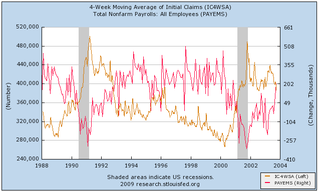
I. Initial Jobless Claims

In the first installment of the series, I looked at initial jobless claims. I noted that (1) in those recessions and recoveries where jobless claims fell steeply, peak unemployment occurred within 2 months of the point where jobless claims fell 12% from the peak; but (2) in those recessions and recoveries where jobless claims fell slowly, peak unemployment occurred not at the 12% mark, but only when new jobless claims were more than 16% less than peak claims, and stayed more than 16% off for at least 3 months thereafter.

A month ago, initial claims were still less than 16% off their highs. That all changed in the last four weeks. Jobless claims have fallen substantially, and now the 4 week moving average stands at 531,500, almost 20% off the peak of 658,750, 6 1/2 months ago. Here is a graph comparing this recession with the two previous "jobless recoveries" and the V shaped deep recession of 1982 in terms of initial jobless claims:
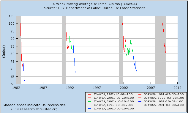
In the graph above, the red lines represent the first 6 1/2 months off the peak of claims. As you can see, our recession/recovery is more comparable to the last two than to the 1982-3 recovery. The green lines represent the continuation of the "jobless recoveries" until the point where both jobs and the unemployment rate had bottomed. As you can see, jobless claims failed to penetrate the 20% off level except for a brief instance in summer 2002 (coinciding with a brief positive jobs number). There is no green line for 1983, because in that recovery payrolls immediately improved. The blue lines show how jobless claims dropped after both payrolls and unemployment reached their nadir.

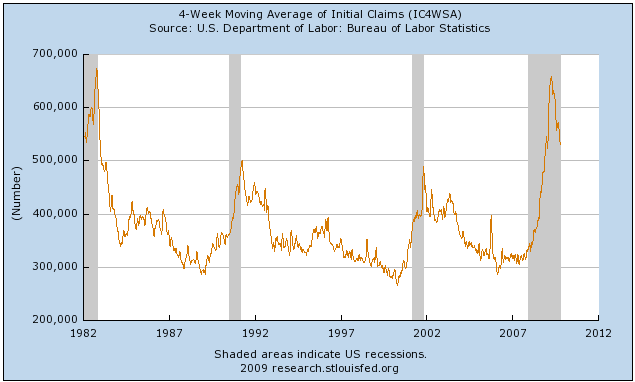
To remind you that the 1991 and 2001 recessions were very shallow compared with 1982 and the present, here is the actual number of claims from 1980-present:


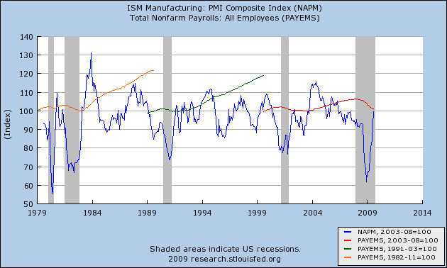
II. ISM Manufacturing

I next looked at the ISM Manufacturing Index, and concluded that the 53 level (50 is the dividing line between expansion and contraction) is the point where jobs began to be added in the very strong recovery after 1982, as well as during the week recoveries of 1992 and 2002. Further, a reading over 54 on the index has always coincided with actual job growth.

Additionally, whenever the hiring vs. firing sub-index is -5 or higher (i.e., no more than 5% more employers plan to fire than hire) and rising, where other evidence indicates a recession is ending, that has always indicated net employment growth was imminent, at least on a temproary basis; and also, whenever current staffing intentions were 65+. and hiring plans were 15+, that has always coincided with positive jobs numbers in the BLS survey, including during and after the "jobless recoveries" of 1992 and 2002.

The ISM manufacturing index stalled out at 52.6 in September, thus the graph looks the same (in the graph, the ISM reading of 53 is normed to 100):


III. Industrial Production

In part 3 of the series I noted that industrial production tends to peak a median +2 months before payrolls, and to trough at the end of recessions a median +1 month before payrolls. Of the 10 troughs since World War 2, in 8 of them industrial production troughed within 2 months of the payrolls number. Further, the only times that industrial production has led employment growth by a relatively long period of time, it has also shown weak growth -- less than 5% a year. In more typical V shaped job recoveries, it has grown at a rate of 10% or more a year.

In September, industrial production continued its strong positive move. I show this graph in conjunction with my discussion of Real retail sales, next.

IV. Real Retail Sales

I described real retail sales as Holy Grail of Leading Indicators for job growth, noting that his consistently turned at both tops and bottoms, an average of 3-5 months before job growth or losses turned. When real retail sales stay flat, they generate a lot of noise, and a longer period between the turn in sales and payrolls. Strong turns in sales generate reliable subsequent moves in payrolls in subsequent months. In general, with regard to recoveries, an increase of about +2.5% a year is necessary to reliably generate a subsequent move in real retail sales.

Because of the unique nature of "cash-for-clunkers", it is difficult to read the last couple of months of this indicator. On a three month smoothed average, it bottomed in April of this year, and on that basis, they are still up only about 0.9% off that low.

Here is a graph, showing the combined moves of Industrial Production which bottomed 3 months ago(in red), and Real Retail Sales which bottomed 7 months ago (in blue), 3 and 7 months respectively from their lows in the last three recessions as well as currently :


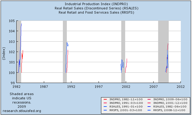
As you can see, because of Industrial production's continued growth in September, it is now up almost 3% -- in excess of the 10% annualized growth correlated with job growth. Industrial production is indeed having a "V" shaped recovery, growing even more than in 1983. By contrast, the expiration of cash-for-clunkers returned Real retail sales to very anemic growth similar to its pattern in the last "jobless recovery," below the 3% annual growth typically associated with job growth. Because of the unique contribution of car sales to this statistic, it is probably more appropriate to average the last two months. Until we see what happens to car sales in October, the jury is out on this number.

V. Summary of the Leading Indicators for Job Growth in the last month

In summary, one indicator (the "holy Grail") Real retail sales, declined, but for unique reasons. One, ISM manufacturing, stalled. But two -- Initial Jobless Claims and Industrial Production -- are now at the levels they simply need to maintain for jobs to be added. Should the Empire State survey be a harbinger, in October ISM manufacturing will join them. Real retail sales, which may improve with renewed car sales, is still the laggard.

VI. How does the poor September Payrolls number fit in?

My painstaking analysis immediately got a good kick in the chops by the September jobs number, a more-than-expected decline of -263,000. But there are many paths to the point where a net +1 job is generated. Monthly nonfarm payrolls is a very noisy series compared with the 4 week moving average of initial jobless claims. Here's a graph demonstrating that point, using the two previous recessions and recoveries:


Sooner or later, however, the payrolls data and the jobs data always resolve in the same direction -- which for jobless claims has been continued improvement ever since April:


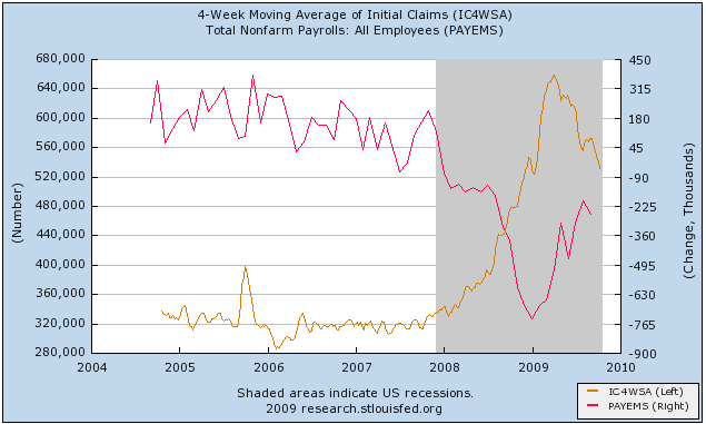
In other words, the September jobs setback could prove to be (painful) noise hiding an improving signal.

Additionally, I have previously shown in a discussion of "Okun's law" that over the last decade or more it has taken 2% YoY growth in GDP for even 1 net job to be added. Here's the relevant graph demonstrating that relationship (with YoY GDP growth shown in green, payrolls in red):


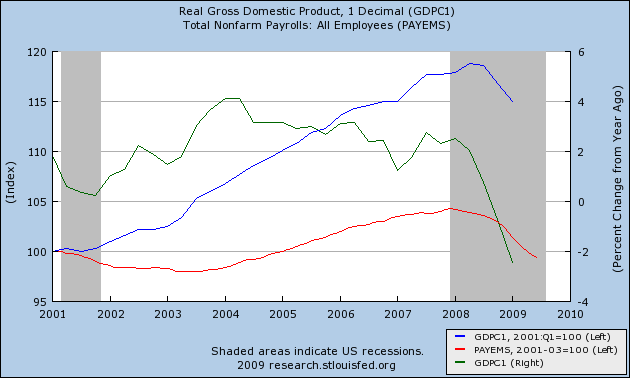
To reach 2%+ GDP growth by the end of this year, GDP must grow about 4.4% in the 3rd and 4th quarter combined. In that regard, 3Q GDP will be reported next week, and Prof. Krugman has a suspicion that it alone may show a 4% gain, which would put it very close to that +2% YoY figure. Yesterday he was seconded by UCSD Prof. James Hamilton of Econbrowser who said, "That kind of growth is inconsistent with a jobless recovery."

In other words, despite the setback of September payrolls and sideways real retail sales, December may yet be the turning point after which the economy will actually add jobs. Much depends on how real retail sales develop. Again, as I said in my concluding installment last month: let me be the first to acknowledge that this is not a scientific truth or certainty, but a best estimate based on a logical review of existing data with a long history that accommodates both traditional and "jobless" recoveries.

Study Proves That Derivatives Are Hard to Price

There is a new paper out titled. "Computational Complexity and Information Asymmetry in Financial Products." Here is the link to a link that will get you there. Here's the money quote from the paper.


Click for a larger image.

First, If you want to get an idea for what's involved, read any of the bond books written by Frank Fabozzi -- they explain the process really well. If you really want to see what's going on with these products, get the Mortgage Backed Securities Workbook which will show you how to use an Excel Spreadsheet to make your very own CMO.

Second, let's back the bus up and get some history. Securitization has been around for about 30 years. It originally involved the mortgage industry, but then expanded into anything that has a fairly predictable cash flow -- credit cards, airplane receivables (the trusts that airlines set-up to lease airplanes) -- you get the idea. In other words, this idea/concept has been around for long enough and used in a a wide enough series of financial situations that we know it can work without blowing up the world.

So what led to the latest blow-up? A large number of inter-related issues that when put together allowed a market -- which BTW had worked really well for some time -- to get completely out of hand. What were these problems? Here are a few: ultra-low interest rates, complete lack of regulatory oversight, a ratings industry that was whoring itself out to the highest bidder, using the wrong financial product sold to the wrong people to sell homes, a financial culture that does not have any "skin in the game etc... In other words, we got here through the culmination of many events combining into one giant cluster.

Back to the article at hand, it basically says we can't price these things. But that leads to a problem: there are many financial products that "can't be priced." Let's start with a simple share of stock. Yes, there is the price quoted by the market. But then there's the value investor who says the share is really worth X because of a set of unconsidered factors. And what about an illiquid bond? The price quoted there is going to jump around as well depending on perception. And what about a thinly-traded option where you can drive a truck through the bid/ask spread? What's the real value there? The answer is it depends. Should all of these products now be banned because we can't get a uniformly stated price?

It's also important to remember this is not the first time we've been through a derivatives problem. The same thing happened when the option market started to use the Black Schoales pricing model. When that happened, we were all going to hell. 40 years later it's standards practice.

Market Monday's


Click for a larger image.

1.) There are two possible trend lines. The highest one here simply connects more low points, thereby making it stronger. The lowest one connects is the absolute lowest points throughout the week.

A.) The main action in the early part of the week were two sell-offs on high volume.

2.) On Tuesday prices consolidated in a triangle pattern

B.) Prices gapped higher on Wednesday and

3.) Formed a secondary uptrend for the week.

C.) Prices gapped lower on Friday morning but found support at the trend line.


There are two important points on the daily chart:

A.) Prices have broken through resistance and

B.) There is an overall uptrend in place