Tuesday, December 31, 2019

The chart of the decade


 - by New Deal democrat

Today doesn’t just mark the end of 2019, but the end of the 2010’s as well. So it’s only suitable that I post the one chart that I think most explains the economy over the past 10 years.

In terms of public policy, that chart would be of the continual explosion of income and wealth inequality, particularly at the very top 0.1% or 0.01% of the distribution.

But in terms of explaining why the economy has chugged along at roughly 2% GDP growth every year for 10 years, with no recession, the below graph, that was part of my year-end review last week, sums it up nicely. Here it is again, the YoY changes in the Fed funds rate and the YoY% change in the price of gas:


Every recession in the past 60 years has been preceded by a spike in short term interest rates, the price of oil, or both. Although not shown, if I went back before the Fed started using interest rate policy as a tool in the late 1950s, I could take a similar graph of short term commercial paper  interest rates and the YoY% change in the price of commodities back about 150 years and the same pattern would obtain.

What generally kills economic growth is either a sharp change in the cost of financing and/or a sharp increase in the costs of inputs. In the 2010’s we never had either. In 2018 we came close, particularly in a YoY change in gas prices, but it was an increase from a very low level, and it didn’t last that long.

This very long moderation in both interest rates and important commodity prices is the most basic explanation for the fact that the expansion that started in 2009 is still going on as we begin 2020.

See you on the other side. In the meantime, Happy New Year!

Monday, December 30, 2019

A response to Kevin Drum: for wages and inflation, it’s all about the price of gas


 - by New Deal democrat

Last week Kevin Drum had the following inquiry:    

[H]ow is it that wages can go up but overall inflation remains so subdued? That seems to be the real disconnect here. During the dotcom boom, wages went up but inflation remained around 3 percent. During the housing bubble, wages didn’t go up and inflation remained around 3-4 percent. Right now, wages are going up but inflation has remained around 2 percent. Wages no longer seem to have much correlation with overall inflation. 

I haven’t seen anyone address this specific issue, but I’d be interested in hearing more about it.... What’s the deal?
The answer here, I believe, is quite simply that in the modern era since 1983, consumer inflation more than anything else is about the price of gas. Let me show you why.

First, here’s the relationship that is the subject of Drum’s query: wages for non-supervisory workers (blue) vs. consumer inflation (red) YoY:


Overall inflation has been more variable than Drum’s summary indicates, but it is fair to say that during the 90’s and 00’s it averaged roughly between 1.5%-4% regardless of wage growth. During the present expansion, inflation has been more variable to the downside, coming in negative in 2015. So, has inflation been non-responsive to wage growth?

Not really, I think. To show you, let me first add in a third line, consumer inflation ex-energy (gold):


Note that it has been much more stable than overall inflation. But to cut down on the noise, and better show the relationship, let me take out overall inflation and just compare wages and inflation ex-energy:


Note three important things:

  1. Wage growth YoY does increase as the expansion goes on. In the past I’ve shown that this generally happens once the broad U6 underemployment rate goes under roughly 9%. So, a tighter job market even in the modern era does lead to faster wage growth.
  2. Inflation ex-energy has increased by roughly 1% YoY before each of the last 3 recessions, from 4% to 5% in 1990, and from 2% to 3% in 2000 and 2007 (which was presumably a motivating factor in the Fed’s raising rates during those times). It has also increased in the last couple of years to about 2.3%.
  3. In 3 of the 4 expansions since 1983, the increase in inflation ex-energy has broadly correlated with increased wage growth.

Next, let’s take out wage growth and just focus on overall inflation (red) and inflation ex-energy (gold):


While it isn’t a perfect relationship, what we learned going back to the 1970s is that oil prices feed through into overall inflation with about a 12 month lag. But on the other hand, the direction of overall inflation tends to feed back into energy prices with about a 24 to 36 month lag (this is something Mark Thoma wrote about maybe 8 years ago; I don’t have the energy to go back and dig up the link). 

Put another way, core and overall inflation has something like a Sun-Jupiter relationship. Jupiter revolves around the sun, but the center of gravity is outside the sun, I.e., the sun’s direction wobbles in response to Jupiter’s gravitational tug as well.

To drive the point home, let’s add in the price of gas only measured YoY (divided by 10 for scale) (green):


Take a look at the late 1990s. The spike in gas (green) with a slight lag shows up in overall inflation (red), and then with a further lag in inflation ex-energy (gold). This again happens in 2011. Other times, overall inflation picks up exactly when gas prices go up - but the lag time for it to show up in inflation ex-energy remains.

In other words, there has continued to be a broad correlation between non-energy core inflation and wage growth.  But the main driver of inflation for the past 35 years has been the price of gas, which has drowned out the trend in wages vs. inflation.  To answer Drum’s question, that’s how  “wages can go up but overall inflation remains so subdued.”

A multitude of economic sins were hidden by somnolent gas prices in 2019. The implication for 2020 is that, with an already tight labor market, if gas prices continue to rise YoY as they have in the past few months, with core inflation ex-energy already at 2.3%, the Fed might feel compelled to raise interest rates even if the economy seems to be faltering.

Saturday, December 28, 2019

Weekly Indicators for December 23 - 27 at Seeking Alpha


- by New Deal democrat

My last Weekly Indicators post of the year is up at Seeking Alpha.

The producer side of the economy seems to be worsening, while initial jobless claims suggest some weakness is spreading over to the consumer side.

As usual, clicking over and reading helps reward me a little bit for the effort I put in.

Friday, December 27, 2019

Marking my 2019 forecast to market


 - by New Deal democrat

One of the things I do at the end of every year, in the interest of transparency, is to go back and see how my 6 and 12 month forecasts for the year panned out.

So how did I do this year? Not perfect, but not too shabby either. I marked to forecasts to market Over at Seeking Alpha.

As usual, clicking over and reading puts a penny or two in my pocket for my efforts.

Tuesday, December 24, 2019

Happy [insert name of preferred religious holiday here]! 3 quick hits


 - by New Deal democrat

I’ll be traveling and enjoying the holiday for a few days, so ... light to non-existent posting!

In the meantime, three quick hits for you:

1. New home sales - continued strength in this very forward looking sector. Even though sales declined m/m, the upward trend is pretty clear:


2. Durable goods - flat (blue), except for Boeing (red), which is bad:


Since Boeing is part of the economy, this is just more bad news for the short leading manufacturing sector.

3. Trucking falls off a cliff in November - the ATA Trucking Index fell -3.5%:


The accompanying note says “there is no way to sugar-coat this.” This is the worst move except for late 2012 since the Great Recession. Since this is a coincident indicator, this is more evidence that a shallow industrial recession has already begun.

The auto and truck sales report in the beginning of January will be very important to see if this is spreading out to the consumer.


Sunday, December 22, 2019

A roadmap to a Democratic Senate supermajority


 - by New Deal democrat

A worthy criticism made by many observers on the Democratic side is that most of the plans being painstakingly described by the Presidential candidates will come to nothing, because the filibuster in the Senate will kill them all. The GOP will then run on the “do nothing” socialist democrats in 2022 and 2024 to retake the Congress and Presidency. As things now stand, that is a reasonable position.

Bear in mind the Mitch McConnell and the GOP are perfectly happy with a Senate that still employs a filibuster for legislation: they don’t want to pass any! Seriously, when was the last time you heard a GOPer tout any sort of legislation at all? Now that the GOP has packed the courts (full of judges who will overrule any progressive legislation put in place since, oh, 1866), they have no incentive to allow any movement of legislation at all. The only change is that they will instantaneously revert to deficit scolds who bemoan that Social Security and Medicare are killing us fiscally, at roughly 12:01 pm on January 20, 2021.  

So, are we helpless in the face of a rural-State packed filibuster-proof GOP Senate? It’s a definite uphill climb, but I don’t think so.

Here’s the interesting thing. If you want to flip a Senate seat, the most efficient use of resources is in a *small* State, since flipping just 100,000 or 200,000 votes there makes all the difference, and the media markets - and their expenses - are a lot cheaper. With that in mind, I took a look at the 2018 Congressional results to see if I could identify 30 States where the Democrats might, admittedly with lots and lots of effort, elect Senators. I came up with 32, 5 of which are smaller states where a relatively small shift can make all the difference.

The 32 States where Democrats might make a Senate supermajority fall into 5 categories: blue bastions, defensive holds in the rustbelt (plus Iowa), booming sunbelt states on the cusp of turning, two Southern stretches, and rural states with exurban metropolitan bleed-over.

Let me start with the 2018 Congressional vote map by State. A year ago, both Nate Silver and I had the same idea: apply the 2018 Congressional vote totals by State to the 2020 elections. Here’s what that map looked like:


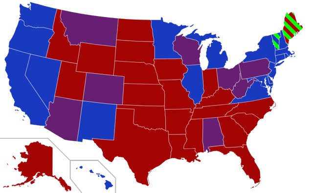
Now, I disagree with Nate’s map with regard to one State: North Carolina, where he deleted the results from a district where the Democrat didn’t have a GOP challenger. Had those results been included, and also giving the GOP a similar vote total as the other Democratic-stacked districts, the Democrat total would be 52%.

But let’s get to the 5 categories:

1. Blue bastions

These are the 20 States that went for HIllary Clinton in 2016: the West Coast plus Nevada, the Eastern seaboard from Maine through Virginia, plus Illinois, Minnesota, Colorado, New Mexico, and Hawaii. I’ll have more to say about Maine later, but for now note that these States are the start.

2. Defensive holds in the rustbelt

These are the traditional “blue wall” States of the upper Midwest that defected to Trump in 2016: Michigan, Wisconsin, and Ohio. Michigan looks like it has returned to the fold. Wisconsin is on knife’s edge, and Ohio is a tougher sell (but note, it does have one Democratic Senator now). An economically progressive Democrat in the mold of Elizabeth Warren should do well in these States.

I’m also including Iowa in this list because it is Midwestern, has historically elected some Democrats, has traditionally responded to an economic populist message, and is showing up “blue” in most of the 2020 Presidential polling.

OK, that’s the defensive part of the plan, adding up to 25 States. The last 7 are a stretch of one sort or another, but there appear to be paths to victory.

3. Sunbelt States “on the cusp:” North Carolina, Florida, Georgia, and Texas

As shown on the map above, in 2018 Florida voted Democratic in the Congressional races. As I’ve already mentioned, in actuality so did North Carolina. Since Senate seats are statewide and so can’t be gerrymandered, if Democrats duplicate those 2018 results in Senate races, these States flip. 

Georgia came excruciatingly close in 2018 to electing a Democratic governor, and probably would have were it not for racially based voter suppression. In 2016, Trump won Georgia by only 5%. This is a State that is well worth putting more effort into.

The same goes for Texas. In 2018, Beto O’Rourke came within 2% of winning the Senate race. In 2016 Trump won by 9%. We know that demographically Texas is close to becoming a “minority majority” State. As of 2017, the GOP only led in voter registrations by 3%. 

4. Two Southern Stretches: South Carolina and Mississippi

OK these are GOP bastions. But in 2018 the democrats got over 40% of the vote in each State. Mainly these States break down on racial lines. But in South Carolina there is a little “relocated yankee” action going on in both the northwestern corner of the State, in the Greenville-Spartanburg area, and in the Myrtle Beach, Charleston, and Hilton Head Island areas on the coast. Driving better turnout in the African American areas, and building up an organization in the areas where northerners have moved, and especially identifying and involving socially liberal retirees on the coast, might put a good candidate over the top, if not in 2020, then maybe in 2022 or 2024.

Mississippi is a further stretch, but the base is there. In 2018 Democratic Congressional candidates received 42.5% of the vote, trailing the GOP by only 8% (third party candidates took 8%). This is one of the few States where the GOP won that Democrats got over 40% of the vote. With a good candidate, and probably with a poor GOP candidate in opposition, Mississippi is in the ballpark.

5. Three exurban bleed-overs: Maine, Kansas, and West Virginia

All three of these States include declining rural areas, and small patches of fast-growing exurbs of metropolitan areas.
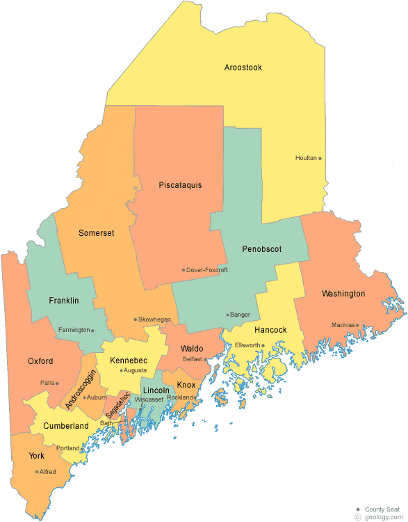
Maine 

In Maine it is the southeast corner that is within the exurbs of Boston. Here is a county map of the State:


And here are the population projections for the next 5 years in the relevant counties:


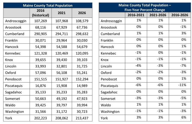
Three of the fastest growing counties are the ones just above Portsmouth, NH along the coast. Together with Aroostoock County that include Bangor, they make up the majority of the State’s population.

Maine is a State that is trending towards blue, and should be helped along with organization in those fast-growing counties.

Kansas 

In Kansas it is the northeast corner that is across the Missouri River from Kansas City. Here is a county map, along with the population forecast for each:


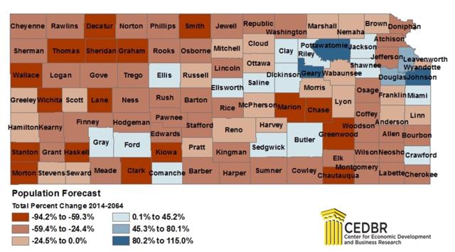
The western half of the State is actually *losing* population. In addition to the suburbs of Kansas City, the other fast growing area is Topeka.

And here is the population of the largest counties in Kansas:


Those fast-growing counties, plus Sedgwick County where the Capital is located, make up over half of the State’s population.

Kansas just elected a Democratic governor. It is had its bellyful of nutcase starve-the-beast State government. In 2018, Democratic Congressional candidates received 44% of the vote. Again, pouring resources into just the 5 or 6 fastest-growing counties to groom Democratic organizations ought to help move this State along from red to purple.

West Virginia

In West Virginia it is two separate pockets, one in the northeast corner that is within the exurbs of Washington, D.C., and one along the Pennsylvania border that is within the exurbs of Pittsburgh.

Yes, I know. Right now West Virginia is awful. But the situation is a reasonable mirror of Kansas. Here’s the county map, showing in blue all of the rural counties that are actually losing population - as is the State as a whole - together with the handful of counties in red and yellow that are gaining population:


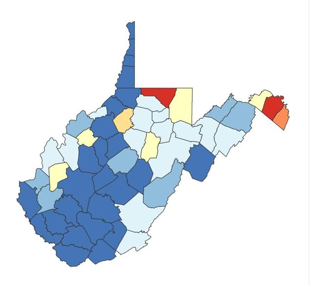
The five growing counties in the north and northeast currently have about 1/4 of the entire State’s population. The two northeastern counties are growing by about 1.5% a year 

Just as growth in northern Virginia powered that State’s flip from red to blue, so the exurban push into the northeastern corner of West Virginia can help nudge that State along.

UPDATE: I had forgotten, South Carolina also has some exurban spillover, in this case from Charlotte, NC. Of its 46 counties, #7 York and #16 Lancaster Counties are part of the Charlotte metro:

A final note about all four of the last five States -  Mississippi,  Maine, Kansas, and West Virginia. All have small populations, at 3.0 million,  1.3 million, 2.9 million, and 1.8 million respectively (only South Carolina has a relatively large 5.1 million population.)  Flipping a Senate seat in any one of them requires only 10% or less of the votes it would take in North Carolina, Texas, or Florida. And the organizational effort - where party organizations have until now been close to non-existent in some cases - only needs to be directed to about 5 counties in each of them.

In conclusion, put the 5 categories together, and there are 32 States where effort might be rewarded with a supermajority Democratic Senate. And even if not, a Senate with 55 or 56 Democrats can afford to lose a few milquetoasts and still vote to repeal the GOP filibuster. It’s would be tough, but it is still a worthwhile roadmap to potential victory.

Saturday, December 21, 2019

Weekly Indicators for December 16 - 20 at Seeking Alpha


 - by New Deal democrat

My Weekly Indicators post is Up at Seeking Alpha.

Are we just having a slowdown, or actually slipping into contraction? The short leading indicators would like to have a word.

As usual, clicking over and reading should bring you up to the moment on the economy, and rewards me a little bit for my efforts.

Friday, December 20, 2019

The consumer vs. producer divergence widens at year end


 - by New Deal democrat

My economic theme for about the past half year has been the contrast between the floundering producer sector vs. the decent consumer sector. With two of the last important reports of the year out this morning, that divergence has been highlighted.

First, the good news: real personal income rose +0.4% in November, and real personal spending rose +0.3%. Here’s a look at the past five years:


No perceptible slowdown here!

But now, let’s look at the producer side, where the Kansas City Manufacturing Survey was the last of three regional surveys to be reported this week.  Here is the moving monthly average of all five regions that I update in my weekly post:

Regional Fed New Orders Indexes
(*indicates report this week)
Today marks the very first time all year that the average of all five actually crossed into negative territory. This does not bode well for the December ISM manufacturing survey in particular, and for the manufacturing sector going forward into 2020 in general.

To conclude 2019: the consumer is alright. The producer, not so much.

Thursday, December 19, 2019

Political leanings through time for birth cohorts


 - by New Deal democrat

A chart on “political preferences by generation” from Pew Research has been making the rounds in the past few days. Here it is:

This chart tells the simplistic story that older generations are more conservative than young ones. It’s considerably misleading.

After all, how did the democrats ever win if older generations, who vote in higher percentages, are always more conservative than younger ones? The answer is, it’s not true.

Although Pew’s chart does not show the now-passed “greatest generation,” the simple fact is, that generations which came of age during the Great Depression and World War 2, and revered FDR, voted Democratic their whole lives.

As I’ve posted before, better way of looking at political preferences is to consider who was President during their teenage years. Because people tend to form their basic ideologies in their later teenage, or college years, and stick to it for the rest of their lives. 

That is shown by this striking graph, of the evolution of political ideology over time for each birth year, from The Upshot today. The large circles show the ages and voting preferences for each year’s birth cohort as of the last election:


All of a sudden, that inexorable conservative drift with age disappears. Rather, people born during the LBJ and Nixon presidencies shifted ever bluer compared with those born before. Those who formed their ideologies during the unpopular Carter presidency, or during the Reagan years - basically, late Boomers and at the first half of Gen X - became the most conservative of all.

Over the next decade, as the oldest cohort dies off and the blue cohorts who formed their ideologies during the Clinton years and later vote in higher percentages, we can expect the electorate to turn more Democratic. But then, when the blue mid-Boomer contingent passes from the scene, over the next 15-20 years, the most conservative cohort of all, who have always worshipped at the altar of St. Ronnie, will also become the highest voting contingent of all.


A yellow flag for initial jobless claims


 - by New Deal democrat
As you know, I’ve been monitoring initial jobless claims closely for the past several months, to see if there are any signs of a slowdown turning into something worse. Simply put, if businesses aren’t laying employees off, those same people are consumers who are going to continue to spend, which is 70% of the total economy. So the lack of any such increase has been the best argument that no recession is imminent.
This morning’s report of 234,000 initial claims is enough to put us over the threshold to a “yellow flag,” but historically still has more often coincided with slowdowns rather than recessions.

To reiterate, my two thresholds for initial claims are:

1. If the four week average on claims is more than 10% above its expansion low.
2. If the YoY% change in the monthly average turns higher. 
I’ve also added a threshold for the less leading, but also much less volatile 4 week average of continuing claims at 5% higher YoY.


Aside from last week’s 252,000 claims, this week was the weakest but for two weeks  since January of 2018. As a result, the 4 week moving average of claims has risen to 225,500, and is 11.9% above the lowest reading of this expansion, which occurred back in April: 


On a YoY% change basis, the 4 week average is 1,500, or 0.7%, higher:


For the first two weeks of December (blue in the graph below), the average is 243,000 vs. 223,200 for the entire month of December last year (red), or higher by 9.0%, while on direct comparison with the first two weeks of last December, they are higher by 12.2%:


In short, pending the completion of December for a direct month to month comparison, both thresholds for initial claims have been met this week.


Meanwhile, the less volatile 4 week average of continuing claims is 0.3% above where it was a year ago:


Here is the longer term graph:


The four week average of continuing claims, while cautionary, is consistent with a significant slowdown. But there have been similar readings in 1967, 1985-6, 3 times in the 1990s, and briefly in 2003 and 2005, all without a recession following. So the threshold for continuing claims being a negative (vs. neutral) has not been met.
  
Several weeks ago I wrote that “unless initial claims start to be reported in the 230’s, and continuing claims continue to trend  higher, into the 1.770 million range (by mid-December, after which the YoY comparisons for continuing claims get much easier), no interim recession will be signaled.” 

For the last two weeks, both numbers have been in the 230’s or higher, and 4 of the last 6 weeks have been above 225,000. Because continuing claims have not climbed meaningfully higher, and because we still have two weeks left in December, there is no red flag. 

For the record, if the four week average of claims is more than 12.5% higher than their low, that will be a red flag. If they move more than 15% higher, and the YoY changes are higher for two months in a row, that would mean a near-term recession were almost certain. 
  
But we have just enough as of this week to move this short leading indicator to a yellow flag, I.e., from neutral to weakly negative.

Wednesday, December 18, 2019

October JOLTS report shows soft patch in employment


 - by New Deal democrat


Let’s take a look at yesterday morning’s JOLTS report for October. I thought I’d start off this month by stepping back and comparing the monthly change in employment from the  jobs report (red) with the monthly total of hires minus total separations from the JOLTS report (blue), going all the way back to the beginning of the latter series in 2001:


Note that the monthly changes are almost always very close.

Here is a close-up of the past few years:


By contrast, since April of this year the series have diverged significantly. I’m not sure what the reason is, but it is something to keep an eye on.

Next, let’s review the order in which the JOLTS series peaked during the 2000s expansion:

  • Hires peaked first, from December 2004 through September 2005
  • Quits peaked next, in September 2005
  • Layoffs and Discharges peaked next, from October 2005 through September 2006
  • Openings peaked last, in April 2007 
as shown in the below graph (quarterly, normed to 100 as of May 2018): 

Here is the close-up on the past few years (monthly), normed to 100 as of August 2018:


In the past 14 months, with the exception of job openings, these series have essentially gone sideways, with job openings and hires both below their levels then, and quits and separations only slightly (1.1% and 0.6%) higher, respectively.

Here is the same data tracked YoY, first quarterly since 2001:


Note that hires and total separations turned negative YoY first, in Q1 2007, followed by quotes and openings in Q3.

And now focused on the past five years:


The soft patch during the shallow industrial recession of 2015-16 is evident. The current soft patch is not quite so negative.

Finally, For completeness’ sake, below are total layoffs and discharges (blue). Note that these turned up appreciably in the six months or so before the Great Recession. This month I thought I would compare them with initial jobless claims (averaged monthly, red) to compare which gives better signals of turning points:


As you can see, both peaked at the same time near the end of the last two recessions, but  initial claims are much less noisy in the lead-up to recessions, and so are the better indicator.

Because November’s jobs report was so strong, I am expecting a better JOLTS report next month. In the meantime, the soft patch in the employment market is evident.

Tuesday, December 17, 2019

Live-blogging the Fifteenth Amendment: December 17, 1868


 - by New Deal democrat

In the Senate, Senators Dixon and Ferry, both Republicans from Connecticut, continued the debate from several days prior concerning a federal imposition of African-American voting rights on the States:

Dixon: 
[M]y colleague ... proposes to amend the Constitution of the United States in a manner which to me is very revolting, not because I hate negro suffrage, but, sir, I do desire that the proud old State of Connecticut, shall not be humbled in the dust. Having enjoyed the right of suffrage and of regulating her own right of suffrage for over two hundred years — longer, I believe, than any State in the Union — I do not desire that at this late day she should be compelled to submit to the demands ... of any other State with regard to who shall vote within her borders . . . .
Ferry:
With regard to an amendment to the Constitution of the United States removing the distinctions of color now existing in different States of the Republic I had certainly hoped that my colleague would be willing to stand side by side with me in the support of it. I know that he had twice in my State voted with me for a constitutional amendment there to extend the franchise to the negro; and I ask what difference is there between an amendment to the constitution of my State and an amendment to the Constitution of the United States for the purpose of accomplishing the same object? . . . . 
Dixon:
I prefer leaving it to the State of Connecticut to decide for herself; and that was the substance of Dr. Bacon’s letter. He said he was in favor of negro suffrage, but preferred that the negroes should never vote rather than that negro suffrage should be forced upon Connecticut by act of Congress; and you may say the same thing of an amendment  to the Constitution of the United States.

[ Source: Congressional Globe, 40th Congress, 3rd Session, pp. 123-124, Appendix, p. 50 ]

The above exchange highlights what Dr. Foner refers to in his book “The Second Founding.” For the proponents of the Fifteenth Amendment were proposing that the Federal government be given the right to demand and enforce voting rights in the States, which was anathema not only to most Jacksonian Democrats, but also to some anti-slavery Republicans as well.

————
Previous installments:

December 7, 1868 


November housing and production both up sharply


 - by New Deal democrat

We got two of our final most important reports of 2019 this morning. Both were positive, one strongly so.

Starting with the best and most forward-looking news, housing permits and starts both improved strongly in November:


I’ll have a more detailed report up at Seeking Alpha later today, and I’ll link to it here once it’s up. The bottom line is that lower interest rates have re-ignited the housing market, and that good news is going to flow through the economy in 2020. [UPDATE: Seeking Alpha article is up here ]

Industrial production, the King of coincident indicators, was also up a sharp +1.1% in November (blue in the graph below). Most of that was the end of the GM strike, but even without that, production was up +0.6%:


One important drawback in this number, though, is that manufacturing production, while up for the month, is still lagging (red in the graph above) and if anything, appears to still be in a slight downtrend. 

All in all, this tells us that right now we are in a shallow manufacturing recession, but that the situation in the economy overall should improve as we head out of winter towards summer next year.

Monday, December 16, 2019

The oncoming generational UK and US political tsunamis


 - by New Deal democrat

No big economic news today, so let me put up a couple of striking charts about the UK election last week.


Tories:   13.9. 13.6
Labour: 10.3. 12.9 (a 20% decline!)
Lib Dems: 3.7  2.4
SNP:        1.2  1.0

Total turnout was down 1.5%. As should be obvious, as the accompanying commentary said, the Tories didn’t win; Labour lost, and terribly. Apparently having a leader (Jeremy Corbyn) with a -44% approval rating, and no substantive position at all on the most important issue in decades, Brexit, was a loser. Hoocoodanode?!?

Second - and this is really stunning - which party won seats based on age group: 


The conservatives won precisely *zero* seats among the youngest voters.
Meanwhile Labour won only 32 seats among the oldest.

More generally, there was a Labour landslide among voters under 50. But an even larger Conservative landslide among voters 50 and older. One caveat: I don’t know the source for this information, because voting is of course anonymous. Probably the information comes from exist polls, so take with a few grains of salt.

Since people tend to form their basic political ideologies in their later teens or early twenties, at some point - probably within the next 10 years - there is likely to be a political tsunami in the UK sweeping away right wing economic policies.

That made me go look for a similar breakdown of the 2018 US Congressional elections. The below graph is the closest thing I found:


Interesting that the inflection point seems to be at age 50 in the US as well. People who formed their political views in the Reagan era or earlier in the US, and the Thatcher era and earlier in the UK, skewed conservative, while those whose views were formed later skewed to the left.

In the UK, the immediate risk is that the union itself ruptures, with Scotland and possibly Northern Ireland as well leaving. In the US, the risk is a rupture of the Constitutional fabric, by way of heightened mutual “hardball” and political violence, and a significant chance of a slide into Presidential autocracy.

Sunday, December 15, 2019

Live-blogging the Fifteenth Amendment: December 15, 1868


 - by New Deal democrat

Sen Orrin S. Ferry (R-Conn), in the course of offering a joint resolution to lift the disabilities mandated by the 3rd Section of the Fourteenth Amendment against those who participated in the rebellion:

[I]t does seem to me as if the experience of the last fifty years ought to enlighten us as to the chimerical character of the dangers which have been apprehended from the extension of suffrage and to eligibility to office at one time and another. 
It has been thought once, even in this land, that poverty disqualified a man from voting, and no man, unless he was the owner of property, was permitted to exercise the suffrage. Time went on; the property qualification disappeared; and nowhere are the law and order more respected, are person and property more secure than in those communities where suffrage is most universal and government rests upon the broadest foundation. 
It has been thought that dangers might assail us in the influx of the enormous immigration from the Old World, and a great party was once organized upon that very apprehension. The fear has passed away, for time and experience have demonstrated that the evils accompanying that immigration are but temporary, and will pass away in a single generation. 
The time has been when the negro was a beast of burden, and nothing else. The time is now when good men too often apprehend the danger of the extension of the suffrage unto him be reason of the ignorance which is the result of centuries of slavery; but it is beginning to be seen by the practical operation of the laws extending suffrage [mandated by the Congress in the constitutions of reconstructed States], that all these fears are chimerical, and that the black man as well as the white is an element of strength and prosperity in civil society.

In support of the resolution, Sen. Willard Warner, a union general, who moved from Ohio to Alabama after the war, and was elected to the Senate from Alabama in 1868, argued that a Republican-controlled legislature in Alabama had removed the disabilities to those who had engaged in rebellion, but that even after that, Republican candidates had triumphed in the next election. 

To which, Garrett Davis, a unionist KY Democrat, replied:

[S]uppose there was no military force moving from this center, this capital, and from States and places outside of Alabama, what would become of the honorable Senator’s negro government and of his representation of it in this body? I am inclined to think they would be fugitives from it. 
.... I will never consent that the Congress of the United States shall vote to force negro suffrage upon the State of Alabama or the State of Kentucky or any other State; and I assert that Congress has not a vestige of power to enforce such a constituency upon the people of any State. 
The honorable Senator [Warner] ... seems to be very much enamored with the idea of negro suffrage, and he seems to think that I and my political party are responsible for the non-existence of that political power in the other States. Who voted down negro suffrage in Kansas? Who voted down negro suffrage in Ohio? Who voted down negro suffrage in Michigan, but the honorable Senator’s political friends.... Now, when Ohio by more than forty thousand, Kansas by eight or ten thousand, Michigan by twenty or thirty thousand, all the northern States, where there are no negroes to vote, voted down the principle of negro suffrage by such immense majorities, with what grace can they or their southern auxiliary, the Senator from Alabama, vote to force negro suffrage upon the ten southern States, under the principle of the Constitution of the United States that the people of a State have the sole and exclusive power of framing their own governments.

[ Source, Congressional Globe, 40th Congress, Third Session, pp. 79, 86 ]

As Davis pointed out, when it came to their own States, northern States had refused to grant to African-Americans the right to vote. That a majority of their own constituents did not actually believe in racial equality, but that the effects of the Fifteenth Amendment would overwhelmingly be felt in the South, has to be taken into account when considering why the Amendment wound up being more narrowly crafted.


Saturday, December 14, 2019

Weekly Indicators for December 9 - 13 at Seeking Alpha


 - by New Deal democrat

My Weekly Indicators post is up at Seeking Alpha.

Every time I am tempted to remove my “recession watch” for this quarter through mid-year 2020, more data shows up that is at very least not inconsistent with a recession having actually started a month or two ago.

To find out what I am talking about, go click over and have a read. As usual, it should be useful for you, and it helps reward me a little bit for my efforts.

Friday, December 13, 2019

November real retail sales show consumption still weakly positive


 - by New Deal democrat

Retail sales are one of my favorite indicators, because in real terms they can tell us so much about the present, near term forecast, and longer term forecast for the economy.

This morning retail sales for November were reported up +0.2%, while October was also revised up +0.1%. Since consumer inflation increased by +0.3%, however, real retail sales were down less than -0.1%. Real retails sales remain slightly below their August peak.


Here is what the longer term absolute trend looks like.   


A closer view shows that the last three months’ decline remains well within the range of noise:


Others may use other deflators. I use overall CPI because:
1. I’ve been doing it this way for over 10 years. 
2. This is the deflator used by FRED.
3. It has a 70+ year history.
4. Over that 70+ year history, it has an excellent record as a short leading indicator for employment and recessions. That’s the kind of track record I like.

Further, although the relationship is noisy, real retail sales measured YoY tend to lead employment (red in the graphs below) by about 4 to 8 months. Here is that relationship over the past 20 years: 


The recent peak in YoY employment gains followed the recent peak in real retail sales by roughly 6 months, and the downturn in real retail sales at the end of last year has already shown up in weakness in the employment numbers this year, as shown in this shorter term view of the past 5 years (note change of scale in payrolls better to show the changes): 


Similarly even with the recent small decline at least stabilization in the  employment numbers by about next spring. 

Finally, real retail sales per capita is a long leading indicator. In particular it has turned down a full year before either of the past two recessions:


In the last 70 years, with the exception of 1973 and 1981 this measure has always turned negative YoY at least shortly before a recession has begun:


Thus this is a quite reliable indicator, and with this result still being up +0.7% YoY, it is not flagging any imminent recession.

To summarize, this is a small decline from a peak three months ago. On the positive side, it is not enough for me to change this indicator to neutral, although it is enough to downgrade it to a weak positive. I will need at very least one more month without making a peak, or a more serious decline, to downgrade this indicator. On the negative side, together with yesterday’s poor weekly jobless claims number, if there is further confirmation, it *could* mark the beginning of the spread of contraction from the manufacturing sector into the consumer sector that I have been worried about.

Thursday, December 12, 2019

Off topic: two solutions to home delivery theft


 - by New Deal democrat

By now we all know that theft of packages delivered to people’s home doorstep is a big problem. Here are pictures of two solutions:

1. Massive 1984-style and easily hackable home monitoring. Or even worse, the ability of the delivery person to open the homeonwer’s garage to leave the package inside.


2. A large 1950’s style milkbox:


For those of you who may not know what I am talking about, the milkbox was built into the side wall of a garage and had doors that could be opened and locked from the inside on each side.

The homeowner unlocked the outside door. When the milk was delivered and the milkman closed the outside door, it would lock from the inside. When the homeowner wanted to retrieve the milk, they opened the inside door.

 Make the box wider to accommodate larger sized packages. Problem solved.

Initial claims turn neutral on seasonality, but no red flag


 - by New Deal democrat

As you know, I’ve been monitoring initial jobless claims closely for the past several months, to see if there are any signs of a slowdown turning into something worse. Simply put, if businesses aren’t laying employees off, those same people are consumers who are going to continue to spend, which is 70% of the total economy. So the lack of any such increase has been the best argument that no recession is imminent.
This morning’s report of 252,000 initial claims is enough to signal a caution, but historically has more often coincided with slowdowns rather than recessions.

To reiterate, my two thresholds for initial claims are:

1. If the four week average on claims is more than 10% above its expansion low.
2. If the YoY% change in the monthly average turns higher. 
I’ve also added a threshold for the less leading, but also much less volatile 4 week average of continuing claims at 5% higher YoY.

This week’s reading of 252,000 was the weakest since September of 2017. As a result, the 4 week moving average of claims has risen to 224,000, is 11.2% above the lowest reading of this expansion, which occurred back in April: 


Nevertheless, on a YoY% change basis, the 4 week average is still slightly below, as in by 1,000 or -0.5%, its level one year ago:


For the first two weeks of December (blue in the graph below), the average is 226,000 vs. 223,200 for the entire month of December last year (red), or higher by 1.3%, while on direct comparison with the first two weeks of last December, they are higher by 4.4%:


Both thresholds for concern - extra watchfulness - have been met. 

Meanwhile, the less volatile 4 week average of continuing claims is 0.2% above where it was a year ago:


Here is the longer term graph:


Again, this certainly is cautionary, and is consistent with a significant slowdown. But there have been similar readings in 1967, 1985-6, 3 times in the 1990s, and briefly in 2003 and 2005, all without a recession following. So the threshold for continuing claims being a negative (vs. neutral) has not been met either.
  
Several weeks ago I wrote that “unless initial claims start to be reported in the 230’s, and continuing claims continue to trend  higher, into the 1.770 million range (by mid-December, after which the YoY comparisons for continuing claims get much easier), no interim recession will be signaled.” Last year we also saw some seasonal weakness in initial claims, even before the government shutdown, so one bad week is not enough reason for a fundamental change of opinion beyond turning neutral. So it will take several more weak weeks of readings in the 230’s or worse for initial claims to raise a red flag.