Saturday, January 4, 2020
Weekly Indicators for December 30 - January 3 at Seeking Alpha
- by New Deal democrat
My Weekly Indicators post is up at Seeking Alpha.
There were marginal moves to the downside on both the producer and consumer sides of the ledger this past week.
As usual, clicking over and reading rewards me with just a little bit of $$$ for my efforts.
Friday, January 3, 2020
Initial jobless claims still negative, but no recession signal
- by New Deal democrat
As you know, I’ve been monitoring initial jobless claims closely for the past several months, to see if there are any signs of a slowdown turning into something worse. Simply put, if businesses aren’t laying employees off, those same people are consumers who are going to continue to spend, which is 70% of the total economy. So the lack of any such increase has been the best argument that no recession is imminent.
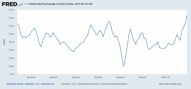
Yesterday morning’s report of 222,000 initial claims continues the string of numbers above the 2018-19 average. Superficially the four week average of 233,250 is also enough for a recession flag, but as we will see below this is really an artifact of seasonality.
To reiterate, my two thresholds for initial claims are:
1. If the four week average on claims is more than 10% above its expansion low.
2. If the YoY% change in the monthly average turns higher.
As indicated above, the 4 week moving average of claims has risen to 233,250, which is 15.8% above the lowest reading of this expansion, which occurred back in April:
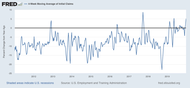
On a YoY% change basis, the 4 week average is 11,500, or 5.2%, higher:
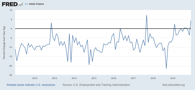
For the month of December (blue in the graph below), the average is the same 233,250 vs. 223,200 for the entire month of December last year
In short, both thresholds for initial claims have been met this week.
But hold your horses: this is only because the 203,000 figure from the last week of November has gone out of the 4 week and monthly average, while the 252,000 number from the first week of December is still in. Almost certainly that wild swing had to do with the change in the week of Thanksgiving this year. If we average the two at 227,500, and use that for our monthly and 4 week averages, then both are 227,000. That puts the 4 week average 12.7% above its low, and higher by 1.7% YoY.
This maintains the “red flag” that began last week, but still remains as consistent with a slowdown as with an impending recession.
Meanwhile, the less volatile 4 week average of continuing claims is 0.8% above where it was a year ago:
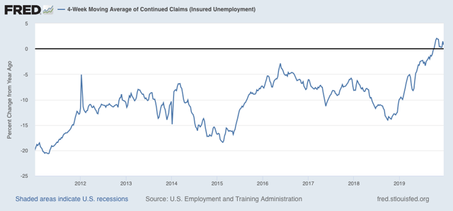
Here is the longer term graph:
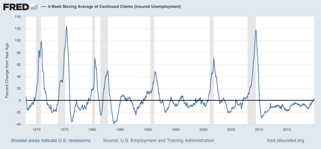
This is also consistent with a significant slowdown. But there have been similar readings in 1967, 1985-6, 3 times in the 1990s, and briefly in 2003 and 2005, all without a recession following. So the threshold for continuing claims being a negative (vs. neutral) has not been met.
Unless initial claims are reported in the 230’s without seasonal flukes (or 15%+ higher than their lows), and continuing claims continue to trend higher, into the 1.750 million range or higher, there is no recession flag.
So. this short leading indicator remains weakly negative, a red flag but no imminent downturn.
Tuesday, December 31, 2019
The chart of the decade
- by New Deal democrat
Today doesn’t just mark the end of 2019, but the end of the 2010’s as well. So it’s only suitable that I post the one chart that I think most explains the economy over the past 10 years.
In terms of public policy, that chart would be of the continual explosion of income and wealth inequality, particularly at the very top 0.1% or 0.01% of the distribution.
But in terms of explaining why the economy has chugged along at roughly 2% GDP growth every year for 10 years, with no recession, the below graph, that was part of my year-end review last week, sums it up nicely. Here it is again, the YoY changes in the Fed funds rate and the YoY% change in the price of gas:
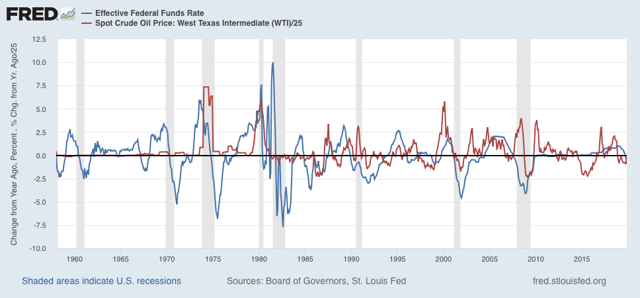
Every recession in the past 60 years has been preceded by a spike in short term interest rates, the price of oil, or both. Although not shown, if I went back before the Fed started using interest rate policy as a tool in the late 1950s, I could take a similar graph of short term commercial paper interest rates and the YoY% change in the price of commodities back about 150 years and the same pattern would obtain.
What generally kills economic growth is either a sharp change in the cost of financing and/or a sharp increase in the costs of inputs. In the 2010’s we never had either. In 2018 we came close, particularly in a YoY change in gas prices, but it was an increase from a very low level, and it didn’t last that long.
This very long moderation in both interest rates and important commodity prices is the most basic explanation for the fact that the expansion that started in 2009 is still going on as we begin 2020.
See you on the other side. In the meantime, Happy New Year!
Monday, December 30, 2019
A response to Kevin Drum: for wages and inflation, it’s all about the price of gas
- by New Deal democrat
Last week Kevin Drum had the following inquiry:
[H]ow is it that wages can go up but overall inflation remains so subdued? That seems to be the real disconnect here. During the dotcom boom, wages went up but inflation remained around 3 percent. During the housing bubble, wages didn’t go up and inflation remained around 3-4 percent. Right now, wages are going up but inflation has remained around 2 percent. Wages no longer seem to have much correlation with overall inflation.
I haven’t seen anyone address this specific issue, but I’d be interested in hearing more about it.... What’s the deal?
The answer here, I believe, is quite simply that in the modern era since 1983, consumer inflation more than anything else is about the price of gas. Let me show you why.
First, here’s the relationship that is the subject of Drum’s query: wages for non-supervisory workers (blue) vs. consumer inflation (red) YoY:
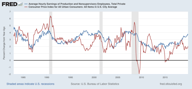
Overall inflation has been more variable than Drum’s summary indicates, but it is fair to say that during the 90’s and 00’s it averaged roughly between 1.5%-4% regardless of wage growth. During the present expansion, inflation has been more variable to the downside, coming in negative in 2015. So, has inflation been non-responsive to wage growth?
Not really, I think. To show you, let me first add in a third line, consumer inflation ex-energy (gold):
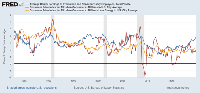
Note that it has been much more stable than overall inflation. But to cut down on the noise, and better show the relationship, let me take out overall inflation and just compare wages and inflation ex-energy:
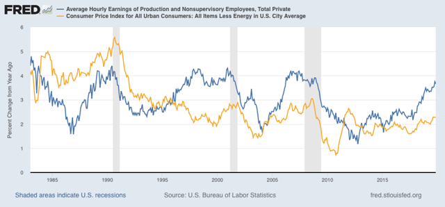
Note three important things:
- Wage growth YoY does increase as the expansion goes on. In the past I’ve shown that this generally happens once the broad U6 underemployment rate goes under roughly 9%. So, a tighter job market even in the modern era does lead to faster wage growth.
- Inflation ex-energy has increased by roughly 1% YoY before each of the last 3 recessions, from 4% to 5% in 1990, and from 2% to 3% in 2000 and 2007 (which was presumably a motivating factor in the Fed’s raising rates during those times). It has also increased in the last couple of years to about 2.3%.
- In 3 of the 4 expansions since 1983, the increase in inflation ex-energy has broadly correlated with increased wage growth.
Next, let’s take out wage growth and just focus on overall inflation (red) and inflation ex-energy (gold):
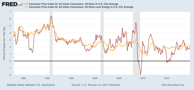
While it isn’t a perfect relationship, what we learned going back to the 1970s is that oil prices feed through into overall inflation with about a 12 month lag. But on the other hand, the direction of overall inflation tends to feed back into energy prices with about a 24 to 36 month lag (this is something Mark Thoma wrote about maybe 8 years ago; I don’t have the energy to go back and dig up the link).
Put another way, core and overall inflation has something like a Sun-Jupiter relationship. Jupiter revolves around the sun, but the center of gravity is outside the sun, I.e., the sun’s direction wobbles in response to Jupiter’s gravitational tug as well.
To drive the point home, let’s add in the price of gas only measured YoY (divided by 10 for scale) (green):
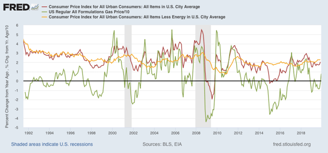
Take a look at the late 1990s. The spike in gas (green) with a slight lag shows up in overall inflation (red), and then with a further lag in inflation ex-energy (gold). This again happens in 2011. Other times, overall inflation picks up exactly when gas prices go up - but the lag time for it to show up in inflation ex-energy remains.
In other words, there has continued to be a broad correlation between non-energy core inflation and wage growth. But the main driver of inflation for the past 35 years has been the price of gas, which has drowned out the trend in wages vs. inflation. To answer Drum’s question, that’s how “wages can go up but overall inflation remains so subdued.”
A multitude of economic sins were hidden by somnolent gas prices in 2019. The implication for 2020 is that, with an already tight labor market, if gas prices continue to rise YoY as they have in the past few months, with core inflation ex-energy already at 2.3%, the Fed might feel compelled to raise interest rates even if the economy seems to be faltering.
Subscribe to:
Posts (Atom)