Saturday, April 4, 2015
Weekly Indicators for March 29 - April 2 at XE.com
- by New Deal democrat
My Weekly Indicators post is up at XE.com.
The US appears to have "imported" a near-recession limited to production and spending for the first time in over a century, while income and employment still show a good domestic economy.
Friday, April 3, 2015
March jobs report: the good streak is broken
- by New Deal democrat
HEADLINES:
- 126,000 jobs added to the economy
- U3 unemployment rate unchanged at 5.5%
With the expansion firmly established, the focus has shifted to wages and the chronic heightened unemployment. Here's the headlines on those:
Wages and participation rates
- Not in Labor Force, but Want a Job Now: down -169,000 from 6.538 million to 6.369 million
- Part time for economic reasons: up 70,000 from 6.635 million to 6.605 million
- Employment/population ratio ages 25-54: down -0.1% to 77.2%
- Average Weekly Earnings for Production and Nonsupervisory Personnel: up +0.2% from $20.82 to $20.86, up +1.8%YoY (this YoY change is a bounce from last month's +1.5%). (Note: you may be reading different information about wages elsewhere. They are citing average wages for all private workers. I use wages for nonsupervisory personnel, to come closer to the situation for ordinary workers.)
January was revised down by -38,000 from 239,000 to 201,000.
The more leading numbers in the report tell us about where the economy is likely to be a few months from now. These were generally negative for the second month in a row.
- the average manufacturing workweek declined -0.1 to 40.9 hours. This is one of the 10 components of the LEI and so will affect it negatively.
- construction jobs decreased by -1,000. YoY construction jobs are up 282,000 YoY.
- manufacturing jobs also decreased -1,000, and are up 188-,000 YoY.
- Professional and business employment (generally higher-paying jobs) increased 40,000 and is up 662,000 YoY.
- temporary jobs - a leading indicator for jobs overall - increased by 11,400.
- the number of people unemployed for 5 weeks or less - a better leading indicator than initial jobless claims - increased by 57,000 to 2,488,000, compared with December 2013's low of 2,255,000.
Other important coincident indicators help us paint a more complete picture of the present:
- Overtime decreased by 0.1 hour from 3.4 hours to 3.3 hours
- the index of aggregate hours worked in the economy fell -0.2 from 103.1 to 102.9.
- The broad U-6 unemployment rate, that includes discouraged workers decreased from 11.0% to 10.9%
- the index of aggregate payrolls rose by 0.2% to 122.1.
- the alternate jobs number contained in the more volatile household survey increased by 34,000 jobs. This represents a 2,535,000 million increase in jobs YoY vs. 3,128,000 in the establishment survey.
- Government jobs increased by 1,000.
- the overall employment to population ratio for all ages 16 and above was unchanged at 59.3%, and has risen by +0.3% YoY. The labor force participation rate declined -0.1% from 62.8% to 62.7% and is down -0.5% YoY, and is equal to its 2014 low (remember, this includes droves of retiring Boomers).
SUMMARY:
Obviously this was a disappointing report relative to the last year of reports. The headline numbers were positive or neutral, but most of the internal numbers declined. That there were downward revisions to the previous two months' numbers is also not something that happens in a robust expansion. Most of the leading indicators in the report also declined.
There were a few bright spots, as wage growth increased, and those not in the labor force who want a job now decreased. But these really just reversed last month's poor numbers.
In the longer view, while this is a bad month, I do not think the expansion itself is in danger. We are importing some of the global weakness, and the oil patch has a very focused decline, which has shown up in the initial jobless claims in the last month or two. In fact, the most noteworthy item in the report was that there have been -11,000 job losses in areas that typically support the oil and gas industries.
If we were to see a real decline of concern, it would show up in housing and vehicle purchases. We just got a good March report on vehicle sales, so the reports on the housing industry this month are of added importance.
Thursday, April 2, 2015
Chevron's 4% Dividend Is Safe
I own this. This is not a solicitation to buy or sell this security. Do your own research and come to your own conclusions.
Oil’s recent sell-off provided one of the best buying opportunities in the energy sector since the Lehman crash. Of course, the next logical question is, “what security?” I started by looking at the big, multi-national oil companies. What first attracted me to CVX was its dividend, which is currently yielding a healthy 4%. On deeper analysis, I believe the dividend is safe, making this a very attractive company, especially at current price levels.


Oil’s recent sell-off provided one of the best buying opportunities in the energy sector since the Lehman crash. Of course, the next logical question is, “what security?” I started by looking at the big, multi-national oil companies. What first attracted me to CVX was its dividend, which is currently yielding a healthy 4%. On deeper analysis, I believe the dividend is safe, making this a very attractive company, especially at current price levels.
Let’s start by
looking at the weekly chart:
Charts, however,
aren’t the whole picture. Let’s turn to
CVX’s valuation by looking at this table from Morningstar:
Turning to the
company’s financials, CVX’s balance sheet demonstrates the company is well managed. Accounts receivable has decreased from 11.24%
of assets in 2010 to the current level of 6.29%. Inventory levels have been consistently between
2.5% and 3%. The current ratio is 1.32,
giving the company a bit of financial flexibility. On the other side of the balance sheet, long
term debt is only 9% of liabilities. Value
investors should be impressed by the increase in book value, which rose from $105
billion in 2010 to $155 billion in 2014.
Although not bullet proof, CVX’s balance sheet is in good shape.
This is
fortunate, because the income statement shows some weakness. The company’s revenue fell from $254 billion in
2011 to the current level of $211 billion.
Over the same period, the cost of revenue has decreased from 66.2% to
56.4% while operating expenses have increased by the same amount. The result is net margin has consistently been
between 9%-10% for the last five years. Management
has been distributing a large minority of these earnings. The dividend payout ratio has increased from
30% in 2011 to its current level of 41%.
This is a key reason why the current dividend is safe. Top line revenue would have to fall by 40%
before the payout ratio was challenged.
With a company of this size, a drop of that magnitude is highly
unlikely.
Finally we have
the cash flow statement. Free cash flow
(operating cash flow – investment expenses) has been positive in all but one
year for the last five years. From
2010-2102, the company added $38 billion in cash before considering investment
activity; the only year of decreases saw a drop of $607 million.
To conclude, the
company is a bit undervalued. Its
balance sheet is solid, with a well-managed short-term asset position and a
reasonable amount of debt. Although
revenue has declined, it would have to drop at least 40% more to threaten the
current dividend. The company has been
cash flow positive for the 4 of the last 5 years. Finally, the 4% dividend gives the stock
built-in price support. At these levels,
CVX is buy.
Wednesday, April 1, 2015
The long leading indicators updated through Q1 2015
- by New Deal democrat
I have a new post up at XE.com.
What do those indicators that forecast the economy more than 1 year out say now?
Tuesday, March 31, 2015
Once more into the breach on wages and income since the Great Recession
- by New Deal democrat
Two articles were posted elsewhere this morning discussing wages and income during this expansion. Both have misleading aspects to a lesser or greater degree.
The first is an article by Pavlina R. Tcherneva of the Levy Economics Institute. While I do not disagree with its overall emphasis or conclusion, I do have a significant quibble, because there is one erroneous comparison which can be misleading.
Tcherneva says:
Tcherneva says:
"In the postwar period, with every subsequent expansion, a smaller and smaller share of the gains in income growth have gone to the bottom 90 percent of families. Worse, in the latest expansion, while the economy has grown and average real income has recovered from its 2008 lows, all of the growth has gone to the wealthiest 10 percent of families, and the income of the bottom 90 percent has fallen [through 2013]."
....
Consider what has happened to the incomes of the bottom 99 percent of families in the meantime. Average real income for the bottom 99 percent, which fell after the crash—from $50,400 (2007) to $47,000 (2008) —continued falling during the expansion, to $44,300 (until 2011). It finally showed a small uptick in 2012, to $44,900, but in 2013 it remained essentially flat. Thus, any “improvement” in the income distribution is not due to improvements in the well-being of the bottom 99 percent of households."
Included in the article is a graph, which is likely to see wide distribution, and which is the problem with this article:

The problem with this graph, and its description, is that it purports to measure income growth during entire expansions. But that's not quite true, since the current expansion did not end in 2013, but is ongoing. Thus the measure of the relative income shares of the bottom 90% vs. top 10% in prior expansions is not directly comparable.
To be directly, comparable, Tcherneva should have measured relative income shares during the first 4 years of each expansion. I should emphasize that, had she done so, the results would have been similar, using the Saez and Piketty tax return data, which can be found here,
Aside from technical accuracy, I am highlighting this issue because a slightly deeper look can give us much more information.
To begin with, the Saez and Piketty numbers are based on "tax units," i.e., tax filings. Thus it is very similar to, although not identical with, households. Thus the data is subject to all of the same issues that we get into when we discuss median household income - e.g., distortions based on the tsunami of Boomer retirements, and the importance of the unemployment rate (since the unemployed are counted in households and tax units, but not for purposes of median or average wages.
The second is best summed up in this graph, from Doug Short, which shows the real median income of the bottom 90% from the Saez and Piketty data, for the entire last century:

Note that income first peaked in the early 1970s, and has only exceeded that peak one time, briefly, during the tech boom of the late 1990s. Of particular interest is how long it took in each economic recovery since 1980, and also the plateauing of income in the late 1980s.
Tcherneva herself posted a graph several months ago showing what happened with the comparative incomes of the bottom 90% and top 10% from income peak to income peak:

This tells us the importance of three trends: (1) after the second Oil shock of 1979, and particularly in 1986, real gas prices fell dramatically, in contrast to the rise of gas prices from a low of $1.40 in 2009 to a high of $3.95 in 2012 and 2013; (2) household income rose dramatically in the early 1980s, despite a fall in real wages, due to the huge numbers of women entering the workforce; and (3) wage growth declines after particularly severe recessions like 1981 and 2008-09.
In short, if we want to explain Tcherneva's data, both during the current economic expansion, and over the longer term, we really don't have to look further than three things
- 1. the increase of gas prices post-Great Recession currently, and its volatility since 1974,
- 2. the decline in labor force participation rate since 2000, and its dramatic rise in the 1970s and 1980s due to women entering the workforce in huge numbers; and
- 3. the decline of labor bargaining power due to the collapse of unionization and the correlative rise of globalization.
The other article this morning deals with wages, and comes from the Cleveland Fed via Barry Ritholtz.
The purpose of the study was to determine what has happened with real wages during this economic expansion - are they stagnant or have they fallen? If so, why?
As the authors state, "This article answers the question: What fraction of recent changes in the average wage is due to changes in the occupation mix versus changes in wages within occupations?" The answer is given in the below chart:

Interestingly, the authors find that, through 2013, the jobs added in the recession have NOT been, as commonly assumed, low wage jobs, but have actually skewed towards higher paying jobs. They do find, however, that within occupations, real wages actually fell slightly.
My big problem with this article is in its explanation for the data. To begin with, it is not demographically normalized. While it is always true that old fogies retire and young whippersnappers take their places at entry level incomes, this has disproportionately been the case as Millennials move into the labor force as Boomers retire. This is likely to place some unusual downward pressure on wages.
But here is my real problem. The authors conclude:
You have got to be kidding me."Why did wages rise during the recession and fall during the recovery? It may be due to what are called “selection effects.” During recessions, firms tend to retain their most productive workers, both across and within occupations. ..."It is also possible that wages declined more in the recovery than in the recession due to what economists call “sticky wages.” Reducing real wages is one of the ways the labor market adjusts to drops in demand for labor. ..."
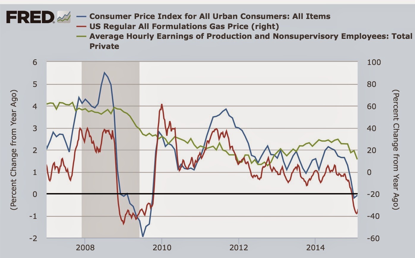
Wages rose during the recession because the price of gas fell was $3+ at the end of 2007 when it began and was under $2 a gallon when it ended. Wages fell from there to 2013 because the price of gas went up to $3.95 a gallon during 2012 and 2013 (red, right scale in the graph below). This translated into actual deflation during the later stage of the recession, and 3%+ inflation during 2011 (blue, left scale), while nominal wage growth slowly decelerated from 4% YoY to 1.5% YoY (green, left scale):
Period. End of story.
It continues to amaze me how the huge impact of the Oil Choke Collar has been almost completely overlooked.
Monday, March 30, 2015
Subscribe to:
Posts (Atom)