Friday, August 15, 2008
Weekend Weimar and Beagle
I'm writing this from my IPhone, so I don't have access to the kids' pictures. So -- have a good weekend and I'll see you on Monday.
We're Nowhere Near A Bottom in Housing
Consider the news from this week.
From Zillow:
So -- 33% of the homes purchased in the last years are underwater -- as in there is negative equity in the homes. I did some simple back of the envelope calculations on this number and came to $1 trillion. Assuming I'm in the ballpark that's a huge number (BTW: recently PIMCO said their estimate of US mortgage related losses was $1 trillion, so I fell pretty confident the number is close).
Foreclosures are increasing:
Home prices are still dropping hard:
Notice how the writer tried to spin this into happy news -- 1/4 of urban areas saw increases! Yeah!
Of course, that means 3/4 saw declines. Also notice that all regions saw price declines as well. In other words -- the happy talk isn't cutting it.
From Zillow:
Almost one-third of U.S. homeowners who bought in the last five years now owe more on their mortgages than their properties are worth, according to Zillow.com, an Internet provider of home valuations.
So -- 33% of the homes purchased in the last years are underwater -- as in there is negative equity in the homes. I did some simple back of the envelope calculations on this number and came to $1 trillion. Assuming I'm in the ballpark that's a huge number (BTW: recently PIMCO said their estimate of US mortgage related losses was $1 trillion, so I fell pretty confident the number is close).
Foreclosures are increasing:
Property foreclosure filings for July rose 8% from June and 55% from a year earlier, as credit woes and tumbling home values continue to hit homeowners.
Foreclosure-listing service RealtyTrac said there were foreclosure filings on 272,171 properties last month, or one for every 464 households. Bank repossessions, or real-estate-owned properties (REOs), continued to be the fastest-growing segment, said Chief Executive James J. Saccacio. The number of REOs nearly tripled from July 2007, while default notices jumped 53% and auction notices rose 11%.
The combination of slow sales and bank repossessions has created a "bloated inventory of bank-owned properties," he said, with RealtyTrac now having more than 750,000 properties in its active REO database, or about 17% of the inventory of existing homes for sale reported in June by the National Association of Realtors.
Home prices are still dropping hard:
Nearly one in four metropolitan areas in the U.S. saw home prices rise in the second quarter, according to data released Thursday by the National Association of Realtors, though the group's president said foreclosures are distorting data.
NAR's results, which come from its survey of 150 metropolitan statistical areas -- saw 35 areas with higher median existing single-family home prices than a year earlier. That sounds a bit better than what's been said elsewhere in the market in recent months, though it also means 115 -- or 77% -- of the areas studied saw price declines.
NAR also said the median existing single-family home price fell 7.6% nationally in the second quarter. It blamed foreclosures and short sales -- which accounted for a third of transactions -- with pulling prices down.
Breaking the country down into four regions, the West logged the biggest drop, 17.4%, while prices in the Northeast declined 9.6%, dipped 0.9% in the Midwest and fell 4.1% in the South. Prices fell the most in parts of California and Florida, with several areas reporting declines of more than 30%.
Notice how the writer tried to spin this into happy news -- 1/4 of urban areas saw increases! Yeah!
Of course, that means 3/4 saw declines. Also notice that all regions saw price declines as well. In other words -- the happy talk isn't cutting it.
Forex Fridays --- The Dollar
Big news in dollar land -- we have a trend reversal (which was first called by Corey over at Afraid to Trade)
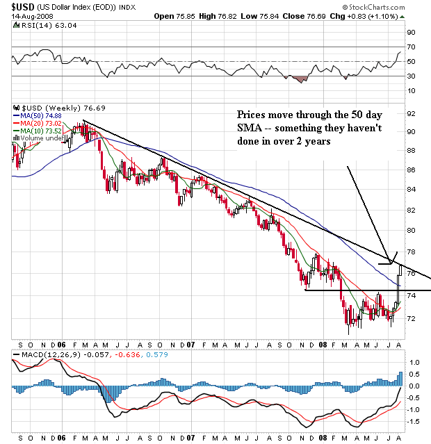
Notice the following:
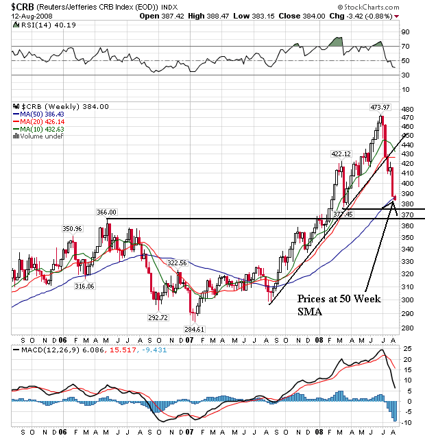
-- Prices broke above the 50 week SMA -- which they have not done for over 2 years. Also note the strength of the bar they printed on -- there was a huge rally last week which this week's action is pulling higher.
-- The 10 week SMA is now above the 20 week SMA
-- Prices are now above a low established at the end of 2007 providing more technical proof of a break-out rally.
-- Prices are right below the long-term downward sloping trend line that has provided upside resistance to the dollar for the last two and a half years.
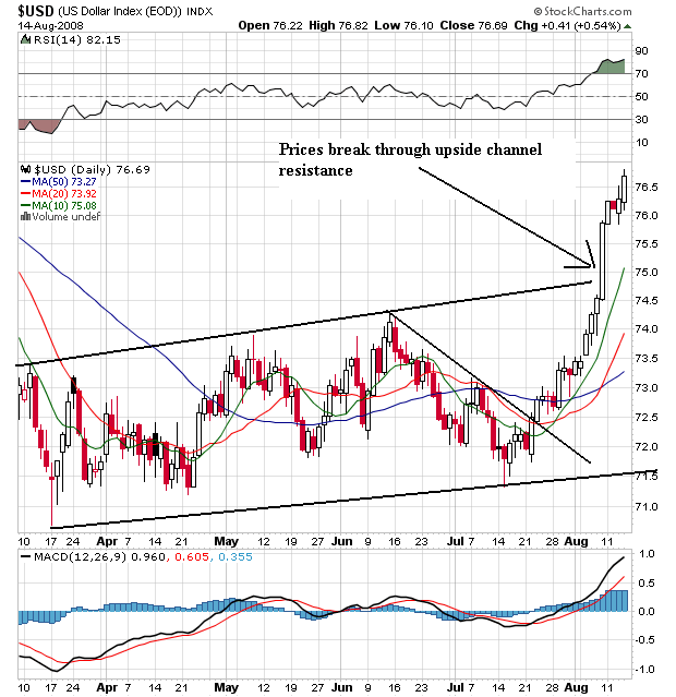
On the daily chart of the dollar, notice the following:
-- Prices have broken through the upside channel line established in March of this year.
-- The SMAs are breaking into a very bullish pattern, with
-- The shorter SMAs higher than the longer SMAs
-- All the SMAs moving higher
-- Prices above all the SMAs
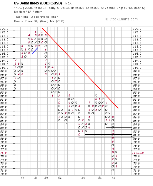
The P&F chart shows us there is tremendous upside resistance at various levels in the low 80s. So the next move for the dollar will be one of two things.
1.) Continue higher and attempt to break through the upside resistance in the lower 80s, or
2.) Move lower and test important technical support levels to confirm we're in a rally.
So -- why is the dollar rallying?
This is not so much of a dollar rally as it is a drop in the value of other currencies. Let me explain that statement.
There are two reasons why a person would purchase a currency.
1.) The interest rate differential. If interest rates are higher in one country than the other traders/investors will purchase interest yielding assets in the country with higher interest rates. This is not the case with the current situation. The US 10-year government bond is currently yielding 3.88% while the German 10-year is yielding 4.19%, the UK 10-year is yielding 4.58% and the Australian 10 year is yielding 5.85%.
2.) The economy is growing and is therefore good place to invest. This is also not the case with the US. The economy is in a recession, the housing market is still dying, the credit crunch ongoing and the consumer is pulling back from spending.
So -- the two primary fundamental reasons for an increase in the dollar aren't occurring. Then why is it rallying?
Well -- the dollar isn't rallying. Instead, other currencies are falling because there is fresh evidence the "decoupling" of the world economies isn't happening. Instead, the US slowdown is slowing down everyone else:
As a result, the euro is dropping:
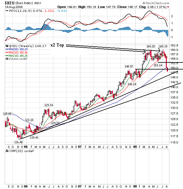
First, notice the euro is more or less the exact mirror image of the dollar's chart for the last few years. That's because the euro has been the primary beneficiary of the dropping dollar as investors have moved some of their holdings into euros. However, also notice the recent change in the euro's chart as prices formed a double top with the first top occurring at the beginning of 2Q 2008 and the second top occurring at the beginning of 3Q 2008. Also note that prices have moved below all the weeks SMAs -- a bearish orientation. Finally, notice that prices are now below the 50 week SMA -- the first time they have been in this position for the last two years.
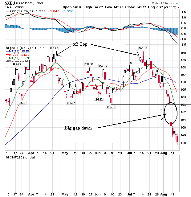
The daily chart of the euro shows important points in more detail.
-- The double top formation, and
-- A big downward move that started with a massive gap down.
-- The 10 and 20 day SMA are moving lower
-- The 10 and 20 day SMA have moved through the 50 day SMA
-- All the SMAs are moving lower
-- Prices are below all the SMAs
So -- we have a dropping euro that is benefiting the dollar. The euro is dropping because the EU zone is in a borderline recession right now -- as is the US. In other words, the overall pain is spreading.
Notice the following:
-- Prices broke above the 50 week SMA -- which they have not done for over 2 years. Also note the strength of the bar they printed on -- there was a huge rally last week which this week's action is pulling higher.
-- The 10 week SMA is now above the 20 week SMA
-- Prices are now above a low established at the end of 2007 providing more technical proof of a break-out rally.
-- Prices are right below the long-term downward sloping trend line that has provided upside resistance to the dollar for the last two and a half years.
On the daily chart of the dollar, notice the following:
-- Prices have broken through the upside channel line established in March of this year.
-- The SMAs are breaking into a very bullish pattern, with
-- The shorter SMAs higher than the longer SMAs
-- All the SMAs moving higher
-- Prices above all the SMAs
The P&F chart shows us there is tremendous upside resistance at various levels in the low 80s. So the next move for the dollar will be one of two things.
1.) Continue higher and attempt to break through the upside resistance in the lower 80s, or
2.) Move lower and test important technical support levels to confirm we're in a rally.
So -- why is the dollar rallying?
This is not so much of a dollar rally as it is a drop in the value of other currencies. Let me explain that statement.
There are two reasons why a person would purchase a currency.
1.) The interest rate differential. If interest rates are higher in one country than the other traders/investors will purchase interest yielding assets in the country with higher interest rates. This is not the case with the current situation. The US 10-year government bond is currently yielding 3.88% while the German 10-year is yielding 4.19%, the UK 10-year is yielding 4.58% and the Australian 10 year is yielding 5.85%.
2.) The economy is growing and is therefore good place to invest. This is also not the case with the US. The economy is in a recession, the housing market is still dying, the credit crunch ongoing and the consumer is pulling back from spending.
So -- the two primary fundamental reasons for an increase in the dollar aren't occurring. Then why is it rallying?
Well -- the dollar isn't rallying. Instead, other currencies are falling because there is fresh evidence the "decoupling" of the world economies isn't happening. Instead, the US slowdown is slowing down everyone else:
The global economy -- which had long remained resilient despite U.S. weakness -- is now slowing significantly, with Europe offering the latest evidence of trouble.
On Thursday, the European Union's statistics agency said gross domestic product in the euro zone contracted 0.2% in the second quarter, the equivalent of a 0.8% annual rate of decline. It marked the first time since the early 1990s that GDP has fallen overall in the 15 countries that use the euro.
.....
With the European growth report, four of the world's five biggest economies -- the U.S., the euro zone, Japan and the U.K. -- are now flirting with recession.
As a result, the euro is dropping:
First, notice the euro is more or less the exact mirror image of the dollar's chart for the last few years. That's because the euro has been the primary beneficiary of the dropping dollar as investors have moved some of their holdings into euros. However, also notice the recent change in the euro's chart as prices formed a double top with the first top occurring at the beginning of 2Q 2008 and the second top occurring at the beginning of 3Q 2008. Also note that prices have moved below all the weeks SMAs -- a bearish orientation. Finally, notice that prices are now below the 50 week SMA -- the first time they have been in this position for the last two years.
The daily chart of the euro shows important points in more detail.
-- The double top formation, and
-- A big downward move that started with a massive gap down.
-- The 10 and 20 day SMA are moving lower
-- The 10 and 20 day SMA have moved through the 50 day SMA
-- All the SMAs are moving lower
-- Prices are below all the SMAs
So -- we have a dropping euro that is benefiting the dollar. The euro is dropping because the EU zone is in a borderline recession right now -- as is the US. In other words, the overall pain is spreading.
Thursday, August 14, 2008
Today's Markets
Swamped at work today, so this will be a quick one. I'll be using the daily chart.
notice the following:
-- The uptrend that started in mid-July is still intact.
-- The 10 and 20 day SMA are still rising
-- The 10 day SMA is higher than the 20 day SMA
-- The 10 day SMA is approaching the 50 day SMA
-- Prices are still around the 50 day SMA level. That's a crucial hurdle for the market to overcome if it's going to move higher.
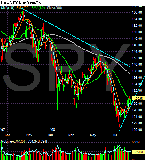
Just as a note, we're still in a bear market rally. Notice the clear lower low, lower high pattern the market is is right now. Prices would need to break through the downward sloping line connecting the tops of the prices. That's about 5% from current levels. In addition, to hit that level, prices would probably have to move through the 200 day SMA which has provided strong upside resistance thus far. In other words, breaking through the upside resistance looks pretty tough right now -- especially in a recessionary environment.
notice the following:
-- The uptrend that started in mid-July is still intact.
-- The 10 and 20 day SMA are still rising
-- The 10 day SMA is higher than the 20 day SMA
-- The 10 day SMA is approaching the 50 day SMA
-- Prices are still around the 50 day SMA level. That's a crucial hurdle for the market to overcome if it's going to move higher.
Just as a note, we're still in a bear market rally. Notice the clear lower low, lower high pattern the market is is right now. Prices would need to break through the downward sloping line connecting the tops of the prices. That's about 5% from current levels. In addition, to hit that level, prices would probably have to move through the 200 day SMA which has provided strong upside resistance thus far. In other words, breaking through the upside resistance looks pretty tough right now -- especially in a recessionary environment.
Will the Export Story Continue?
From Marketwatch:
Exports have been one of the few very bright spot in the US economy over the last few years. However, there are problems developing for that area of the US economy:
"Sharp reversals" in GDP indicate there are some strong fundamental changes going on -- none of them good.
Also note this news from Japan:
Note that prices played a huge deal for both areas. As oil drops the situation might change for the better. Also note that with the euro dropping, European exports could increase helping to ameliorate the negative impacts of slowing export growth (of course, that leads to the question of who would buy the goods? Do emerging markets still need European goods?).
Finally, if the US dollar continues to increase will that stifle the export story?
The U.S. trade deficit narrowed by 4.1% to $56.8 billion in June on record exports and a decline in non-oil imports, the Commerce Department estimated Tuesday.
.....
The balance of trade has been declining for nearly two years, the result of the dollar slipping in value against other global currencies as well as weaker demand at home.
Exports have been keeping the economy afloat, as consumer spending, business investment and housing investment have slumped. Indeed, net exports contributed more to GDP in the second-quarter than at any time in the past 28 years.
Exports have been one of the few very bright spot in the US economy over the last few years. However, there are problems developing for that area of the US economy:
The euro-zone economy shrank in the three months from April to June, its first quarter-to-quarter contraction since records began in early 1995.
After a surprisingly strong start to the year, the economies of the 15 countries that share the euro succumbed to the global credit crunch, high oil prices and a strong currency.
.....
Figures published Thursday by the European Union's statistics agency, Eurostat, showed euro-zone gross domestic product fell 0.2% from the first quarter, and rose 1.5% from a year earlier. That marked a sharp reversal of the 0.7% rate of growth recorded in the three months from January to March, but was stronger than expected. Economists surveyed by Dow Jones Newswires last week estimated that GDP shrank 0.3% on a quarter-to-quarter basis and grew 1.5% on an annualized basis.
"Sharp reversals" in GDP indicate there are some strong fundamental changes going on -- none of them good.
Also note this news from Japan:
Japan's economy shrank for the first time in a year in the April-June quarter, confirming fears that the world's second-largest economy has entered a slump at the same time as some other major countries.
Gross domestic product, the widest measure of economic activity, fell 0.6% from the previous quarter on a seasonally-adjusted basis, the government said early Wednesday. That translates to an annualized rate of decline of 2.4%, and it represents the first quarterly contraction in a year.
The decline was the largest in nearly seven years, coming as rising prices of energy, food and raw materials hit consumers and corporations. Many Japanese companies are suffering from higher costs of materials at the same time as their sales decline around the world, and they are responding by cutting production. Japan is particularly vulnerable to higher energy prices, as it relies nearly entirely on imported oil.
Note that prices played a huge deal for both areas. As oil drops the situation might change for the better. Also note that with the euro dropping, European exports could increase helping to ameliorate the negative impacts of slowing export growth (of course, that leads to the question of who would buy the goods? Do emerging markets still need European goods?).
Finally, if the US dollar continues to increase will that stifle the export story?
Retail Sales Close-Up
For reasons unknown the St. Louis Federal Reserve has yet to update their real retail sales graph. So I pilfered Calculated Risks:
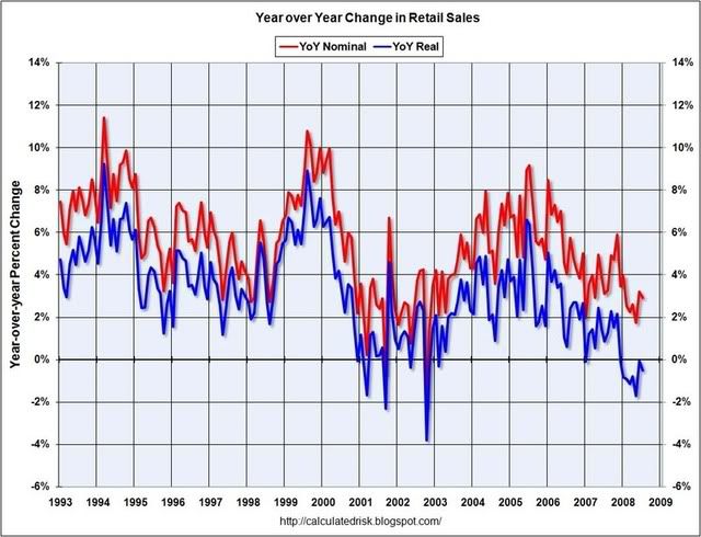
This chart is verified by the drop in personal consumption expenditures from the BEA's national income report:
Notice the following points:
-- Retail sales have been declining since the beginning of 2005 on a y/o/y basis.
-- Retail sales rate of y/o/y change has been negative for the entire year (that's 7 months). Remember that includes the stimulus checks. So even with free money, consumers aren't spending in strong enough patterns to raise retail sales into positive y/o/y territory. Let that sink in.
Let's add some possible reasons to the mix -- why aren't people buying more stuff?
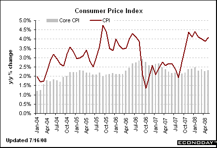
Inflation is eating a larger percentage of their paychecks:
And today we learned that:
It's important to add that with the CRB index dropping (along with oil's price) this number should be coming down over the next 3-6 months. However, that raises a second set of questions. At what point is the price decline enough to warrant consumers increasing their purchases? Note that CPI's increase has taken a bigger and bigger bite out of paychecks over the last 6-12 months. At what point is a price drop sufficient to warrant an increase in confidence? Have the dynamics of the CPI's impact changed to where the drop has to be more pronounced and prolonged to increase retail spending?
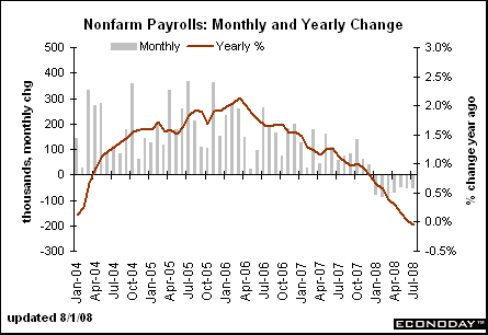
The jobs picture has been deteriorating for the last two and a half years (and that's before we start to critique the birth/death model's laughable impact on the employment report). When jobs become less plentiful, people lose confidence and start to pull in their spending. Not only has the employment picture been declining for some time, but

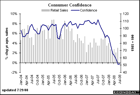
The unemployment rate has been increasing for the last year and a half. And the situation is deteriorating:
Also note there has been wealth destruction in the US over the last year. We've seen the stock market drop along with the housing market. Neither of these developments encourages confidence. In fact, all of these events are leading to a big drop in consumer confidence.
So -- let's assume the best going forward. Even if the CPI starts dropping in the next 3-6 months (which it will if the CRB continues to weaken or remains at current levels) we still have a deteriorating situation in
-- employment (leading to a decline in income),
-- the real estate market (leading to an overall decline in wealth), and
-- the stock market (leading to a decline in wealth).
None of the preceding three situations will positively impact consumer sentiment going forward.
Therefore, retail sales probably won't be doing that well over the next few months.
This chart is verified by the drop in personal consumption expenditures from the BEA's national income report:
Notice the following points:
-- Retail sales have been declining since the beginning of 2005 on a y/o/y basis.
-- Retail sales rate of y/o/y change has been negative for the entire year (that's 7 months). Remember that includes the stimulus checks. So even with free money, consumers aren't spending in strong enough patterns to raise retail sales into positive y/o/y territory. Let that sink in.
Let's add some possible reasons to the mix -- why aren't people buying more stuff?
Inflation is eating a larger percentage of their paychecks:
And today we learned that:
U.S. consumer prices climbed more than forecast in July, reducing the ability of the Federal Reserve to lower interest rates should the economic slowdown deepen.
The consumer price index climbed 0.8 percent, twice as much as anticipated, the Labor Department said today in Washington. The cost of living was up 5.6 percent in the year ended in July, the biggest jump in 17 years. So-called core prices, which exclude food and energy, also rose more than projected.
It's important to add that with the CRB index dropping (along with oil's price) this number should be coming down over the next 3-6 months. However, that raises a second set of questions. At what point is the price decline enough to warrant consumers increasing their purchases? Note that CPI's increase has taken a bigger and bigger bite out of paychecks over the last 6-12 months. At what point is a price drop sufficient to warrant an increase in confidence? Have the dynamics of the CPI's impact changed to where the drop has to be more pronounced and prolonged to increase retail spending?
The jobs picture has been deteriorating for the last two and a half years (and that's before we start to critique the birth/death model's laughable impact on the employment report). When jobs become less plentiful, people lose confidence and start to pull in their spending. Not only has the employment picture been declining for some time, but
The unemployment rate has been increasing for the last year and a half. And the situation is deteriorating:
More Americans than anticipated filed initial claims for jobless benefits last week, signaling further weakness in the labor market.
The number of first-time applications decreased by 10,000 to 450,000 in the week ended Aug. 9, from a revised 460,000 the prior week that was higher than previously estimated. The total number of people receiving benefits climbed to an almost five- year high.
Also note there has been wealth destruction in the US over the last year. We've seen the stock market drop along with the housing market. Neither of these developments encourages confidence. In fact, all of these events are leading to a big drop in consumer confidence.
So -- let's assume the best going forward. Even if the CPI starts dropping in the next 3-6 months (which it will if the CRB continues to weaken or remains at current levels) we still have a deteriorating situation in
-- employment (leading to a decline in income),
-- the real estate market (leading to an overall decline in wealth), and
-- the stock market (leading to a decline in wealth).
None of the preceding three situations will positively impact consumer sentiment going forward.
Therefore, retail sales probably won't be doing that well over the next few months.
Thursday Oil Market Round-Up
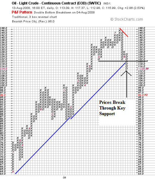
The P&F chart is very revealing. Looking carefully at the rally that led to the recent top in oil prices we see a clear pattern of rising bottoms and tops. Prices continually broke through key levels of upside resistance and then moved lower, consolidating gains.
Now look at the the last three columns. Notice we may be in a period where the market makes lower lows and lower highs -- a bear market pattern. Now, this is still very early in the correction so making bold predictions is pointless. However, it's also important to be aware what the chart may be saying in order to keep an eye out in future price movements.
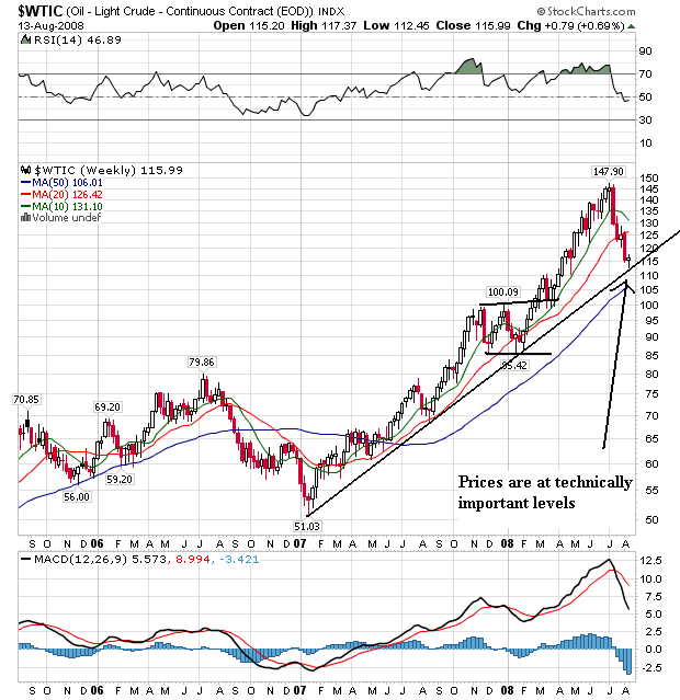
On the weekly chart, notice the following technical developments:
-- Prices have moved through the 10 and 20 week SMA
-- The 10 week SMA has turned negative. Because this is a weekly number it takes longer for trends to develop. Therefore, this number turning negative is a significant development
-- Prices are at a technically important level, bumping into the upward sloping trend line that started a year and a half ago
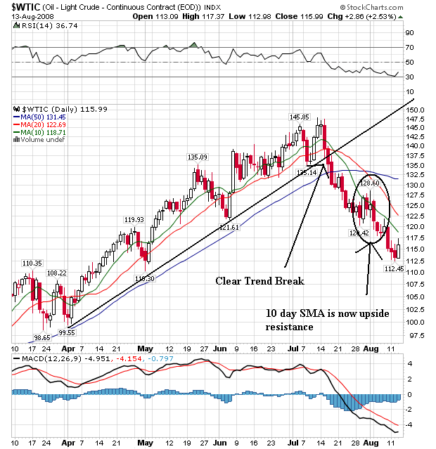
On the daily chart, notice the following:
-- Prices are below all the SMAs
-- All the SMAs are headed lower
-- The 10 and 20 day SMA have moved through the 50 week SMA
-- The 10 week SMA has provided upside resistance in the latest market sell-off.
The real question now is what is happening -- why are prices dropping like they are? It seems like a few weeks ago we were looking at record oil prices (and it was just a few weeks ago).
There are several reasons for the drop. The first is the realization that high prices are taking a bite out of demand. Note the following developments that have lowered demand:
"It looks like the high price has done its job in destroying demand," said Muhammad-Ali Zainy, senior energy economist at the Center for Global Energy Studies in London.
China reported Monday that its crude imports swooned 7% in July to a seven-month low. The Chinese government joined several other Asian nations in June, gently loosening federal subsidies to refiners and raising caps on retail gasoline prices.
Also consider this news from the US (hat tip: Calculated Risk):
Americans drove 4.7 percent less, or 12.2 billion miles fewer, in June 2008 than June 2007. The decline is most evident in rural travel, which has fallen by 4 percent – compared to the 1.2 percent decline in urban miles traveled – since the trend began last November.
Also consider this overall drop in US demand:
U.S. consumption fell by 800,000 barrels a day in the first half of '08 vs. the prior year, the largest drop in 26 years, the Energy Information Administration said Tuesday.
In addition, there has been an increase in overall supply:
The International Energy Agency said Tuesday that production rose nearly 900,000 barrels a day in July, bringing supply and demand, for the time being, into what appears to be a balance.
However, let's not forget the big picture (hat tip, the Big Picture):
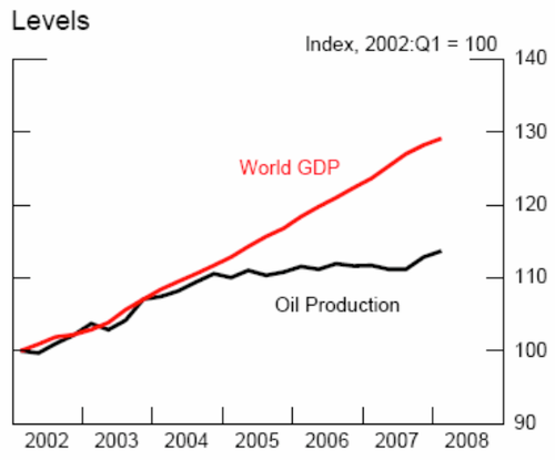
In other words, the overall supply/demand situation is still very much out of whack and will be for some time.
Wednesday, August 13, 2008
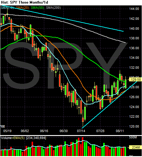
Today's Markets
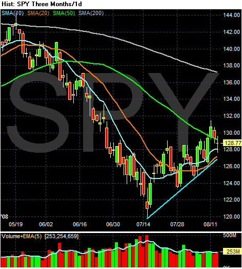
I'm going to use the daily chart today in order to clear out the noise of the day to day chart.
Notice the following:
-- Prices are still in the uptrend that started on July 15
-- The 10 and th 20 day SMA are moving higher
-- The 10 day SMA is higher than the 20 day SMA
-- Prices are running into resistance at the 50 day SMA. If they move over this level look for some upside running in the market.
However, this is still a bear market rally in action. Let's look at the longer term chart:
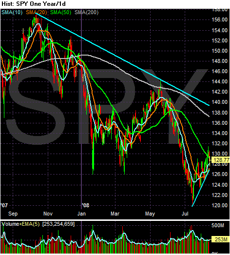
Notice we are in a clear pattern of lower lows and lower highs with the 200 day SMA providing upside resistance.
A Closer Look At the Latest Loan Officer Survey
The financial sector stands at the middle of the economy. They take individual savings and investment, pool it, and then make loans or underwrite security offerings for the business sector. This is why the "ex-financial" reporting is such crap. Because it stands at the center of the economy, the health and overall attitude of the financial sector to its business is vital to the economy's current and future prospects.
In addition, it's clear from a deeper analysis of the data that the US is in a recession which started at some time in the last quarter of 2007. (If you want to see some really great analysis regarding GDP, read this article from Chris Puplava). That being the case, the economy will need the financial sector to become more active in the loan market in order to get out of its current hole.
But that won't be happening anytime soon. First we've learned that total financial sector losses are now over $500 billion dollars:
Now the IMF's estimate of $1 trillion doesn't seem that far-fetched (it's not as though they are the only organization making that estimate. PIMCO recently made the same prediction).
And there's a good reason for that. The latest Quarterly Banking Profile from the FDIC was a wake-up call to anyone who cared to listen:
Looking at that paragraph we see phrases like "deteriorating asset quality...higher loss provisions...losses taking a larger percentage of revenue....lower return on assets...broad-based declines in profitability...phrases all investors want to see about a vitally important sector of the economy.
All of these events -- the increasing losses and writedowns -- have led to an overall credit tightening. When losses increase, loan's are harder to find. Hence the bearish news from the latest loan officer survey:
Strong majorities -- as in 60% are increasing the cost of loans to mid-level and higher borrowers. Credit is tightening in a bigger way for small firms as indicated by more banks tightening lending standards to there borrowers. In short, banks are making it harder for the big guys to get loans and more harder (if that's a phrase) for the smaller firms to get a loan.
Here's some more troubling news:
The speed of business is slowing down in a big way -- there is less need to finance investment and inventory. There are not good developments for the macro-economy.
And what about the future?
A majority will tighten C&I loans this year. That pretty much sinks a second half recovery right there. Combine that with a slowdown in investment and inventory building and you've got a recipe for some serious problems. And finally, we're learning the Europe and Japan are slowing down (Japan's economy contracted last quarter). That means exports -- a sole bright spot in the US economy - will probably start decreasing.
None of this is looking good.
In addition, it's clear from a deeper analysis of the data that the US is in a recession which started at some time in the last quarter of 2007. (If you want to see some really great analysis regarding GDP, read this article from Chris Puplava). That being the case, the economy will need the financial sector to become more active in the loan market in order to get out of its current hole.
But that won't be happening anytime soon. First we've learned that total financial sector losses are now over $500 billion dollars:
Banks' losses from the U.S. subprime crisis and the ensuing credit crunch crossed the $500 billion mark as writedowns spread to more asset types.
The writedowns and credit losses at more than 100 of the world's biggest banks and securities firms rose after UBS AG reported second-quarter earnings today, which included $6 billion of charges on subprime-related assets.
The International Monetary Fund in an April report estimated banks' losses at $510 billion, about half its forecast of $1 trillion for all companies. Predictions have crept up since then, with New York University economist Nouriel Roubini predicting losses to reach $2 trillion.
Now the IMF's estimate of $1 trillion doesn't seem that far-fetched (it's not as though they are the only organization making that estimate. PIMCO recently made the same prediction).
And there's a good reason for that. The latest Quarterly Banking Profile from the FDIC was a wake-up call to anyone who cared to listen:
Deteriorating asset quality concentrated in real estate loan portfolios continued to take a toll on the earnings performance of many insured institutions in first quarter 2008. Higher loss provisions were the primary reason that industry earnings for the quarter totaled only $19.3 billion, compared to $35.6 billion a year earlier. FDIC-insured commercial banks and savings institutions set aside $37.1 billion in loan-loss provisions during the quarter, more than four times the $9.2 billion set aside in first quarter 2007. Provisions absorbed 24 percent of the industry's net operating revenue (net interest income plus total noninterest income) in the quarter, compared to only 6 percent in the first quarter of 2007. The average return on assets (ROA) was 0.59 percent, falling from 1.20 percent in first quarter 2007. The first quarter's ROA is the second-lowest since fourth quarter 1991. The downward trend in profitability was relatively broad: slightly more than half of all insured institutions (50.4 percent) reported year-over-year declines in quarterly earnings. However, the brunt of the earnings decline was borne by larger institutions. Almost two out of every three institutions with more than $10 billion in assets (62.4 percent) reported lower net income in the first quarter, and four large institutions accounted for more than half of the $16.3-billion decline in industry net income.
Looking at that paragraph we see phrases like "deteriorating asset quality...higher loss provisions...losses taking a larger percentage of revenue....lower return on assets...broad-based declines in profitability...phrases all investors want to see about a vitally important sector of the economy.
All of these events -- the increasing losses and writedowns -- have led to an overall credit tightening. When losses increase, loan's are harder to find. Hence the bearish news from the latest loan officer survey:
About 60 percent of domestic banks—a slightly larger fraction than in the April survey—reported having tightened lending standards on commercial and industrial (C&I) loans to large and middle-market firms over the past three months. About 65 percent of those institutions—up notably from roughly 50 percent in the April survey—also indicated that they had tightened their lending standards on C&I loans to small firms over the same period. Significant majorities of domestic respondents indicated that they had tightened selected price terms on C&I loans to firms of all sizes: About 80 percent of banks—up from roughly 70 percent in the April survey—noted that they had increased spreads of loan rates over their cost of funds on C&I loans to large and middle-market firms, and about 70 percent of respondents—a somewhat higher fraction than in the April survey—reported having widened spreads on loans to small firms. In addition, considerable fractions of domestic respondents reported having boosted non-price-related lending terms on C&I loans to firms of all sizes over the survey period, and the fraction of banks that tightened such terms on loans to small firms increased significantly relative to the April survey.
Strong majorities -- as in 60% are increasing the cost of loans to mid-level and higher borrowers. Credit is tightening in a bigger way for small firms as indicated by more banks tightening lending standards to there borrowers. In short, banks are making it harder for the big guys to get loans and more harder (if that's a phrase) for the smaller firms to get a loan.
Here's some more troubling news:
Substantial majorities of domestic institutions that experienced weaker loan demand over the past three months cited a decrease in customers’ needs to finance investment in plant or equipment as well as firms’ decreased need to finance inventories. In addition, about 65 percent of domestic and 70 percent of foreign respondents pointed to a decrease in customers’ needs for merger and acquisition financing as a reason for the lower demand for C&I loans. Regarding future business, small domestic and foreign institutions, on balance, reported that inquiries from potential business borrowers were about unchanged during the survey period. In contrast, about 15 percent of large domestic banks, on net, reported an increase in the number of inquiries from potential business borrowers over the past three months.
The speed of business is slowing down in a big way -- there is less need to finance investment and inventory. There are not good developments for the macro-economy.
And what about the future?
Concerning loans to businesses, about 55 percent of domestic and 45 percent of foreign respondents indicated that they expected their banks to tighten credit standards on C&I loans in the second half of this year, and about 45 percent of domestic and 30 percent of foreign institutions, on net, anticipated tightening their lending standards on these loans in the first half of next year. Regarding commercial real estate loans, about 70 percent of domestic and 45 percent of foreign respondents believed that their institutions would tighten their lending standards on these loans in the second half of 2008, and roughly 50 percent of both domestic and foreign banks anticipated doing so in the first half of 2009.
A majority will tighten C&I loans this year. That pretty much sinks a second half recovery right there. Combine that with a slowdown in investment and inventory building and you've got a recipe for some serious problems. And finally, we're learning the Europe and Japan are slowing down (Japan's economy contracted last quarter). That means exports -- a sole bright spot in the US economy - will probably start decreasing.
None of this is looking good.
Wednesday Commodities Round-Up
First, let's start with a P&F chart as this type of chart shows pure price movement. This will give us an idea of where we really are without a bunch of noise.
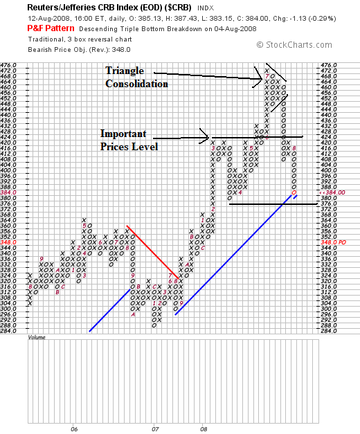
First, notice the pretty extreme volatility in this chart. Remember, prices have to move at least 12 points for a row of X's or O's to be added to this type of chart. At a price of 400 that means prices have to move at least 3%. Also notice the following:
-- 420 provided a great deal of resistance on the way up; prices ran up against this level three times before it broke through. On the way down, notice this level provided upside resistance in the row of x's just before the latest downward move of O's. Finally, prices had no problem moving through 420 on the way down, indicating strong downward momentum.
-- Prices consolidated gains in a triangle pattern at the top of the movement.
On the weekly chart, notice the following:
-- Prices have clearly broken the uptrend that started in mid-2007. That indicates the latest reversal is very strong and important -- breaking a long-standing trend is a very important technical development.
-- Prices are below the 10 and 20 week SMA which will pull these SMAs lower
-- Prices are standing right at the 50 day SMA -- a move below this level would be a very important development
-- The 10 day SMA is starting to turn negative. Because this is a weekly SMA it will take longer for the line to move in one direction or the other.
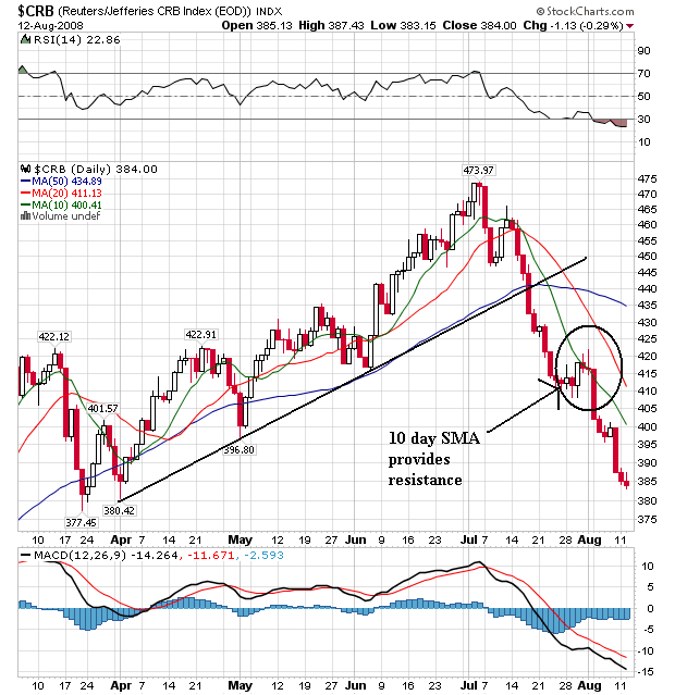
On the daily chart, notice the following:
-- Prices have broken the trend line started in March
-- Prices are below all the SMAs
-- The 10 and 20 day SMA have moved through the 50 day SMA
-- All the SMAs are now moving lower
There has been a fair amount of discussion about why this is happening -- why the sharp sell-off in commodities. Weren't these the hot areas of the market?
The real answer lies in the global slowdown that is going on. For example, from today's WSJ:
And Asia isn't the only one. Consider this story from July 2:
So we have one economy that is in a technical recession, and three other countries face problems related to a housing market correction. This picture was highlighted in the latest ECB interest rate decision where Trichet changed from inflation hawk to at least a neutral stance on rates:
The point of the preceding articles on Japan and the EU is this: demand is slowing down. Therefore, there is less need for commodities of all stripes. Traders are taking this confluence of events and dumping long positions
First, notice the pretty extreme volatility in this chart. Remember, prices have to move at least 12 points for a row of X's or O's to be added to this type of chart. At a price of 400 that means prices have to move at least 3%. Also notice the following:
-- 420 provided a great deal of resistance on the way up; prices ran up against this level three times before it broke through. On the way down, notice this level provided upside resistance in the row of x's just before the latest downward move of O's. Finally, prices had no problem moving through 420 on the way down, indicating strong downward momentum.
-- Prices consolidated gains in a triangle pattern at the top of the movement.
On the weekly chart, notice the following:
-- Prices have clearly broken the uptrend that started in mid-2007. That indicates the latest reversal is very strong and important -- breaking a long-standing trend is a very important technical development.
-- Prices are below the 10 and 20 week SMA which will pull these SMAs lower
-- Prices are standing right at the 50 day SMA -- a move below this level would be a very important development
-- The 10 day SMA is starting to turn negative. Because this is a weekly SMA it will take longer for the line to move in one direction or the other.
On the daily chart, notice the following:
-- Prices have broken the trend line started in March
-- Prices are below all the SMAs
-- The 10 and 20 day SMA have moved through the 50 day SMA
-- All the SMAs are now moving lower
There has been a fair amount of discussion about why this is happening -- why the sharp sell-off in commodities. Weren't these the hot areas of the market?
The real answer lies in the global slowdown that is going on. For example, from today's WSJ:
Japan's economy shrank for the first time in a year in the April-June quarter, confirming fears that the world's second-largest economy has entered a slump at the same time as some other major countries.
Gross domestic product, the widest measure of economic activity, fell 0.6% from the previous quarter on a seasonally-adjusted basis, the government said early Wednesday. That translates to an annualized rate of decline of 2.4%, and it represents the first quarterly contraction in a year.
The decline was the largest in nearly seven years, coming as rising prices of energy, food and raw materials hit consumers and corporations. Many Japanese companies are suffering from higher costs of materials at the same time as their sales decline around the world, and they are responding by cutting production. Japan is particularly vulnerable to higher energy prices, as it relies nearly entirely on imported oil.
And Asia isn't the only one. Consider this story from July 2:
European recession fears grew Tuesday as Denmark became the first European Union country to slip into a technical recession and a raft of weak data indicated others could soon follow.
The Purchasing Managers Index for the euro zone's manufacturing sector contracted in June for the first time in three years, dropping to 49.2 from 50.6 in May, research group Markit Economics said. A PMI reading above 50 signals an expansion in manufacturing, while a level below 50 indicates a contraction.
Europe's economies are currently facing a toxic combination of elevated inflationary pressures, higher oil prices, strong exchange rates, weakening global growth and tight credit conditions. Denmark, Spain, the United Kingdom and Ireland also face falling housing prices after a recent boom, trailing a trend set in the U.S. after a two-year lag.
So we have one economy that is in a technical recession, and three other countries face problems related to a housing market correction. This picture was highlighted in the latest ECB interest rate decision where Trichet changed from inflation hawk to at least a neutral stance on rates:
The dollar has bounced sharply higher against the euro in the wake of the European Central Bank head’s press conference, after the ECB elected to maintain its current 4.25% base rate for the eurozone. However, a few tweaks in the ECB’s statement, as well as acknowledgement by Mr. Trichet of weakness in the economy, have brought out the dollar bulls, who are selling the euro against the greenback.
The point of the preceding articles on Japan and the EU is this: demand is slowing down. Therefore, there is less need for commodities of all stripes. Traders are taking this confluence of events and dumping long positions
Tuesday, August 12, 2008
Today's Markets
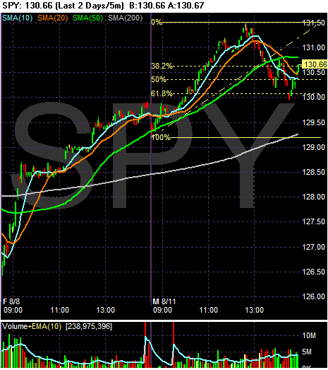
The market has been in a rally for the last week, so now's a good time to take a look at the longer minute charts to see what they look like.
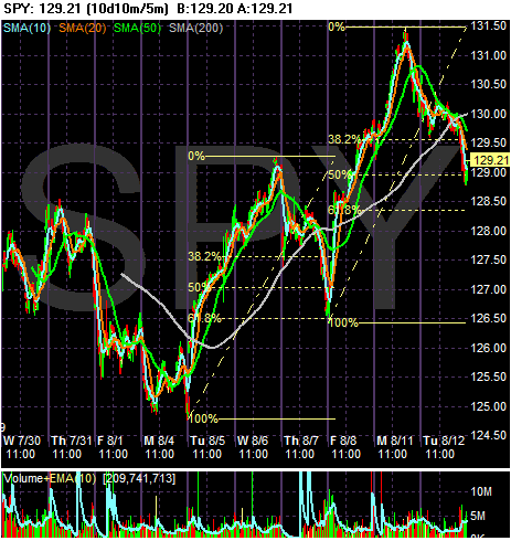
So far we've had two upswings followed by sell-offs. The first occurred from the beginning of last Tuesday to the beginning of last Friday. The second occurred from the beginning of last Friday to today's close. Notice the importance of Fibonacci patterns to these swings, as prices retreat to key Fibonacci levels.
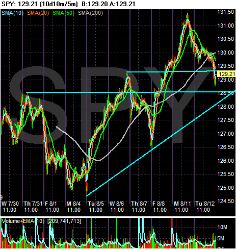
Notice the following with this chart:
-- The uptrend is firmly intact.
-- Prices have retreated below the 200 minute SMA and bounced back.
-- 128.50 is a key technical level.
So far we've had two upswings followed by sell-offs. The first occurred from the beginning of last Tuesday to the beginning of last Friday. The second occurred from the beginning of last Friday to today's close. Notice the importance of Fibonacci patterns to these swings, as prices retreat to key Fibonacci levels.
Notice the following with this chart:
-- The uptrend is firmly intact.
-- Prices have retreated below the 200 minute SMA and bounced back.
-- 128.50 is a key technical level.
Half a Trillion Dollars Later
From Bloomberg:
But the financials are bottoming -- I can just feel it! Let's plow some money into the XLFs!!!!!!!
Banks' losses from the U.S. subprime crisis and the ensuing credit crunch crossed the $500 billion mark as writedowns spread to more asset types.
The writedowns and credit losses at more than 100 of the world's biggest banks and securities firms exceeded $501 billion after UBS AG reported second-quarter earnings today, which included $6 billion of marks on subprime-related assets.
The International Monetary Fund in an April report estimated banks' losses at $510 billion, about half the total for all companies. Predictions have crept up since then, with New York University economist Nouriel Roubini forecasting losses to reach $2 trillion.
But the financials are bottoming -- I can just feel it! Let's plow some money into the XLFs!!!!!!!
Half a Trillion Dollars Later
From Bloomberg:
But the financials are bottoming -- I can just fell it! Let's plow some money into the XLFs!!!!!!!
Banks' losses from the U.S. subprime crisis and the ensuing credit crunch crossed the $500 billion mark as writedowns spread to more asset types.
The writedowns and credit losses at more than 100 of the world's biggest banks and securities firms exceeded $501 billion after UBS AG reported second-quarter earnings today, which included $6 billion of marks on subprime-related assets.
The International Monetary Fund in an April report estimated banks' losses at $510 billion, about half the total for all companies. Predictions have crept up since then, with New York University economist Nouriel Roubini forecasting losses to reach $2 trillion.
But the financials are bottoming -- I can just fell it! Let's plow some money into the XLFs!!!!!!!
Read This Now
Corey at Afraid to Trade is one of the best chart readers on the web. His analysis of the dollar's recent moves is very insightful and is a must read.
Housing is Nowhere Near a Bottom
From Bloomberg:
Let's think about that for a minute, shall we? 1/3 of the all the mortgages originated in the last five years in the US are larger than the value of the homes they are tied to. According to the Federal Reserve's Flow of Funds Report total mortgage debt outstanding in the first quarter of 2008 was $10.6 trillion and total mortgage debt outstanding in the 1Q 2003 was $6.222 trillion. So over the last 5 years we've see an increase of $4.3 trillion in mortgage debt. Let's assume that 25% of that is home equity, leaving us with $3.321 trillion in first lien mortgages. That means $1.086 trillion of mortgages are more expensive than the properties they are tied to. That's also roughly 10% of all mortgages in the US financial system.
Let's add to the analysis.
We've seen two straight years of increases in foreclosures and a doubling (as in times two) of the foreclosure rate from last year. That's a mammoth increase. Putting that together with the number of homeowners who are underwater we get a really scary picture.
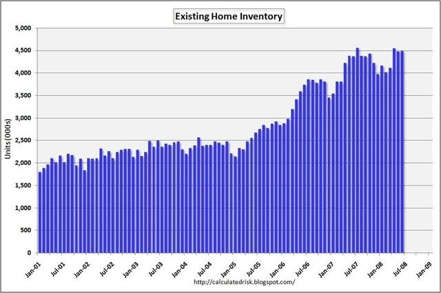
As those foreclosures increase we'll see an increase in existing homes for sale inventory (chart from Calculated Risk):
And who is going to buy these houses with Credit getting tighter -- at least according to the Federal Reserve's latest survey of lenders:
Let's also note the US families are massively indebted. Total household debt outstanding is now $13.9 trillion.
All of this activity -- homes underwater, increasing foreclosures, tightening credit -- is leading to an increasing rate of home price declines:
A lot of this is a chicken and egg situations -- are foreclosures leading to price declines, or are price declines leading to increasing foreclosures? At this point it doesn't matter. The bottom line is there are some serious problems in the housing market and there aren't any signs it is ending soon.
Almost one-third of U.S. homeowners who bought in the last five years now owe more on their mortgages than their properties are worth, according to Zillow.com, an Internet provider of home valuations.
Second-quarter home prices fell 9.9 percent from a year earlier, giving 29 percent of owners negative equity, said Zillow, the Seattle-based service that offers values for more than 80 million homes. For those who bought at the 2006 peak of the housing market, 45 percent are now underwater, Zillow said.
Let's think about that for a minute, shall we? 1/3 of the all the mortgages originated in the last five years in the US are larger than the value of the homes they are tied to. According to the Federal Reserve's Flow of Funds Report total mortgage debt outstanding in the first quarter of 2008 was $10.6 trillion and total mortgage debt outstanding in the 1Q 2003 was $6.222 trillion. So over the last 5 years we've see an increase of $4.3 trillion in mortgage debt. Let's assume that 25% of that is home equity, leaving us with $3.321 trillion in first lien mortgages. That means $1.086 trillion of mortgages are more expensive than the properties they are tied to. That's also roughly 10% of all mortgages in the US financial system.
Let's add to the analysis.
Home foreclosure filings rose 14 percent in the second quarter, the eighth consecutive quarterly climb, and more than doubled from the same period a year-earlier, real estate data firm RealtyTrac said on Friday.
Home foreclosure filings during the second quarter were reported on 739,714 U.S. properties, up 121 percent from a year earlier, RealtyTrac, an online market of foreclosure properties, said in a report.
The figure is a total of default notices, auction sale notices and bank repossessions between April and June.
We've seen two straight years of increases in foreclosures and a doubling (as in times two) of the foreclosure rate from last year. That's a mammoth increase. Putting that together with the number of homeowners who are underwater we get a really scary picture.
As those foreclosures increase we'll see an increase in existing homes for sale inventory (chart from Calculated Risk):
And who is going to buy these houses with Credit getting tighter -- at least according to the Federal Reserve's latest survey of lenders:
Large majorities of domestic respondents reported having tightened their lending standards on prime, nontraditional, and subprime residential mortgages over the previous three months. About 75 percent of domestic respondents—up from about 60 percent in the previous survey—indicated that they had tightened their lending standards on prime mortgages.2 Of the 32 respondents that originated nontraditional residential mortgage loans, about 85 percent—up from about 75 percent in the April survey—reported having tightened their lending standards on such loans.3 Finally, 6 of the 7 respondents that originated subprime mortgage loans—a somewhat higher proportion than in the April survey—indicated that they had tightened their lending standards on those loans over the past three months.4
Let's also note the US families are massively indebted. Total household debt outstanding is now $13.9 trillion.
All of this activity -- homes underwater, increasing foreclosures, tightening credit -- is leading to an increasing rate of home price declines:
Prices of U.S. single-family homes plunged at a record pace in May from a year earlier, with each of the 20 regions monitored showing annual declines for a second month, according to the Standard & Poor's/Case Shiller home price indexes reported on Tuesday.
A lot of this is a chicken and egg situations -- are foreclosures leading to price declines, or are price declines leading to increasing foreclosures? At this point it doesn't matter. The bottom line is there are some serious problems in the housing market and there aren't any signs it is ending soon.
Treasury Tuesdays
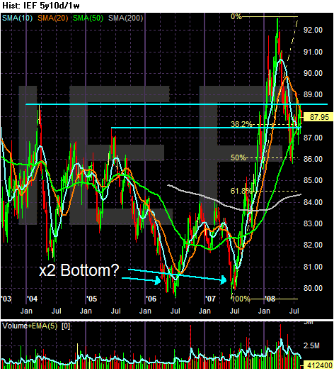
Let's start with the "super-long" view to get an idea about where we are in the big picture.
Prices meandered from 2003-2005 as money flowed into the stock markets. Traders had not reason to engage in a massive sell-off because inflation was under control. At the same time, there was no reason to rally because the economy was expanding. So sideways was the primary direction.
From mid-2005 to the beginning of 3Q 2006 the market sold-off big time, losing about 10%. Then the market rallied and sold-off again, bottoming at the beginning of 3Q 2007. This was the formation of a double bottom in the IEF chart. Starting in the 3Q of 2007 we get the credit crunch rally, as traders started to move into the government debt market in a big way. Hence the run-up from $80 - $92. Investors were looking for return of capital rather than return on capital. Since the topping of that rally (more on that in a minute) the market has sold-off, originally to the 50% Fibonacci level and now is working with the 38.2% level.
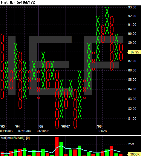
The P&F chart shows the market had a slightly downward moving bias from 2003 - 2007. Note this chart really shows the double bottom along with the strength of the credit crunch rally. Notice in the 2007-2008 rally that price moved higher and the sold-off by a few points, only to then move higher.
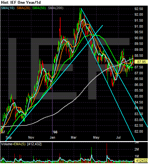
The year chart also clearly shows the credit crunch rally. Prices continually moved through previously established price levels and then sold-off to consolidated gains. Notice how prices used the 50 day SMA as support during this rally. Also note the timing of the sell-off -- the Fed's backstopping the Bear Stearns buyout. This event signaled the Fed was not going to let the market "self-correct" but instead the Fed was going to take an active role in the "correction". In other words, the bail-outs were beginning.
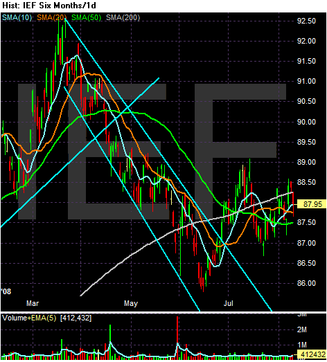
The 6 month shows the sell-off. Prices moved lower for three solid months, holding within a trend channel. Also note the shorter SMAs moved below the 50 day SMA in late April signaling a confirmation of the trend reversal. Also note that prices eventually dipped below the 200 day SMA which is typically bear market territory.
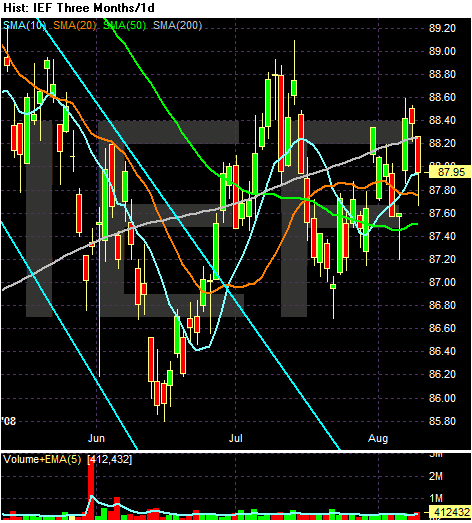
The three month chart is sending a very confusing message.
-- Prices are bunched around the 200 day SMA and have been for the last month or so.
-- The SMAs and prices are configured very tightly.
-- The 200 and 20 day SMA are moving higher whereas the 20 is moving a bit lower and the 50 is moving up a bit. In other words there is no clear signal about market direction at this point.
Monday, August 11, 2008
Today's Markets
The market opened a bit lower today, briefly falling through the 50 minute SMA. But it quickly recovered and moved through the 50, 20 and 10 minute SMA before 9 AM. Prices moved along the 10 minute SMA until about 9:30 when they started to moved higher. They continued to move up until a little before 1 PM, when they moved lower. Prices fell through the 10 and 20 minute SMA, and continued to move lower, falling through the 50 minute SMA. Prices staged a rebound but ran into resistance at the 20 minute SMA. Prices fell back and then rallied again, this time getting through the 10 minute SMA. Note how today's price action really highlighted the Fibonacci retracement levels in the market.
Hank Paulson Lies
From Bloomberg:
First, Paulson has continually made statements that his later actions directly contradicted. Before he asked for the line of credit for the GSE's he said they were in fine shape and there was nothing to worry about. According to him, the US has had a strong dollar policy for the duration of his tenure at Treasury. In other words, his credibility is a bit lacking in these matters.
Basically, the bail-out bill allows the Treasury to inject funds directly or provide a backstop for the GSE's stock:
Let's look at Freddie and Fannie's balance sheet.
Fannie has lost money for four straight quarters. Here is a link to the last three at Reuter's. They're not pretty. But here's the real problem. According to Reuter's, Fannie has total long term investments of $780 million. The real question is what are those investments really worth. Considering the degree of writedowns we've seen over the last year, I seriously doubt those are really worth that much. The question is how off are the official valuations on the balance sheet?
Freddie has the same problem. According to Reuter's, they had $672 billion in long term assets on their balance sheet at the end of last year. But again -- what are they really worth?
These institutions touch 70% of the mortgage market. In other words, they are vital to out economy -- now more than ever. But just how solid are their balance sheet statements? Considering the mammoth amount of writedowns we've seen so far, I seriously doubt their latest statements are accurate.
And therein lies the problem for Hank Paulson. My guess is he knows there are serious problems lurking under the hood which is why he asked for such massive bail-out provisions which literally amount to a blank check. And that's why his happy talk is patently absurd.
U.S. Treasury Secretary Henry Paulson said there are no plans to use his new authority to inject capital into mortgage companies Fannie Mae and Freddie Mac, which both posted worse-than-expected earnings last week.
``We have no plans to insert money into either of those two institutions,'' Paulson said in an interview with NBC's ``Meet the Press'' broadcast today from Beijing. He added that their earnings results were ``not a surprise.''
Paulson and Congress last month brokered a plan to bolster the two government-sponsored enterprises that includes giving Treasury the right to buy their shares. Fannie and Freddie, which account for almost half of the $12 trillion mortgage market, reported losses three times worse than estimated, prompting some analysts to predict that Paulson will have to act.
First, Paulson has continually made statements that his later actions directly contradicted. Before he asked for the line of credit for the GSE's he said they were in fine shape and there was nothing to worry about. According to him, the US has had a strong dollar policy for the duration of his tenure at Treasury. In other words, his credibility is a bit lacking in these matters.
Basically, the bail-out bill allows the Treasury to inject funds directly or provide a backstop for the GSE's stock:
First, as a liquidity backstop, the plan includes an 18-month temporary increase in Treasury's existing authority to make credit available for the GSEs. Given the difficulty in determining the appropriate size of the credit line we are not proposing a particular dollar amount. Flexibility is the best means of increasing market confidence in the GSEs, and also the best means of minimizing taxpayer risk.
Second, to ensure the GSEs have access to sufficient capital to continue to fulfill their mission, the plan gives Treasury an 18-month temporary authority to purchase – only if necessary – equity in either of the two GSEs.
Let's look at Freddie and Fannie's balance sheet.
Fannie has lost money for four straight quarters. Here is a link to the last three at Reuter's. They're not pretty. But here's the real problem. According to Reuter's, Fannie has total long term investments of $780 million. The real question is what are those investments really worth. Considering the degree of writedowns we've seen over the last year, I seriously doubt those are really worth that much. The question is how off are the official valuations on the balance sheet?
Freddie has the same problem. According to Reuter's, they had $672 billion in long term assets on their balance sheet at the end of last year. But again -- what are they really worth?
These institutions touch 70% of the mortgage market. In other words, they are vital to out economy -- now more than ever. But just how solid are their balance sheet statements? Considering the mammoth amount of writedowns we've seen so far, I seriously doubt their latest statements are accurate.
And therein lies the problem for Hank Paulson. My guess is he knows there are serious problems lurking under the hood which is why he asked for such massive bail-out provisions which literally amount to a blank check. And that's why his happy talk is patently absurd.
Yes It Is a Recession; No, It Won't End Soon
From the UK's Telegraph:
Looking at the numbers, Rosenberg is dead-on accurate.
Anyone who is currently arguing that we are not in a recession is simply proving how little they know about economics. The underlying facts and figures are clearly pointing otherwise.
There is one measure that the "there is no recession" (or as Barry Ritholtz calls them the Pervasive Pollyannas of Prosperity or PPP) crowd points to: we have not have two consecutive quarters of negative GDP growth. Therefore, we're not in a recession. The official organization that dates recessions (the NBER) answers that observation thusly:
In other words, using one statistic to describe a system as complex as the US economy is pointless. What we're really looking for is a fairly widespread decline in activity that lasts a fairly long time. To that end, the NEBR uses the following criteria
Why are these particular indicators important? Let's look at each one in detail.
1.) Personal income tells us if there is wage pressure in the economy. Wage pressure occurs at full employment which is a sign of an economic expansion. When unemployment is low, people can go to their boss and say, "I want a raise, and you'll give me one because you can't find a replacement for me that will work at a lower rate." A lack of wage pressure indicates there is slack in the labor market, which in turn tells us we're not at full employment, which in turn tells us things might not be that good.
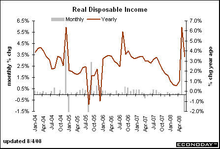
Transfer payments are the eco-geeks way of saying "government assistance." In other words, the stimulus checks that went out over the last few months don't count. All that being said, here is a chart from Econoday of personal income's year over year change:
But, remember -- that nice big jump doesn't count (The same thing happened a few years ago when Microsoft declared a special dividend). As Marketwatch noted:
In other words, without government help, incomes didn't increase at all thanks to the stimulus checks. That tells us there is no wage pressure, indicating we're nowhere near full employment.
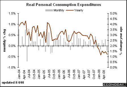
Now let's look at personal consumption expenditures (adjusted for inflation) to see how healthy consumers feel.

That charts tells us one thing. Consumers have not been feeling healthy about spending since the end of last summer. In fact, they have continually decreased their consumption expenditures over the last year. That is a very negative sign, especially for an economy that is dependent on consumer spending for 70% of its growth.
2.) Employment growth tells us if business is feeling healthy or not. If business sees blue skies on the horizon they add employees. If business sees storms, they "downsize" (or fire people).
To that end, business sees a lot of storms ahead.

The year over year rate of job growth has been dropping for the last two years. In addition:
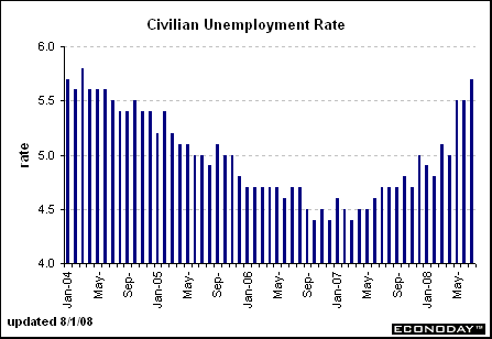
The unemployment rate has been increasing for a year and a half. That is definitely a very bad development.
But there are deeper issues in the employment report which are highlighted very nicely in a recent article by Chris Puplava. He writes at a website called Financial Sense.
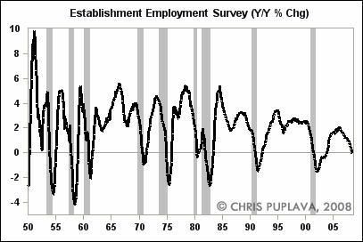
The chart above places the year over year change in employment in long-term perspective. The point is clear: every other time the year over year chart has been at current levels, the US economy has been in a recession.
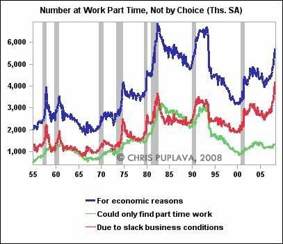
The chart above shows the number of people who have had their employment hours cut back involuntarily. In other words, the business where they work is decreasing the number of hours each person works. Again note that when this statistic was at similar levels in 1980 and 1990, the country was in a recession.
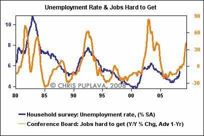
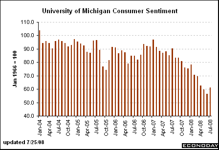
The chart above shows that the number of people who thing jobs are hard to get is increasing at a quick pace. That is helping to lower consumer sentiment and confidence, which in turn is lowering personal consumption expenditures.
So on the employment front we are clearly in a downtrend. Several important indicators are at levels usually seen during recessions.
3.) I explained the current situation regarding industrial production in this article. None of the indicators has changed sign I wrote that article. The short summation is this: national industrial production has been decreasing since the last quarter of 2007. Capacity utilization is decreasing, indicating we're using less of our manufacturing capability, and several regional indexes are showing contraction.
Regarding the manufacturing sector, there is a new development that is troubling. Exports have been one bright spot of the current economic situation. However, several regions of the world are now reporting a slowdown:
While some of these growth rates are still strong, they are weakening. In other words, the PPP's arguments about "decoupling" (meaning the US can slowdown and the rest of the world can continue to grow at high rates) is bunk. But the problems aren't just in Asia:
Europe is also slowing down.
So -- two regions of the world that have been important US exports are now seeing lower growth. This will slow the rate of growth in US export sales, which in turn will hurt overall US GDP growth.
Now -- I haven't even mentioned the continuing problems in the credit market or the continuing fallout from the housing market which is still nowhere near a bottom. Neither of these two areas of the economy are helping growth. In fact, both are adding to the problems.
So, according to the NBER's far broader measure of economic activity we have the following facts:
1.) Personal incomes adjusted for inflation and not including the transfer payments are decreasing
2.) The year over year percentage change in job growth has been decreasing for several years, every time the year over year number has been at current levels over the last 50 years the economy has been in a recession, the unemployment rate has been increasing for a year and a half, and the number of people who are involuntarily working fewer hours are increasing.
3.) Industrial production has been decreasing for the last 9 months, capacity utilization is decreasing and several regional manufacturing indicators are at recessionary levels.
4.) Two important export markets -- Asia and Europe -- are experiencing slower growth. This will negatively impact US exports which have been one of the only bright spots over the last year or so.
5.) We haven't even discussed the continual deterioration in the financial or housing sector.
The conclusion is clear: we're in a recession and have been for a bit.
The United States remains firmly in an economic recession in spite of economic growth figures to the contrary, a leading economist has warned.
Merrill Lynch’s David Rosenberg, the first economist from a major bank to declare a US recession was underway back in early January, argues that recent unemployment figures show yet more evidence that the US economy is a deep recession.
Pointing to last week’s news that employment has now declined for six months in a row, Mr Rosenberg, Merrill’s chief North American economist, says that “at no time in the past 50 years has this happened without the economy being in an official recession.”
.....
However he argues that this is only a matter of time, given that all four recession determinants “have peaked and rolled over.”
He points to widespread decline in economic activity, noting that real sales in manufacturing and retail, employment, industrial production, and real personal income – the four determinants – are all way below their peaks.
Looking at the numbers, Rosenberg is dead-on accurate.
Anyone who is currently arguing that we are not in a recession is simply proving how little they know about economics. The underlying facts and figures are clearly pointing otherwise.
There is one measure that the "there is no recession" (or as Barry Ritholtz calls them the Pervasive Pollyannas of Prosperity or PPP) crowd points to: we have not have two consecutive quarters of negative GDP growth. Therefore, we're not in a recession. The official organization that dates recessions (the NBER) answers that observation thusly:
A: Most of the recessions identified by our procedures do consist of two or more quarters of declining real GDP, but not all of them. Our procedure differs from the two-quarter rule in a number of ways. First, we consider the depth as well as the duration of the decline in economic activity. Recall that our definition includes the phrase, "a significant decline in economic activity." Second, we use a broader array of indicators than just real GDP. One reason for this is that the GDP data are subject to considerable revision. Third, we use monthly indicators to arrive at a monthly chronology.
In other words, using one statistic to describe a system as complex as the US economy is pointless. What we're really looking for is a fairly widespread decline in activity that lasts a fairly long time. To that end, the NEBR uses the following criteria
The committee places particular emphasis on two monthly measures of activity across the entire economy: (1) personal income less transfer payments, in real terms and (2) employment. In addition, we refer to two indicators with coverage primarily of manufacturing and goods: (3) industrial production and (4) the volume of sales of the manufacturing and wholesale-retail sectors adjusted for price changes.
Why are these particular indicators important? Let's look at each one in detail.
1.) Personal income tells us if there is wage pressure in the economy. Wage pressure occurs at full employment which is a sign of an economic expansion. When unemployment is low, people can go to their boss and say, "I want a raise, and you'll give me one because you can't find a replacement for me that will work at a lower rate." A lack of wage pressure indicates there is slack in the labor market, which in turn tells us we're not at full employment, which in turn tells us things might not be that good.
Transfer payments are the eco-geeks way of saying "government assistance." In other words, the stimulus checks that went out over the last few months don't count. All that being said, here is a chart from Econoday of personal income's year over year change:
But, remember -- that nice big jump doesn't count (The same thing happened a few years ago when Microsoft declared a special dividend). As Marketwatch noted:
Personal incomes rose 1.9% in May, the largest gain since September 2005, when insurance payments from hurricane damage flooded into bank accounts. The increase was close to the 1.5% gain expected by economists surveyed by MarketWatch.
Real disposable incomes (after taxes and adjusted for inflation) increased 5.3%, the biggest increase since 1975, when the government also sent out rebate checks.
Excluding the impact of the rebates and inflation, real disposable incomes were flat.
In other words, without government help, incomes didn't increase at all thanks to the stimulus checks. That tells us there is no wage pressure, indicating we're nowhere near full employment.
Now let's look at personal consumption expenditures (adjusted for inflation) to see how healthy consumers feel.
That charts tells us one thing. Consumers have not been feeling healthy about spending since the end of last summer. In fact, they have continually decreased their consumption expenditures over the last year. That is a very negative sign, especially for an economy that is dependent on consumer spending for 70% of its growth.
2.) Employment growth tells us if business is feeling healthy or not. If business sees blue skies on the horizon they add employees. If business sees storms, they "downsize" (or fire people).
To that end, business sees a lot of storms ahead.
The year over year rate of job growth has been dropping for the last two years. In addition:
The unemployment rate has been increasing for a year and a half. That is definitely a very bad development.
But there are deeper issues in the employment report which are highlighted very nicely in a recent article by Chris Puplava. He writes at a website called Financial Sense.
The chart above places the year over year change in employment in long-term perspective. The point is clear: every other time the year over year chart has been at current levels, the US economy has been in a recession.
The chart above shows the number of people who have had their employment hours cut back involuntarily. In other words, the business where they work is decreasing the number of hours each person works. Again note that when this statistic was at similar levels in 1980 and 1990, the country was in a recession.
The chart above shows that the number of people who thing jobs are hard to get is increasing at a quick pace. That is helping to lower consumer sentiment and confidence, which in turn is lowering personal consumption expenditures.
So on the employment front we are clearly in a downtrend. Several important indicators are at levels usually seen during recessions.
3.) I explained the current situation regarding industrial production in this article. None of the indicators has changed sign I wrote that article. The short summation is this: national industrial production has been decreasing since the last quarter of 2007. Capacity utilization is decreasing, indicating we're using less of our manufacturing capability, and several regional indexes are showing contraction.
Regarding the manufacturing sector, there is a new development that is troubling. Exports have been one bright spot of the current economic situation. However, several regions of the world are now reporting a slowdown:
Singapore cut its 2008 growth forecast for a second time this year, joining its Asian neighbors in signaling a deeper slowdown.
The island's economy will expand between 4 percent and 5 percent, from an earlier estimate of 4 percent to 6 percent, Prime Minister Lee Hsien Loong said yesterday. Growth was 7.7 percent in 2007.
.....
Governments from South Korea to Thailand have lowered their 2008 growth forecasts since the start of this year as the impact of the U.S. slowdown spreads and soaring oil and food prices hurt spending.
Japan's government this week said the world's second- biggest economy is ``weakening'' for the first time since 2001. Gross domestic product in Japan probably shrank an annualized 2.3 percent in the three months ended June 30, according to a Bloomberg News survey.
.....
In China, economic growth slowed for a fourth straight quarter in the three months to June 30, expanding 10.1 percent. Growth below 9 percent would be ``unacceptable'' for a government targeting 10 million new jobs a year, Credit Suisse Group said this month.
South Korea's finance ministry on Aug. 7 said growth in Asia's fourth-largest economy is easing as consumer spending slows and higher fuel costs stoke inflation. An expansion of 4.8 percent last quarter was the weakest annual pace since the start of 2007.
While some of these growth rates are still strong, they are weakening. In other words, the PPP's arguments about "decoupling" (meaning the US can slowdown and the rest of the world can continue to grow at high rates) is bunk. But the problems aren't just in Asia:
Europe's economy will grow 1.2 percent next year, with growth in Germany, the largest of the 15 nations that share the currency, slowing to 1 percent from 2 percent this year, according to the International Monetary Fund.
Italy's economy unexpectedly shrank in the second quarter, edging it closer to a fourth recession in a decade as households and businesses struggle to cope with more expensive oil.
The economy, the fourth-largest in Europe, contracted 0.3 percent after expanding 0.5 percent in the first quarter, the Rome-based statistics office Istat said yesterday. Economists expected stagnation, according to the median of 22 forecasts in a Bloomberg News survey. From the same period a year earlier, the economy didn't grow at all.
Europe is also slowing down.
So -- two regions of the world that have been important US exports are now seeing lower growth. This will slow the rate of growth in US export sales, which in turn will hurt overall US GDP growth.
Now -- I haven't even mentioned the continuing problems in the credit market or the continuing fallout from the housing market which is still nowhere near a bottom. Neither of these two areas of the economy are helping growth. In fact, both are adding to the problems.
So, according to the NBER's far broader measure of economic activity we have the following facts:
1.) Personal incomes adjusted for inflation and not including the transfer payments are decreasing
2.) The year over year percentage change in job growth has been decreasing for several years, every time the year over year number has been at current levels over the last 50 years the economy has been in a recession, the unemployment rate has been increasing for a year and a half, and the number of people who are involuntarily working fewer hours are increasing.
3.) Industrial production has been decreasing for the last 9 months, capacity utilization is decreasing and several regional manufacturing indicators are at recessionary levels.
4.) Two important export markets -- Asia and Europe -- are experiencing slower growth. This will negatively impact US exports which have been one of the only bright spots over the last year or so.
5.) We haven't even discussed the continual deterioration in the financial or housing sector.
The conclusion is clear: we're in a recession and have been for a bit.
Market Mondays
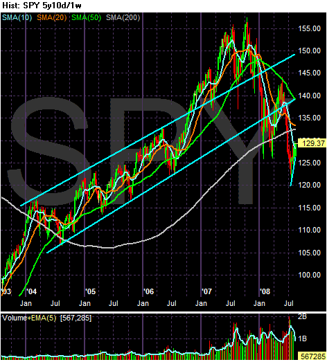
Let's start with a really long-term look at the market -- a 5 year look. This will give us an indication of where we are in the bull/bear cycle.
The market started to rally in 2004. It maintained an upward sloping channel until the beginning of 2007 when it broke through the upper trend line. The market used the upper trend line for technical support all during 2007. In addition, the market formed a double top in 2007, with the first top occurring at the beginning of the third quarter and the second top occurring at the beginning of the third quarter. This was also when we started to hear about problems in the financial sector (which started with news that Bear Stearns hedge funds were losing big sums of money). As a result, the market started to drop.
Since the market top in 2007, notice the following:
-- Prices have moved through upward sloping trend lines
-- Prices are now below the 200 week SMA
-- The 10 week SMA has crossed below the 200 week SMA
-- The 20 week SMA is about to cross over the 200 week SMA
-- With the exception of the 200 week SMA, the shorter SMAs are below the longer SMAs, and
-- All the SMAs are headed lower
In other words, the long term picture is bearish. The only good news on this chart is the 200 week SMA is positive.
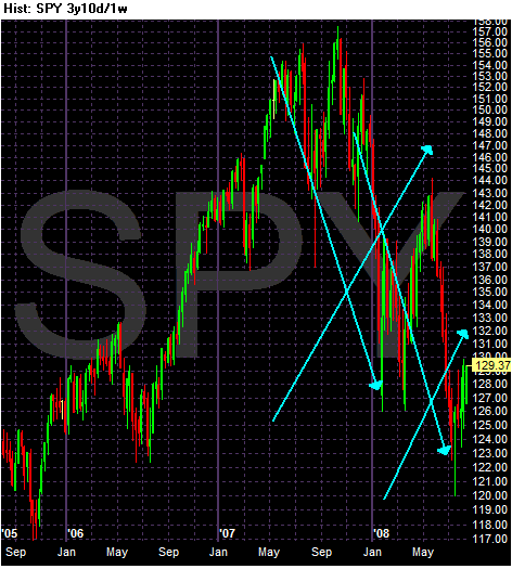
Above is a two year chart. I put this chart up without any indicators to clearly demonstrate the market is in a clear down up down trading pattern.
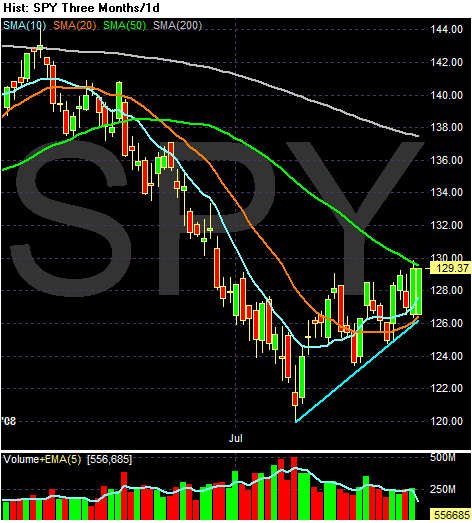
On the daily chart, notice the following:
-- Prices have been in an uptrend since early July
-- The 10 and 20 day SMA are both positive
-- Prices are clearly looking for move higher.
BUT
-- The 20 and 200 day SMA are heading lower, indicating the longer-term trend is down.
Placing all of these charts together we get the following picture emerging.
The long-term trend is down and has been for awhile. The market is in a clear lower low/lower high pattern.
The shorter term trend is for a rally, which means this is most likely a bear market rally.
Subscribe to:
Posts (Atom)