Saturday, August 15, 2020
Weekly Indicators for August 10 - 14 at Seeking Alpha
- by New Deal democrat
My Weekly Indicators post is up at Seeking Alpha. There was continued improvement across the time spectrum this week.
The underlying story remains the same: the economy “wants” to improve, but that is subject to the course of the pandemic and the continuing political decisions that are being made at both the federal and State levels, in particular the cessation of the $600 enhanced weekly unemployment benefit.
As usual, clicking over and reading will bring you up to the virtual moment on the economy, and reward me a little bit for the efforts I make.
Friday, August 14, 2020
Industrial production and retail sales both improve strongly in July, suggest further gains in employment
- by New Deal democrat
This morning two important indicators for July, with implications for future employment, were released: retail sales and industrial production.
Retail sales for July increased 0.8% on an unadjusted basis. After adjusting for inflation, they rose 0.7%. In the past two months they have completely recovered to higher than their pre-pandemic levels:
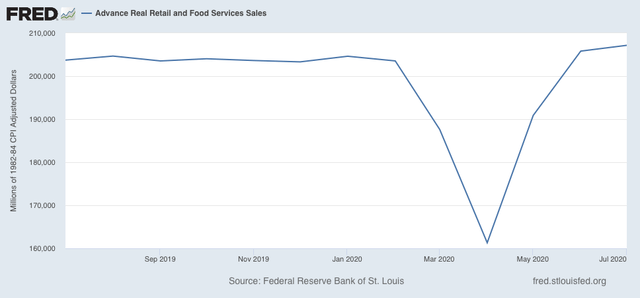
Since consumption is about 70% of the entire US economy, this constitutes good news.
Meanwhile, industrial production, the King of Coincident Indicators, also rose sharply, by 3.0%. Manufacturing production rose 3.4%. As a result, total production has recovered 50% of its lost ground to the pandemic, while manufacturing production has recovered 60%:
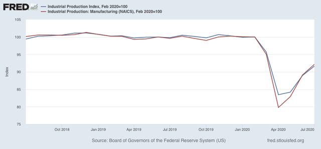
Note that production actually peaked in summer 2018, and was already on a slightly fading trajectory thereafter before the pandemic hit.
Thus, three of the four monthly coincident indicators (including employment) used by the NBER to determine if the US is in recession or not, all indicate that July marked the 3rd month of a recovery. Note they do *not* forecast whether the recovery will last - they are nowcasting tools only.
As noted above, both retail sales and industrial production do have implications for future employment.
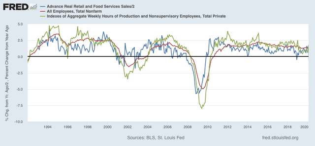
Going back over half a century, consumption leads employment. More specifically, real retail sales (blue in the graphs below) tend to lead employment (red) by 3 to 6 months. They are an even better fit for aggregate hours worked (green) 3 to 6 months in the future.
Here is the past 25+ years through February:
And here is this year through July:
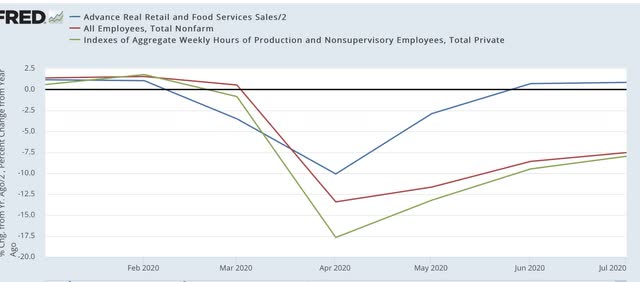
The recovery in sales suggests that total hours of employment and the number of jobs will both continue to increase in the next few months.
Meanwhile, since the early 1980s manufacturing production (red in the graph below) has generally led employment in manufacturing (gold). Here’s the last 13 years:
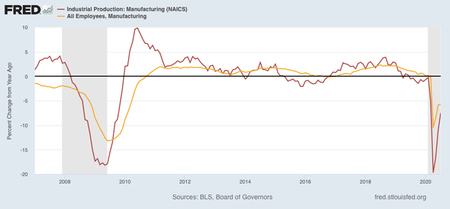
The increase in manufacturing suggests that manufacturing employment, itself a leading indicator for total employment, will pick up steam in the next few months.
The huge monkey wrench in the works, of course, is the termination of Congress’s supplemental unemployment assistance. I am expecting a sharp slowdown in sales as a result beginning this month, with all of the negative consequences that typically follow.
Thursday, August 13, 2020
Initial and continuing claims: the most “less awful” so far
- by New Deal democrat
This morning’s initial and continued jobless claims continue the trend of “less awful” numbers that resumed last week.
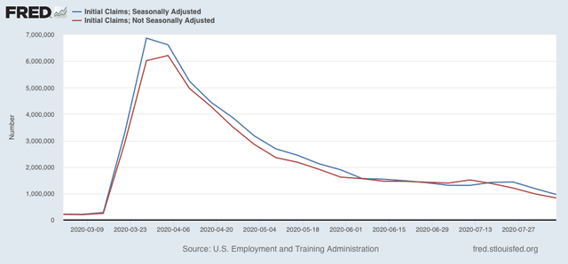
New jobless claims, which fell to under 1,000,000 for the first time on an un-adjusted basis last week, declined about 150,000 further to 831,856 (red in the graph below), and on an adjusted basis (blue) declined to 963,000, the first time since the pandemic that number was also under 1 million:
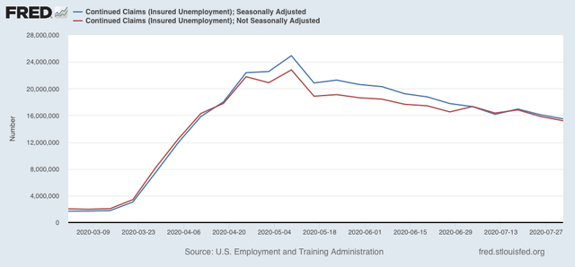
Continuing claims, on both an un-adjusted (red), and seasonally adjusted (blue) basis, also made new pandemic lows under 16 million, at roughly 15.2 million and 15.5 million respectively:
All of these remain at far worse levels than even at their worst during the Great Recession, as shown below in the seasonally adjusted numbers (initial claims, dark blue; continuing claims, light blue):
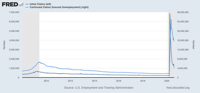
On both an adjusted basis, initial claims peaked at roughly 650,000 during the Great Recession, while their non-adjusted peak came during January, when there is typically a big spike, at roughly 950,000. Continuing claims peaked at roughly 6.5 million on both an adjusted and unadjusted basis, so claims now are roughly 2.5 times that peak.
This is progress, so it’s “good” news, and a positive short leading indicator for the economy, but of course, as I have said many times over the past few months, on an absolute basis it is really just “less awful.”
Wednesday, August 12, 2020
July inflation consistent with early recovery; no compelling evidence of wage deflation
- by New Deal democrat
This morning July consumer prices were reported to have increased 0.6% for the second month in a row (as did core inflation, ex-food and energy):
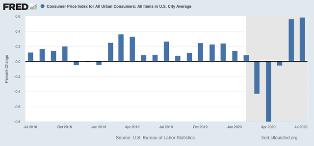
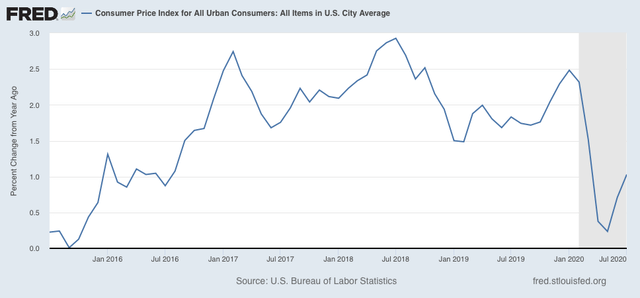
As a result, YoY inflation has increased to 1.0%:
The widespread price increases are signs of increased demand, which in these circumstances is a good thing. In the past, deflationary recessions, most notably the “great contraction” of 1929-32, ended when the YoY change in producer and consumer prices bottomed out. In this recession they did so in April, so this adds to the evidence that *technically* a recovery has been in progress thereafter (even though in absolute terms things remain awful. They are simply “less awful” than before).
Because I have been looking for signs of wage deflation, let’s put this morning’s inflation data into the mix.
Because I have been looking for signs of wage deflation, let’s put this morning’s inflation data into the mix.
As of July, consumer prices have come back to only -0.1% below where they were in February just before the recession hit (blue in the graph below). Meanwhile, nominal average wages for nonsupervisory workers, after rising 4.8% in two months, are back to 2.8% above where they were in February (red):
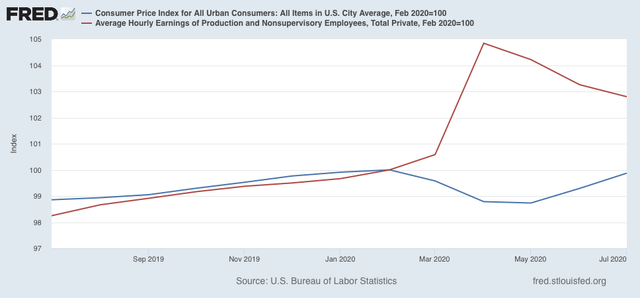
Remember that *average* wages increased, because the vast majority of workers laid off during the lockdowns were in low-wage jobs. Relatively speaking, the remaining workforce therefore consisted of higher-paid workers.
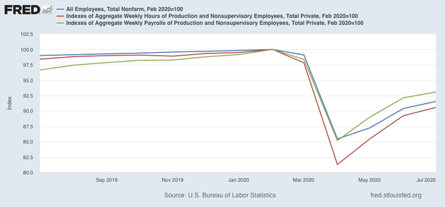
Typically in recoveries hours are added before jobs. That has been the case since April. Aggregate hours (red in the graph below) have rebounded by slightly more than 50% from their February through April losses, while jobs (blue) have only made back 42% of their decline. As a result, aggregate payrolls (green) have increased faster than jobs:
In short, the inflation and jobs picture are what we would typically expect as a recovery is starting out. Although there were lots of anecdotes about pay cuts early in the pandemic, so far it is not showing up in any compelling way in the data (which is definitely a *good* thing).
Whether the recovery will continue, of course, is completely contingent on the future course of the pandemic.
Tuesday, August 11, 2020
Coronavirus dashboard for August 10: some good news to balance the bad
- by New Deal democrat
Total US cases: 5,060,880
Average last 7 days: 52,393/day
Total US deaths: 154,947
Average last 7 days: 1,045/day
Source: COVID Tracking Project
Let’s take a look at some good news as well as continued bad news today.
Let’s take a look at some good news as well as continued bad news today.
First, the bad news. Here are the top 10 States for coronavirus infections:

And here are the top 10 States for deaths:
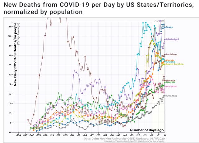
Note that with the exception of Nevada and Idaho, all of the top 10 States in both categories are from the Confederacy. About the best that can be said is that for most of them, cases and deaths may be leveling off. I can’t help but think that the racial demographics of who is getting seriously ill and dying plays a role in why these States are so recalcitrant.
But there is some good news as well.
First, Arizona, which a month ago was turning into the poster child for renewed out of control exponential spread, has seen a drop of about 70% in new cases, and about 33% in deaths:
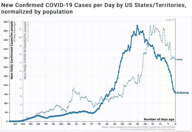
Not only did the State’s citizens react individually to curtail activities, but the governor issued a limited mask mandate, and allowed cities to issue more stringent ones, which the State’s major cities all did. Masks + social distancing work! Hoocoodanode!?!
Second, Texas, whole governor also issued a mask mandate several weeks ago, also has seen a 1/3 decline in new cases, and a leveling off in deaths:
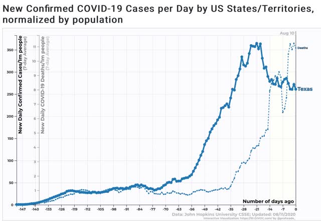
It’s too soon to declare this a success story, but signs are encouraging.
In short, even in the most culturally recalcitrant States, surging deaths eventually cause action to be taken. Will they keep up the progress, or once again rush to lift all restrictions and undo this preliminary success? We’ll have to wait and see.
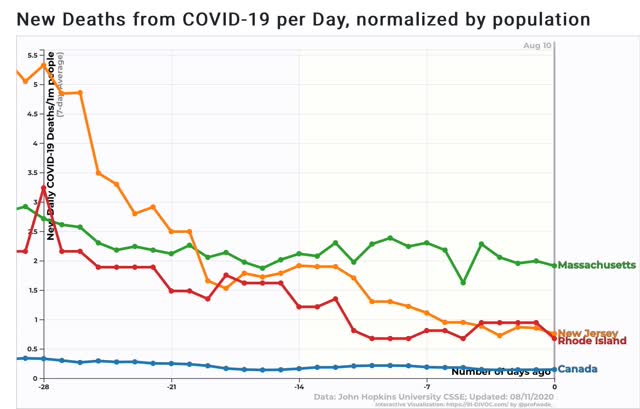
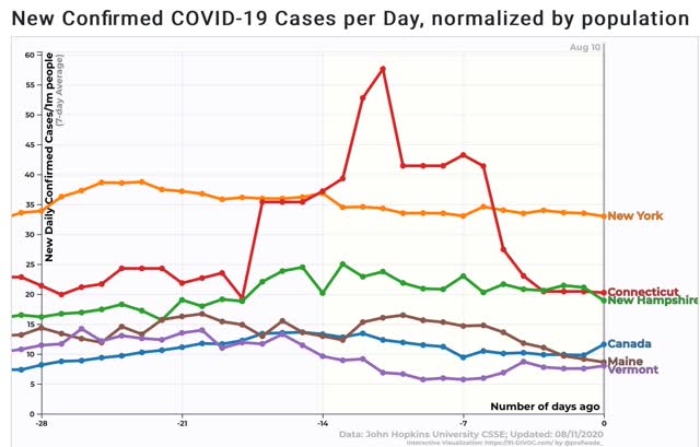
Next, let’s turn to the Northeast, the biggest success story in the US. In the below graphs, I’ll compare all of the States with next-door neighbor Canada.
Within that region, Massachusetts, Rhode Island, and New Jersey still have not brought their new case count down close to Canada, and in fact cases are increasing again:
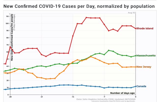
Deaths have leveled off at multiple the rate of Canada’s:
But northern New England, Connecticut, and New York are true success stories, with new infection rates either equivalent to, or 2 to 3.5 times that of Canada:
Deaths are also equivalent to, or up to 3 times that of Canada’s:
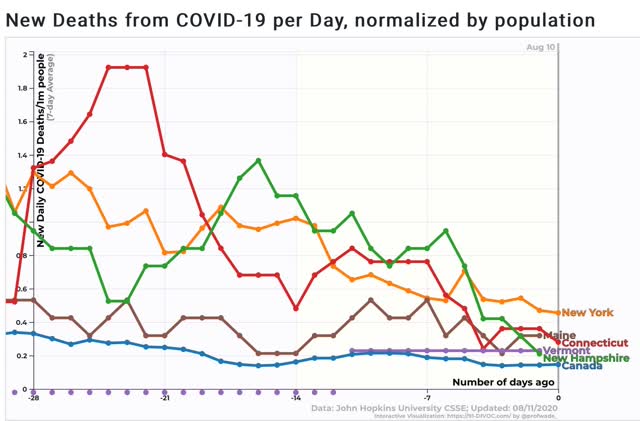
Governors of these 5 States ought to be lobbying Canada and the EU to allow travel restrictions to those countries for their residents.
Subscribe to:
Posts (Atom)