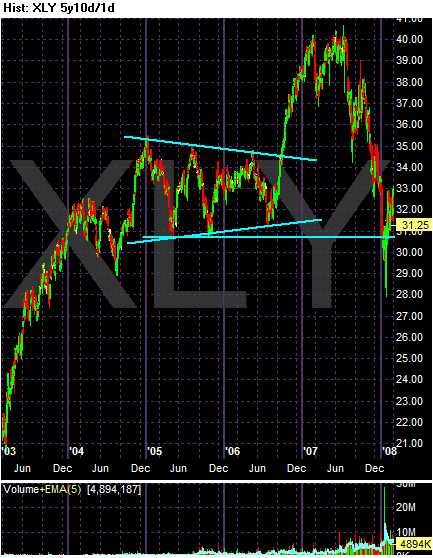
The XLYs rose from 2003-2004 then consolidated for 2005-2006. They went higher in 2007 forming a double top in the first half of the year and have since fallen to 2005-2006 levels on higher volume,

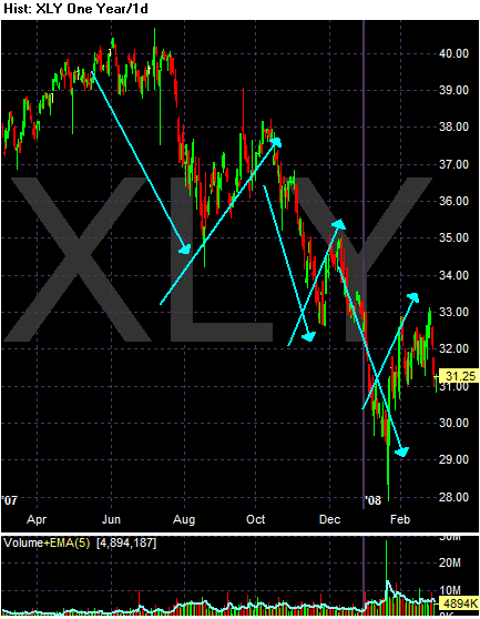
The chart for the last year shows a clear pattern of lower lows and lower highs -- a classic bearish chart.

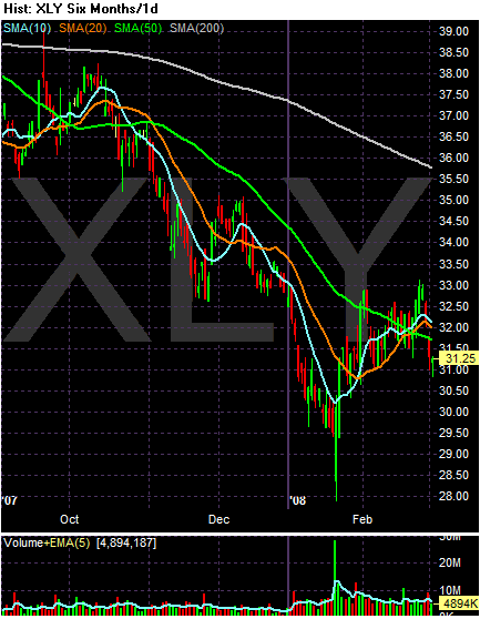
The SMA picture is interesting. This is similar to a lot of charts we're seeing right now.
-- The 50 and 200 day SMAs are heading lower, while
-- The short SMAs (10 and 20 SMAs) are headed higher.
-- Prices are below the 200 day SMA
-- Prices have recently broken below the moving averages. If this continues, the SMA s -- all of them -- will continue to move lower.