Friday, October 2, 2009

Weekend ... Pitbull


It's that time of the week again. And again -- here is Max (yes we named him). He is really sweet. He rolls over on his belly for scratches and licks faces. And he is still looking for a home or foster. So if you are interested, please leave a post in the comments.

See you on Monday.

More On the Unemployment Numbers

Let's take a deeper look into the data to see what's there. Click for a larger image.


The number of people unemployed less than 5 weeks is still decreasing.


The number of people unemployed for 5-14 weeks decreased a bit but is still high. My guess here is that we'll see this number in the above range as people who are unemployed for less than 5 weeks don't find work.


The number unemployed 15 weeks and longer edged up.


The median weeks on unemployment increased but is still below the high of the cycle.

What I find interesting is the short end of the unemployment cycle -- people unemployed for less than 5 weeks -- continues to drop and has been dropping since the beginning of the year.

Payrolls Drop 263,000; Unemployment Increases to 9.8%

From the BLS:

Nonfarm payroll employment continued to decline in September (-263,000), and the unemployment rate (9.8 percent) continued to trend up, the U.S. Bureau of Labor Statistics reported today. The largest job losses were in construction, manufacturing, retail trade, and government.


I had thought that we could continue to see a decline in the number of job losses. However, that obviously did not happen.

CBS Marketwatch summed the report up:

Details of the report were almost universally dismal, with the number of unemployed people rising by 214,000 to 15.1 million. Of those, 5.4 million have been out of work longer than six months, accounting for a record 35.6% of the jobless. The employment participation rate fell to 65.2%.

An alternative gauge of unemployment, which includes discouraged workers and those forced to work part-time, rose to 17% from 16.8%.

Total hours worked in the economy fell by 0.5%. The average workweek fell back to an all-time low of 33 hours. Average hourly earnings rose just 1 cent, or 0.1%, to $18.67. Average hourly earnings are up 2.5% in the past year.

Let's look at a few points from within the report:


Click for a larger image.

The overall trend in the rate of job losses from the beginning of this year is still lower. Also note we had the same situation in June when losses spiked only to move lower the next month.

Secondly,


The rate of job losses in three job categories is near 0. Oddly, the government lost 53,000 workers. That number seems a bit odd during the middle of a stimulus program.

All that being said, this is a clear step in the wrong direction. Considering the rate of job losses at the beginning of the year (600,000+/month) expecting an immaculate recovery is highly unrealistic. However, the bleeding has to stop at some point. So by the end of this year we have to be far lower than today's number for a recovery to be viable. Consumers cannot continue to hear news like this and expect to have a positive attitude about the economy. It's that simple.

Markets Are In Sell-Off Posture

Usually I do a "Forex Friday" here. However, there are important technical developments in the markets.

Consider the following charts:


A.) The DIAs have moved through one key support line and are approaching another. This has occurred on high volume.


A.) The IWMs have moved through one key trend line and are approaching another on high volume.


A.) The QQQQ have moved through key support on high volume. In addition, the QQQQs were one of the primary reasons for the rally over the last 3-6 months.


A.) Prices of the transports have sold-off through two key trend lines on high volume.


A.) On both the bond charts notice that prices have moved about key resistance lines on strong volume. This indicates that money is looking for more safety right now.

Thursday, October 1, 2009

Today's Markets


Click for a larger image

A.) Prices gapped lower at the open

B.) Prices tried to rally but ran into resistance at the 10 minute EMA

C.) Prices again tried to rally but ran into resistance at the 20 minute EMA

D.) Prices again tried to rally but they couldn't move beyond the 50 minute EMA.

E.) Prices moved lower at the end of the day on high volume


Click for a larger image

A.) Prices have moved through two trend lines and EMAs on high volume.

Let's do some basic math. Prices topped out at around 108. A 10% correction would take prices down to roughly 97.20. Here is a chart that shows important technical levels on the way down:

Challenger Job Cut Survey Drops


From Marketwatch:

Major U.S. corporations announced the fewest number of layoffs during September than at any time since March 2008, in a "sign of further job-market stabilization," according to a monthly tally compiled by outplacement firm Challenger Gray & Christmas.

Planned layoffs fell to 66,404 last month, down 13% compared with August and down 50% compared with September 2008.

For the third quarter, planned job reductions as tracked by Challenger Gray totaled 240,233, the fewest since the first quarter of 2008.

ISM Manufacturing, employment indexes stall in September

- by New Deal democrat

Previously I have that in the 1992 and 2002 recoveries, the ISM manufacturing index never rose above 53.6, in contrast to earlier recoveries where it quickly rose above 55 or even 60, and prepared a graph showing that an ISM reading of 53 or above strongly correlates with the economy adding jobs. Below that number the economy tends to shed jobs. In the graph, below, the low point for payrolls in each of the last 3 recessions (shown in red, green, and orange, respectively) is normed to 100. A reading of 103, for example, means 3 percent growth in payrolls from that low point. The ISM index is normed so that it crosses the 100 threshold at a reading of 53:


As of August, the index had surged to 52.9. September’s reading of 52.6 suggests that, unfortunately, just like the last two “jobless recoveries”, the index may again stall out at this level.

I have also noted that the employment sub-index compares the percentage of employers planning to hire, lay off, or keep current staffing levels in the next month. A reading above 50 indicates net hiring, and visa versa for a reading below 50. Two items of data in this index stand out very clearly as harbingers of or absolutely coincident with employment growth. First, whenever the hiring vs. firing index is -5 or higher (i.e., no more than 5% more employers plan to fire than hire) and rising, where other evidence indicates a recession is ending, that has always indicated net employment growth was imminent, at least on a temproary basis.Secondly, whenever current staffing intentions were 65+. and hiring plans were 15+, that has always coincided with positive jobs numbers in the BLS survey, including during and after the "jobless recoveries" of 1992 and 2002.

September’s employment index of the ISM deteriorated slightly from August’s. 15% of employers planned to hire, but only 62% held steady, and the net rating was -8.

Putting this together with the September jobless claims data, it appears that, while overall there may have been fewer jobs lost in September, that improvement was probably confined to the service sector of the economy. We’ll obviously find out much more tomorrow.

On the bright side, vendor deliveries slowed, meaning the Leading Indicator part of the ISM index improved.

A Closer Look At Personal Consumption Expenditures

Let's take a look at the latest Personal Income/Consumption Report from the BEA.

Here is a link to the report.

First, let's note some important percentages. By far, services comprise the largest segment of PCEs, representing 65.56% of total expenditures. Non-durable goods make up the second largest percentage at 21.90% and durable goods make up 12.54%. In other words, the cash for clunkers (C4C) impacted the smallest percentage of PCEs.

Here are the charts of the data:


Total real service expenditures have been increasing for the last three months. However, mind the scale of the right.


Spending on non-durables (goods that last less than three years) has been decreasing since March, but saw a big increase last month. There were two big events last month -- C4C and back to school shopping.


Real spending on durable goods was already increasing. C4C helped to spike the spending but it was already increasing at a slow rate.

What does this tell us?

1.) Note that on the chart of spending on services it appears that spending bottomed out in the earlier part of this year. As this is the largest percentage of PCEs this bottoming is a good development.

2.) Non-durables are still a wild-card.

3.) Real durables purchases were already increasing before the C4C and appear to have bottomed out as tell. The real question will be what happens over the next several months to this number.

M&A Activity Heating Up

If memory serves, the first big move was Disney buying Marvel. Aside from the obvious humor of Bambi now owning the Hulk, this deal makes a great deal of sense. Disney is a teen marketing powerhouse. Marvel now gives them a bigger reach in that market. Then there was Kraft going after Schepees - another decent move. We've started to see some in the drugs industry, and now we've learned of another merger this time in the tech field:

Cisco Systems on Thursday said it struck a $3 billion deal to buy Norway's Tandberg to bolster its position in video conferencing, though there's doubt in the market that the deal will be completed on these terms.

The bottom line is M&A activity has been increasing. This is a good sign for several reasons. The first is it indicates that companies are feeling a bit more secure about the future. When companies are nervous about the future they hoard cash. In addition, mergers take time to close and consolidate. This is better done when the economy is stagnant or growing rather than contracting.

Today the WSJ has an article titled M&A is Back! Well, Sort Of where they note that the number of deals is declining and is lower from year ago levels. However, they also note the following:


But unlike in recent quarters, deal makers seem more willing to declare that M&A activity is back. The standard banker line that "deals are in the pipeline" is becoming more common.

"I think we hit a bottom over the summer. Since about the third week of August, we noticed a pickup in activity," said Bruce Evans, head of M&A for the Americas at Deutsche Bank AG. "A lot is driven by companies having a view of the future....It is no longer just about fixing their balance sheets."

Kraft Foods Inc.'s proposal to acquire Cadbury PLC was the largest announced deal of the period, though Cadbury rejected the $16.66 billion bid and it is likely to be weeks before Kraft submits a formal offer. Other big deals included Abbott Laboratories' $7.05 billion purchase of a Belgian pharmaceutical business, Dell Inc.'s $3.88 billion acquisition of Perot Systems Corp. and Walt Disney Co.'s $3.92 billion deal to buy Marvel Entertainment Inc.

"With general sentiment improving, together with equity and financing markets, companies are pushing forward with deals they've been thinking about all year but were reluctant to proceed with until now," said Adrian Mee, head of European M&A at Nomura Holdings Inc. in London.


I think this is more of a perception/sentiment issue. There have simply been some larger far more public deals over the last few months compared to a year ago. And that is a good thing.

New Jobless Claims: 4 week average falls below 550,000

- by New Deal democrat

Initial jobless claims rose last week to 551,000. At September's end, the 4 week moving average was 548,000. This is the lowest average of the year, since January.

While it looks like the retail sales effect on unemployment claims of "cash for clunkers" is ebbing, of more interest is that this is the very first time that the 4 week average is more than 16% less than the April 4 peak of 658,750.

It is my hypothesis that when this average stays below the 16% level for 2-3 months, preferably falling to the 20% level for about a month (under 530,000), that will mark the point where the economy actually starts to add jobs.

Thursday Oil Market Round-Up


A.) Prices have broken the upward sloping trend line that started in March.


Click for a larger image. Ignore the last bar.

A.) Prices gapped down lower when they broke the trend.

B.) Prices then continued lower printed long bars on higher volume. This indicates the sell-off was strong; people were obviously had plans to get out of the oil market.

C.) As a result of the downward price action the EMAs are not more bearishly aligned. The shorter EMAs are below the longer EMAs. The 50 day EMA is getting pulled lower.

D.) Yesterday prices rebounded strongly on high volume.

Wednesday, September 30, 2009

Random Musings

Are Parents Keeping Their Own Kids Out of the Workforce?

I have been exploring various methods of examining how our demographics are factoring into our economy. I think such an examination is all the more meaningful given the fact that boomers have seen such a dramatic decline in their net worth at a time they saw retirement on the horizon. The implications are, of course, vast, and many may stay in the workforce much longer than they’d ever expected.

Among the possible consequences of a workforce that pushes back retirement is the effect it has on new labor market entrants (e.g. it’s harder for them to find a job). I did some work on this over at Blah3.com, and present another analysis of it here.

I decided to look at the ratio of Employed 55+ to Employed 25-54. These two cohorts make up the vast majority of workers – only those 16 – 24 are omitted, and I did that deliberately to focus on those who are (presumably) more career-minded (or at least I’d hope).

The front end of the boomers – born in 1946 – started hitting the workforce in about 1971, and continued to do so until the last of them – born 1964 – entered in 1989. What we see couldn’t be more clear: As the boomers entered the workforce, they drove the ratio of 55+/25-54 ever lower, until it bottomed out in the early-to-mid 90s. As that same front end of the boomer generation hit 55 – in 2001 – that trend started to reverse, and has been going up as successive years of boomers hit 55 and stay in the workforce. There is no telling how much higher this ratio might go, or if it will hit a new high, but that would certainly not surprise me.

The irony of it is this: We spend a fortune to put our kids through school, only to now have to keep our own jobs longer and effectively freeze them out of the work force. (Click through for larger images.)

For some fascinating further reading on demographic trends and the movement of boomers through the system, see here (.pdf).
Some Thoughts on Today’s GDP Release

Taking a look at today’s final Q2 GDP release, some items stood out:

PCE as a contributor to GDP has been down in four of the last six quarters. This is unprecedented. I’d further note that Q2 of 2008 – which got goosed by the Bush stimulus to nowhere – printed as a +0.06 contribution. Without that stimulus, there’s no doubt at all that PCE would be a negative contributor in five of six quarters.

We’ve not seen anything like this in the history of BEA’s records:


Further, the six-quarter average contribution of PCE to GDP is now at a record low –0.86:
Exports and government spending carried the day today. Period.

Today's Markets


A.) The market sold-off on strong volume at the beginning of the day. Note the long bards and the high volume.

B.) After rising for most of the day, prices again broke lower on higher volume.

C.) Prices found support at the 61.8% Fibonacci level and rose into the end of trading.


A.) Prices are edging as close as possible to the upward sloping trend line. Friday's jobs report is looming large at this point.

Are Gas Prices Heading Lower?

Click for a larger image


A.) Prices have broken the upward sloping trend line

B.) There is strong resistance in the upper 35/lower 36 area.


Let's look at the sell-off in more detail

A.) Prices gap down. This is a bearish development as it indicates a big change in the supply and demand picture favoring the bears.

B.). Prices print a strong downward bar, a gap, and then a second downard moving bar. This is a big development. There is also strong volume on these down days.

C.) The 10 day EMA is moving lower and has moved through the 200 day EMA. The 20 and 50 day EMA are also moving lower.

Fed Governor Plosser On the Economic Outlook

From a recent speech:

Although many forecasters now expect growth to improve, they also expect the unemployment rate to rise to near 10 percent at the end of this year or the beginning of 2010. Actual numbers are trending in that direction. The unemployment rate climbed to 9.7 percent in August, even though nonfarm payroll jobs had the smallest decline so far this year.

I too anticipate that the unemployment rate will continue to creep up for a little while longer. We will continue to hear about this as a concern in news reports in coming months. Yet, we know that the unemployment rate is a lagging indicator. We will see the unemployment rate come down only well after the economy begins to recover.


Unemployment is a lagging indicator? Who knew!

Seriousl, let's place the employment picture in a very necessary context. At the beginning of this year we were printing job losses in the 600,000/month range. An economy as large as the US and one that experienced that amount of pain is not going to turn around it's employment picture overnight. Consider the following chart of job losses from the latest employment report:


For four months we experienced job losses over 600,000. That means the following 9-12 months are pretty much dead issues from a growth perspective. To expect otherwise -- that is, to expect unemployment to drop or hold steady -- is just plain stupid. What that means is we need to put policies in place that deal humanely with an increasing unemployment picture.

A key element of the improving outlook is the better news from the housing market. Housing sales and starts have generally shown improvement over the past six months, and even house prices appear to have bottomed out this summer.


See this post from yesterday.

The outlook for consumer spending is a mixed bag. The good news is that while the "cash for clunkers" effect on auto sales appeared to be significant, measures of consumer spending that exclude automobiles and gasoline have stabilized and the prospects have improved somewhat. Nonetheless, there are reasons to remain cautious in one's outlook: employment remains weak and housing values, while showing some signs of life, remain well below their pre-crisis levels. On the other hand, increases in equity values have helped restore some strength to household balance sheets.


This remains the big issue for the outlook. As Invictus has written, there are strong reasons to be incredibly concerned about the prospect for consumer spending. However, I am more optimistic about the outlook. Only time will tell who is right.

Wednesday Commodities Round-Up

Interesting developments in the copper market.

Click on all images for a larger image


A.) Prices are just below the long-term upward sloping trend line. Now, prices have not make a solid break through the trend line -- we don't have a strong downward moving candle. Instead we have prices consolidating just below the trend line. That could mean that instead of a break in the trend line we are seeing a new point to connect the low points; we need more data before we can make a final determination.

B.) There are three things we ultimately look for in technical analysis: reversals, continuations of current trends and divergences between technical indicators and price action. Point B looks like a rounding top pattern.

C.) Notice the MACD has been declining for two months. This tells us that momentum is decreasing.


A.) This shows us a better image of the trend break. Notice that prices have formed a very weak trend break -- the candles are very weak.

B.) Prices have run into a great deal of resistance in the 40.50 - 41 range.

C.) The 10 day EMA is moving lower and has crossed below the 20 day EMA. The 20 day EMA is moving lower as well. This tells us the short and intermediate trends are bearish.

Tuesday, September 29, 2009

Today's Markets


The primary point of this chart is to show that for the last two days prices have been trading in a narrow range (roughly 50 cents with the exception of this morning's price action).


The purpose of this chart is to show that sometimes the analysis is far from clear. Note that on the top we have lives A and B. While line A is a longer duration and therefore more important, it doesn't connect the other points from later in the day. Line B connects the more recent points but is not as important as line A because line B is shorter in duration.

The same issues apply to the bottom lines. I personally like line C because it connects a large number of points. Using this line we could see that prices already moved through lower support and are holding on to the 200 minute EMA.

Putting this all together we see that prices have been consolidating for the last two days and are looking for a direction to move.

A Note on the Housing Market


Click for a larger image.

The existing home sales market is by far the largest of the housing markets. Notice that over the last roughly 2 years the pace of sales has stabilized between (roughly) a 5.25 million and 5.75 million annual pace. That is what a bottom looks like.


New home sales appear to have bottomed at the end of this year and are now increasing.

The increase we've seen in both of these numbers will likely drop over the next few months; home buying typically increases up to the end of the summer when before the start of the school year.

There has been a lot of internet chatter about the shadow inventory: these are homes that are in the process of being foreclosed on but have not yet been sold. In other words -- there are a slow of homes out there ready to hit the market to create another set of problems.

The WSJ did an analysis of this problem. Here is their conclusion:


As of July, mortgage companies hadn't begun the foreclosure process on 1.2 million loans that were at least 90 days past due, according to estimates prepared for The Wall Street Journal by LPS Applied Analytics, which collects and analyzes mortgage data. An additional 1.5 million seriously delinquent loans were somewhere in the foreclosure process, though the lender hadn't yet acquired the property. The figures don't include home-equity loans and other second mortgages

Moreover, there were 217,000 loans in July where the borrower hadn't made a payment in at least a year but the lender hadn't begun the foreclosure process. In other words, 17% of home mortgages that are at least 12 months overdue aren't in foreclosure, up from 8% a year earlier.

Some borrowers may be able to catch up on their payments or receive a loan modification that helps them keep their home. There has also been an increase in short-sales, transactions in which at-risk borrowers sell their homes for less than the loan amount, with the lender's approval. In some cases, lenders have decided not to foreclose because the home's value is so low. These factors could mean fewer foreclosures.

Foreclosed homes are partly responsible for the recent increase in home sales. But foreclosures also push down home values. According to Collateral Analytics, a housing research firm, homes that have been foreclosed on typically sell at a 10% to 50% discount.

.....

But the number of foreclosures is expected to increase in the fourth quarter as mortgage-servicing companies determine who is eligible for a loan modification and who isn't. "We are going to see a spike from now to the end of the year in foreclosures as we take people out of the running" for a loan modification or other alternatives, says a Bank of America Corp. spokeswoman. Foreclosure sales had dropped to "abnormally low" levels in response to government efforts to stem foreclosures, she adds.


The recent Case Shiller indicates that prices are increasing on a month to month basis


And decreasing at a lesser rate on a year over year basis:


My guess is the following will happen. Prices will be under pressure for some time. However, prices have also moved to a level where prices are very affordable and where they are attractive investment purchases. In other words, the sales pace will at worst remain stable.

Getting it wrong about the CS-CPI

- by New Deal democrat

One of the most interesting alternate measures of the economy was first posted a couple of years ago by Tim Iacono of The Mess that Greenspan Made. The CS-CPI is the consumer price index, with the Case Schiller house price index substituted for owner's equivalent rent. In that manner it captures the impact of price changes in the biggest asset most consumers will ever buy, on the inflation rate.

I have mentioned several times how research into the Roaring Twenties and Great Depression showed that it was when the year-over-year rate of inflation (really, deflation) bottomed and started back up, that the economy started to recover. I correctly suspected that the same scenario would play out this summer.

But I always suspected that the "real" bottom in the economy might be when the CS-CPI bottomed, meaning that the deflationary pressure on all things bought or sold by average Americans, including houses, was beginning to ease. I hadn't read any updates about the CS-CPI since February, but a post within the last week by Mish, claiming that the CS-CPI was at an all-time low, caused me to take another look.

Well, it turns out that Mish simply reprinted the very same graph, and the very same text, he had used back in February -- and it makes a big difference.

I have calculated the CS-CPI for January of this year (cited by Mish) and compared it with the CS-CPI now (calculating OER as 25% of total CPI, and once obtaining the value for the remaining 75%, re-doing the calculation using the Case-Schiller index, just updated this morning). It turns out the CS-CPI bottomed earlier this year. In January the CS-CPI was (-10.1%). Now it stands at (-5.3%).

In summary, the deflationary pressures on average American families are decreasing. And Mish's latest post is simply wrong.

China Turns Inward For Growth

From the WSJ:

Chinese businesspeople like Mr. Tseng are adapting to what they believe will be a lasting consequence of America's deep recession. Savings by suddenly frugal U.S. households soared to an annualized $566 billion in the second quarter, more than quadruple the rate at the start of 2008. While that is important to rebuilding U.S. financial health, it is also sucking demand out of the world economy. China's exports, after growing for years at a steady 20%-plus rate, recorded a year-over-year drop last November. They kept falling, and in August were down 23% from a year earlier.

Spending by Chinese consumers, meanwhile, is holding up pretty well, partly because of heavy stimulus spending by a government flush with cash. Urban household spending in China was up 9.2% in the first half of 2009, not far off the country's average overall growth in recent years.

This shifting dynamic shows how the global economic turmoil is pushing China, the world's second-largest exporter after Germany, to become a more inward-focused economy. Even once world growth gets back on track, China is likely to run into limits on how much more it can expand its export market share, economists say. The World Bank expects that slower export gains in the future will shave about two percentage points off China's historical growth rate of 10%.

With the recession, Chinese exporters have been taught the dangers of a narrow business model. "The lesson we learned from the financial crisis is not to put all your eggs in one basket. We relied too much on the U.S. market," says Mr. Tseng, a 42-year-old native of Taiwan. "If we had started domestic sales earlier, our business wouldn't have declined so much this year."

Chinese domestic demand isn't a panacea for exporters. For one thing, domestic demand itself can suffer to some extent when exports decline, because the jobs of so many Chinese are linked to export industries. In addition, China's consumers simply don't have the money to drive the global economy in the same way as big-spending New Yorkers and Parisians.


This had been a wild card in the recovery game -- China becoming a demand center for consumer goods. The logic is simple: the country has experienced on of the largest growth spurts of any economy in some time. Some of that money has translated into higher living standards and an incredibly high savings rate. But as people see their incomes increase, they want more things. This is called the wealth effect and its a natural by-product of a growing economy.

There is no formula for how much of the growth will translate into increased consumer spending. That makes this idea a wild card for the next world expansion. But don't be surprised to the Chinese consumer taking on a larger role as the world economy recovers.

Treasury Tuesdays


Notice there are two upward sloping trendlines that connect the lows on the long term chart. Also note that prices have held above that support even though prices have sold-off.


A.) Prices have run into upside resistance before only to be rebuffed.

B.) Prices crossed over the 200 day EMA, indicating a more from bear to bull market.

So -- what gives with the Treasury market? Frankly, I though the large amount of supply that is hitting the market (and will continue hitting the market) would provide strong enough downward pressure to keep prices moving lower. But that has not happened. Despite record issuance, bond purchases continue to keep up with increased supply. That means there is plenty of demand for the new issues (at least for now). In addition, there is continued talk of the stock market rally being tired/in need of a sell-off etc... So long as there is talk along those lines, Treasuries will be an attractive investment alternative to stocks.

Monday, September 28, 2009

Today's Markets


Prices rebounded today on M&A news. Notice that prices moved to the 61.8% Fibonacci line and the sold off a bit.


1.) Prices gapped a bit higher at the open.

2.) Prices moved higher with strong bars on (3) higher volume.

4.) Prices consolidated moves higher.

5.) Prices found upside resistance at the 61.8% Fibonacci level.


On the daily chart we have good and bad news. The good news is prices rebounded from technically important levels (an upward sloping trend line). The bad news is occurred on low volume.

Why I'm Bullish: K.I.S.S. Edition

- by New Deal democrat

Since today is a dead economic news day, and since Bonddad and Invictus have weighed in on the linchpins for their current economic views (Bonddad noticed right track/wrong track numbers getting better, Invictus notes headwinds facing the average wage-earner/consumer), I thought I would add my own post simply stating why I am bullish on the economy.

As an initial point, though, I want to say that my viewpoint is not really much different from that of Invictus. Whether or not there is a "Recovery" really just hinges on two quarters of GDP growth, which I think will be satisfied by Q3 and Q4 2009. Like Invictus, however, I am extremely concerned by the headwinds faced by ordinary American working families. I have written several times this year how there cannot be "sustained" growth without the participation of the average consumer, and a consumer constrained by debt payments and miserly wage increases in not going to give us that sustained growth. It boils down to how long there can be substantial growth without broad participation. I suspect, to paraphrase Bonddad, it will proceed in "fits and starts" until the situation changes.

After the economy fell off a cliff last fall, the next question was, how deep is the abyss. And sure enough, things kept falling and falling and hey, wait a minute! Retail sales just rose in January! That was when I first suspected that the bottom of the cliff might not be too far off, and I wrote about it near the end of February.

But I also wrote a series looking at economic indicators of the Roaring Twenties and Great Depression, and that convinced me that if the Fed and the new Administration didn't screw up, the rate of deflation might bottom in or about July, and in the face of a positively sloped yield curve, that would signal the end of the "Great Recession." That is indeed what has happened.

OK, now to the K.I.S.S. part. Way back when I first started to be involved as an individual investor, I realized that there was no way the individual could compete with the resources available to the Big Boyz. What I wanted to do, was focus on a few measures that would take me no more than 1/2 hour a week and give me 80% of the information that the Big Boyz had. Very soon, among a few other things, I was led to the yield curve in the bond market, and the CPI and PPI, as predictors of the stock market, but also the broader economy.

In periods of inflation, the yield curve in the bond market has an almost flawless record -- since WW2, the only time it was incorrect was when the yield curve inverted in the mid to late 1960s. Aside from that, whenever the yield curve was positive, then 1 year later the economy was growing. Whenever it was inverted, one year later the economy was in recession. (Later Doug Kasriel of Northern Securities added the parameter of real M1 growth, and that made it an absolutely perfect record).

Last year blogger Theroxylandr posted a graph from Ned Davis research showing one very important exception -- the yield curve was positive throughout the entire 1930s, even during most of the "Great Contraction" from 1930-32. That was a potent wake-up all to examine how the yield curve performed in times of deflation, and hence my subsequent series on Economic Indicators during the Roaring Twenties and Great Depression. That series yielded two vital insights:

1. A positive bond yield curve does portend economic growth in a deflationary scenario, provided the deflation is easing, i.e., price changes are rising towards inflation.

2. An inverted yield curve in the presence of even 3 months of deflation is the Death Signal. In the last 90 years, it has only occurred twice. The first time was in 1928. The second time was in early 2007.

With those provisos, a positively sloped yield curve has pefectly predicted conditions over the next year for the last 90 years.

Always.

Every.Single.Time.

So, where do the yield curve and inflation stand now? Here's the graph:


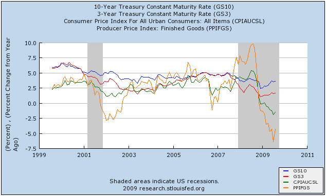
The first thing to notice is that the yield curve is wildly positive. 3 month rates are still close to zero (red line), while the 10 year bond is between 3-4% (blue line). This is a portent of potent growth ahead for the next 12 months, provided we don't relapse into further deflation.

The second thing to notice is the relationship of CPI and PPI. Before recessions, both tend to rise, and PPI tends to exceed CPI. As recessions wear on, the relationship reverses, with both declining, PPI moreso than CPI. At the bottom (in deflationary busts), or shortly thereafter (in inflationary recessions), both start to increase, but YoY PPI is still well below YoY CPI. That's where we are now.

Barring speculators and/or the Chinese government thinking that somehow $100+ Oil is a neat thing, which seems pretty unlikely; or wages being actually cut (which is a possibility, but I suspect the threat is easing), we are in for a period of substantial GDP growth between now and next summer.

Rail Traffic Incrased In Third Quarter


The above chart is from Railfax and it shows that rail traffic increase in the third quarter. The reason this is important is simple: when an economy increases activity it has to ship more stuff from point A to point B. The increase in activity is a good overall sign, which explain why the above chart is so important.


The year over year chart shows a decline but a decline that is decreasing. Also note this is a great example of the shortcomings of year over year statistics at turning points. The first chart shows an increase in the 3rd quarter from 2nd quarter levels. This is a good indicator for the third quarter and adds yet another indicator that the economy is coming out of a recession.

Time Capsule Post: Open in One Year

Fast forward one year from now, to late summer/early fall 2010. According to most accounts, at that point we should be about one year removed from the trough of economic activity, otherwise known as the end of the recession. So let's say, for the sake of argument, that the recession ended in June, at the end of the second quarter (also, not coincidentally, the latest quarter for which we have some GDP numbers).


What should GDP look like in the first four quarters after a trough? What has it looked like in the past?


Average GDP in the first year of recovery -- going back nine recessions -- is, believe it or not, 7.11%. Raise your hand if you think we'll hit that bogey this time around. After the 2001 recession, however, GDP over the next four quarters averaged only 2.63%, and I fear we won't even do that much this time around.


Interestingly -- and this is the point of the post -- one category has led out of recession seven of nine times, and that is PCE. In the two first-years that PCE did not lead us out -- 1950 and 1980/81 -- Inventories did.


Here is what the average first year looks like:


So, the consumer has led us out of recession by averaging a 3.4% annualized contribution to GDP in seven out of nine (78%) recessions. Inventories, at two out of nine, place a distant second, and nothing else even comes close.

As David Rosenberberg recently put it:

Sustained recoveries hinge on the consumer. While the inventory cycle is key, the word cycle means more than a one-quarter bounceback in auto assemblies from depressed levels -- by definition a cycle implies a trend. So while Inventories play a supporting role after a recession ends, it is only perpetuated if the consumer revives. On average, consumer spending is responsible for over three percentage points of the bulk of growth in the first year of recovery. Housing is also a key contributor. But the consumer has already shown us that it is heading into a secular period of frugality and savings, while housing, notwithstanding signs of an upturn that are really little more than noise on a fundamental downtrend, is in a secular decline. Usually, government plays a small role, but this time around, it may be the only actor in the play, and what multiple does that deserve is a very good question, especially now that Uncle Sam's generosity is supporting a record of nearly 20% of personal income.

Headwinds

Invictus

I’ve made no secret of the fact that I have serious reservations about the sustainability of any strength in our economy. I’ve tried to document and chronicle most of the reasons for my doubts as I’ve seen them. (See any of my previous posts here or my hundreds of posts over at Blah3.com.)

I had a long talk with Bonddad this week about the nature of my skepticism. It all boils down to the consumer. Here is a follow-up to our conversation, and here are more of the reasons I'm not sold on recovery.

We know that the consumer has been 70% of GDP. I’ve written about it both here and elsewhere. We know that the consumer took his Debt/Income ratio to a very unsustainable 136% (now 129%), and that it was debt-financed consumption that contributed mightily to our current woes as we spent beyond our means and saved, literally, nothing for some time. I recently demonstrated that just to return Debt/Income to its trendline (114%) would involve retiring roughly $1.6 trillion, and getting back to the mean is virtually unthinkable. We know that the median age of boomers is now 52, and that this cohort is likely more concerned with retirement planning and rebuilding his/her nest egg than with aggressive consumption or aggressive investment strategies.

Beyond that, as I saw Joseph Stiglitz pointing out yesterday on Bloomberg television, this was not a recession caused by any of the typical reasons (e.g. manufacturing/inventory hiccup or the Fed hitting the brakes a bit too hard). This recession was born of the popping of a massive credit bubble that was years – if not decades – in the making, and will likely be years in the unwinding.

On to some interesting charts I saw this week in David Rosenberg’s work, and have taken the liberty of replicating. They (obviously) all support my thesis.


Above is yet another indicator of how weak the labor market is, as we see the number of people working part-time for economic reasons is easily at an all-time high. Yes, the labor market is usually a lagging indicator, but as I recently documented, its weakness this time around is far greater than we’ve seen in any post-war recession.


In part because of the slack in the labor market, we are now experiencing wage deflation, as “organic” income is on the decline:


Organic wages are on the decline. “Transfer payments” – more largesse from the government – are the only component of income that’s growing. (Note that I’m not arguing the government should not be stepping in, just pointing out that wages, dividends, interest income, etc., are all declining.)


Couple the decline in income with the fact that credit is now (very understandably) contracting:


As a result of both declining income and contracting credit, it stands to reason that Personal Consumption Expenditures would drop, and in fact they have:


I previously mentioned the median age of boomers, and in the past have written about the increase over the past several decades in Durable Goods/Household (now at about $37,000). Part of this growth was attributable to Boomers moving through their peak consumption years, which are now behind them.

Let’s take a look at another very interesting chart that flows from the increase in Durable Goods/Household: Vehicles on the Road/Licensed Drivers:


The question needs to be asked: How many more vehicles/driver are we going to put on the road? How many cars/driver do we really need? Further, I will respectfully disagree with Bonddad and state for the record that there’s little doubt in my mind that Cash for Clunkers pulled forward some (perhaps unquantifiable) amount of future sales. The run rate didn’t go from ~9MM annually to ~13MM annually on its own. Unfortunately, it appears we’re headed back down toward ~9MM again, so it’s hard to believe the Clunker program didn’t cannibalize some Q4 sales. Keep in mind, too, that scrappage is about 12MM vehicles/year so we are, in fact, taking cars off the road, which would be consistent with the trend of the chart above beginning to turn down.


The U.S. Homeownership rate, which had peaked at 69% and is now on the way down, still has a way to go on the downside (probably to about 65% or so):


Now, none of this is to say that the recession may not “technically” be over. However, as Paul Krugman recently noted, that may indeed be irrelevant. Based on some correspondence with members of the National Bureau of Economic Research’s Business Cycle Dating Committee, I’m led to believe that they’re inclined to view growth from all sources – be it it private sector or government – equally. So the life-support the government has provided may well be enough to “officially” declare an end to the recession. What the private sector looks like absent the public support, however, is another story altogether, and one that has yet to be told. That is the crux of my concern: How do crippled consumers take the handoff from the government when stimulus programs and funding begin to wind down and end. And therein lies the story of what I believe might well be a double-dip, or at the very least sub-par growth for as far as the eye can see.

Does Blogger suck, or is it me?

[Note to commenter on original post: The Boss asked me to hold the post until Monday, so I took it down and rescheduled it. Sorry for having lost your comment.]