Saturday, July 26, 2025

Weekly Indicators for July 21 - 25 at Seeking Alpha


 - by New Deal democrat


My “Weekly Indicators” post is up at Seeking Alpha.

With the continued pause in actual tariff increases, the data has rebounded basically across the board from April and May. Even the long leading indicators have improved somewhat, led by some un-inversions of the yield curve and the improvement in corporate profits as reported (at least, so far).


As usual, clicking over and reading will bring you up to the virtual moment as to the state of the economy, and reward me a little bit for my efforts collecting and collating it. 

Friday, July 25, 2025

Has consumer spending really been flagging in 2025?


 - by New Deal democrat


There was no big economic news today, despite the report on durable goods, which declined -9.3% in June — after a 16.5% advance in May. Simply put, it was all about aircraft orders from Boeing. Take out transportation, and orders rose 0.6% in May and 0.2% in June. The more important core capital goods number declined -0.7% after a 2.0% increase in May. Even more fundamentally, in addition to being very noisy (see above), sometimes durable goods orders lead, and sometimes they don’t. So I don’t normally pay much attention to them.


But what I do pay a lot of attention to is consumer spending, and today I want to address variations on a graph I have seen in various places in the past few weeks. Below is a graph of real retail sales, total real personal consumption, and real personal consumption on goods, all normed to 100 as of last December:


It doesn’t take a genius to see that these are all trending sideways or down since then. So the claim is that real consumer spending has been flat this year.

True in the most literal sense, compared with last December. But now let’s look at the monthly changes since December 2023:


Note that the two biggest declines were in each January, and that each December was above average. Holiday spending is always difficult to seasonally adjuste, and has been especially so in the wake of COVID. In other words, this suggests very strongly that there is some unresolved Holiday seasonality in the December vs. January numbers.

Probably the best way to deal with this issue is to average December and January together. FRED doesn’t let us do that (and regrettably is not set up for 3 month moving averages either), but another way to minimize the impact of this residual seasonality is to use quarterly rather than monthly data. And that’s what the below graph does, with the monthly data in narrow lines, with the quarterly averages of the same data in bold thicker lines (note that the Q2 average isn’t available yet for the two personal spending series) :


Now we can see that while spending has decelerated, the trend still appears to be higher. In other words, the choice of December as the starting point is carrying a lot of weight in the suggestion that consumer spending has stalled in 2025.

Finally, even if I can’t show you in FRED, below are the three month averages starting with October-December 2024, and averaging December and January together:

Months: Retail sales, Total PCE, Goods PCE (US$ Billions)
Oct-Dec 2024:  224.6. 16.26. 5.54
Nov 24- Jan 25:  224.7. 16.30. 5.56
Dec 24 - Feb 25:  223.9. 16.29. 5.56
Jan-Mar 2025: 224.4. 16.31. 5.58
Feb-Apr 2025: 224.7.  16.33. 5.59
Mar-May 2025: 224.9. 16.36. 5.61
Apr-Jun 2025*: 224.2. N/A
*(only retail sales available)

While real retail sales have indeed trended sideways since last autumn, note that the highest 3 month average was in May of this year, followed by April (tied with January). But the 3 month averages of both total and goods real personal spending have almost uniformly trended higher throughout this period.

Personal income and spending will be reported next Thursday. At that point we will have a much better look at the Q2 trend in real spending.

Thursday, July 24, 2025

New home sales continue rangebound, prices continue to decline, inventory continues to rise


 - by New Deal democrat


This morning’s report on new home sales for June indicated that sales continue to be rangebound, YoY prices continue to decline, and inventory of homes for sale continue to rise. This complicates the story of rebalancing between new and existing homes.

To recapitulate, while new home sales are the most leading measure of the housing market, they are very noisy and heavily revised, which is why I generally pay more attention to single family permits. Still, if averaged over three or more months they are valuable indicators of the underlying upward or downward pressure on the economy going forward one year or more. 

Let me begin also with a periodic reminder that sales lead prices:

As well as leading inventory:


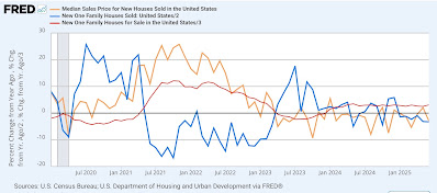
Here is the YoY% change post-pandemic of all three:

As per history, sales rose first, followed by prices and inventory. Sales then abated, and median prices have since turned down, although inventory has not yet done so.

Turning to each metric in order …. 

With mortgage rates remaining in the 6%-7% range, sales of both new and existing homes have also been rangebound for over two years. In June, new home sales rose 4,000 to 627,000, near the bottom of that range: 


Over the same 2+ year period of time, prices also stalled, and then began a very slow deflation on the order of -1% -5% YoY. In absolute terms that trend continued last month, as the median price of a new single family home declined -$20,900 to $401,800 (gold, right scale in the graph below. Note that this metric is not seasonally adjusted, so the YoY% change is also shown (magenta, left scale):


Since 2019, the median price of existing homes has increased substantially more than that of new homes. For a rebalancing to occur, these should start to converge. Since YoY prices of new homes continue to decline, while that of existing homes continues to increase, albeit at a lower pace, per yesterday’s 2.0% YoY increase, that is not happening yet.

Finally, after a slight decline in April, the inventory of homes for sale has risen in both of the last two months, and in June rose 6,000 to 511,000, another post-pandemic high:


This is significant because as indicated in the second from top graph above, in the past recessions have happened after not just sales decline, but the inventory of new homes for sale (red, right scale) - which also consistently lag - also decline (as builders pull back.

The June report suggests that rebalancing of the market has quite a way yet to go, as prices continue to diverge, with new home inventory also well ahead of the increases in the inventory of existing homes. Further, this report was not recessionary as sales continued rangebound and inventory has not turned down.


Jobless claims: clear evidence of a break in trend to the downside


 - by New Deal democrat


Last week I suggested that there might have been a break in the trend of higher YoY jobless claims, but there was not enough evidence yet. It is fair to say that this week’s report supplied that evidence.


Initial claims declilned another -4,000 to 217,000, the lowest weekly number since mid-April. The four week average declined -5,000 to 214,500, also the lowest such number since mid-April. Contrarily, with the typical one week delay continuing claims rose 4,000 to 1.955 million, close to its 3.5 year high set four week ago:


On the more important for forecasting YoY basis, initial claims were down -8.1%, and the four week average down -4.1%. Only continuing claims were higher, by 5.5%:


Initial claims are squarely in the middle of their range over the past 3.5 years, suggesting that very few people are getting laid off. Indeed, as a percentage of the labor force, so far this month the average is only about 0.13% of the labor force has been laid off, among the lowest proportions since initial claims were first reported 60 years ago (not shown). The only soft spot is that those who have been laid off are finding it more difficult to find new employment.

This is very strong evidence of a break in the weaker trend that began last September. I have no thesis as to why, beyond speculation that it may have to do with employers in some sectors wary of losing their employees who may be of dubious legal immigration status.

Finally, here is the comparison with the unemployment rate:


With total claims now running roughly even to last year’s level, this suggests that the unemployment rate, which was 4.2% one year ago as well as last month, is likely to stay very close to that level as well.

Wednesday, July 23, 2025

June existing home sales: a pause in the rebalancing of the housing market


 - by New Deal democrat


Housing data for June resumed this morning with existing home sales. 
Let me start with my usual caveat: although they typically constitute about 90% of all sales are the least important for forecasting purposes, since the main thing that happens is only a change in ownership, and therefore they have much less economic impact than new home sales.

The trend I have been looking for in the past several years is the rebalancing of the new and existing homes markets. Existing home inventory has been removed from the market for over 10 years (likely due in part to absentee rental owners buying increasing chunks of inventory), and really accelerated during the pandemic. This caused an acute shortage of houses for sale, which in turn led to bidding wars among buyers and a spike in prices.

A rebalancing of the market more than anything would require an increase in inventory at least to pre-COVID levels, and a deceleration of price increases, or even outright decreases. Which means that the level of sales themselves was far less important than what the median price for an existing home and inventory are telling us about the ongoing rebalancing of the housing market.

Let’s start with sales. In reaction to generally stable mortgage rates in the 6%-7% range, sales of existing homes, just like new homes, have been rangebound for the past 2+ years. In June they again remained within that range, decreasing -2.7% to 3.93 million annualized on a seasonally adjusted basis. On a YoY basis sales were exactly unchanged. The below graph shows the last 5 years, showing both the immediate post-COVID surge and the low but rangebound trend since:


But as I wrote above, prices and inventory continued to be more important this month. 

Let’s start with inventory. The secular decline in inventory reached a nadir in 2022. Unlike sales, this series is not seasonally adjusted, so it must be looked at YoY, and although it declined -1,000 on a month over month basis, in June inventory increased YoY by 15.9% to 1.530 million units, , and for the third month in a row only 1,000 units lower than the comparable month in 2020 (June data not shown in the graph below):


Pre-2020, inventory was typically in the 1.7 million to 1.9 million range, which means that although it is lessening the chronic shortage still exists.

Finally, let’s look at prices. Builders of new homes are much more able to respond to market pressures, and - leaving the effects of tariffs on building materials aside - this has continued to make new homes relatively much more attractive than the constricted existing homes market, which has had strong upward pricing pressures right through the end of last year.

In the past few months there has been strong evidence that this upward pricing pressure was abating. This month broke that trend, but only slightly.  Like inventory, this data is not seasonally adjusted and so must be looked at YoY, as in the graph below of the last 10 years:


In the immediate aftermath of the pandemic in 2021-22, prices increased as much as 15% or more YoY. After the Fed started its sharp hiking regimen, prices briefly turned negative YoY in early 2023, with a YoY low of -3.0% in May of that year. Thereafter comparisons accelerated almost relentlessly to a YoY peak of 5.8% in May of 2024, before decelerating to 2.9% in September.

Here are the comparisons since:

October 4.0%
November 4.7%
December 6.0%
January 4.8%
February 3.6%
March 2.7%
April 1.8%
May 1.3%

In June prices were higher by 2.0% YoY, as indicated slightly breaking the trend  in place since December.

To conclude, this month’s existing home sales report marked a pause although not a reversal in the rebalancing of the housing market. Seasonally adjusted sales remain rangebound, as did the YoY change in inventories, while YoY price increases firmed a little. 

Last month I concluded with “Although inventory is still low by historical standards, it is possible that by July’s report it could reach the 1.7 million level, i.e. the bottom of its pre-2014 historical range.” This now appears very unlikely. This report will have to be weighed against the report for new home sales, which will be released tomorrow. Despite this month’s pause, I still expect moderation in price increases and more importantly, for inventories finally to exceed their 2020 levels.


Tuesday, July 22, 2025

Updating transport and consumer spending since Tariff-palooza!


 - by New Deal democrat


New economic data will resume tomorrow. Since I haven’t updated the impact of Tariff-palooza! on transport and spending in awhile, let’s take a look at that.


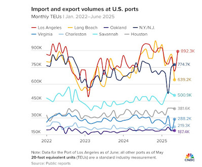
The “tip of the spear” is container shipping. Here’s a graph of traffic at the busiest ports in the US, from CNBC:


At the busiest ports, the steep decline this spring after a period of front-running is evident. In the past few weeks, there has been a rebound, doubtless in part caused by the TACO delay in tariff implementation. With the current “Liberation Day 2.0” set for August 1, a similar dynamic may well be in play.

Once containers arrive in the US, they are typically shipped long distances by rail. Here is the historical record of monthly intermodal volumes through June, measured YoY to deal with seasonality:


Again, the slowdown this spring is apparent.

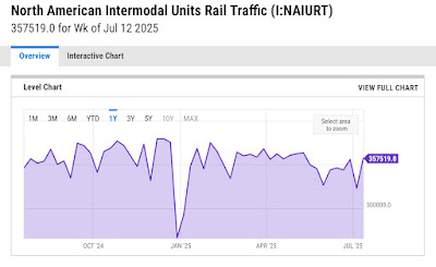
Here is a weekly close-up of the past year:


Much like shipping traffic, there has been a rebound so far in July, which may very well represent front-running the August 1 deadline.

Finally, here is YoY weekly consumer spending from Redbook, updated this week:


Again, we can see graphic evidence of front-running in February and particularly in the earlier part of April, which has now leveled off. The YoY nominal gain of just over 5% so far in July is very similar to the YoY gain last July. In short, there is no evidence of a consumer slowdown at this point.

In sum, the evidence of the past several months is that the economy has held up, in large part due to the delay in implementation of many of the tariffs. We’ll see what happens if implementation actually goes forward in August.

Monday, July 21, 2025

Real average wages and aggregate payrolls for nonsupervisory workers for June


 - by New Deal democrat


Once again there is a hiatus in the data for a couple of days. So let’s take a look at two of my favorite labor indicators: real average hourly wages and real aggregate payrolls for nonsupervisory workers.


First, here are real average hourly earnings for nonsupervisory workers:


These were unchanged in June. Nominally wages increased 0.3% in June, but so did consumer inflation, so the net was zero. The upward trend in these since July 2022 (when gas prices backed off from $5/gallon due to the Ukraine war) remains intact.

Here is the long term YoY% look:


Real hourly wages have increased. 1.2% in the 12 months. With a few exceptions, for the past two years they have increased between 1.0% and 1.7% YoY. More importantly, with the exception of the 2001 and COVID recessions, real hourly wages have always been negative YoY by the onset of the downturn. Typically this has been because of an inflationary pulse in the economy, which the Fed then combatted with higher interest rates.

Needless to say, real average hourly wages are not telegraphing trouble at present.

Real aggregate nonsupervisory payrolls are an even better labor indicator for the economy. Here is the long term pre-pandemic look, both in absolute terms (blue, right scale) and in YoY% change terms (red, left scale):


With the exception of the pandemic, real aggregate nonsupervisory payrolls have always peaked at least several months before the onset of a recession, and their YoY% growth has declined sharply, and crossed the zero line to negative close to coincident with the onset of recessions. It is a virtually perfect indicator, with no false positives or negatives outside of COVID and, arguably, the 2002 near-double-dip.

Here is the same graph for roughly the past three years:


Nominally aggregate payrolls declined -0.2% in June (one of the three lowest nominal readings since the onset of the pandemic), which together with consumer inflation, produced a -0.5% decline in the real number (one of the five lowest in the same period).

Despite the monthly decline, this also does not break the rising post-pandemic trend. And note, for example, as similar rough patch in early 2022. If there are further declines in the next several months, and we set a 6 month low, that would be worthy of a yellow caution flag. but we’re not there now.