Saturday, November 17, 2018
Weekly Indicators for November 12 - 16 at Seeking Alpha
- by New Deal democrat
My Weekly Indicators piece is up at Seeking Alpha.
If my reference frames are well- constructed, economic trends ought to start out in the long leading forecast, then start to show up in the short leading forecast, and finally make it through to the coincident nowcast.
Almost 6 months ago, the long leading forecast changed from positive to neutral for the first time. It's been flirting with further deterioration ever since. Well, this week ....
As usual, clicking through and reading is a way to help support my putting in the effort to describe and forecast the economy for you.
Friday, November 16, 2018
Credit remains loose, but big borrowers aren't interested; real consumer spending may be stalling
- by New Deal democrat
We interrupt this coverage of the ongoing Trump Boom (c) to advise you that two more long leading indicators, while still positive, are showing at least some weaknesses. This story is up at Seeking Alpha.
As usual, reading the story over there is both informative for you and a little $$$ revwarding for me.
Also, as an aside, once corporate profits for Q3 are reported in two weeks as part of the revised GDP report, that will be a good time to do a comprehensive update of the long leading forrecast through 2019.
Thursday, November 15, 2018
Initial markers for a manufacturing slowdown now hit
- by New Deal democrat
I have a new article that hopefully will get posted by Seeking Alpha later today. In the meantime ...
Two weeks ago I wrote an article establishing a manufacturing baseline for my forecast of an economic slowdown by about the middle of next year. I concluded that by saying:
the first thing I am looking for is decelerating growth which will show up in a reading below 15 in the average of Regional Fed reports, and below 60 in ISM new orders.
The ISM new orders index did fall below 60 to a new nearly 2 year low (but still positive!) at the beginning of this month.
As of this morning, the average of the five Fed regional new orders indexes also declined from 18 to 15*, as the Empire Fed index fell slightly (from 22.5 to 20.4), and the Philly Fed index fell substantially (from 19.3 to 9.1).
This could of course all be noise, but I've made a forecast, I've laid down some markers, and the data is - at least on an initial basis - hitting those markers.
*(okay, technically not "below" 15, but close enough).
*(okay, technically not "below" 15, but close enough).
Wednesday, November 14, 2018
Real wages unchanged, real money supply increases in October
- by New Deal democrat
With October consumer price inflation reported, let's update a few metrics.
First of all, while the YoY% growth in real wages increased:

real wages were unchanged month over month, as both nominal wages and consumer inflation both increased by +0.3%:

Real wages have still not even increased 1% in the last 2 1/2 years.
Because, as I noted yesterday, so much of consumer inflation, and therefore real wages, depends on gas prices, and oil prices have been - well - crashing for the past several weeks:

we are likely to see a further decrease in inflation, so consumer purchasing power should increase.
Another measure worth updating for business cycle purposes is real M1, which rose to a new high in October:
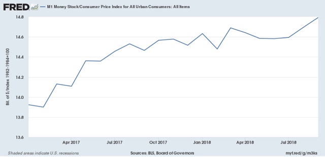
as the nominal increase in M1 surpassed inflation handily.
Growth in real M1 had been decelerating, and was on the cusp of turning negative throughout the summer. But in the last two months it has rebounded. This is a good lesson in not simply projecting the trend in leading indicators forward -- because we never know when that trend may change.
Tuesday, November 13, 2018
Changes in labor bargaining power take up to a decade to be fully effective
- by New Deal democrat
Sorry for the recent lack of posting on economic matters. Partly it is ennui, and partly it is a near total dearth of data in between the employment report a week ago Friday and tomorrow's CPI report. Even a couple of quarterly series I usually report on have been inexplicably delayed.
In the meantime, here is a graph from Jared Bernstein that is worth some extended comment. It is the YoY% change in real wages, adjusted by the full CPI (blue) and CPI less energy (gold):

It is worthwhile to remember that, since 1980, YoY inflation has been decelerating on a secular basis:

Bernstein uses this graph to make the point that the changes in "real" wages in the last decade or so have been, more than anything, about the change in gas prices. Very true, but I think we can add some further comments.
1. Generally speaking, in the 1970s and 1980s, YoY real wages kept pace with CPI including gas prices. Beginning with the run-up in gas prices that started in 1999, they didn't. This tells us a lot about the presence of labor bargaining power in the 1970s vs. the absence of labor bargaining power in the last 20 years.
2. Note that YoY real wage gains started to decelerate in the mid-1960s before turning negative in about 1974. Thereafter the negative trend intensified, and only finally ended in the mid-1990s. This is powerful evidence that the massive entry of women into the labor force had a big depressing effect on wages.
3. The depressing effect on wages of a surge in the labor force serves as a natural experiment that powerfully contradicts the narrative by those like Matt Yglesias who incessantly reiterate the claim that immigration raises wages. If that were true, why shouldn't women's participation have had the same effect?
4. Note that renewed long term decelerating trend in real wage growth ex-gas since the late 1990s.
5. The above show us that the trend in "real wages ex-gas prices" gives us two further lessons in how long it takes for the lessons of changes in labor bargaining power to be internalized by both labor and management. It took almost 10 years from the time when women started entering the labor force en masse for the trend in real wages to actually turn negative (vs. deceleratingly positive). Once that secular force ended, as a whole employers only gradually learned that they could continually reduce annual raises. All of which suggests that it will take up to a decade of increased labor bargaining power for employers to internalize the necessity for bigger wage increases.
Sunday, November 11, 2018
A baseline road map for the 2020 elections
- by New Deal democrat
Now that the 2018 midterm elections are behind us, let's take a preliminary look at 2020.
It occurred to me that a decent baseline for that election is to simply take the total 2018 House votes for each state, assume that the Presidential vote in 2020 in each state will be the same, and apply that to the Electoral College. Alternatively, you could use the results of the 2018 Senate races in those states where there were races in 2018, and apply those results for those states. That's because the midterm turnout approached Presidential election levels, and Trump is going to engender the same intensity in two years as he did this past week.
So, using the 2018 results as the template for 2020, who wins?
It turns out that I wasn't the only one who had that thought. Nate Silver already had the same idea and did that for the House vote. Here's what that hypothetical 2020 Electoral College map looks like:

If you apply the 2018 House votes to the Presidency in 2020, the Democratic candidate wins handily. As Nate Silver points out, it is a virtual duplicate of the 2012 map.
[Before I go further, let me just note that the above House map has a few glitches. Florida only went Democratic when the votes in House districts where there was no GOP candidate are added. Conversely, in North Carolina, there was a House district without a Democratic candidate. If we were to add just 2/3's of the typical democratic vote in other GOP-dominated districts in NC to that district, then NC flips to the democratic column.]
Next, here's what the 2018 Senate map looked like a couple of days ago. Since then, it appears that the Democratic candidate won in Arizona. For now, let's leave Florida alone:

The only changes in the map for 2020 are that Florida flips to the Republican column, and Montana, Arizona, and West Virginia flip to the Democratic column. Again, the 2020 Democratic candidate wins if we apply this layer over the House map.
In fact, even if we give Florida to the GOP, and don't give Montana, Arizona, and West Virginia to the Democrats, the democratic candidate still wins!
In short, if the 2020 electorate is the same as the 2018 electorate, Donald Trump is going to be defeated.
What this also tells us is that the upper Midwest is not lost to the democrats, and that the "blue wall" states that Hillary Clinton lost -- Pennsylvania, Michigan, and Wisconsin -- plus Iowa, are the states that the 2020 candidate most needs to focus on. Secondarily, states like Arizona and North Carolina should be targeted for insurance. Florida probably should get demoted to a "plan C" state.
And "urban cosmopolitanism" isn't going to win back the upper midwest. A similar mix of economic issues (e.g., improving, expanding, and enhancing Obamacare) and social issues (particularly those issues most aggrieving women about the Trump-GOP party) are going to be necessary.
By the way, winning the Presidency in 2020 is not the ball game. There is every reason to believe that a Mitch McConnell-led GOP Senate will engage in maximum obstruction of Presidential appointments. So let's look at the 2020 Senate map (showing which party won those seats in 2014):

There are a slew of seats all over Dixie and the high plains that simply aren't competitive for Democrats. They will probably need to flip at least 3 of the following 6 seats: Colorado, Iowa, North Carolina, Maine, Montana, or West Virginia. That is probably going to remain an uphill climb.
Subscribe to:
Posts (Atom)