- by New Deal democrat
The final week of 2010 ended with some long-in-coming good news, as Initial Jobless Claims dropped below 400,000 for the first time since before the 2008 crash. The 4 week average fell to 414,000.
In other news, the Chicago PMI was also a complete upside blowout, rising to the highest reading in over 20 years! Consumer confidence declined slightly. House prices continued to decline. On balance, I believe this is a good thing, as it makes housing more affordable (but I support bankruptcy cramdown legislation for existing homeowners).
Besides initial jobless claims, here is this week's other high frequency data:
Gas at the pump sold at $3.05 a gallon last week, and Oil remained above the $90 a barrel mark for most of the week, but closed at about $89.50. Despite this, gasoline usage was once again significantly above last year's levels - about 3%,
The Mortgage Bankers' Association did not report this week. It's reports will resume next Wednesday.
The ICSC also ended 2010 with a bang, reporting same store sales for the week ending December 25 increased 4.8% YoY - the best YoY comparison all year - and increased 1.0% week over week. Shoppertrak went the other way, reporting that sales fell 4.1% YoY in the week ending December 26. Shoppertrak blamed the poor week in part on the east coast snowstorm.
Railfax declined in all areas last week, for seasonal reasons. It remained steady in its comparative improvement over last year. Shipments of waste and scrap metal continue to improve, but auto shipments are significantly below last year, although they have now stabilized.
The American Staffing Association Index fell one point to 100 for the week ending December 18. This index will decline further, and significantly next week for seasonal reasons, and won't give much reliable information again until January.
M1 and M2 were not reported in time for me to include them in this post. I'll update over the weekend at some point when I have a chance.
Weekly BAA commercial bond rates fell back to 6.10% last week from 6.18%. This was in line with a decline in yields of the 10 year Treasury bond. All bonds have come under stress recently, but this suggests investors are "reaching for yield." There appears to be no fear of a deflationary pulse.
The Daily Treasury Statement showed receipts in the first 21 reporting days of December of $153.8 B vs. $145.1 B a year ago, for a gain of 6.0%. With the change in Social Security payroll reporting in 2011, this metric will have to be fudged somewhat to try to at least get a comparative handle on the data.
This week's data confirms that the story at the end of 2010 is that the economy seems to be gaining momentum. Once again that suggests that Oil and other commodity prices, and mortgage rates, are likely to be a "choke collar" on that growth.
In the meantime, I owe you a 2010 report card and a look ahead at 2011, which I'll try to do in the next week or so.
Have a happy and safe New Year. We'll see you then!
Friday, December 31, 2010
Thursday, December 30, 2010
Have a Safe And Happy New Year
To all our readers...
NDD is going to put up his weekly summation on Friday, but I think that's about it until next Monday. Until then, have a safe and happy New Years.
BD
NDD is going to put up his weekly summation on Friday, but I think that's about it until next Monday. Until then, have a safe and happy New Years.
BD
Chicago PMI ends 2010 data with a BANG!
- by New Deal democrat
The Chicago Purchasing Managers reported that its Index
This completes a clean sweep. In December every single regional manufacturing report surprised to the upside, sometimes strongly. The employment component of the Chicago PMI is particularly welcome.
Bonddad here: This is another great report. We've had some really good numbers lately, indicating the the economy should be picking up steam going into the first quarter.
The Chicago Purchasing Managers reported that its Index
achieved its highest level since July 1988, expanding for the fifteenth consecutive month.Here's the graph showing business activity in the Chicago PMI since 1985:
BUSINESS ACTIVITY:
- PRODUCTION reached its highest levels since October 2004;
- NEW ORDERS improved to 2005 levels;
- EMPLOYMENT reached its highest level in more than 5 years;
- PRICES PAID accelerated to its highest point since July 2008.
BUYING POLICY:
- Lead times extended for MRO SUPPLIES and CAPITAL EQUIPMENT, while lead times for
PRODUCTION MATERIEL plummeted to near August’s level.
This completes a clean sweep. In December every single regional manufacturing report surprised to the upside, sometimes strongly. The employment component of the Chicago PMI is particularly welcome.
Bonddad here: This is another great report. We've had some really good numbers lately, indicating the the economy should be picking up steam going into the first quarter.
Jobless Claims Drop Below 400,000
From Marketwatch:
This is the first time we've seen these numbers below 400,000, so we shouldn't get too excited. HOWEVER -- this is a great print and a fabulous way to end the year.
====
NDD here: I agree with Bonddad's comment above, and add that weekly readings during the height of the holiday season are particularly vulnerable to seasonality. But with those cautions, this is still excellent news.
Here is the updated graph of the 4 week moving average in initial jobless claims (blue) since their March 2009 high, compared with monthly new nonfarm payrolls (inverted, in thousands, red):

Here is the scatter graph comparing initial jobless claims with payrolls since the March 2009 high in claims:
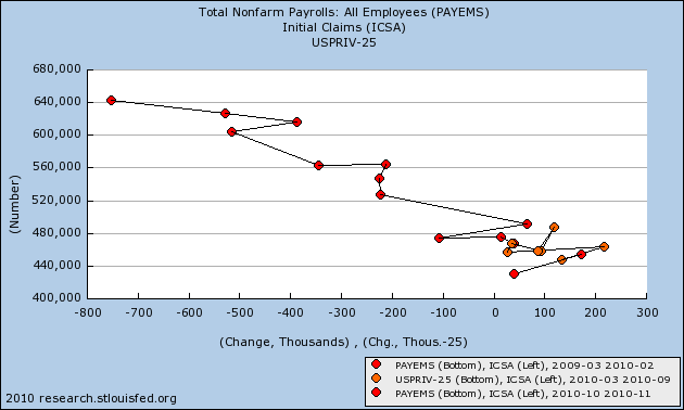
Here is the same comparison including the 1974 and 1982 recessions:
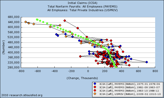
The green line is my best estimate of the trend line comparing the two data series coming out of severe recessions. It is one reason why I expect November's initial jobs report of +39,000 to be revised higher. More importantly, at a 4 week average of 414,000, it suggests that December payrolls should come in somewhere near +200,000 ( +/- 125,000).
====
And Atrios calls it "Actual good news." That makes it official.
The number of U.S. workers filing new applications for jobless benefits fell 34,000 to a seasonally adjusted 388,000 in the week ended Dec. 25, hitting the lowest level since July of 2008, the Labor Department reported Thursday. Economists polled by MarketWatch had expected initial claims of 413,000. The four-week average of new claims, which is smoother than the weekly data, fell 12,500 to 414,000, also reaching the lowest level since July of 2008.
This is the first time we've seen these numbers below 400,000, so we shouldn't get too excited. HOWEVER -- this is a great print and a fabulous way to end the year.
====
NDD here: I agree with Bonddad's comment above, and add that weekly readings during the height of the holiday season are particularly vulnerable to seasonality. But with those cautions, this is still excellent news.
Here is the updated graph of the 4 week moving average in initial jobless claims (blue) since their March 2009 high, compared with monthly new nonfarm payrolls (inverted, in thousands, red):
Here is the scatter graph comparing initial jobless claims with payrolls since the March 2009 high in claims:
Here is the same comparison including the 1974 and 1982 recessions:
The green line is my best estimate of the trend line comparing the two data series coming out of severe recessions. It is one reason why I expect November's initial jobs report of +39,000 to be revised higher. More importantly, at a 4 week average of 414,000, it suggests that December payrolls should come in somewhere near +200,000 ( +/- 125,000).
====
And Atrios calls it "Actual good news." That makes it official.


Wednesday, December 29, 2010
Does Copper Bode Well For the New Year?
Click for a larger image

Copper is a great indicator of overall economic activity. Notice that we're seeing prices near their highest level in five years. In addition to a declining dollar, this also indicates demand is strong, which should bode well for the new year.

Copper is a great indicator of overall economic activity. Notice that we're seeing prices near their highest level in five years. In addition to a declining dollar, this also indicates demand is strong, which should bode well for the new year.
Case Shiller Drops For Third Month
From the WSJ:
Home prices across 20 major metropolitan areas fell 1.3% in October from September, the third straight month-over-month drop, according to the S&P/Case-Shiller home-price index released Tuesday. Many economists expect the declines to continue into at least next spring, erasing most of the gains made since prices bottomed out in early 2009.
The housing market, which appeared poised for a recovery earlier in the year, now could be heading for a second downward drift.
"This looks like a double-dip [in housing] is pretty much on the way, if not already here," said David Blitzer, chairman of the Standard & Poor's index committee. "Somebody who thought last year that it's going to be straight up from here was wrong."
Given the massive inventory overhand in the system, this shouldn't be surprising.


Tuesday, December 28, 2010
The Victims of Economic Triage: a response to Bob Herbert
- by New Deal democrat
Today's NY Times column by Bob Herbert entitled "The Data and the Reality" is getting a lot of play. It starts out:
Herbert goes on to catalogue the plight of the long-term unemployed, which he calls " a portrait filled with gloom" and says "It is hard to overstate the dire shape of the unemployed.” They have gone through their savings, their 401k's, they may be foreclosed upon, they may have had to borrow. And they have lost hope of ever making their nest egg - such as it may have been - back:
If you are employed, you probably are feeling more optimistic about your current situation and the immediate future. In short, for people with jobs, the data looks promising because it is promising. Ironically, Herbert stumbles on to the truth in his last three sentences:
There has been, wittingly or not, a deliberate triage in the approach of Washington to the Great Recession. Those who kept their jobs have been tided over the worst of the economy. Those who lost their jobs are being told to please disappear so that we cannot see their privation. And there is no prospect whatosever that this callous and deliberate neglect is going to abate in the next two years.
The data and the reality are not at loggerheads. While we have a Recovery that is stronger than the last two, and nearly as strong as that following 1982, it isn't enough. The employed - which includes the vast majority of Americans, after all - really are seeing the benefit of that Recovery, and that is what the data is showing. Furthermore, the consumer spending data that Herbert highlights (the same highlighted by Bonddad earlier today) constitutes the best hope that some of those destitute unemployed will be offered jobs in the near future -- remember: spending leads employment, not the other way around.
The problem is, what we need is a Recovery that at least deserves to be compared to that of the New Deal. We don't have it, and we're almost certainly not going to - certainly as long as one political party idolizes Calvin Coolidge, and the other party includes a President whose opinion of FDR appears to have been shaped by Amity Schlaes.
Today's NY Times column by Bob Herbert entitled "The Data and the Reality" is getting a lot of play. It starts out:
I keep hearing from the data zealots that holiday sales were impressive and the outlook for the economy in 2011 is not bad.Data zealot here, reporting for duty.
Maybe they’ve stumbled onto something in their windowless rooms. Maybe the economy really is gathering steam.My room isn't windowless, and the economy really is gaining steam. Just for example, see this post by Calculated Risk noting that personal consumption expenditures are growing, and growing at an increasing rate. As a result, many analysts are increasing their estimates of growth in this quarter and for 2011.
But in the rough and tumble of the real world, where families have to feed themselves and pay their bills, there are an awful lot of Americans being left behind.I guess this is the part where I am supposed to disagree with Herbert, because allegedly there is a contradiction between "the data and the reality." Actually, I do agree with Herbert, but there is no disconnect between the data and the reality, as I'll explain below.
Herbert goes on to catalogue the plight of the long-term unemployed, which he calls " a portrait filled with gloom" and says "It is hard to overstate the dire shape of the unemployed.” They have gone through their savings, their 401k's, they may be foreclosed upon, they may have had to borrow. And they have lost hope of ever making their nest egg - such as it may have been - back:
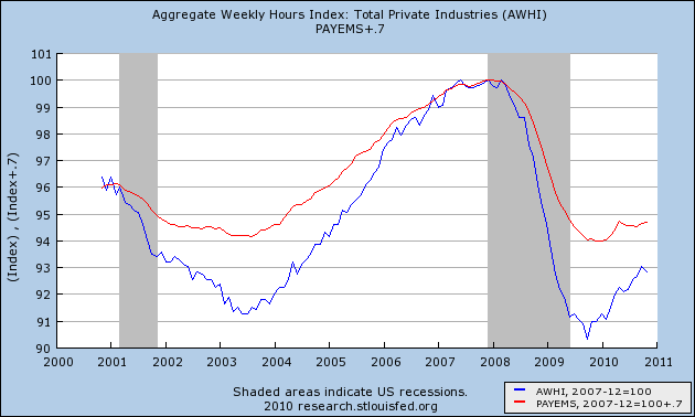
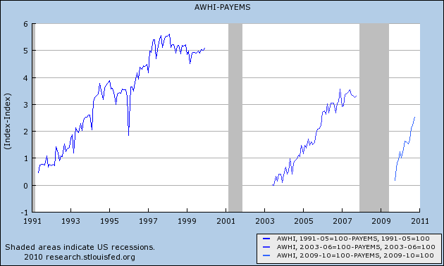
There is a fundamental disconnect between economic indicators pointing in a positive direction and the experience of millions of American families fighting desperately to fend off destitution. Some three out of every four Americans have been personally touched by the recession — either they’ve lost a job or a relative or close friend has. And the outlook, despite the spin being put on the latest data, is not promising.Not promising for whom? The data isn't lying. If you are employed, there is an excellent chance you are going to stay employed. People who are fearful of being laid off don't spend like the data from the last few months say they are spending. As I also pointed out last week, the cuts in the Recession were so deep that we are adding much more by way of hours (blue) than we are in jobs (red) :
If you are employed, you probably are feeling more optimistic about your current situation and the immediate future. In short, for people with jobs, the data looks promising because it is promising. Ironically, Herbert stumbles on to the truth in his last three sentences:
The zealots reading the economic tea leaves see brighter days ahead. They can afford to be sanguine. They’re working.And that, dear reader, is the rub. The Recovery has not been strong enough so far, and may not become strong enough in 2011, to place many of the unemployed into jobs. And not enough people inside Washington, DC, including one entire political party, and apparently the President as well, seem to care enough to alleviate their plight. How else explain the recent Tax Deal which extended Bush tax cuts for billionaires, but failed to extend unemployment benefits for the "99ers?"
There has been, wittingly or not, a deliberate triage in the approach of Washington to the Great Recession. Those who kept their jobs have been tided over the worst of the economy. Those who lost their jobs are being told to please disappear so that we cannot see their privation. And there is no prospect whatosever that this callous and deliberate neglect is going to abate in the next two years.
The data and the reality are not at loggerheads. While we have a Recovery that is stronger than the last two, and nearly as strong as that following 1982, it isn't enough. The employed - which includes the vast majority of Americans, after all - really are seeing the benefit of that Recovery, and that is what the data is showing. Furthermore, the consumer spending data that Herbert highlights (the same highlighted by Bonddad earlier today) constitutes the best hope that some of those destitute unemployed will be offered jobs in the near future -- remember: spending leads employment, not the other way around.
The problem is, what we need is a Recovery that at least deserves to be compared to that of the New Deal. We don't have it, and we're almost certainly not going to - certainly as long as one political party idolizes Calvin Coolidge, and the other party includes a President whose opinion of FDR appears to have been shaped by Amity Schlaes.
Holiday Sales Are Strongest in Years
From the NY Times:
Shoppers spent more money this holiday season than even before the recession, according to preliminary retail data released on Monday.After a 6 percent free fall in 2008 and a 4 percent uptick last year, retail spending rose 5.5 percent in the 50 days before Christmas, exceeding even the more optimistic forecasts, according to MasterCard Advisors SpendingPulse, which tracks retail spending.
The rise was seen in just about every retail category. Apparel led the way, with an increase of 11.2 percent. Jewelry was up 8.4 percent, and luxury goods like handbags and expensive department-store clothes increased 6.7 percent. There was even a slight increase in purchases of home furniture, which had four consecutive years of declining sales. The figures include in-store and online sales, and exclude autos.
Retail sales have been incredibly strong the last few months, printing incredibly strong growth rates. Let's broaden the picture to real PCEs, which are growing strongly.
Personal income increased $42.3 billion, or 0.3 percent, and disposable personal income (DPI) increased $37.8 billion, or 0.3 percent, in November, according to the Bureau of Economic Analysis. Personal consumption expenditures (PCE) increased $43.3 billion, or 0.4 percent. In October, personal income increased $49.5 billion, or 0.4 percent, DPI increased $39.3 billion, or 0.3 percent, and PCE increased $68.9 billion, or 0.7 percent, based on revised estimates.
Let's look at the data:

Real PCEs have been increasing for most of the last year.

The largest component of PCEs are services, which account for about 65% of all purchases. While these were moving sideways for the last three months, they jumped strongly last month. Also note they have increased over the course of the last year.

Non-durable purchases account for about 22% of all expenditures, stalled for the first have of the year, but have risen strongly over the last four months.

Durable goods also stalled in the spring, but have been increasing for the last four months as well.
Real Personal Savings suggest strong GDP, less Unemployment in 2011
- by New Deal democrat
Over at Firedoglake, David Dayen wonders how economists can say the economy will be "good" in 2011 if unemployment remains above 9%. Atrios agrees.
Bill McBride at Calculated Risk has updated his graph of "Okun's Law" showing that we need growth of 5%+ to cause the unemployment rate to decline under 9%.

In the last couple of weeks, I have been discussing the anomaly of high unemployment compared with the relatively average number of first time jobless claims adjusted for population. 2010 has been one of only two exceptions in nearly the last half century where the unemployment rate has been more than 2% higher than that predicted by the "initial jobless claims rate:"
Which leads to an update on the subject of the "real personal savings rate" that I have written about several times in the past, notably here and here.
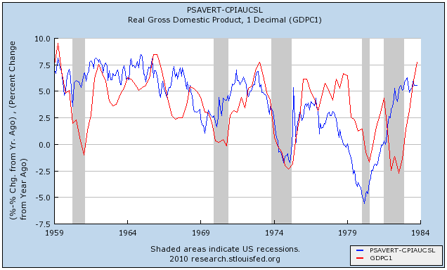
To recap the points I made previously, the relationship isn't perfect, but the lagged correlation is clear. A substantial change in the real personal savings rate is mirrored by a similar substantial change in real GDP about 6 to 18 months later, and then via "Okun's law" to a predictable change in the unemployment rate. The logic of this isn't hard to follow: increased savings serve as the "tinder" that ignites subsequent spending. That spending leads to growth, and then that growth leads to the creation of jobs.
Thus an increase in savings is a "long leading indicator" for employment in a range of 18 to 30 months later. Here are the historical graphs of the "real personal savings rate" vs. real GDP, first for the period of 1959 through 1984:
and the updated graph from 1984 through November 2010 based on the data released last week:
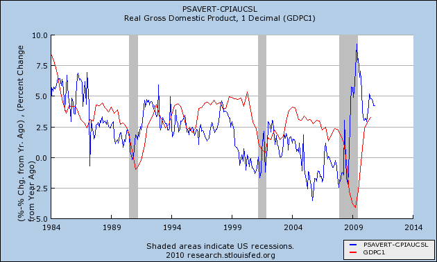
We are now 18 months past the June 2009 peak. This relationship predicts further increases in YoY job growth beginning about now and continuing in 2011. While the relationship is "noisy," subsequent GDP increases are generally similar to the precursor real personal savings rate -- which has been above 5% for much of the last 18 months. Which means that an unemployment rate significantly under 9% by the end of 2011 is quite doable.
UPDATE: Just to be clear, I'm not suggesting that an unemployment rate of 8% or even 7% would qualify as "good," either. The point is, it is by no means a foregone conclusion that we will endure 9%+ unemployment all next year.
Over at Firedoglake, David Dayen wonders how economists can say the economy will be "good" in 2011 if unemployment remains above 9%. Atrios agrees.
Bill McBride at Calculated Risk has updated his graph of "Okun's Law" showing that we need growth of 5%+ to cause the unemployment rate to decline under 9%.
In the last couple of weeks, I have been discussing the anomaly of high unemployment compared with the relatively average number of first time jobless claims adjusted for population. 2010 has been one of only two exceptions in nearly the last half century where the unemployment rate has been more than 2% higher than that predicted by the "initial jobless claims rate:"
Which leads to an update on the subject of the "real personal savings rate" that I have written about several times in the past, notably here and here.
To recap the points I made previously, the relationship isn't perfect, but the lagged correlation is clear. A substantial change in the real personal savings rate is mirrored by a similar substantial change in real GDP about 6 to 18 months later, and then via "Okun's law" to a predictable change in the unemployment rate. The logic of this isn't hard to follow: increased savings serve as the "tinder" that ignites subsequent spending. That spending leads to growth, and then that growth leads to the creation of jobs.
Thus an increase in savings is a "long leading indicator" for employment in a range of 18 to 30 months later. Here are the historical graphs of the "real personal savings rate" vs. real GDP, first for the period of 1959 through 1984:
and the updated graph from 1984 through November 2010 based on the data released last week:
We are now 18 months past the June 2009 peak. This relationship predicts further increases in YoY job growth beginning about now and continuing in 2011. While the relationship is "noisy," subsequent GDP increases are generally similar to the precursor real personal savings rate -- which has been above 5% for much of the last 18 months. Which means that an unemployment rate significantly under 9% by the end of 2011 is quite doable.
UPDATE: Just to be clear, I'm not suggesting that an unemployment rate of 8% or even 7% would qualify as "good," either. The point is, it is by no means a foregone conclusion that we will endure 9%+ unemployment all next year.


Monday, December 27, 2010
The Fall of The WSJ
When I was in college in the late 1980s, newspapers were still the predominate form of news transmission. I had a professor who told me to read the WSJ and NYT every day in order to stay informed. As he was my hero, I took his advice to heart and religiously read both every day. I would carry both papers with me wherever I went and would read them usually drinking a really bad cup of coffee and smoking a Marlboro (which I finally quit a few years ago).
Then a really funny thing happened after reading the WSJ for about 6-12 months; I started to understand the economy. I had taken a few economics classes by this time, and would eventually take more. But these were theoretical. The world of the WSJ was real and it showed how the markets interact with data. The more I read, the more I understood how things operate.
When Rupert Murdoch was in negotiations to purchase the WSJ, I wrote an article against the transaction (not that he would listen). But I was incredibly worried about the paper becoming more like Fox news than the WSJ of old. However, the deal went through a few years ago. Unfortunately, it has not been for the better.
Now when I read the journal, I find fewer fewer economic stories between more and more political stories. And the economic stories are more and more political; I find that I have to be extremely careful in reading the articles as they are more and more about blaming the left and promoting the right through economic analysis. And the market pages just aren't what they use to be either. While I think the WSJ has passed on the real market commentary to the Marketwatch.com page, it's a shame to see them get away from the really good commentary they use to have.
In short, the WSJ is losing its business edge. While I still read it, I find I read the Financial Times and Bloomberg first, then go to the Journal to see if I missed something. In short, for me it is becoming less and less relevant. And it is a shame, because it use to be so good.
Yes, Virginia, this is a Recovery
- by New Deal democrat
I have been meaning to write a piece like this for awhile, but I couldn't - and still can't - decidehow much should be soothing reason and how much should be intellectual outrage. So this will be some of both. Your mileage may vary.
On the one hand, I fully appreciate those who say, essentially, "we're not in a recovery because things are still awful," but on the other hand want to take no prisoners of those who disrespect that the term has an academic meaning that is well known and that requires respect.
Well, the Doomorons are at it again, this time citing as authority a piece written at New Deal 2.0 by a "Junior Fellow" at the Franklin and Eleanor Roosevelt Institute, who claims that it is "idiocy" to say that we are in a recovery because, allegedly, the middle class is doing worse than it was in 2009. He provides no evidence, and in fact, almost all the evidence is that the middle class is still doing poorly, but better than it was doing in 2009. Real income is still bad, but up. Foreclosures are bad, but down. Household net wealth isn't good, but has gone up. Hourly earnings are still bad, but up. Jobs are bad, but up. Unemployment is bad, but down.
The author of this little polemic turns out to be a guy who just got his Ph.D. in finance a year ago from the august halls of Florida Atlantic University, a small regional school that seems to specialize in online or video courses. If his screed is correct, then perhaps its most noxious implication is that, by its own standard, FDR's original New Deal also fails to qualify as a Recovery.
Shame on New Deal 2.0. I will accept the contrary decision of the NBER's dating committee, which consists of the following members, instead:
Robert Hall, Stanford University (chair)
Martin Feldstein, Harvard University
Jeffrey Frankel, Harvard University
Robert Gordon, Northwestern University
James Poterba, MIT and NBER President
James Stock, Harvard University
Mark Watson, Princeton University.
Not Florida Atlantic University I realize, and not newly minted last year, but still not too shabby a group.
And then, last night, I get an email from a young friend who regards me as something of an Economic Deity, saying in part " I don't think were out of the recession like everyone else says." I know what he means and I'm not upset with him at all.
The problem is that we need to be able to measure how the economy is doing by two different standards. (1) Is it good or bad? and (2) is it improving or worsening? It can be good an improving, or good but worsening. It can be bad and worsening, or bad but improving.
In a recent opinion piece, Catherine Rampell of The New York Times nailed the problem, pointing out that:
Prof. Mark Thoma was similarly spot on when he likened the condition to being in a recovery unit in a hospital:
In fact, there are general terms for all of the categories above, but like the word "recession" they have no rigorous analogy. Some people call an economy that is improving, but just barely, a "growth recession." An economy which has made up all of its losses in GDP terms from the last recession, and is improving, is typically styled an "expansion."
Worse, the usual definition of a "recovery" does not include what is happening with jobs. Many people take exception to the term "jobless recovery" and they have a point. Can you truly say that the economy is "improving" if it is still shedding jobs - by most peoples' measures, the most important factor of all?
In my blog posts, I try to use terms in their more precise academic or business meaning. Hence, we are in a Recovery. And I believe that is the proper term. Leaving aside the census, the economy has added jobs every single month this year, and real personal income, as well as median inflation-adjusted wages are up. Not by much, but up. Thoma's analogy of the hospital recovery unit makes perfect sense to me.
I have been meaning to write a piece like this for awhile, but I couldn't - and still can't - decidehow much should be soothing reason and how much should be intellectual outrage. So this will be some of both. Your mileage may vary.
On the one hand, I fully appreciate those who say, essentially, "we're not in a recovery because things are still awful," but on the other hand want to take no prisoners of those who disrespect that the term has an academic meaning that is well known and that requires respect.
Well, the Doomorons are at it again, this time citing as authority a piece written at New Deal 2.0 by a "Junior Fellow" at the Franklin and Eleanor Roosevelt Institute, who claims that it is "idiocy" to say that we are in a recovery because, allegedly, the middle class is doing worse than it was in 2009. He provides no evidence, and in fact, almost all the evidence is that the middle class is still doing poorly, but better than it was doing in 2009. Real income is still bad, but up. Foreclosures are bad, but down. Household net wealth isn't good, but has gone up. Hourly earnings are still bad, but up. Jobs are bad, but up. Unemployment is bad, but down.
The author of this little polemic turns out to be a guy who just got his Ph.D. in finance a year ago from the august halls of Florida Atlantic University, a small regional school that seems to specialize in online or video courses. If his screed is correct, then perhaps its most noxious implication is that, by its own standard, FDR's original New Deal also fails to qualify as a Recovery.
Shame on New Deal 2.0. I will accept the contrary decision of the NBER's dating committee, which consists of the following members, instead:
Robert Hall, Stanford University (chair)
Martin Feldstein, Harvard University
Jeffrey Frankel, Harvard University
Robert Gordon, Northwestern University
James Poterba, MIT and NBER President
James Stock, Harvard University
Mark Watson, Princeton University.
Not Florida Atlantic University I realize, and not newly minted last year, but still not too shabby a group.
And then, last night, I get an email from a young friend who regards me as something of an Economic Deity, saying in part " I don't think were out of the recession like everyone else says." I know what he means and I'm not upset with him at all.
The problem is that we need to be able to measure how the economy is doing by two different standards. (1) Is it good or bad? and (2) is it improving or worsening? It can be good an improving, or good but worsening. It can be bad and worsening, or bad but improving.
In a recent opinion piece, Catherine Rampell of The New York Times nailed the problem, pointing out that:
Economists and laypeople mean different things when they use the word “recession”: To most people, it refers to the level of economic activity. To economists, it refers to the change in economic activity.Thus, as she points out, the NBER was careful to note that:
That is, most people associate a poor economy — that is, low levels of spending, high levels of unemployment — with the word “recession.” They use the word to refer to times when the country just feels lousy.
But economists use the term “recession” to talk about the economy’s direction. Regardless of whether the level of economic activity is good or poor, is the economy shrinking, or is it growing?
“In determining that a trough occurred in June 2009, the committee did not conclude that economic conditions since that month have been favorable or that the economy has returned to operating at normal capacity. Rather, the committee determined only that the recession ended and a recovery began in that month.”We are in a state right now where things are still bad, but they are improving. That's a "recovery." Yet if you ask the typical person on the street, they'll say that we are still in a recession and not in a recovery because things are bad.
Prof. Mark Thoma was similarly spot on when he likened the condition to being in a recovery unit in a hospital:
When we say the recession is over, what we mean is that the fever finally broke — the patient was getting sicker and sicker, but now it finally looks like recovery has started. The patient still can’t get out of bed, and is still quite sick, and it may take a long, long time before there is a full recovery, but at least things are no longer getting worse. People use the term “recession” to mean still sick and in bed, even if the recovery has started, while economist use it to mark the point at which the fever breaks and the recovery begins.The term "recovery" is, as Thoma explains, a very good analogy. The problem in my opinion is rather with that the economic term for a condition that is contracting, regardless of whether most people would consider the economy doing well, is still called a "recession," which has no obvious general-usage-in-english analogy. Thus, for most people, a "recession" means the economy is bad. So when you say the recession is over and we are in a recovery, people think you are saying the economy is "good", which you're not.
In fact, there are general terms for all of the categories above, but like the word "recession" they have no rigorous analogy. Some people call an economy that is improving, but just barely, a "growth recession." An economy which has made up all of its losses in GDP terms from the last recession, and is improving, is typically styled an "expansion."
Worse, the usual definition of a "recovery" does not include what is happening with jobs. Many people take exception to the term "jobless recovery" and they have a point. Can you truly say that the economy is "improving" if it is still shedding jobs - by most peoples' measures, the most important factor of all?
In my blog posts, I try to use terms in their more precise academic or business meaning. Hence, we are in a Recovery. And I believe that is the proper term. Leaving aside the census, the economy has added jobs every single month this year, and real personal income, as well as median inflation-adjusted wages are up. Not by much, but up. Thoma's analogy of the hospital recovery unit makes perfect sense to me.
Even if we were to accept the polemicists' argument and change the name of a time when the economy is bad, but improving, to something else - call it an 'Upmove' - sooner or later the public would criticize that term as well: "We can't be in an Upmove, everything still stinks!"
So, despite my intellectual disdain for those who are dismissive of the academic sense of the word "recovery," it makes sense to me that the terms "recession" and "expansion" ought to be reconsidered. An expansion ought to mean all times when the economy is growing, whether good or bad. A recession ought to mean all times when the economy is bad. Further, we should adopt the monetarist definition of "contraction" to include all contractions in the economy, whether the economy is doing well or badly. Finally, we should stick with the term "growth recession" to indicate those times when the economy is doing well but declining, i.e., not well enough to add new jobs and the unemployment rate may be slowly rising (as is typically the case when YoY GDP falls under about 2%).
Thus, most people, correctly in my opinion, consider the entire period from 1929 to 1941 as the "Great Depression," although it featured what the monetarists call "The Great Contraction" of 1929-32 followed by the New Deal, which was the strongest and most impressive Recovery of the entire 20th Century, from 1933 through 1937. Similarly, by this standard, we are currently in the Recovery phase of a Recession. Which ought to be clear enough.
So, I will continue to call this a Recovery, because that is what it is.
2011 Predictions
It's nearing the end of the year, so people are making their predictions for the coming year. So, here are mine. Remember that I really don't place much stock in them because there are a ton of factors to consider, but they are fun to make. So, here goes.
1.) The economy does not fall into the Abyss; the recovery continues. Despite the near constant call for the near collapse of the economy, it doesn't fall apart, but instead continues to expand. This will not stop the continual calls for doom which will accelerate and become more prolific.
2.) The pace of growth will be between 3%-3.5% for the year. All current indicators tell us the slowdown created by the EU crisis is over. The recent rise in the leading indicators tells us the pace of expansion is increasing. In addition, manufacturing activity has picked up and retail sales are increasing, all of which point to increased activity.
3.) The jobs market will pick up. Initial unemployment claims have been in a downward trajectory for the last few months. Companies are stretched to the bone and we've now had five quarters of growth, meaning there is enough visibility to make important decisions.
4.) The real estate market will hit its final bottom in the 3-4 quarter of next year. Affordability is very good, there is a ton of inventory and lenders are starting to loosen standards a bit.
5.) Raw materials will increase in price, but this will not lead to a a massive increase in inflation. Producer pries need to fluctuate in massive extremes to have a long-term and pronounced effect on CPI; we simply have not had enough time in that area.
6.) The unemployment rate will drop to between 8.3% and 8.7% by the end of the year.
7.) The interest rate on the 10 year will end within 20 basis points of 5%. the great bull market in bonds is over.
8.) The stock market will increase between 10% and 15% for the year, as measured by the S%P 500.
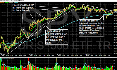
Yesterday's Market
Click on all images for a larger image. The text on the chart should explain it all. Feel free to leave a comment about this new approach if you like.


Friday, December 24, 2010
Weekly Indicators: What's in your stocking? edition
- by New Deal democrat
This week Americans got both something good and something bad in their stockings. Personal income and spending both continued to rise smartly, showing more evidence that the consumer has more cash, and the consumer is willing to spend it. The savings rate remained basically steady. I'll have an update on this next week. Durable goods orders fell, but if you exclude Boeing, they did rather well. New and existing home sales remained in the tank, but if you do a YoY comparison with 2008 instead of 2009 (which was distorted by the $8000 housing credit), there was actually a small increase. Consumer sentiment including expectations were at the highest level since June.
But there was coal, too - well, at least a different hydrocarbon in the form of Oil, which hit $90 this week, triggering renewed concern about how robust consumer spending can be with this "tax" on consumption. There was also a big lump of coal in the mortgage rate stocking. More below.
Here is this week's high frequency data:
The BLS reported 420,000 new jobless claims for the second week in a row. The 4 week moving average rose slightly to 426,000. Eight of the last nine weeks have now been reported under 440,000. The issue now becomes, are we in a new range of 410,000 to 440,000, or will the average continue to fall to under 400,000?
Gas at the pump reamined at $2.98 a gallon last week. As reported above, Oil breached the $90 a barrel mark. Despite this, gasoline usage was once again about 2% above last year, Gasoline stocks are towards the high end of their normal range for this time of year.
The Mortgage Bankers' Association reported that its seasonally adjusted Purchase Index decreased 2.5% last week, but generally has remained stable for the last couple of months, at a rate slightly below the comparable year-ago levels excluding those periods when home buyers rushed to beat the expiring $8000 tax credit. Contrarily, the Refinance Index fell off a cliff, declining for the sixth straight week, by 24.6%! Rapidly increasing mortgage interest rates have just about killed refinancing, and this is likely to have an effect on consumer spending next year.
The ICSC reported same store sales for the week ending December 18 increased 4.2% YoY, and increased 1.7% week over week. Likewise, Shoppertrak reported that sales increased 5.5% YoY in the last weekend before Christmas. Most of the retailing reports are indicating that this will end up being a strong holiday shopping season.
Railfax remained steady in its comparison with last year. Shipments of waste and scrap metal continue to improve, but auto shipments are significantly below last year. I have no idea why.
The American Staffing Association remained at 101 for the week ending December 11. This index will decline significantly over the next several weeks for seasonal reasons, and won't give much reliable information again until January.
M1 was down -0.5% for the week and vs. last month, and +7.5% YoY, meaning "real M1" is up 6.5%. M2 was up +0.2% for the week, up +0.3% vs. last month, and 3.1% YoY, meaning "real M2" is up 2.1%. Real M2 remains stalled without being able to break out of the "red zone" below +2.5% YoY.
Weekly BAA commercial bond rates increased from 6.09% last week to 6.18%. All bonds have come under stress recently, but this suggests investors are "reaching for yield." It's once again worth noting also that bond yields and stocks continue to move in opposite directions, indicating zero fear of a deflationary pulse.
The Daily Treasury Statement showed receipts in the first 11 reporting days of December of $119.5 B vs. $105.2 B a year ago, for a gain of close to 14%! For the last 20 days, $146.2 B has been received vs. $131.5 B a year ago, another strong gain of 12%.
The economy seems to be gaining momentum, which may also explain the steepening yield curve in the bond market. Indeed, so much so that Oil and other commodity prices, and mortgage rates, are once again becoming a "choke collar" on growth.
Have a wonderful holiday!
Thursday, December 23, 2010
Happy Holidays
It's the day before Christmas Eve, and things are winding down. Between work and family issues, life has been pretty crazy, so I'm going to wish you all a Merry Christmas. We'll be back on Monday for a holiday shortened week.
---- NDD here: I'll put up Weekly Indicators, probably tomorrow. Happy holidays!
---- NDD here: I'll put up Weekly Indicators, probably tomorrow. Happy holidays!
Wednesday, December 22, 2010
Real retail sales and hours worked
- by New Deal democrat
Following up on my last post, I wondered whether the secular shift to hours worked vs. jobs added in recoveries also fit better with the metric of real retail sales.
To start with, here is the last ten years of hours worked in private industry vs. private payrolls, measured YoY:
The two series fit like tightly, showing ever so slightly over 10 years the secular shift.
Now here are real retail sales vs. hours worked in absolute terms:
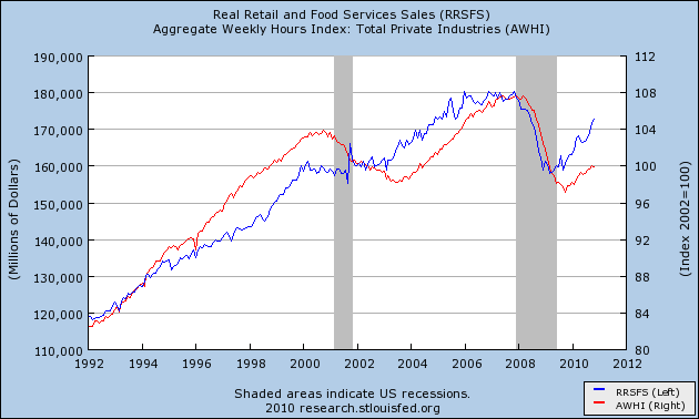
and here they are measured YoY:
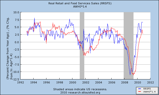
:Real retail sales maintains its status as a leading indicator, in this case for hours worked, and if anything the series fits more tightly than real retail sales vs. payrolls, with the exception of the dot-com boom and bust.
Following up on my last post, I wondered whether the secular shift to hours worked vs. jobs added in recoveries also fit better with the metric of real retail sales.
To start with, here is the last ten years of hours worked in private industry vs. private payrolls, measured YoY:
The two series fit like tightly, showing ever so slightly over 10 years the secular shift.
Now here are real retail sales vs. hours worked in absolute terms:
and here they are measured YoY:
:Real retail sales maintains its status as a leading indicator, in this case for hours worked, and if anything the series fits more tightly than real retail sales vs. payrolls, with the exception of the dot-com boom and bust.
----
P.S. I'm probably preaching to the choir here, but I hope posts like I've put up in the last week dispel any claim that I am an economic "cheerleader" or "Pollyanna." I started out with intellectual curiosity about the historical durations of 400,000+ jobless claims, was completely surprised by what happened when I normed those for population, and raw intellectual curiosity took over again from there. I go where the data leads me, it's that simple.
New Jobless Claims and the Unemployment Rate continued (II)
- by New Deal democrat
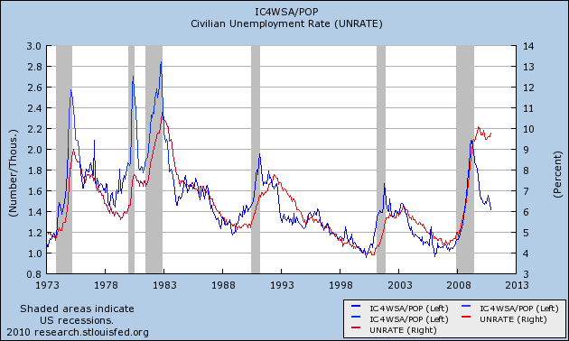
On Friday I posted the below graph that showed the very surprising close and leading correlation between initial jobless claims adjusted for population (the "initial jobless claims rate") and the unemployment rate:
So close is the correlation that the initial jobless claims rate predicts the unemployment rate 3 months later within 2% in all but 31 of 524 months - about 93% of the time, and predicts the unemployment rate within 3% all but 13 times, or 97.5% of the time:
It appears there is a slight secular trend higher in this metric in the long term. I will address this in point 4 below. (Note: my co- blogger Silver Oz has put this relationship together in a spreadsheet. If you would like a copy, let us know in the comments section).
On Monday I showed an alternative, similar measure caclulated from the YoY change in the 6 month averages in the two metrics.
Both ways of looking at the data show that this past year has been an exception to the rule: the unemployment rate has remained stubbornly high and unchanged even though initial claims have dropped by over 20%.
On Friday I suggested that the exceptional circumstances prevailing now meant that layoffs were actually no longer higher than average for the last 50+ years. Rather, the issue was a lack of new job creation.
I believe there are 4 reasons that give rise to this exceptional situation in which job creation has not been as strong as compared with the leading metrics. Numbers 1 and 2 are unique to this recovery, while number 3 and 4 are continuations of a trend - and in the case of number 4, a continuation at a completely new scale:
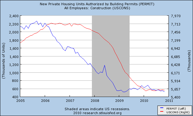
1. The expiration of the $8000 housing credit distorted the normal recovery pattern. Construction growth is not only failing to lead this recovery, but there has been no net construction hiring 19 months after the bottom of the economy.
2. In accord with number 1, and drastic cutback in fiscal aid to the states after one year has pushed job losses that would otherwise have taken place in 2009, into 2010, instead of renewed hiring beginning.
3. Manufacturing job growth is taking place in Asia in response to renewed American consumer demand.
4. Growth in hiring has been replaced with growth in hours.
1. Housing
As part of the February 2009 economic stimulus package, Congress passed an $8000 housing credit. In response, housing sales and prices, both of which had been plummeting, stabilized and housing sales actually increased. When the stimulus was originally planned on being terminated in October 2009, and then when it actually did terminate at the end of April 2010, housing starts and permits dropped again, all the way back to their previous lows, and decreased demand showed up in dropping prices as well.
Prof. Edward E. Leamer made a persuasive case several years ago that housing booms and busts always lead the economy into and out of recessions. With the huge housing hangover, there has been no such growth yet, and construction jobs have flatlined as shown in this graph:
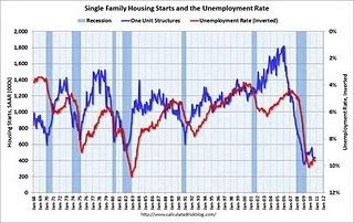
Bill McBride, t/a Calculated Risk, has produced this graph over the last few months showing that housing permits and starts lead the unemployment rate:
It is obvious they are still affecting it.
2. Of a piece with the housing stimulus is the saga of Congressional fiscal aid to the states, which was forthcoming in 2009, grudgingly and only partially extended for one more year in June 2010. State and local layoffs, which otherwise would have taken place in 2009, have taken place in 2010 instead. If you needed the reminder, here is the graph of local employment. Over 250,000 jobs in this sector have been lost.
As to both housing and state and local government employment, what happened is a shift in layoffs. There would have been more layoffs and a steeper climb in the unemployment rate in 2009, and most likely a decline to where we are now this year. Instead the unemployment rate has flattened.
3. Another piece in the puzzle has to do with imports. Intermodal containers are typically the boxes that arrive via ship on the West Coast, and then are transported by rail to other locations.
Consider this graph of intermodal transit on railroads:
Consider also this graph of Los Angeles port traffic:
Although real retail sales have rebounded approximately 2/3 from their recession low, intermodal container imports and rail transit have made up essentially all of their lost ground. In other words, American cnsumer demand stimulated production in Asia, not manufacturing jobs in America.
4. Growth in hiring has been replaced with growth in hours.
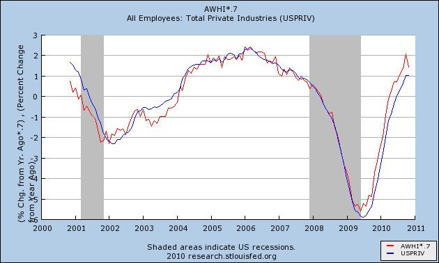
The Great Recession, unlike prior recessions, including other severe recessions, hit service jobs every bit as hard as manufacturing jobs. Fully half of the 8 million or so jobs lost during the recession came from services. No other prior recession comes even remotely close to that percentage:
In short, this was a broad based drastic decline in jobs across the entire spectrum of the economy.
I submit that the Recovery in employment is taking place, relatively speaking, in the amount of hours worked, rather than in the number of jobs gained, and until that is resolved, metrics like the initial jobless claims rate (and real retail sales too) compared with employment and unemployment will lag compared to prior recoveries.
This in my opinion is the crucial graph -- average hours worked in private industry:
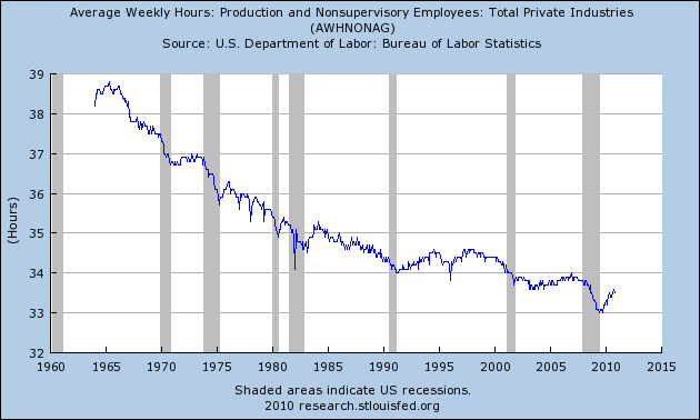
As you can see, it has been in decline for half a century. What this means is, every time there is a recession, there are more and more hours available to be increased in the workforce before new hires need to be brought on board. To see that, first let's look at the following graphs, in which for each recovery, the YoY percentage change in jobs is subtracted from the YoY change in hours. Here are the 1970s and 1982 severe recessions:
And here are the more recent "jobless recoveries:"
As you can see, in earlier recoveries the number of hours initially grew faster than the number of jobs, but quickly reached a "saturation point" after which jobs grew just as fast. In more recent recoveries, the saturation point was very lately, if ever, reached.
Let's now look at the actual growth in jobs and hours over time. In this next graph, the last half century's data is normed so that the 1981 peak is at 100. You can see that before then, jobs grew faster than hours. After that, the growth looks a little more equivocal.
When we look at the same data over the last 10 years normed so that the 2007 peak is normed to 100, the change becomes much more obvious.
Since 1981, jobs and hours over the long term have grown about equally. Hours decline more in recessions, and grow more in recoveries. In the Bush economy, the number of hours worked only caught up with the number of jobs gained in 2007 - just in time for the Great Recession. Since bottoming a year ago, half of the difference in the declines has been made up.
Let me show you the same data one more way. This is the same information above in YoY terms:
If it looks like gradually hours are being added faster in expansions, and job losses are increasing relatively speaking in recessions, then this next graph, with payroll changes amplified 1.6 times so that the YoY changes in the last 10 year are almost identical, should make it obvious:
It is now easy to see that over time, fewer and fewer jobs were gained in economic expansions, and more jobs were shed during recessions, relative to hours worked.
So let's put together the above 4 points into a conclusion.
There has been a lag in job growth and unemployment decline compared with historical norms as to any number of metrics, including but not limited to the initial jobless claims rate and real retail sales. This is due in part to distortions due to the economic stimulus package of February 2009 which delayed and blunted losses in residential construction and state and municipal labor, which have continued to take place later than usual. In particular, one normal leading engine of recovery - residential building - is still bouncing along the bottom.
Additionally, the rise of offshoring on a secular basis has meant that increased spending by Americans is, relative to past recoveries, stimulating job growth in Asia rather than in America.
Finally, the secular reduction in average weekly hours worked in America means that there is much more slack to be taken up by growth in hours than by growth in jobs.
This does not mean that the historical metrics aren't relevant. There are signs in things like architectural billings, rail freight related to housing, and prices for housing that in real terms are lower in some markets than at any point in the last 25 years - that suggest both residential and nonresidential construction may start to grow together at some point in the next 4-8 months. Additionally, if hours continue to regain lost ground relative to jobs at the same pace as they have in the last 12 months, then by about the end of next year hours will have caught up with jobs, and if we avoid another crisis we can expect job growth to accelerate.
On Friday I posted the below graph that showed the very surprising close and leading correlation between initial jobless claims adjusted for population (the "initial jobless claims rate") and the unemployment rate:
So close is the correlation that the initial jobless claims rate predicts the unemployment rate 3 months later within 2% in all but 31 of 524 months - about 93% of the time, and predicts the unemployment rate within 3% all but 13 times, or 97.5% of the time:
It appears there is a slight secular trend higher in this metric in the long term. I will address this in point 4 below. (Note: my co- blogger Silver Oz has put this relationship together in a spreadsheet. If you would like a copy, let us know in the comments section).
On Monday I showed an alternative, similar measure caclulated from the YoY change in the 6 month averages in the two metrics.
Both ways of looking at the data show that this past year has been an exception to the rule: the unemployment rate has remained stubbornly high and unchanged even though initial claims have dropped by over 20%.
On Friday I suggested that the exceptional circumstances prevailing now meant that layoffs were actually no longer higher than average for the last 50+ years. Rather, the issue was a lack of new job creation.
I believe there are 4 reasons that give rise to this exceptional situation in which job creation has not been as strong as compared with the leading metrics. Numbers 1 and 2 are unique to this recovery, while number 3 and 4 are continuations of a trend - and in the case of number 4, a continuation at a completely new scale:
1. The expiration of the $8000 housing credit distorted the normal recovery pattern. Construction growth is not only failing to lead this recovery, but there has been no net construction hiring 19 months after the bottom of the economy.
2. In accord with number 1, and drastic cutback in fiscal aid to the states after one year has pushed job losses that would otherwise have taken place in 2009, into 2010, instead of renewed hiring beginning.
3. Manufacturing job growth is taking place in Asia in response to renewed American consumer demand.
4. Growth in hiring has been replaced with growth in hours.
Let's look at them in turn.
1. Housing
As part of the February 2009 economic stimulus package, Congress passed an $8000 housing credit. In response, housing sales and prices, both of which had been plummeting, stabilized and housing sales actually increased. When the stimulus was originally planned on being terminated in October 2009, and then when it actually did terminate at the end of April 2010, housing starts and permits dropped again, all the way back to their previous lows, and decreased demand showed up in dropping prices as well.
Prof. Edward E. Leamer made a persuasive case several years ago that housing booms and busts always lead the economy into and out of recessions. With the huge housing hangover, there has been no such growth yet, and construction jobs have flatlined as shown in this graph:
Bill McBride, t/a Calculated Risk, has produced this graph over the last few months showing that housing permits and starts lead the unemployment rate:
It is obvious they are still affecting it.
2. Of a piece with the housing stimulus is the saga of Congressional fiscal aid to the states, which was forthcoming in 2009, grudgingly and only partially extended for one more year in June 2010. State and local layoffs, which otherwise would have taken place in 2009, have taken place in 2010 instead. If you needed the reminder, here is the graph of local employment. Over 250,000 jobs in this sector have been lost.
As to both housing and state and local government employment, what happened is a shift in layoffs. There would have been more layoffs and a steeper climb in the unemployment rate in 2009, and most likely a decline to where we are now this year. Instead the unemployment rate has flattened.
3. Another piece in the puzzle has to do with imports. Intermodal containers are typically the boxes that arrive via ship on the West Coast, and then are transported by rail to other locations.
Consider this graph of intermodal transit on railroads:
Consider also this graph of Los Angeles port traffic:
Although real retail sales have rebounded approximately 2/3 from their recession low, intermodal container imports and rail transit have made up essentially all of their lost ground. In other words, American cnsumer demand stimulated production in Asia, not manufacturing jobs in America.
4. Growth in hiring has been replaced with growth in hours.
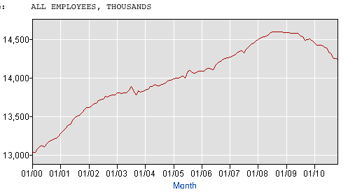
The Great Recession, unlike prior recessions, including other severe recessions, hit service jobs every bit as hard as manufacturing jobs. Fully half of the 8 million or so jobs lost during the recession came from services. No other prior recession comes even remotely close to that percentage:
In short, this was a broad based drastic decline in jobs across the entire spectrum of the economy.
I submit that the Recovery in employment is taking place, relatively speaking, in the amount of hours worked, rather than in the number of jobs gained, and until that is resolved, metrics like the initial jobless claims rate (and real retail sales too) compared with employment and unemployment will lag compared to prior recoveries.
This in my opinion is the crucial graph -- average hours worked in private industry:
As you can see, it has been in decline for half a century. What this means is, every time there is a recession, there are more and more hours available to be increased in the workforce before new hires need to be brought on board. To see that, first let's look at the following graphs, in which for each recovery, the YoY percentage change in jobs is subtracted from the YoY change in hours. Here are the 1970s and 1982 severe recessions:
And here are the more recent "jobless recoveries:"
As you can see, in earlier recoveries the number of hours initially grew faster than the number of jobs, but quickly reached a "saturation point" after which jobs grew just as fast. In more recent recoveries, the saturation point was very lately, if ever, reached.
Let's now look at the actual growth in jobs and hours over time. In this next graph, the last half century's data is normed so that the 1981 peak is at 100. You can see that before then, jobs grew faster than hours. After that, the growth looks a little more equivocal.
When we look at the same data over the last 10 years normed so that the 2007 peak is normed to 100, the change becomes much more obvious.
Since 1981, jobs and hours over the long term have grown about equally. Hours decline more in recessions, and grow more in recoveries. In the Bush economy, the number of hours worked only caught up with the number of jobs gained in 2007 - just in time for the Great Recession. Since bottoming a year ago, half of the difference in the declines has been made up.
Let me show you the same data one more way. This is the same information above in YoY terms:
If it looks like gradually hours are being added faster in expansions, and job losses are increasing relatively speaking in recessions, then this next graph, with payroll changes amplified 1.6 times so that the YoY changes in the last 10 year are almost identical, should make it obvious:
It is now easy to see that over time, fewer and fewer jobs were gained in economic expansions, and more jobs were shed during recessions, relative to hours worked.
So let's put together the above 4 points into a conclusion.
There has been a lag in job growth and unemployment decline compared with historical norms as to any number of metrics, including but not limited to the initial jobless claims rate and real retail sales. This is due in part to distortions due to the economic stimulus package of February 2009 which delayed and blunted losses in residential construction and state and municipal labor, which have continued to take place later than usual. In particular, one normal leading engine of recovery - residential building - is still bouncing along the bottom.
Additionally, the rise of offshoring on a secular basis has meant that increased spending by Americans is, relative to past recoveries, stimulating job growth in Asia rather than in America.
Finally, the secular reduction in average weekly hours worked in America means that there is much more slack to be taken up by growth in hours than by growth in jobs.
This does not mean that the historical metrics aren't relevant. There are signs in things like architectural billings, rail freight related to housing, and prices for housing that in real terms are lower in some markets than at any point in the last 25 years - that suggest both residential and nonresidential construction may start to grow together at some point in the next 4-8 months. Additionally, if hours continue to regain lost ground relative to jobs at the same pace as they have in the last 12 months, then by about the end of next year hours will have caught up with jobs, and if we avoid another crisis we can expect job growth to accelerate.
In short, the correlation may be delayed, but most likely it will assert itself in 2011.
Subscribe to:
Posts (Atom)