- by New Deal democrat
Patience is said to be a virtue. So you must be a little patient with me until I get to my promised third installment discussing last week's employment report. I'll put it up early next week. This week I've been engaged in a kind of audit that I decided really needed to be finished before tonight, although the final result requires patience on my part as well.
There really was little monthly data this week - consumer confidence edged up. So let me take this opportunity for a reminder that I first started looking at high frequency indicators to see if the recovery had "legs." Then last summer they accurately and in real time showed that the economy was experiencing a slowdown but no double-dip. Now I am mainly watching for sings of re-acceleration (initial jobless claims) vs. the choke collar of Oil prices.
Speaking of cold, it appears the succession of bad winter storms last week really played havoc with this week's high frequency data:
The BLS reported initial jobless claims of 383,000, and the 4 week moving average fell to 416,000. While I'd love to be able to do a happy-dance, and I hope that this result is "the real thing, " the fact is that initial claims have been very erratic due to the weather. The 457,000 reading a few weeks ago was due to delayed filing of claims, and I suspect we will see another spike next week. The 4 week average is a much better "read" and that has been generally moving in a range for over a month. In short, take this week's reading with an extra grain of salt.
The Mortgage Bankers' Association reported an decrease of 5.5% in seasonally adjusted mortgage applications last week, which maintains this series generally in a flat range since last June. Refinancing decreased 7.7%, and remains near its lowest point in a year. Higher mortgage rates have really bitten these two series. A decline in refinancing in particular means slower consumer deleveraging.
Gas at the pump made a new post-recession high at $3.13 a gallon, while Oil ended the week at about $86.50 a barrel. Gasoline usage was significantly lower than last year - over 200,000 barrels a day, or 2.6%. This is the second consecutive negative YoY reading, and is more evidence that gas prices are beginning to "bite" - but again the unusually stormy winter weather could be the culprit.
The American Staffing Association Index remained at 90 for the week ending January 30. This was 13% higher than a year ago, and remains only about 9% below the peak January levels from 2008. This is equal to the closest so far the index has come to pre-recession levels.
Railfax, for the first time in a long time, showed total rail shipments were -0.6% lower in the week ending February 5 than during the same week last year. Shipments of waste and scrap metal were actually below last year's levels, as was intermodal freight, and food and grains. At this point, then the slowdown cannot be dismissed, but again it is possible that an unusually stormy winter is playing a role, as municipalities devote resources to plowing rather than recycling and trash. Since Canadian railroads were particularly hard hit, it may be that there is a unique Canadian factor impacting these results.
The ICSC reported that same store sales for the week of February 5 increased 2.5% YoY, and 2.2% week over week. Shoppertrak reported that sales rose 1.1% YoY for the week ending February 5, and also increased 1.2% from the week before. These are very tepid compared with recent readings.
Weekly BAA commercial bond rose +.09% to6.17%. This is at the top end of its range over the last two months. This compares with a 0.14% increase in the yields of 10 year treasuries, which have also been in a tight range for over a month. This certainly does not imply relative weakness for corporate bonds.
M1 was up 2% w/w, up 1.2% M/M and up a strong 9.0% YoY, so Real M1 is up 7.6%. M2 was up 0.4% w/w, up 0.2% M/M and up 4.3% YoY, so Real M2 is up 2.9%. Both of these are now in ranges where economic expansion has always taken place.
Adjusting +1.07% due to the recent tax compromise, the Daily Treasury Statement showed adjusted receipts for the first 7 days of February of $54.4 B vs. $57.7 B a year ago, for a loss -6.0% YoY. For the last 20 days, $148.3 B was collected vs. $138.6 B a year ago, for a gain of $6.5%
In short, one of two things happened in the first week of February: (1) the economy went into a sudden nosedive; or (2) the winter storms caused a decline in almost all activities - including layoffs. I vote for (2), but we'll see in a few weeks.
In the meantime, have a good weekend!
Friday, February 11, 2011
Bernanke on the Economy
From his recent testimony:
Every 4-6 weeks we get some statement from the Federal Reserve which provides a good comprehensive overview of the economic situation. This is incredibly important, as it allows us to continually reevaluate where the economy is at the macro scale, analyzing a large swath of important data, rather than concentrating on a few data points out of context.
Simply put, we're in much better shape now. The latest GDP report and latest Beige Book (see here, here, and here) all show a far better economic picture. Consumer spending has rebounded, manufacturing is very strong, services are improving and we're finally seeing a little inflation. The sum total of these factors is -- as Bernake notes -- "increased evidence that a self-sustaining recovery in consumer and business spending may be taking hold."
We have two problem areas: real estate and jobs. While commercial real estate is doing better residential real estate is still dogged by a massive inventory overhang which won't clear up anytime soon. The employment situation is also poor with the unemployment rate still high. The real issue is the last of meaningful job creation. As I noted this week, the real issue here isn't that we're not creating jobs; we're not creating enough of them. I'm still not sure what the issue is here, or whether it's a combination of these issues.
However, the bottom line is clear: we're doing pretty well right now.
The economic recovery that began in the middle of 2009 appears to have strengthened in the past few months, although the unemployment rate remains high. The initial phase of the recovery, which occurred in the second half of 2009 and in early 2010, was in large part attributable to the stabilization of the financial system, the effects of expansionary monetary and fiscal policies, and the strong boost to production from businesses rebuilding their depleted inventories. But economic growth slowed significantly last spring and concerns about the durability of the recovery intensified as the impetus from inventory building and fiscal stimulus diminished and as Europe's fiscal and banking problems roiled global financial markets.
More recently, however, we have seen increased evidence that a self-sustaining recovery in consumer and business spending may be taking hold. Notably, real consumer spending rose at an annual rate of more than 4 percent in the fourth quarter. Although strong sales of motor vehicles accounted for a significant portion of this pickup, the recent gains in consumer spending appear reasonably broad based. Business investment in new equipment and software increased robustly throughout much of last year, as firms replaced aging equipment and as the demand for their products and services expanded. Construction remains weak, though, reflecting an overhang of vacant and foreclosed homes and continued poor fundamentals for most types of commercial real estate. Overall, improving household and business confidence, accommodative monetary policy, and more-supportive financial conditions, including an apparently increasing willingness of banks to lend, seem likely to result in a more rapid pace of economic recovery in 2011 than we saw last year.While indicators of spending and production have been encouraging on balance, the job market has improved only slowly. Following the loss of about 8-3/4 million jobs from 2008 through 2009, private-sector employment expanded by a little more than 1 million in 2010. However, this gain was barely sufficient to accommodate the inflow of recent graduates and other new entrants to the labor force and, therefore, not enough to significantly erode the wide margin of slack that remains in our labor market. Notable declines in the unemployment rate in December and January, together with improvement in indicators of job openings and firms' hiring plans, do provide some grounds for optimism on the employment front. Even so, with output growth likely to be moderate for a while and with employers reportedly still reluctant to add to their payrolls, it will be several years before the unemployment rate has returned to a more normal level. Until we see a sustained period of stronger job creation, we cannot consider the recovery to be truly established.
On the inflation front, we have recently seen increases in some highly visible prices, notably for gasoline. Indeed, prices of many industrial and agricultural commodities have risen lately, largely as a result of the very strong demand from fast-growing emerging market economies, coupled, in some cases, with constraints on supply. Nonetheless, overall inflation is still quite low and longer-term inflation expectations have remained stable. Over the 12 months ending in December, prices for all the goods and services consumed by households (as measured by the price index for personal consumption expenditures) increased by only 1.2 percent, down from 2.4 percent over the prior 12 months. To assess underlying trends in inflation, economists also follow several alternative measures of inflation; one such measure is so-called core inflation, which excludes the more volatile food and energy components and therefore can be a better predictor of where overall inflation is headed. Core inflation was only 0.7 percent in 2010, compared with around 2-1/2 percent in 2007, the year before the recession began. Wage growth has slowed as well, with average hourly earnings increasing only 1.7 percent last year. These downward trends in wage and price inflation are not surprising, given the substantial slack in the economy.
Every 4-6 weeks we get some statement from the Federal Reserve which provides a good comprehensive overview of the economic situation. This is incredibly important, as it allows us to continually reevaluate where the economy is at the macro scale, analyzing a large swath of important data, rather than concentrating on a few data points out of context.
Simply put, we're in much better shape now. The latest GDP report and latest Beige Book (see here, here, and here) all show a far better economic picture. Consumer spending has rebounded, manufacturing is very strong, services are improving and we're finally seeing a little inflation. The sum total of these factors is -- as Bernake notes -- "increased evidence that a self-sustaining recovery in consumer and business spending may be taking hold."
We have two problem areas: real estate and jobs. While commercial real estate is doing better residential real estate is still dogged by a massive inventory overhang which won't clear up anytime soon. The employment situation is also poor with the unemployment rate still high. The real issue is the last of meaningful job creation. As I noted this week, the real issue here isn't that we're not creating jobs; we're not creating enough of them. I'm still not sure what the issue is here, or whether it's a combination of these issues.
However, the bottom line is clear: we're doing pretty well right now.


Thursday, February 10, 2011
Chinese Drought Will Add to Food Inflation
From the WSJ:
A United Nations agency said this year's wheat crop is at risk in at least five Chinese provinces, echoing continuous warnings from China that its major northern wheat growing areas are facing an epic drought.In a rare special early warning global alert, the U.N. Food and Agriculture Organization said north China's "ongoing drought is potentially a serious problem." The Rome-based FAO, which based its notice partly on a stream of warnings from Beijing about the wheat crop, said the provinces primarily affected include Shandong, Jiangsu, Henan, Hebei and Shanxi, which together represent about two-thirds of China's national wheat production.
For weeks, Beijing officials have underscored their concern about risks to the wheat crop, with the state-run Xinhua news agency reporting on Tuesday that the production base in Shandong province "is bracing for its worst drought in 200 years."
.....
Global wheat producers, including in the U.S., have been attentive to the possibility China will import wheat this year at a time when a half-year-old Russian export ban is in place after wildfires there and when Australian producers have faced weeks of adverse weather. On Tuesday, U.S. wheat futures surged to a 30-month high.
Initial Claims Fall Below 400,000
From Bloomberg:
The number of Americans filing first-time claims for unemployment insurance fell to the lowest level since July 2008 last week, showing further strength in the labor market after the jobless rate declined to a 21-month low.Applications for jobless benefits decreased by 36,000, more than forecast, to 383,000 in the week ended Feb. 4, Labor Department figures showed today. Economists forecast claims would fall to 410,000, according to the median estimate in a Bloomberg News survey. The total number of people receiving unemployment insurance fell, while those collecting extended payments increased.
A slowdown in firings means U.S. companies may begin creating enough jobs to keep unemployment going down after the rate’s biggest two-month decline since 1958. Federal Reserve Chairman Ben S. Bernanke yesterday said the jobless rate will likely stay high “for some time” as companies remain reluctant to add to payrolls.
“The first indication that we’re going to see strength falling into the labor market is a sustainable decline in initial claims,” Lindsey Piegza, an economist at FTN Financial in New York, said before the report. “This is a step in the right direction, signaling that, on the margin, businesses will begin to take on new employees.”
Over the last few weeks, we've seen spikes in this number which were supposedly caused by the weather. Now we know those claims were pretty much true.
Jobless Recoveries, Redux
Over the last three days, I've normalized the employment numbers for the last three jobless recoveries to compare and contrast the performance of the employment numbers. Here are the links to the posts; part 1, part 2 and part 3. All the data compared points 20 months into the recovery.
Here are the summary points.
By 20 months, the 1990s recovery was in full on growth mode. The unemployment rate was dropping, and initial unemployment claims were decreasing, after spiking the first 10 months of the recovery. Both the private sector the the government were creating jobs. In the private sector, service sector growth was strong, while manufacturing employment -- after dropping for the first 10 or so months -- was rebounding.
In contrast, the early 2000s recovery was languishing. After 20 months of recovery, the unemployment rate had increased and initial unemployment claims were still elevated. Total employees had decreased, with the decrease coming entirely in the private sector. While the service sector was creating some jobs, the manufacturing sector was still bleeding jobs.
Despite having higher absolute levels, the relative performance of both initial unemployment claims and the unemployment rate for the current recovery are in fact the best of the three recoveries. Overall job growth has increased slightly; while government jobs spiked due to the census hiring, their totals after 20 months of recovery are in fact noticeably lower than the previous two recoveries. Private sector employment is responsible for all the job gains, with both the service sector and manufacturing contributing to overall growth.
It's a misnomer to call the early 90s recovery jobless after 20 months; that recovery was seeing good growth across a variety of sectors by this time.
By 20 months, the 2000s recovery was bleeding jobs, primarily in the manufacturing sector. It was seeing some job growth in the service sector, but not really a meaningful amount.
The current recovery is seeing job growth in both service and manufacturing; the central problem is degree; considering the massive bleeding that occurred in 2008 far brisker job creation is needed going forward.


Wednesday, February 9, 2011
Another Day, Another Journalist Embarrasses Himself
It appears that each day we can find some website publishing an intellectually embarrassing screed from someone who tries to pretend they actually know something about economic or statistics. For today, I would like to highlight this piece by Charles Hugh Smith that is featured on CNNFN. Not only (as I will show) does Mr. Smith have no idea what he is talking about, but his conclusions show that he was much more interested in pushing his (wrong) worldview than pursuing any actual academic rigor with this opinion piece (it has to be called an opinion piece because it is almost completely bereft of facts).
Let us begin with Mr. Smith's complete misunderstanding of the Household Survey , which is exactly as the name implies, a survey of households (60,000 to be precise) from which the BLS gets the numbers for the labor force, unemployed, employed, the unemployment rate, etc. Mr. Smith states:
"This ongoing adjustment of who gets counted as part of the labor force leads statisticians to lower the unemployment rate -- even though the number of employed people has barely ticked up."
Of course, this statement is completely wrong, as those surveyed determine whether they are in the labor force or not, not some magical BLS adjustment. Mr. Smith then goes on to state:
"Given this substantial increase in population every year, we might reasonably expect the civilian labor force to expand proportionally, as students graduate and new immigrants enter the workforce."
Of course, what Mr. Smith misses completely is that while we do have an increasing population, we also have an aging one, with about 10,000 people a day turning 65 in this country and retired people are not counted in the labor force (again they have to self select as being retired age alone doesn't put them in this category). And when we couple the number turning 65 with all those turning at least 62 (the point at which one can take early social security benefits), we may (and I say may) have some explanation of why the labor force could be shrinking.
Now, for the most glaring error that Mr. Smith makes, which showcases that he neither understands how the Household Survey works nor has any desire to do so:
"When unemployed people stop looking for jobs at their local unemployment office, the government no longer counts them as unemployed. That's how the number of unemployed can drop from 15 million in November 2010 to 13.8 million in January 2011, a decline of 1.2 million, even though the economy created only about 400,000 jobs in those three months."
Anyone who has even remotely studied the Household Survey knows that unemployment insurance/benefits have absolutely nothing at all to do with determining the number of unemployed for purposes of the Household Survey. The Household Survey is exactly that, a survey and so long as you say you are currently looking for work you count as unemployed (regardless of benefit status). Also, we must note that even those who are no longer looking, but would still like to have a job are broken out from the generic "not in the labor force" category and this breakout category actually decreased (by a little) last month, which means that while the number not in the labor force jumped a lot in January, the number of those who would still like a job did not (which pretty well flushes Mr. Smith's thesis down the toilet). But we aren't done here just yet.
The final error Mr. Smith makes is in his chastisement of the infamous birth/death adjustment about which Mr. Smith states:
"Depending on what the "black box (he is referring to the birth/death adjustment - SilverOz)" issues every month (the BLS does not reveal its methodology), the government may report that the economy has created hundreds of thousands of new jobs -- that are often revised away in estimates a few months later."
I want to just say that it took me less than 30 seconds to find the methodology for the birth/death adjustment on the internet, again showcasing Mr. Smith's research skills. I also want to point out that the BLS has always made adjustments for the birth and death of businesses just that prior to the publication of the birth/death adjustment as a separate number, they were simply included (unattributed) in the normal data/seasonal adjustments.
Finally, I would like to point out the extreme flaw with the basis for Mr. Smith's article: that the unemployment rate cannot really be going down because all we are seeing is a decline in the labor force and number of unemployed, but not job creation. To which, I point Mr. Smith back to December-March of 1982-83. Between December and March of 82/83 the unemployment rate fell .5%, while the labor force lost 496,000 people (the number "not in the labor force" grew by 953,000 during that period), the number of unemployed shrank by 643,000, yet the number of employed only went up by 147,000. And somehow, that recovery seemed to end up being fairly decent if my memory serves me correctly.
The January Jobs report: the Unemployment rate I.
- by New Deal democrat
This is the second of three posts in which I dissect last Friday's jobs reports. On Monday I showed that, even after the BLS benchmark revisions, there was gradual improvement in the jobs reports, and that "the disappointment syndrome" caused almost everybody to overlook that final revisions two months after the original reports showed most monthly jobs reports in line with estimates. As usual, it is always best to average these reports over a 2 or 3 month period to deal with anomalies such as mid-January's unusual southern snowstorm.
But the big head-scratching Friday was how to square the meager 36.000 jobs created as shown in the establishment report with the big drop in unemployment from 9.4% to 9.0% in the household report.
To begin with, you may recall that several months ago I showed that, over the last 45 years, the rate of initial jobless claims (new claims divided by population) almost always could predict within 2% the unemployment rate about 3 months later. The exceptions were during the big recessions of 1974 and the double dip 1980 and 1981 recessions (in which the new claims rate overpredicted unemployment), and this recovery (in which the new claims rate underpredicted unemployment by about 4% as of November!) Here's the graph I ran then:
Take a look at the same graph updated through January:

The big decline in the unemployment rate still puts it about 3% above predicted rates, but supports the correlation's continued viability whereby the initial jobless claims rate is a leading indicator for the unemployment rate.
I also ran a graph, courtesy of Thumbcharts, that compared the 6 month average of new jobless claims with the same data from the year before, and similarly compared the average unemployment rate for the last 6 months with that of a year before. Here is that graph from two months ago:

The graph showed that in every case except for the 1980-1982 "double dip," a decline of 10% as measured of initial jobless claims was followed within 10 months by a similar decline in the unemployment rate
Here is the same graph now:

In this series too the leading relationship between initial claims and the unemployment rate is continuing to manifest itself.
These two series suggest that the decline in the unemployment rate is no fluke. While based on fundamental analysis of the economy, many forecasters were predicting that the unemployment rate would not get down to 9% until the end of 2011, instead it hit that rate in the first month. Further, since the historical relationship between these two series has not fully been resolved (i.e., the unemployment rate is still significantly higher than that predicted by initial jobless claims), one place to look for an economic surprise in the coming months is whether the unemployment rate continues to decline much more quickly than had been anticipated.
Finally, while the leading relationship described above suggests that the surprise decline in the unemployment rate is no fluke, it doesn't tell us *why* the unemployment rate declined as it did, and if the reasons are good news or bad. There are probably three main factors at work. That will be described in my next post.
Take a look at the same graph updated through January:
The big decline in the unemployment rate still puts it about 3% above predicted rates, but supports the correlation's continued viability whereby the initial jobless claims rate is a leading indicator for the unemployment rate.
I also ran a graph, courtesy of Thumbcharts, that compared the 6 month average of new jobless claims with the same data from the year before, and similarly compared the average unemployment rate for the last 6 months with that of a year before. Here is that graph from two months ago:
The graph showed that in every case except for the 1980-1982 "double dip," a decline of 10% as measured of initial jobless claims was followed within 10 months by a similar decline in the unemployment rate
Here is the same graph now:
In this series too the leading relationship between initial claims and the unemployment rate is continuing to manifest itself.
These two series suggest that the decline in the unemployment rate is no fluke. While based on fundamental analysis of the economy, many forecasters were predicting that the unemployment rate would not get down to 9% until the end of 2011, instead it hit that rate in the first month. Further, since the historical relationship between these two series has not fully been resolved (i.e., the unemployment rate is still significantly higher than that predicted by initial jobless claims), one place to look for an economic surprise in the coming months is whether the unemployment rate continues to decline much more quickly than had been anticipated.
Finally, while the leading relationship described above suggests that the surprise decline in the unemployment rate is no fluke, it doesn't tell us *why* the unemployment rate declined as it did, and if the reasons are good news or bad. There are probably three main factors at work. That will be described in my next post.
Jobless Recoveries, Part III
Let's continue our look at jobless recoveries by looking at another way to divide the total establishment jobs report into distinct parts: service and manufacturing employment. Remember, all of the charts below are on a scale of 100 to normalize the performance, thereby allowing us to compare the performance of the sectors.
 First, note that by 20 months, the 1990ss recovery had rebounded, while the early 2000s recover was still losing jobs. The latest recovery is standing still, having dropped a bit, but then rebounding.

Manufacturing jobs had dropped in the early 1990s recovery, but had started to recover by the 20 month mark. In contrast, the early 2000s recovery was still losing manufacturing jobs at a steep pace. The current recovery has seen a drop in manufacturing jobs, but has also seen a slight rebound.

In comparison, the early 1990s recovery was responsible for a huge increase in service jobs by 20 months. In comparison, neither the 2000 or current recovery is really doing much in terms of service sector job creation.
 First, note that by 20 months, the 1990ss recovery had rebounded, while the early 2000s recover was still losing jobs. The latest recovery is standing still, having dropped a bit, but then rebounding.
Manufacturing jobs had dropped in the early 1990s recovery, but had started to recover by the 20 month mark. In contrast, the early 2000s recovery was still losing manufacturing jobs at a steep pace. The current recovery has seen a drop in manufacturing jobs, but has also seen a slight rebound.

In comparison, the early 1990s recovery was responsible for a huge increase in service jobs by 20 months. In comparison, neither the 2000 or current recovery is really doing much in terms of service sector job creation.


Tuesday, February 8, 2011
Commodity Prices And Supply and Demand
From the WSJ:
The story highlights a very important issue: prices are being driven by final demand. While the dropping dollar has done something to increase prices, a big part of the increase has been caused by demand.
From Marketwatch:
Much of the $30 billion U.S. timber industry is still depressed because of weakness in the housing market, but some companies have found relief in a nontraditional customer: China.U.S. timber exports to China are suddenly surging, especially from mills around the Pacific Northwest, giving a boost to companies like Weyerhaeuser Co. and Plum Creek Timber Co. Helping to spur the increase: One of China's biggest timber sources—Russia—increased tariffs on its wood exports in 2007, leading Chinese buyers to turn increasingly to the U.S. and Canada for wood amid the country's construction boom.
"Everybody in the Northwest is talking about China," said Dan Fulton, chief executive of Weyerhaeuser, a timber company in Federal Way, Wash.
On Friday, Weyerhaeuser said it had swung to a fourth-quarter profit from a loss a year earlier. It noted that a tripling of its Chinese log exports in 2010 helped offset a 10% drop in its total logging volume in the same period.
Mr. Fulton said the Chinese are mostly using wood for nonresidential purposes such as crates and pallets.
The story highlights a very important issue: prices are being driven by final demand. While the dropping dollar has done something to increase prices, a big part of the increase has been caused by demand.
From Marketwatch:
Copper’s supply picture is not expected to change any time soon. “Supply is likely to be constrained in the foreseeable future as the mining industry has not responded quickly enough to recovering demand and is also battling against declining ore grades,” analysts at Commerzbank said in a note to clients Monday.
Jobless Recoveries Compared, Part II
Let's continue our look at the performance of various employment numbers from the last three "jobless recoveries." For more background, here is a link to the first installment.

The above chart shows total nonfarm payrolls, with the numbers adjusted to a base of 100 so we can compare the three recoveries. First, notice that by 20 months into the recovery of the 1990s, the establishment job market had turned around. However, the recovery in the 2000s had not really started -- in fact, the job market had gotten worse. In contrast, the current recovery has more or less been hovering around "no change" compared to the last two recoveries.

Let's break the numbers down into total private industries and government employees. In the 1990s recovery, total private jobs had rebounded strongly by this time. However, the recovery of the 2000s showed a decrease. In the current recovery, we're essentially back at square one, after printing a drop then an increase.

In the recovery of the early 1990s and 2000s, total government employees had pick-up by this time. However, in the current recovery, total government employees spiked higher because of the census, but then dropped lower. Part of the drop is the result of the census hiring then firing people. But there has been the added problem of the states laying people off due to state budget situation.
So, with the data we have the following points so far.
1.) The early 1990s recovery was actually on track by 20 months into the recovery. Both private sector and government job growth had pick-up.
2.) The early 2000s recovery was pretty slow, with the bulk of the jobs 200 months in coming from government growth, not private sector growth.
3.) The current recovery has been hit by poor growth in the private sector and job losses in the government sector -- in other words, both areas of job growth have been hit.


Monday, February 7, 2011
Will Arianna Share the Money?
Today, it was announced that AOL (which I use to call America on Hold) will buy the Huffington Post. As you may know, I use to blog over there, but haven't contributed in more than a few years.
Here's my question: the deal is worth $300 million. Will she be sharing the booty with any of the bloggers? This looks to me like a great time for a special dividend.
Here's my question: the deal is worth $300 million. Will she be sharing the booty with any of the bloggers? This looks to me like a great time for a special dividend.
The Dumbest Blog Post of the Year Goes To: Zero Hedge
I am going to make an early award for dumbest blog post of the year for this absolutely moronic piece showcasing the complete inability of the author to comprehend the data he is looking at. The sadder part of all of this, was while I was trying to find out just who the hat tipped individual was who came up with the stupid graph in the first place (a John Poehling according to ZeroHedge), I noticed that many other blogs picked this retarded screed up and ran it as some sort of fact. The only "fact" from this piece is that whoever came up with the "period 13 adjustments" to the non-farm payroll data likely did so in an office in the same building in Virginia where we filmed the moon landing.
Here is the telling quote from the above referenced tripe:
"Yet what could possibly be the biggest tell in the BLS tendentious spin of data comes courtesy of the BLS "period 13" data reporting, which is the full year adjustment the BLS gives at the end of every single year (it can be pulled from BLS data series CEU0000000001). And as John Poehling shows after parsing the data, in 72 years, there have been just 5 positive adjustments. And curiously, of these 5, the two largest ones by a huge margin occurred in the prior 2 years: 2008 and 2009, when year end adjustments (subsequently revised lower in the interim) added a total of 2.2 million jobs for the current administration. In 2010 there was no such luck, as the period 13 revision took out 1,243,000 jobs from the running total."
Let me debunk this as quickly as I can. The "period 13" that the author cites is nothing more than the yearly average of the employment data. Thus, in most years in which we added employment, the "period 13" (hereafter known as the annual average) will be lower than the December number. In years where we began the year with more employees than we ended it (like 08 and 09), the annual average will be higher than the December number. Look at that, simple math (this isn't even statistics, it is 3rd grade reading comprehension and math skills). We can only hope that whoever this "John Poehling" is that ZeroHedge gives credit to for coming up with this crap is not in fact managing anyone's money.
In other words, there is no such thing as a period 13 revision.
Update: It looks like Zero Hedge at least took the responsibility to pull this embarrassingly inaccurate post (sadly, it can still be found elsewhere on the blogosphere).
Update II: You can still find the article in full here. People would rather post things that agree with their worldview than take the time to see if what they are posting has any basis in fact/reality it seems.
The Disappointment Syndrome Redux (Or: if I don't toot my own horn, who will?)
- by New Deal democrat
One month ago I described the disappointment syndrome, writing that
In fact, leaving aside the yearly revisions for now, every single initial report in 2010 except one was revised higher. Here are the initial and final monthly jobs numbers (in thousands) excluding census, showing total revisions, for all of 2010:
(p)=preliminary
Now let's add in the yearly benchmark revisions:
(p)=preliminary
Even after the reductions due to the annual benchmarking, 9 of the 12 months still had upward revisions compared with the initial estimate, with the median revision being +27.
In that regard, here is the scatter graph of the monthly average of initial jobless claims compared with payrolls (using private jobs to avoid census distortions), updated by the benchmark revisions:

Note Friday's "disappointing" figure, and also that November and December, after revisions, are no longer "disappointing" at all but instead are firmly in mid-trend.

One month ago I described the disappointment syndrome, writing that
... with no more than three exceptions, every initial report on nonfarm payrolls in 2010 has been "disappointing." Two months later, after upward revisions, they have usually been in line with initial expectations. But by that time the econo-punditocracy has moved on to disappointment with the newly-current initial nonfarm payrolls report.Specifically, two months ago, expectations of private payrolls on the order of 90,000 or even better were raised by good ADP and TrimTabs estimates. Yet the initial report was a "devastating" 39,000. I said then that the November jobs report will probably be revised considerably higher:
Take a deep breath. .... The odds are very good that [the November jobs report] will be revised significantly higher in the next two months. .... The median final revision of the Jan-Sep initial reports has been +53,000. All but two of the nine that have been finally revised have increased by at least +46,000. A revision of +53,000 to November would give us +92,000.So, here we are two months later, with the final revisions for November in. And the final number is .... [insert drum roll here] :
92,000.
It's true that even a blind squirrel finds a nut every now and then, but I happen to think it means that you are reading the right blog. More to the point, how much commentary was there Friday pointing out that November's jobs report turned out not to be "disappointing" at all? None.
In a similar vein, in December, most estimates were for 150,000 or more jobs to be added. Instead, there was a "disappointing" 103,000 initial report. Note that after the first revision, close to half of that ground has been made up.
In a similar vein, in December, most estimates were for 150,000 or more jobs to be added. Instead, there was a "disappointing" 103,000 initial report. Note that after the first revision, close to half of that ground has been made up.
| Month | Initial | Final | net change |
|---|---|---|---|
| Jan | -29 | +5 | +34 |
| Feb | -52 | +23 | +75 |
| Mar | +114 | +160 | +46 |
| Apr | +184 | +247 | +63 |
| May | +20 | +21 | +1 |
| Jun | +100 | +50 | -50 |
| Jul | +2 | +77 | +75 |
| Aug | +60 | +113 | +53 |
| Sep | -18 | +53 | +71 |
| Oct | +151 | +210 | +59 |
| Nov | +39 | +92 | +53 |
| Dec | +103(p) | +121(p) | +18(p) |
(p)=preliminary
Now let's add in the yearly benchmark revisions:
| Month | Initial | Final after Benchmark revision | net change |
|---|---|---|---|
| Jan | -29 | -48 | -19 |
| Feb | -52 | -51 | +1 |
| Mar | +114 | +144 | +30 |
| Apr | +184 | +211 | +27 |
| May | +20 | +47 | +27 |
| Jun | +100 | +33 | -67 |
| Jul | +2 | +94 | +92 |
| Aug | +60 | +55 | -5 |
| Sep | -18 | +31 | +49 |
| Oct | +151 | +171 | +20 |
| Nov | +39 | +92 | +53 |
| Dec | +103(p) | +121(p) | +18(p) |
(p)=preliminary
Even after the reductions due to the annual benchmarking, 9 of the 12 months still had upward revisions compared with the initial estimate, with the median revision being +27.
There is thus every reason to believe that January's "disappointing" +36,000 job report will be less disappointing in two months' time, and given that the BLS's establishment survey tends to undercount jobs early in recoveries, we should expect the pattern to continue.
In that regard, here is the scatter graph of the monthly average of initial jobless claims compared with payrolls (using private jobs to avoid census distortions), updated by the benchmark revisions:
Note Friday's "disappointing" figure, and also that November and December, after revisions, are no longer "disappointing" at all but instead are firmly in mid-trend.
Finally, with regard to the benchmark revisions, here is a graph from Tim Iacono:
Note that the benchmark revisions reached back 5 years, in some cases making revisions greater than 50,000 in either direction well before the "official" benchmarked period began in March 2009. Despite that, the overall pattern is completely intact. Thus, so long as we don't get too caught up in any one month's figure, we can expect that the trend we believed we had before Friday will still prove to have been the trend in 3 months, a year, and several years' time.
Here is that trend, averaging jobs by quarter:
| Quarter | Average Job gain/loss |
|---|---|
| 4Q 2009 | -135 |
| 1Q 2010 | +15 |
| 2Q 2010 | +97 |
| 3Q 2010 | +60 |
| 4Q 2010 | +128 |
The jobs recovery is proving to be a long, slow, hard slog, but we are still improving.
Jobless Recoveries Compared, Part 1
The US economy is currently experiencing its third jobless recovery, or more accurately, recovery where the drop in the unemployment rate lagged the end of the recession by over a year. This phenomena started with recovery of the early 1990s, and continues with the current recovery. What I want to do is look at the employment data from the three recoveries to see what information we can glean.
Before I go forward, let me state this: I will be using relative levels to look for patterns -- that is, all data will be compared from the same level. I understand -- and am fully cognizant -- that the current situation is worse than the previous two recoveries. However, by putting the information into relative terms, we can compare the data to see what is different this time around which is the entire point of this exercise.
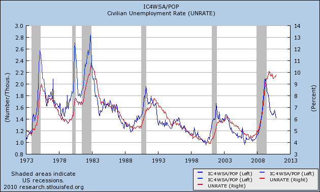
First, for a comparison of the unemployment rates and initial unemployment claims in absolute levels for the last 40 years, see this link.
Let's start with the 4-week moving average of initial jobless claims:

The above chart shows the performance of the 4-week average of initial jobless claims for the first 20 months of the recovery. I have "normalized" the performance to better compare. Interestingly enough, the 4-week moving average has performed better (it has dropped the farthest) during this recovery. This is good news, largely because the number is in fact much higher.
Let's turn to the unemployment rate:

The above chart shows the unemployment rate, normalized to a scale of 100 to better compare the performance of the different recoveries. Notice that after 20 months the absolute performance of the unemployment rate is in fact the best of the three jobless recoveries on record, as the unemployment rate spiked after the end of the two previous recessions.
Let me reiterate: I am well aware the numbers for this recovery are far worse for both the above numbers. That is not the point of the above charts. Instead, I want to compare the performance of both numbers to previous jobless recoveries to see if we are witnessing something different this time around. Despite the high absolute numbers, we are seeing the best performance on a comparative basis in both initial unemployment claims and the unemployment rate when compared to the last two recoveries.
Before I go forward, let me state this: I will be using relative levels to look for patterns -- that is, all data will be compared from the same level. I understand -- and am fully cognizant -- that the current situation is worse than the previous two recoveries. However, by putting the information into relative terms, we can compare the data to see what is different this time around which is the entire point of this exercise.
First, for a comparison of the unemployment rates and initial unemployment claims in absolute levels for the last 40 years, see this link.
Let's start with the 4-week moving average of initial jobless claims:

The above chart shows the performance of the 4-week average of initial jobless claims for the first 20 months of the recovery. I have "normalized" the performance to better compare. Interestingly enough, the 4-week moving average has performed better (it has dropped the farthest) during this recovery. This is good news, largely because the number is in fact much higher.
Let's turn to the unemployment rate:

The above chart shows the unemployment rate, normalized to a scale of 100 to better compare the performance of the different recoveries. Notice that after 20 months the absolute performance of the unemployment rate is in fact the best of the three jobless recoveries on record, as the unemployment rate spiked after the end of the two previous recessions.
Let me reiterate: I am well aware the numbers for this recovery are far worse for both the above numbers. That is not the point of the above charts. Instead, I want to compare the performance of both numbers to previous jobless recoveries to see if we are witnessing something different this time around. Despite the high absolute numbers, we are seeing the best performance on a comparative basis in both initial unemployment claims and the unemployment rate when compared to the last two recoveries.


Subscribe to:
Posts (Atom)