Thursday, December 24, 2009

Christmas Eve Weekly Indicators

- by New Deal democrat

Monthly data was mixed this week. Existing home sales came in higher than expected; new home sales tanked (which may or may not be of a piece with the surprise decline last month in housing permits and starts, which rebounded this month). 3Q GDP was revised down to a merely good 2.2%. The Chicago Fed's index in November improved. Perhaps most importantly, personal income and spending both increased in November, suggesting 4Q personal consumption expenditures will be up significantly compared with earlier this year.

Turning to the high-frequency weekly indicators:

The ICSC reported that same store sales last week
increased both YoY and WoW. The last four weeks show Y/Y and W/W changes as follows:
Dec 19 +0.4 +0.6
Dec 12 +2.4 +0.4
Dec 5 +2.6 -1.3
Nov 28 +3.1 -0.1

Since last Saturday was the east coast blizzard, it is especially noteworthy that the week still showed a gain.

Meanwhile ShopperTrak reported that sales for the week ending December 19 were down -1.2% YoY, although up +20.0% from the prior week. Again, taking into account that the biggest shopping day featured a blizzard in the Megalopolis, this is actually an encouraging report.

The BLS reported 452,000 new jobless claims last week, the lowest in 15 months. The 4 week moving average also continued to decline.

The E.I.A. reported that gasoline usage continued slightly above last year's level, with prices steady at $2.59/gallon. Oil advanced about $4 to $74 a barrel this week.

Railfax reports that rail traffic last week was up +28.1% vs. a year ago. The four week average was up +15.6%. For the 4th quarter as a whole to date, traffic is down -3.1%. Cyclical traffic is now ahead of last year on a 4 week average basis, and has basically reamined steady since mid-3Q, which is very bullish since it almost always starts to decline in October or November. Intermodal traffic is equal to last year.

An important piece of the encouraging rail traffic news may be reflected in the report by Edmund's that:

This month's new vehicle sales (including fleet sales) are expected to be 1,010,000 units, a 13.3 percent increase from December 2008 and a 3.57 percent increase from November 2009. Edmunds.com analysts predict that December's Seasonally Adjusted Annualized Rate (SAAR) will be 11.11 million, up from 10.89 in November 2009.


Finally, the December 22 Daily Treasury Statement, at $105,187 B, is about 10% less than the same day last year, which showed $116,642 B in withholding taxes paid for December. (Of note, on the 21st the two years were almost exactly equal). Either way, tax revenues are still in a state of severe stress.

In summary, the economy still isn't out of the woods. But there are increasing signs that consumer and producer spending are improving significantly, a good sign for employment going forward.

Most importantly of all, best wishes for a very happy holiday!

Initial Jobless Claims: 452,000; Durable Goods up 0.2%

- by New Deal democrat

The BLS reported that for the week ending December 19, seasonally adjusted initial jobless claims fell to 452,000, down from last week's 480,000.

The 4-week moving average is now 465,250, compared with 468,000 last week. The 4 week seasonally adjusted moving average is now about 31% lower than the peak of 658,750 on April 3 of this year. (The last two "jobless recoveries" coincided with new claims declining no more than 20% from peak).

Unadjusted, there were 561,902 new claims, an increase of 6,942 from the week before, showing how much seasonal volatility exists in the weekly numbers at this time of year. Today's reading is well below the initial claims numbers for this time last year, and seasonally adjusted is the best number in 1 year and 3 months.

In summary, based on my prior research, initial jobless claims are continuing to suggest that actual job growth is taking place in the economy this month.
----------
Meanwhile, durable goods orders also increased 0.2%. Bloomberg reports that:

Gains outside of transportation were broad-based, with increases in demand for machinery, metals, computers and communications gear.


Shipments of non-defense capital goods excluding aircraft, which is used in calculating gross domestic product, climbed 0.8 percent in November and October’s reading was revised to show a 1.5 percent jump, compared with a previously estimated 0.3 percent drop. Bookings for such goods, a proxy for future business spending, increased 2.9 percent in November.


The figures suggest business investment will contribute to growth.

----------
While we still don't have figures for several items in the LEI, between expanding positive bond yields, declining new jobless claims, and a rebound in housing permits and consumer sentiment, it is beginning to look like December's LEI could be a blowout, which would give us close to the highest YoY reading on the LEI in over 25 years. This would put the Conference Board's measure in the same territory as ECRI's long leading indicators, which already reached their highest point since 1982 this autumn.

Wednesday, December 23, 2009

Bonddad Signing Off Until Next Week

My father gets in town later today, so the family festivities will be cranking up. I'll be back on Monday.

To all the readers of this blog, have a very Merry Christmas. And don't think about stock charts or economic numbers during the process, OK?

GDP Increases 2.2% in Final Revision

From the BEA:

Real gross domestic product -- the output of goods and services produced by labor and property located in the United States -- increased at an annual rate of 2.2 percent in the third quarter of 2009, (that is, from the second quarter to the third quarter), according to the "third" estimate released by the Bureau of Economic Analysis. In the second quarter, real GDP decreased 0.7 percent.

The GDP estimate released today is based on more complete source data than were available for the "second" estimate issued last month. In the second estimate, the increase in real GDP was 2.8 percent (see "Revisions" on page 3).

The increase in real GDP in the third quarter primarily reflected positive contributions from personal consumption expenditures (PCE), exports, private inventory investment, federal government spending, and residential fixed investment that were partly offset by a negative contribution from nonresidential fixed investment. Imports, which are a subtraction in the calculation of GDP, increased.

The upturn in real GDP in the third quarter primarily reflected upturns in PCE, in exports, in private inventory investment, and in residential fixed investment and a smaller decrease in nonresidential fixed investment that were partly offset by an upturn in imports, a downturn in state and local government spending, and a deceleration in federal government spending.


The original release put this at an increase of 3.5%. This was followed by a lowered revision of 2.8% last month. However, GDP decreased at a .7% rate in the second quarter. In addition, this was the first increase in the last 5 quarters. That still makes this good news.

There was much hay made of the fact that of the 2.2%, 1.45% came from motor vehicle output, and especially that this was from the cash for clunkers program. In response, consider these points. First, a large number of the people complaining about that figure are the same people who argued for the first stimulus and in some cases are arguing for a second stimulus. In other words -- there people will complain no matter what. Secondly, government spending accounts for 20% of GDP growth throughout the economic cycle. Finally, it is standard for the government to use programs to bring an economy out of a recession. A favorite method is increasing the upfront depreciation deduction. However, there is nothing wrong with using standard demand simulating measures as well. So, some type of government programs are standard for getting an economy out of a recession.

There were some good numbers within the report. Personal consumption expenditures increased 2.8%. While durable goods purchases increased 20.4%, non-durable goods purchases increased 1.5% and services purchases increased .8%. Also note that durable goods are by far the smallest component of PCEs, coming in at 10.37% while services account for 67.5%.

Residential investment increased 18.9%. This is very important as it indicates that real estate is no longer a drag on economic growth. In addition, equipment and software investment increased 1.5%, indicating that businesses are tooling up. This helped gross private domestic ivestment increase 5% for the quarter.

In addition, exports increased 17.8% indicating our trading partners are buying things again. However, imports increased 21.3% so the trade gap widened.

Inventory adjustments added .69 to the overall 2.2%. This fits in with my overall thoughts on how the US economy will recover:

Inventories have dropped like a stone for roughly a year. At some point these will need to be replaced. While there is no indication the bottom has occurred yet at some point it will. And when that happens, another item of growth will be added to the equation.


Short version - the recession is over.

NDD adds:

The only people who think this is a big deal of some sort, are the same people who never saw positive GDP coming in the first place. Had the number been originally reported in October as +2.2% and remained there, I would have considered it a good report. Instead, we originally got a surprise "great" number, and then ultimately the final number wound up close to the original forecasts. It remains a great turnaround from earlier in the year, when most observers thought we were falling into a bottomless abyss.

Wednesday Commodities Round-Up


For the DBBs, note the overall trend is up. There has been consolidation along the way in the form of consolidation rectangles and flags, but overall we're still moving higher. Also note the overall EMA picture -- the shorter EMAs are above the longer EMAs, all the EMAs are moving higher and prices are using the EMAs are technical support.


A.) Momentum is about even -- there is no move either way.

B.) The A/D line tells us that volume is still flowing into these shares.


On the P&F chart, note that prices have continued to move through upside resistance for the entire year.

Today's Market


Click for a larger image

Anyone see any pattern? Anyone? The answer is there is one. This is the primary reason the market has me concerned -- we are essentially directionless, trading between several points. There is some good news in this -- namely, we're not engaged in a massive sell-off. That tells me that so far, traders aren't concerned about a big economic fall-out. However, we're not moving higher either, which tells me that traders are waiting for ... something.

Tuesday, December 22, 2009

Today's Markets

Actually, I'm playing hooky right now with family members. We're seeing the IMAX version fo Avatar. I'll print this in the AM.

2009 Year In Review: How Did We Get Here?

Because we are approaching the end of the year, it is appropriate to take a look back at the economy for the last year to see how we're doing. This will be a two part series. The first is, "How Did We Get Here?" It will be a retrospective of the economic numbers for the collapse. The second part will be a "Where We Are Now" piece which will show, well, where the economy is now relative to where we were about a year ago. So, let's get started.

The fall of 2008 was marked by panic. After the fall of Lehman Brothers, there was widespread talk of a "deflationary spiral," which is:

... a situation where decreases in price lead to lower production, which in turn leads to lower wages and demand, which leads to further decreases in price.[7] Since reductions in general price level are called deflation, a deflationary spiral is when reductions in price lead to a vicious circle, where a problem exacerbates its own cause. The Great Depression was regarded by some as a deflationary spiral. Whether deflationary spirals can actually occur is controversial.


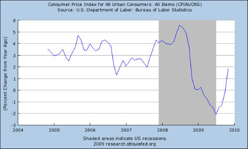
Here is a chart of the year over year percentage change in US inflation for the last five years:


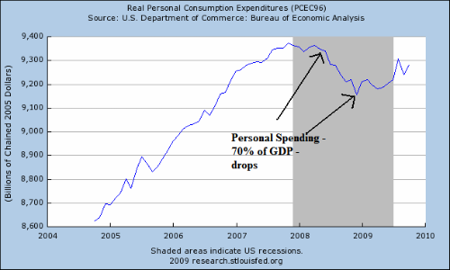
Note the "cliff diving" that occurs in mid-2008: prices literally fell off a cliff. This situation is one of the most serious that can occur in an economy; it says that people have literally stopped buying things en masse. Here is a chart of real personal consumption expenditures (PCEs) for the last five years that shows the drop:


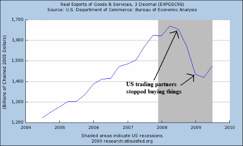
This was the first drop in over 10 years indicating that something fundamental had changed in the US economy. Because PCEs comprise 70% of the US economy, this drop was extremely concerning. However, PCEs weren't the only thing dropping. Real exports were dropping:


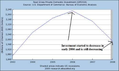
As was total domestic investment:


At this point, it's important to remember the GDP equation: personal consumption expenditures plus investment plus net exports (or exports - imports) plus government spending = GDP. In other words by the end of 2008 every major element of GDP was dropping hard and fast.

In other words, by the end of 2008 -- early 2009, it was obvious the economy was at the beginning of an economic death spiral. This is exactly the same situation the country faced in 1929-1933 -- which was originally mishandled horribly.

So, that's how we started the year. In the next article we'll take a look at the economic numbers for the year to see how the economy is faring.

Will Stocks Rally After the First of the Year?

From Marketwatch:

Still high on the sugar provided by ultra-low interest rates and the massive amounts of liquidity provided by central banks, stocks could climb steadily in the first half of 2010, according to the predictions of some major Wall Street banks and analysts.

But beyond that time frame, many strategists color their views with caution. A big question remains as to what will happen when the Federal Reserve and other major central banks remove the massive amounts of money they injected to rescue the financial system and the global economy.

"Momentum is a powerful force," says Jack Ablin, chief investment officer at Harris Private Bank. "We still have a self-propelling combustion engine to keep the market going a while longer."


Notice the general trend of the Treasury market has been down, up, down. The "Up" is an upward sloping pennant pattern. Treasuries started the year at high levels, largely because of their safety. But as the stock market has rallied, Treasuries have sold off. Yesterday they broke through key support levels, possibly signaling a move lower.


In contract the SPYs have continually moved higher. Also note that for the last few months the rally has stalled. However, a big reason for this is prices are currently at important Fibonacci levels. In addition, we're at the end of a very successful trading year and traders may simply be holding onto their profits waiting to see what happens. However, once the first of the year comes all bets are off.

Is the Bond Market Signaling A Stronger Recovery?

From the WSJ:

A closely watched bond-market measure of investor optimism hit a record Monday, amid signs the U.S. economy's recovery is strengthening.

That measure is the yield curve -- the difference between short-term and long-term interest rates on government bonds. That number is at its highest level ever, surpassing the record set in June, and signals that investors are expecting a stronger economic turnaround ahead.

The milestone comes amid a broad sell-off in government bonds, as investors shift money into riskier assets like stocks in anticipation of stronger growth. Last year, investors dumped stocks and sought the safety of government bonds amid the financial panic. That drove up the prices of government debt, and thus drove down the yields on some to record lows.

.....

The yield curve steepens when the Federal Reserve, which controls short-term interest rates, keeps them low to spur the economy. But at the same time investors, expecting growth to resume and with it the possibility of inflation, sell longer-term government bonds, which sends their prices down and their yields up.


This argument assumes that long-term investors are selling their bonds to move into riskier assets. That may be part of the reason. But another reason may be

1.) Overall concern about the U.S.' long-term finances. The U.S. is running massive deficits and will be for at least one more year. There may be concern about whether or not the government can keep up with this development.

2.) Inflation. First, this isn't an issue right now. The recent spike in PPI and CPI is entirely based on oil prices which have come over the last few weeks. However, gold recently went to a very high level (although it is currently in a sell-off). Inflationary fears are a primary reason for this increase. So the fear of inflation is definitely in the air.

Treasury Tuesdays


Click for a larger image

The big news for the Treasury market was the trading range it was in for the last several months. This area was bounded by lines A and B.

C.) Prices broke through support yesterday.

D.) The MACD printed a lower level on the second top, indicating decreasing momentum for the market.

E.) Money is still flowing into the market long-term, but notice the A/D line decreased a bit over the last few weeks.

Monday, December 21, 2009

Today's Market

Consider this chart of the Russell 2000


Click for a larger image

A.) Prices formed a double top in September and October.

B.) Prices have now broken through two important resistance levels.

C.) Momentum is increasing and

D.) Money is flowing into the the market.

Asian Consumers Spending Helping Growth

At the End of August I wrote and article titled "A Fits and Starts Expansion." In that article I wrote the following:


There's a great myth that goes around the Internet: the US doesn't make things anymore. If that were true, then we would have exported $1.8 trillion dollars of goods in 2008. And in 2008, we exported $108 billion of foods and beverages, $388 billion of industrial supplies, $457 billion of capital goods, $121 of automotive products and $161 billion of consumer goods. In other words, exports account for about 13% of GDP. And they may become far more important to US growth:

In the process of gorging on overseas goods and services, the US by happenstance fired up emerging economies such as China, Korea, Taiwan, India, Brazil and Mexico to build their productive capacities and spawn their own middle classes and consumer cultures. Paulsen has long called this trend the US's "emerging-market Marshall Plan."


As US consumer spending slows we will import less, thereby lowering the total amount of imports in the trade deficit formula. At the same time, Emerging economies have seen a growing middle class which will want to buy more goods and services. And some of those will come from the US.


Now we have confirmation of that fact:

Asia has led the world out of the global economic downturn thanks in part to a welcome burst of consumer consumption. It appears the spending spree will continue into 2010.

Strong government stimulus programs enacted during the depths of the crisis helped spur domestic economic activity across the region. Most of Asia's economies are growing and private consumption has been key. China, India and South Korea are rebounding smartly, a step ahead of the U.S. and Europe.

Now some see consumer spending in Asia picking up support from more than stimulus. Businesses are showing profits. Unemployment rates are falling in most of the region, making households more confident. And unlike the West, consumers have low debt levels and banks are expanding credit rather than shrinking it.

.....

Domestic consumption takes up just over a third of China's economy, compared to two-thirds in the U.S. and well above 50% in most advanced economies. Even with Chinese retail sales that have exceeded 15% growth on a year-to-year basis this year, it will take years for the economy to reach a level where domestic consumption is above 50%.

In other parts of Asia, the story is slightly different. As in China, consumers from India to the Philippines are spending with increasing zeal. But unlike China, private consumption already makes up more than half of GDP in other Asian economies. That means higher consumer spending will make a bigger contribution to overall growth in those countries.

"Households have now become a driver in the recovery" across the region, says Frederic Neumann, Asia economist for HSBC. He notes that consumption grew faster than overall output in most Asian economies in the third quarter, a change from earlier in the decade.


One of the things that throws most people's analysis is they are use to the U.S. being the engine of worldwide economic growth. But they are wrong. This time around we're the caboose.

When Will the economy add jobs? December update: Now!

- by New Deal democrat

Back in September, I published a six-part series, "When will the economy start to add jobs?" . The research in that series led me to conclude that it was most probable that the jobs market would bottom and start to add jobs in November or December, +/- 1 month. Here's a recap of my discussions of each of the above indicators, and why they suggest this Expansion probably isn't a "Jobless Recovery" any more -- or at least won't be after January.

The 4 "Leading Indicators" I found, which in the past have specifically portended job growth, typically turn in the following order:

(1) Real retail sales bottom and turn.
(2) Initial Jobless claims turn.
(3) The ISM manufacturing index turns above 50, i.e., signals actual growth.
(4) Industrial Production turns.
(5) ISM manufacturing index is above 53, ISM employment is at (- 5) or above, initial jobless claims are at least a sustained 16% - 20% off peak, and both Industrial Production and Real retail sales have advanced at a rate of 2.5% or more year-over-year from the bottom.

By September, (1) through (4) had already happened, leaving only number (5), which is all about the strength of the turns. Based on those relationships, in September

As of last week, all of those indicators have now signaled that actual job growth in the economy is set to occur.

I. Real Retail Sales
Contrary to the commonly held belief, historically it has not been the case that job growth leads to consumption. Rather, it is the other way around. Consumer spending typically leads jobs with a lag of about 5 months. Here is a graph showing that point as an average of all post-World War 2 recessions (0 = the month a recession ends):
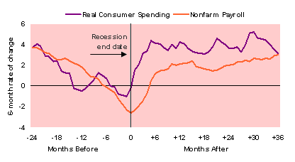

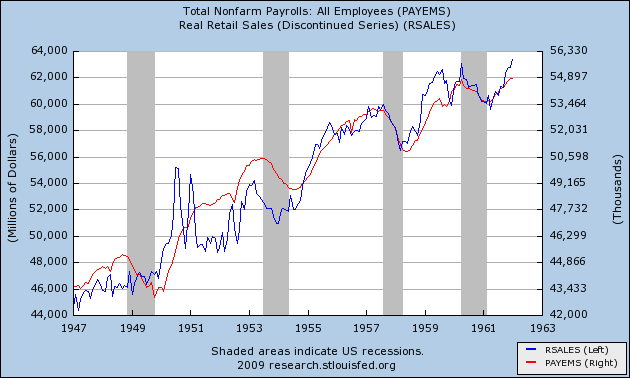
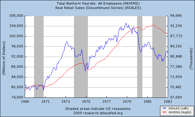
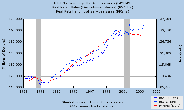
Real retail sales (that is, retail sales adjusted for inflation) are the "Holy Grail" of Leading Indicators for job growth. They have consistently turned at both tops and bottoms, an average of 3-5 months before job growth or losses turned. When real retail sales stay flat, they generate a lot of noise, and a longer period between the turn in sales and payrolls. Strong turns in sales generate reliable subsequent moves in payrolls in subsequent months. In general, with regard to recoveries, an increase of about +2.5% a year is necessary to reliably generate a subsequent move in real retail sales. In order to show you this relationship in the most comprehensive way, I am reproducing here graphs showing the entire 60 year record of real retail sales compared with jobs. With the sole exception of the 1961 recession, Real retail sales (the blue line) has consistently made peaks and troughs ahead of payrolls (the red line) ...

in the postwar period from 1948 through the 1962:


as it did during the 1970s recessions (ex the 1970 trough):


as it did during the 1991 and 2001 recessions and "jobless recoveries":


as it has done now:


On a three month smoothed average, Real retail sales bottomed in April of this year. This past week we learned that real retail sales through November are up 1.9% since then, for an annual rate of about 3.2% -- in other words, heralding actual job growth.

Another way of looking at the same data is to note that, in this Recession, employers have laid off employees exactly as if they were reacting to year-over-year retail sales data, as shown in this graph, where YoY real retail sales are in blue, and payroll gains/losses are in red:

I'm not claiming any deep rational relationship is portrayed in this last graph, just an extremely close fit of the two data series. If the correlation were to continue, then if real retail sales are merely flat this month, meaning they are up 1.9% YoY, payrolls would come over +100,000 (+/- 75,000 variance)! At very least, this is a very strong harbinger of a positive jobs reading.

II. Initial Jobless Claims

Initial jobless claims is weekly number of people who have applied for unemployment benefits for the first time after being laid off. These jobless claims have a good track record of predicting job gains. In those recoveries where jobless claims have fallen steeply, peak unemployment occurred within 2 months of the point where jobless claims fell 12% from the peak; but in those "jobless recoveries" where jobless claims has fallen slowly, peak unemployment occurred not at the 12% mark, but only when new jobless claims were more than 16% less than peak claims, and stayed more than 16% off for at least 3 months thereafter.

Here is a graph comparing this recession with the two previous "jobless recoveries" and the V shaped deep recession of 1982 in terms of initial jobless claims:

In the graph above, the blue lines represent the first 8 months after the peak in initial claims. The green lines represent the continuation of initial claims until the point where both jobs and the unemployment rate finally bottomed in the two "jobless recoveries." As you can see, jobless claims failed to penetrate the 20% off level except for a brief instance in summer 2002 (coinciding with a brief positive jobs number).

In our recession/expansion, initial claims declined 16% from their highs in October, and have declined more rapidly since then. As of this past week, initial jobless claims are off 29% from their April peak. This is not comparable at all to the two "jobless recoveries" but as of now is only comparable to 1983. In short, initial jobless claims are now also heralding actual job growth in the economy.

III. ISM Manufacturing

The ISM Manufacturing Index is a survey which asks purchasing managers for manufacturers if their business is getting better or worse, and contains a sub-index in which business indicate their hiring or firing intentions for the next month. It is a "diffusion index" in which 50 is the dividing line between expansion and contraction. In the very strong recovery after 1982, as well as during the weak recoveries of 1992 and 2002, the 53 level is the point where jobs began to be added. Further, a reading over 54 on the index has always coincided with actual job growth.

Additionally, whenever the hiring vs. firing sub-index is (- 5) or higher (i.e., no more than 5% more employers plan to fire than hire) and rising, where other evidence indicates a recession is ending, that has always indicated net employment growth was imminent, at least on a temproary basis; and also, whenever current staffing intentions were 65+. and hiring plans were 15+, that has always coincided with positive jobs numbers in the BLS survey, including during and after the "jobless recoveries" of 1992 and 2002.

The ISM manufacturing index expanded at 55.7 in October and 53.6 in November. (in the graph, the ISM reading of 53 - in blue - is normed to 100. The red lines represent job growth/losses in the noted recessions and recoveries):

This indicator too is heralding job growth.

IV. Industrial Production

Industrial production means exactly what it sounds like it does. It tends to peak a median +2 months before payrolls, and to trough at the end of recessions a median +1 month before payrolls. Of the 10 troughs since World War 2, in 8 of them industrial production troughed within 2 months of the payrolls number. Further, the only times that industrial production has led employment growth by a relatively long period of time, it has also shown weak growth -- less than 5% a year. In more typical V shaped job recoveries, it has grown at a rate of 10% or more a year.

This year, since bottoming in June, Industrial Production is up 3.6% for an annual rate of 8.7%. This is the best rate of expansion off a recession bottom since 1982, and far exceeds the 1992 and 2002 "jobless recoveries," as indicated in this graph of industrial production from 5 months before to 5 months after the bottom in each recession since 1982:
Industrial production is indeed having a "V" shaped recovery, meaning that it too -- the 4th of four indicators -- is heralding actual job growth.

V. Other signs: the Houshold Survey, Leading Indicators, Employment Trends Index vs. ISM Non-manufacturing, Okun's law

1. The Household Employment Survey

There are actually two surveys of employment conducted each month. While the typically reported number comes from the "Establishment survey" of employers, there is also a "household survey". The household survey has a wider measure of employment, so the two do not measure the exact same thing, but over time they are very closely correlated. More to our point, as noted by renowned bear David Rosenberg:
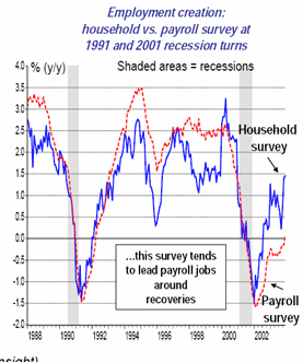
The Establishment Survey (nonfarm payrolls), has a “large company” bias that the companion Household Survey does not have. If you look at the historical record, you will find that at true turning points in the economic cycle, the Household Survey leads the Establishment Survey. This has always been the case heading into expansions and into recession....

Indeed, the household survey almost always turns either coincident with or one to two months before the establishment survey, as can be seen in this graph of the two prior "jobless recoveries":
Although it was not reported widely at all, in fact the household survey (blue line) did indeed show +227,000 jobs added to the economy in November (payroll survey in red):
Together with all of the other above data, this appears to be strong confirmation that we are at a turning point.

2. Leading Indicators

The Index of Leading Economic Indicators is now up 8 months in a row, in is up 5.7% Year-over-year. This graph shows the index since 1992.
What is important for our purposes is that even as to the two "jobless recoveries", jobs were finally added (and briefly so in mid-2002) whenever the Index was up more than 5% YoY -- just as it is now.


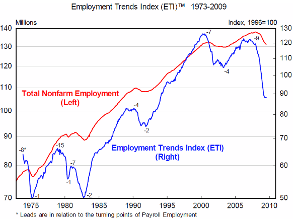
It turns out that I am not the only one putting together an index specifically geared towards leading indicators for job growth. Within the last two years, the Conference Board (the private group which also calculates the LEI) also put together a historical series of indicators that have tended to signal job growth in the near future. Called the "employment trends index," the Conference Board reported this month that the
Emplyment Trends Index increased for the fourth consecutive month. The index now stands at 90.8, up 1.8 percent from the revised October figure.
Here is the most recent graph I could find, which omits the last few months.

It is noteworthy that the series has always previously turned at bottoms 1 to 4 months before job growth. Since the indicator has turned up for the last 4 months, that again is yet another signal that the turn is here.

4. ISM Non manufacturing employment survey

No picture is perfect. While there is a wealth of data, discussed above, suggesting that the the bottom for jobs is occuring in the November-January window, there are a few contrary indicators.

Throughout the last ten years, the ISM Non-manufacturing employment index has been a close fit, especially on a three-month smoothed basis, to the jobs data. Here is the graph, through October,
In November, the Index was reported at 41.6, still showing strong contraction. This index is the one strong "yellow flag" compared with the other data. On the other hand, the series is only 15 years old, so we have no way to compere data with the 1991, 1982, or other prior recessions, so I have not weighted it that strongly.

5. Okun's Law

The other cautionary data point is "Okun's law", which generally holds that for every two percent gained/lost in GDP, unemployment changes by 1%. I have previously written at length about how, especially in the aftermath of offshoring, it takes 2% GDP measured on a YoY basis to result in the gain of one net job. As this graph of YoY GDP (green) vs. payroll gains/losses shows, even with 2.8% growth in the third quarter, and almost certain growth again this quarter, we won't be there.

While this is also a strong caution, on the other hand, Prof. James Hamilton of UCSD has written that:
the change in employment during this recession was noticeably more negative than the standard Okun's Law regression would predict. On the assumption that historical relationships reassert themselves, we surmise that employment could bounce back more strongly during this recovery

In other words, "Okun's law" was violated to the downside during the slump. For the long-term relationship to reassert itself, "Okun's law" may well be violated to the upside now. It is also worth noting that the Leading Indicators strongly suggest that growth will continue through the first quarter of next year. If that is true, then Q1 2010 may yet show +2% YoY GDP growth, which would not significantly violate the idea of job growth beginning now.

VI. Summary and Conclusion

In summary, all 4 of the leading indicators for actual job growth in the economy -- Real retail sales, Initial Jobless Claims (not shown), ISM manufacturing, and Industrial Production -- are now at the levels that portend job growth. This graph captures the percentage growth off the bottom for both real retail sales (blue, +1.9%), industrial production (green, +3.6%), the household employment survey (brown, +227,000 jobs), and the likely bottom, now, of payrolls (red):
It could be that November's (- 11,000) payrolls number is revised to a positive one (note that in all of the last 4 months, the initial reading has been revised by about +75,000); or it may be that the number doesn't bottom until January and turn up thereafter. But it certainly appears that the bottom for jobs is essentially right now.

Market Mondays


It seems appropriate to take a look at the SPYs for the year.

A.) The market bottomed in March on extremely high volume indicating a selling climax.

B.) The market rallied from the lows in March to early June. Prices ran into upside resistance around the 200 day EMA

C.) From June until mid-July prices formed a downward sloping pennant pattern. Prices hit just a bit below the 50 day EMA

D.) From early July until early December prices rallied. However, notice that prices are arcing -- that is, their overall trajectory is decreasing.

E.) In December prices have stalled and are forming what appears to be a rectangle consolidation pattern.

F.) The biggest problem with the rally is that volume has continually decreased as prices have moved higher.