Saturday, December 8, 2012

Weekly Indicators: Superconsumers defeating Superstorm edition


  - by New Deal democrat

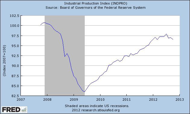
November monthly data reported this week came in surprisingly strong (or at least un-weak). 148,000 new jobs were created, and the unemployment rate fell to a new post-recession low of 7.7%. Auto sales also made a new 4 year high. Construction spending was up, showing the continued resurrection from the dead of the housing sector. ISM services improved, but ISM manufacturing went back into slight contraction. Unit labor costs for the 3rd quarter decreased. More ominously, in possibly the first sign that the "fiscal cliff" sausage-making is beginning to have a real impact similar to the debt ceiling decacle of summer 2011, Michigan consumer sentiment declined, mainly becuase expectations about the future plunged - just like in July 2011.

Woth the probable exception of initial jobless claims, the impact of Hurricane Sandy on most of the high frequency weekly indicators has abated. This makes watching this data of extra importance, since the level of any rebound will show up here well before December's monthly data is released in January.

Same Store Sales and Gallup consumer spending continue to show a strong rebound:

The ICSC reported that same store sales for the week ending Novmeber 30 rose 3.1%w/w and were up +3.2% YoY. Johnson Redbook showed a 2.1% YoY gain. Johnson Redbook has consistently been lower than the other series for consumer spending. The 14 day average of Gallup daily consumer spending as of December 6 was $86, compared with $77 last year for this week last year. This is close to, if not highest, level for consumer spending in 4 years and a very strong YoY improvement.

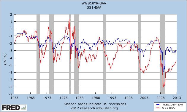
Bond yields were mixed but credit spreads retreated from their recent lows:

Weekly BAA commercial bond yields were unchanged this week at 4.56%. Yields on 10 year treasury bonds however fell -.04% to 1.63%. The credit spread between the two likewise increased by .04% to 2.93%. Spreads have increased in the last few weeks, but are well off their 52 week highs.

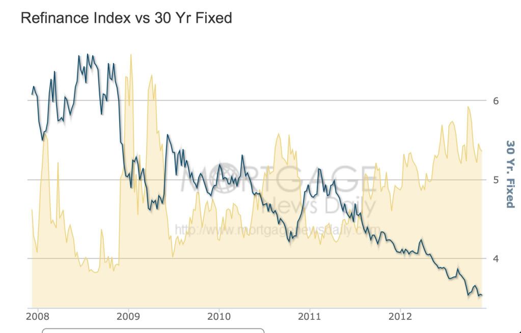
Housing reports were positive:

The Mortgage Bankers' Association reported that the seasonally adjusted Purchase Index rose 0.1% from the prior week, and declined -0.1% YoY (last year at this time they were near a 2 year high). These remain in the upper part of their 2+ year range. The Refinance Index increased 6.1% for the week, and is near its recent multi-year highs.

The Federal Reserve Bank's weekly H8 report of real estate loans this week increased +10 w/w to 3545. The YoY comparison also increased to +2.0% and is 2.1% above its bottom.

YoY weekly median asking house prices from 54 metropolitan areas at Housing Tracker  increased +2.4% from a year ago. YoY asking prices have been positive for over an entire year.

Money supply has been mixed over the last few weeks, but remains generally positive:

M1 declined -1.7%% for the week, and also decreased -1.6% month over month. Its YoY growth rate declined further to +10.3% Real M1 also declined to +8.1% YoY. M2 increased +0.1% for the week, and was up +0.2% month over month.  Its YoY growth rate fell to 7.1%, so Real M2 fell to 4.9% The growth rate for real money supply has been declined significantly, but is still positive.

Employment related indicators were quite positive as the effects of Sandy continue to abate:

The Department of Labor reported that Initial jobless claims fell from 393,000 to 370,000. The four week average rose by 2750 to 408,000. If this follows a similar pattern to that of Hurricane Katrina, claims will remain slightly elevated for a few more weeks. The 4 week average should decline sharply next week as the first post-Sandy shock leaves the average.

The American Staffing Association Index declined 5 to 91. This is normal Thanksgiving week seasonality. The general trend in this index remains similar to last year.

The Daily Treasury Statement showed that for the last 20 days ending on Thursday, $145.7 B was collected vs. $135.0 B for the comparable period in 2011, an increase of $10.7 B or +7.9%. Tax collections have continued to increase very well in the last month.

Rail traffic remained negative YoY, but still due to coal, and the diffusion index decreased again:

The American Association of Railroads  reported that total rail traffic was down -8900 carloads YoY, or -1.6%.   Non-intermodal rail carloads were again off considerably less than in recent weeks, only -6200 or -2.0%, and once again entirely due to coal hauling, which was off -18,100. Ex-coal carloads were up 9200. Negative comparisons declined once again from 8 to 6.  For the first time all year, intermodal traffic was actually down -2600 or -1.1% YoY.

Finally, the price of oil rose slightly again while gasoline fell, but gasoline usage was positive:

Gasoline prices fell $.05 last week to $3.39. This is still higher than last year at this time. Oil prices per barrel declined from $88.28 to $85.93. Gasoline usage was down for one week at 8354 M gallons vs. 8574 M a year ago, or -2.6%. The 4 week average at 8647 M vs. 8640 M one year ago, was actually up a very slight +0.1% YoY.

Turning now to the high frequency indicators for the global economy:

The TED spread fell from 0.24 to 0.23, just .01 above its 52 week low. The one month LIBOR fell from 0.2146 to 0.2120, near its 3 year low.

The Baltic Dry Index fell 120 to 966, a 1 month low. The longer term declining trend in shipping rates for the last 3 years remains. The Harpex Shipping Index also fell 3 more to yet another new 52 week low of 360.

Finally, the JoC ECRI industrial commodities index rose from 121.47 to 122.24. It was again also positive YoY.

The old-fashioned type of economy is producing weak or contractionary data. This includes shipping, intermodal rail traffic, and manufacturing. Since manufacturing in particular generally leads, this is disconcerting. On the other hand, domestic rail ex-coal is positive and improving. Housing continues its resurgeance from a very low level. Consumer spending is going strong again. The service economy is expanding. Employment is positive. Gas prices are accomodative for now. Bank lending rates are positive. Once again the American consumer looks like a Superhero, trumping even the Superstorm.

Have a nice weekend.

Friday, December 7, 2012

And into the weekend we go


- by New Deal democrat

Sorry, no doggie pictures this week, as Bonddad is just too beat. He's told me that the pain has pretty much gone away, but he is exhausted.

Next week I'm sure he'll be more active, although a full blogging schedule might be asking too much. Then again, it's tough to keep the guy away from the computer keyboard! -- which comes in handy for me when I need to take a break.

Anyway, I'll have the Weekly Indicators up some time this weekend, but I won't swear as to when. I hope this week hasn't been too much of a letdown. ;-)

WHEW! The November jobs report doesn't stink


- by New Deal democrat

Considering we were all bracing for the impact from Sandy - and I'm sure there was some hidden in the statistics - November was actually another pretty good report, with a few dark clouds interspersed with the unexpected sun.

As you probably already know, the headline is 146,000 jobs added, and the unemployment rate fell to a new post-recession low of 7.7%.

Let me get right to the leading indicator aspects of the report:
- the manufacturing workweek increased .1 to 40.6 hours. This will be reflected in the LEI.
- temporary jobs increased 18,000. So long as these are increasing, it is quite unlikely that the economy is contracting.
- unemployment of less than 5 weeks decreased by -55,000. This is only about 160,000 above the post-recession low. This is a slightly more leading indicator than the weekly jobless claims, and also indicates no recession.
- aggregate hours worked increased 0.2%. This is a coincident incidator that is thought to be taken into account by the NBER in determining if a recession has begun or ended.

The only downside among leading aspects of the report was that manufacturing shed 7000 jobs, yet another among a slew of indicators suggesting that manufacturing is probably contracting slightly.

Downside coincident data included downward revisions to both September (-16,000) and October (-33,000). It should be noted that September is still 18,000 higher than originally reported.

Also, the more volatile household employment number declined -122,000 from October. (UPDATE: Those who reported they were not working due to weather was about 300,000 higher than normal. Presumably that is Sandy. Without this jump, the household number would have been about +178,000). Those not in the labor force rose by 542,000. Keep in mind that at least some of this is the ongoing wave of Boomer retirements. Thus the labor force participation rate declined, as did the employment to population ratio (to 58.7%), although it is still 0.4% higher than during the spring of this year.

Construction lost -20,000 jobs. Government shed 1,000 jobs. Overtime was steady at 3.2 hours.

Other good news included a further decline in the broad U-6 unemployment rate, which included discouraged workers, to 14.4%, another post-recession low.

Average hourly earnings increased $0.04 to $23.63. Year over year these have increased 1.6%, which is still less than the inflation rate.

Bottom line: The headline numbers were good (but of course still not good enough for a return to full employment anytime this decade), the leading indicator part of the report was mainly good, while the coincident internals in the report were weak. Considering how bad this report could have been including Sandy, I'm encouraged.

Thursday, December 6, 2012

Notes on initial jobless claims (339,000 ex-Sandy!), the unemployment rate, and tomorrow's jobs report


- by New Deal democrat

This morning we got weekly initial claims, and tomorrow we get the monthly jobs report. I just wanted to note of few items of interest. First of all, I wanted to try to find out how much of this morning's initial claims number was still due to Sandy. To do so, I checked the BLS breakdown of initial claims by states, which gives the unadjusted state-by-state initial claims numbers. I deducted NY and NJ, the two states most hit by Sandy, and compared the number as deducted with the unadjusted number minus NY and NJ this week one year ago. Since the seasonal adjustment should be almost identical, that should give me the "real" ex-Sandy initial claims number, assuming NY and NJ would, ex-Sandy, have layoffs at a similar rate to all the other states.

The result surprised me. The unadjusted number this week was 358,541, meaning the seasonal adjustment was 1.03081, to arrive at the seasonally adjusted 370,000. One year ago the unadjusted number was 372,640, which after seasonal adjustment was 383,000.

Leaving aside NY and NJ, last year's unadjusted number was 351,454. Leaving aside NY and NJ, this year's unadjusted number was 311,269. Appling the same multiplier to this year's number as last year's, gives us the nationally seasonally adjusted number backing out Sandy's effects on NY and NJ -- and that number is 339,000 !

Secondly, Gallup's unemployment rate report has been getting play again yesterday and today. This report is new, and its monthly correlation with the Jobs Report's unemployment rate is noisy at best. For example, the official unemployment rate moved from 7.8% in September to 7.9% last month, while Gallup dove from 7.9% to 7.0%. It gives a little better reading when considered year over year. Last year the official rate and Gallup's adjusted rate were both ~8.9% for September through November. This year Gallup's rate over the same three month period averages ~7.9%. If the pattern holds true, tomorrow's official unemployment rate is likelty to also be 7.9% +/- 0.1%.

Finally, recall that the survey for the Jobs Report took place during the week of November 13, in the teeth of the worst effects from Sandy. We know from initial claims that layoffs surged. It's likely that the hiring side of the equation was affected as well. A very poor number should not be unanticipated. My dart-throw would be +50,000, recalling that the range of error is about +/-100,000 on the initial report. So if we get a report as poor as -50,000, don't be surprised. It's still likely to be Sandy.

The economy shambles along: PCE's vs. retail sales


- by New Deal democrat

Back in March I wrote that while personal consumption expenditures and retail sales spending tended to peak and trough at the same time, retail slaes are much more volatile than PCE's, with the result that, "as this graph below (subtracting YoY PCE growth from YoY real retail sales growth through 1997) shows, in a very specific and non-random way:"


"Note that early in economic expansions, YoY real retail sales growth far outstrips YoY PCE growth. As the economy wanes into contraction, YoY real retail sales grow less and ultimately contract more than YoY PCE's. You can see that by noting that retail sales minus PCE's are always negative BEFORE the economy ever tips into recession. That's 11 of 11 times. Further, in 10 of those 11 times (1957 being the noteworthy exception), the number was not just negative, but was continuing to decline for a significant period before we tipped into recession. This makes perfect sense, as retail sales generally include many far more discretionary purchases. As the economy accelerates, consumers make more discretionary purchases. As it slows, the more discretionary retail purchases are the first things cut."

In March, YoY growth in PCE's exceeded that of retail sales - i.e., consistent with an economy that was expanding and was not close to recession.

Let's update this look. Here is a graph showing YoY PCE spending (blue) vs. YoY real retail sales (red):


As you can see, the prelude to the 2008-09 recession folloeed the pattern set forth from earlier. By October, YoY spending was about equal. Here's a graph combining the two into a single line, subtracting YoY PCE spending from retail sales spending as in the first graph above:


In summary, although the relationship is just barely positive, we still don't have the negative values we've seen prior to every single recession since World War 2.

Japan's Worst Case Scenario

Japan is in an incredibly tough spot.  GDP contracted last quarter, and the central bank and government are in the middle of a war of words regarding stimulus. 

Here is their worst case scenario going forward:

In the worst case scenario, the slide in the yen could be the catalyst for a rise in yields on Japanese government bonds, a market that is about the same size as the US Treasury market at between $11tn and $12tn. That in turn could set off a spiral in which non-yen based investors (a mere 8 per cent of the demand today, admittedly) insist on higher yields to compensate for possible losses on the currency, while Japanese banks, whose profitability has been minimal, would be looking at losses on their government bond holdings. In most cases, those holdings are larger than the banks’ domestic corporate loan books, as deposits from risk-averse households come into their coffers.

Wednesday, December 5, 2012

Those Who Implement Austerity Are Stupid

George Osborne has missed one of his key targets to improve the public finances and said he would extend austerity by another year as Britain’s independent budget watchdog slashed its economic growth forecasts.

In addition, with growth slowing, the goals of austerity -- that is, the reason why we're engaging in this policy -- are being pushed out:
Mr Osborne said Britain would miss its target to have debt falling by 2015-16 as a percentage of national income by a year. He also said he would need to extend austerity by another year to 2018 to close the budget deficit.

Let's think this one through.  The UK has been implementing an austerity budget since roughly mid-2010.  Here are the results:


 Just to review:

1.) England is implementing austerity
2.) They are doing this to "clean up their government finances" in the hopes that this "cleaning up" would restore confidence in the UK economy.
3.) The "cleaning up" is leading to contracting growth, which is lowering confidence in the UK economy -- the exact opposite of what was intended from the first place
4.) So, the best plan forward is ... more austerity.

Now, I'm still in a pretty heavily medicated, post surgery situation.  In my condition, the above makes no sense.

Also -- for a really good history of the UK austerity program, read this from Wikipedia.


The economy shambles along: is refinancing staving off recession?


- by New Deal democrat

Perhaps the best single article I've ever read about business cycles was the presentation by Professor Edward Leamer [pdf] of UCLA at the 2007 Jackson Hole conference. In that paper, Prof. Leamer showed that business cycles typically start with a turn in housing, followed by vehicles (consumer durables), then consumer nondurables (general retail sales), and then finally by commercial real estate. The order is the same for both recessions and recoveries.

In the last couple of months, hosuing permits and starts have made new multi-year highs. And just two days ago, we found out that car and light truck sales made a new post-recession high as well. How can that be if we are allegedly already in a new recession?

I get that because of misguided austerity policies in major trading partners manufacturing insofar as it is export-related might decline at least slightly. It is also no surprise that with the labor market having been so weak for so long, wage and salary increases are declining closer and closer to zero, a fact that should have official Washington's hair on fire with urgency, instead of creating phony fiscal crises.

But the fact is, even now, consumer spending does not seem to be faltering. In fact this week Gallup's daily consumer spending is once again touching new post-recession highs. It appears that, despite the recent decline in real income and wages, consumers are benefitting from the record decline in house prices that bottomed recently, and the ability to refinance debt at ever lower rates courtesy of quantitative easing and record low mortgage rates.

Let's go to the graphs. First, here is a graph of average wages divided by house prices, showing how the declilne in prices has made it easier and easier for a given wage to support the purchase of a house:


Here's the same graph using persoanl income rather than average wages. We get the same result:


But that's not the end, because ever lower mortgage rates mean that even with declining real wages, more debt can safely be taken on, as shown by this graph that divides the result in the first graph above by mortgage interest rates:


Again, we get the same result if we use personal income rather than average hourly wages:


While Sandy no doubt impacted a few weeks of spending, which will show up in November's numbers as well as October's, real retail sales made a new high in September, and real manufacturing and trade sales are by my reckoning only 0.1% off their high earlier this year.

In other words, it appears that consumers' ability to buy houses and cars has been increasing, and that has been staving off any generalized significant decline in the economy.

CBOs Fiscal Cliff Analysis

From the CBO:

Substantial changes to tax and spending policies are scheduled to take effect in January 2013, significantly reducing the federal budget deficit. According to CBO’s projections, if all of that fiscal tightening occurs, real (inflation-adjusted) gross domestic product (GDP) will drop by 0.5 percent in 2013 (as measured by the change from the fourth quarter of 2012 to the fourth quarter of 2013)—reflecting a decline in the first half of the year and renewed growth at a modest pace later in the year. That contraction of the economy will cause employment to decline and the unemployment rate to rise to 9.1 percent in the fourth quarter of 2013. After next year, by the agency’s estimates, economic growth will pick up, and the labor market will strengthen, returning output to its potential level (reflecting a high rate of use of labor and capital) and shrinking the unemployment rate to 5.5 percent by 2018.

Tuesday, December 4, 2012

Interest rate indicators


- by New Deal democrat

This is something of a work in progress.

Many people rely on the bond yield curve as a premier leading indicator. In fact, every recession since the 1950s has been preceded by an inverted yield curve, where long term rates are lower than short term rates. In fact, going back nearly 100 years, every time the yield curve has inverted with one exception, a recession has ensued. One problem that I discovered with this indicator, however, is that a deep recession can still occur in the presence of a normally sloped curve when there is deflation -- 1938 for example.

In fact, ECRI has stated that the yield curve is not one of their long leading indicators. Rather, they make use of the spread between corporate and government bonds.

Yet a third way of evaluating bond prices is to compare the yields on longer term bonds with the inflation rate. When bonds yield less than the inflation rate, it is thought, a recession is imminent. When I investigated this as well, I found that while it worked well since the 1950s, it would have falsely indicated economic contraction all through the 1933-37 New Deal recovery of 10% annual GDP growth, and all through the 1940s and early 1950s as well!

In general, based on the above it can be stated that bond interest rates are positive for the economy (1) the wider the positive spread between short and long term rates, (2) to the extent to which money can be borrowed cheaply vis-a-vis inflation, and (3) to the extent that corporate bonds are deemed relatively safe compared with treauries. The opposite conveys a negative indictor for the economy going forward. But no one of the three measures captures the full information. Recently several scholars looked into the matter, and found that taking all three measures into account -- I.e., the shape of the yield curve, bond rates vs. inflation, and corporate vs. government debt yield -- did yield an effective indicator. Unfortunately, their discussion did not include an academic-economics-to-English translation.

But while I can't translate their results into one handy graph, we can look at the separate components and see if we can arrive at a reasonable conclusion about whether they signal a recession or expansion.

First of all, let's take at the yield curve (I'm using the yield on 10 year treasuries - 6 month treasuries) since 1980:


As indicated above, each and every recession since then has been preceded by an inverted yield curve. One problem, however, is that the yield curve normalized early in 2007, more than 2 years before the end of the Great Recession, and indeed over a year before the economy fell off a cliff in September 2008. It has had a normal shape ever since, and although it is less steep than a year or two ago, it is still well within the range of what has generally been considered consistent with expansion.

Next, let's look at the difference in interest rates between corporate bonds and treasuries. Here I am using BAA corporate bonds and comparing their yields with that of 10 year treasuries (blue) and 1 year treasuries (red):


You can see that the spread becomes considerably more negative as we approach and enter a recession, particularly with compared with 10 year treasuries. Sometimes the spread with one year treasuries is much more pronounced on the cusp of a recession. Neither one appears to be signalling any downturn now.

Finally, let's take a look at 10 year treasury yields as compared to the inflation rate:


While it's clear from this graph that yields relative to inflation plunge as we enter a recession, the absolute level of yield is clearly irrelevant. We had a major expansion in the 1980s while yields exceeded inflation by 10%, and we had no recession in 2006 when yields were under the inflation rate. At the same time, there were several occasions in the 1950s and 1970s when there was a 2 year or greater lead time between the decline in the comparison and the onset of recession. We did have just such a precipitous decline in 2010 through early 2011.

One corrective is to measure the YoY change in this relationship, which I've done below:


This graph is extremely noisy, but it does suggest that a decline significantly into negative values shortly before a recession almost always occurs. Presently treasuries are increasing their yields vs. inflation, as compared with a year ago.

I will be putting more work into this, to see if there is an algorithm or simple relationship that will enable us to put all three relationships into one indicator. For now, it is safe to say that neither the shape of the yield curve, nor the spreads between corporate bonds and treasuries is suggesting economic contraction. Only the relationship between bond yields and the inflation rate is consistent with trouble.

Monday, December 3, 2012

The economy shambles along: a study in contrasts


- by New Deal democrat

Continuing with the theme that the economy is a shambles, moving in different directions, here is a study of the contrasts.

For example, housing has finally become a consistent plus for the economy:


While manufacturing, which had been driving the recovery, is actually contracting slightly:


Average hourly earnings have also been declining in real, inflation adjusted terms:


But the ability to refinance mortgage debt has kept consumer spending afloat:


While I'm not sold on the idea that we've entered a new recession, the economy has definitely downshifted since early spring, in a way it didn't do in either 2010 or 2011.

Quick Bonddad Update


Hey all

This is a heavily medicated Bonddad.  Surgery went well -- the doctor is very happy with everything.

Now all I have to do is heal.  This involves rest, which I'll be doing in abundance for the next few days and weeks.

I'll be doing some part-time blogging later this week.

Until then, we've got NDD doing his usually impressive work.


Sunday, December 2, 2012

Weekly indicators: solid Sandy Snapback showing edition


  - by New Deal democrat

In the rear view mirror, third quarter GDP was revised upward to 2.7%. The two most important releases for October, durable goods and income and spending, we're flat to negative in real terms. New home sales also declined. Consumer confidence was up, as we're house prices.

Woth the exception os initial jobless claims, the impact of Hurricane Sandy on most of the high frequency weekly indicators has abated. This makes watching this data of extra importance, since the level of any rebound will show up here well before December's monthly data is released in January.

Same Store Sales and Gallup consumer spending indeed do show a strong rebound:

The ICSC reported that same store sales for the week ending Novmeber 23 rose 3.3%w/w and were up +4.0% YoY. Johnson Redbook also showed a strong 4.0% YoY gain. Johnson Redbook has consistently been lower than the other series for consumer spending. The 14 day average of Gallup daily consumer spending as of November 29 was$81, compared with $73 last year for this week last year.

Bond yields were mixed and credit spreads reamined close to their recent lows:

Weekly BAA commercial bond yields increased +0.09% this week to 4.56%. Yields on 10 year treasury bonds also rose .08% %to 1.67   The credit spread between the two increased by 0.01 to 2.89. Spreads have increased in the last few weeks, but are still closer to their 52 week low.

Housing reports were mixed:

The Mortgage Bankers' Association reported that the seasonally adjusted Purchase Index rose 3% from the prior week, and is also up 4.0% YoY (last year at this time they were at a 2 year high). These remain in the upper part of their 2+ year range. The Refinance Index declined -2% for the week, but this is still near its recent multi-year highs.

The Federal Reserve Bank's weekly H8 report of real estate loans this week fell 7 w/w to 3531. The YoY comparison, however, increased to +1.7% and the same percentage above its bottom.

YoY weekly median asking house prices from 54 metropolitan areas at Housing Tracker  increased +2.3% from a year ago.  As of this week, YoY asking prices have been positive for an entire year.

Money supply remains generally positive:

M1 increased +0.9% for the week, but decreased -1.1% month over month.  Its YoY growth rate declined to +10.8% Real M1 also declined to +8.6% YoY. M2 was down -0.2% for the week, and was up 0.4% month over month.  Its YoY growth rate fell to 7.2%, so Real M2 fell to 5.0% The growth rate for real money supply has declined significantly, but is still positive.

Employment related indicators were again mixed, mainly due to Sandy:

The Department of Labor reported that Initial jobless claims fell from 410,000 to 393,000. The four week average rose by 9000 to 405,250. If this follows a similar pattern to that of Hurricane Katrina, claims will remain slightly elevated for a few more weeks.

The American Staffing Association Index rose to 96, its highest level since 2008, although it remains below 2007 and 2006 values. The general trend in this index remains similar to last year.

The Daily Treasury Statement showed that for the first 19 days of November, $133.3 B was collected vs. $126.7 B a year ago, a $6.6 B increase. For the last 20 days ending on Thursday, $141.8 Bwas collected vs. $133.9 B for the comparable period in 2011, an increase of $7.9 B or +5.6%. Tax collections continue to run very well.

Rail traffic remained negative YoY, but still due to coal, while the diffusion index was less negative:

The American Association of Railroads  reported that total rail traffic was down -8700 carloads YoY, or -2.0%.   Non-intermodal rail carloads were again off a large -4.6% YoY or -12,300, once again entirely due to coal hauling. Negative comparisons declined to 8.  Intermodal traffic was up 3600 or +1.9% YoY.

Finally, the price of oil rose slightly again while gasoline fell, but gasoline usage was positive:

Gasoline prices rose .01 last week to $3.44. This is still higher than last year at this time. Oil prices per barrel increased from $87 to $88.28. Surpirsingly, Gasoline usage was down for one week at 8427 M gallons vs. 8769 M a year ago, or -3.9%. The 4 week average at 8635 M vs. 8664 M one year ago, was off a very slight -0.3% YoY.

Turning now to the high frequency indicators for the global economy:

The TED spread rose from its 52 week low of 0.22 to 0.24. The one month LIBOR rose from 0.2085 to 0.2146. Both are well below their 2010 peaks.

The Baltic Dry Index fell 4 to 1086. The longer term declining trend in shipping rates for the last 3 years remains. The Harpex Shipping Index fell 1 more to yet another new 52 week low of 363.

Finally, the JoC ECRI industrial commodities index rose from 120.13 to 121.47. It was again slightly positive YoY.

While the monthly data from November will suffer from the impact of Sandy, the weekly data is already showing a rebound. Consumer spending and tax withholding are particularly positive. Money supply, bank lending rates, and credit spreads, while off their best levels, are still positives. Housing is now a consistent positive. Shipping and rail loads are still under pressure, but this may entirely be to coal. Gas usage is neutral.

While manufacturing looks to be in recession, and income has contracted slightly, most of the rest of the economy still appears to be moving forward as reflected by the most timely, weekly, data.

Have a nice weekend.