Saturday, March 26, 2022

Weekly Indicators for March 21 - 25 at Seeking Alpha


 - by New Deal democrat

My Weekly Indicators post is up at Seeking Alpha.

The walls closed in a little more on the long leading forecast this week, as now real money supply is beginning to falter.

As usual, clicking over and reading will bring you thoroughly up to date, and will reward me a little bit for giving you a heads up as to what awaits, economically, in the future.

Friday, March 25, 2022

An update on the yield curve


 - by New Deal democrat


This is an update on my yield curve post from earlier this week.


As had happened in the previous few days, the 3 to 5 year Treasury yield spread, which was inverted intraday, un-inverted by the close of the trading day. Here is what the US Treasury yield curve looked like yesterday:


As you can see, it is kinked at the 7 and 20 year maturities. Aside from that, from Fed funds out through 30 years it has a more normal shape. As I pointed out earlier, the 10 and 30 year maturities are typically where investors go to hide in a “flight to safety,” so that they have lower yields than some earlier maturities in those circumstances is not the classic yield curve inversion that has historically forecast trouble. That only happens when maturities in the short to medium range from 3 months out to 5 years start to invert.

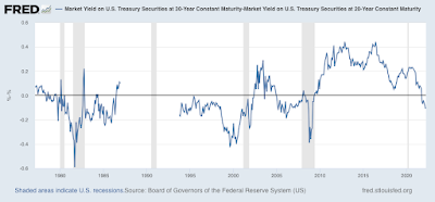
For example, here is the historical 30 year minus 20 year spread:


It has spent half of its existence inverted, including through most of the 1990s Boom.

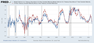
Here is the 10 year minus 7 year spread (blue) v. The 10 year minus 2 year spread (red, /4 for scale):


The 7 to 10 year spread gave a false signal in 1984, briefly in 1995, and spent virtually the entirety of the late 1990s tech Boom inverted. By contrast, the much more followed 2 to 10 year spread did not falsely signal in 1984 and 1995, but only missed during the 1966 near-recession and in 1998. It also properly gave a positive signal prior to the 2008-09 Great Recession, unlike the 7 to 10 year which just touched being flat for several days.

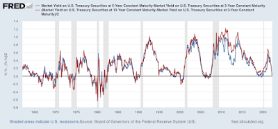
It is when we get closer to the short end of the curve, at 3 years, when things get more interesting. Below is the 3 to 5 year spread (blue) vs the 3 to 10 year spread (red, /2 for scale):


The result is very similar to the 2 to 10 year spread discussed above: the only misfires are during 1966, most of 1967-68, and briefly during 1998. 

During the past week, the 3 to 5 year spread has not closed with an inversion, but the 3 to 10 year spread has twice. By contrast, the 2 to 10 year spread has not closed below 0.15%.

In summary, while the yield curve certainly merits heightened awareness, we haven’t seen the short to medium term inversions which in the past have demonstrated important signal vs. noise value.


Thursday, March 24, 2022

Jobless claims: I feel like humming psychedelic tunes from the 1960s


  - by New Deal democrat

Initial claims (blue) declined 28,000 to 187,000, yet another new pandemic low (pending revisions!), and the lowest of all time going back nearly 60 years except for weeks during 1968 and 1969. The 4 week average (red) declined 11,500 to 211,750 (vs. the pandemic low of 199,750 on December 25). Continuing claims (gold, right scale) declined 67,000 to  1,350,000, also the the lowest number in over 50 years, since January 1970 (the 1960s were uniformly lower):

Well, I am now pleasantly wrong about having said that “we have probably seen the lows in initial claims for this expansion.” With the Omicron wave all but over (I am increasingly less concerned about BA.2), claims have resumed their downturn, as basically nobody is getting laid off. 


What I have been saying for several months, that is still true, is: the record tightness in the jobs market isn’t going away. The number of jobs available relative to the number of applicants will remain tight, meaning there will be continuing upward pressure on wages.


Wednesday, March 23, 2022

The housing market’s downward turn begins: new home sales in February, plus a comment about affordability


 - by New Deal democrat

As of this morning Mortgage News Daily shows the 30 year mortgage rate up to 4.72%, 1.9% higher than their lows 15 months ago, and the highest in four years. That means the housing market is in some serious trouble. Let’s take a look at that via this morning’s new home sales report for January.


First, a reminder, that new home sales: (1) are the most leading of all housing reports, leading even permits, so much so that it is more of a mid-cycle indicator rather than a long leading indicator, and (2) are very noisy, and heavily revised, so much so that it is less useful than single family permits in particular.  

So first, here  is new home sales (blue) vs. single family permits (red) for the past 5 years:


It’s easy to see that the trend in sales led permits - but also that sales are much more noisy. 

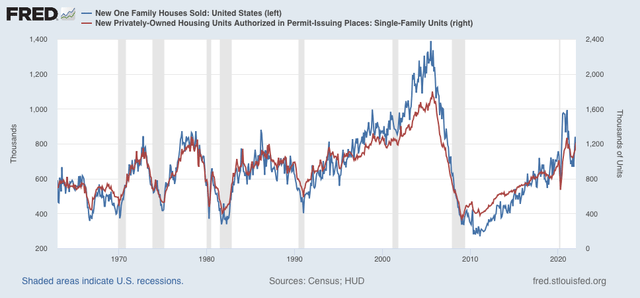
Here is the longer term view of same (excluding the most recent data):


Sales and permits both increased with lower mortgage rates late last year, and after a month in which new buyers locked in sales before rates when higher, both have now backed off  again.

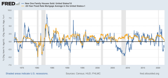
Next, as I always say, interest rates lead sales. Here is the long term view of the YoY% change in mortgage interest rates (gold, inverted, so that an increase in rates shows as a decrease) vs. the YoY% change (/10 for scale) in new home sales for the past 10 years> Note that I have added 1% to the YoY change in mortgage rates so that only increases in mortgage rates of more than 1% show as a negative:


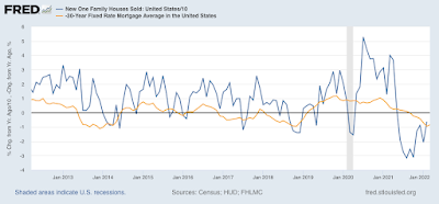
Here is a close-up of the past 10 years:


It is easy to see that interest rates lead sales by 3-6 months. Note that sales were generally more buoyant that interest rates in the past decade, due to the demographic tailwind of the big Millennial generation, a tailwind that is now abating. 

Further, *every* time mortgage rates were higher by more than 1% YoY, new home sales declined YoY at least briefly. But they only correlated with an oncoming recession about 50% of the time. So the increase in interest rates to date by itself does not necessarily signal a recession next year.

Next, sales lead prices. The below graph compares the YoY% changes in sales with that of prices (green):


The YoY change in sales peaked from summer 2020 through spring 2021; prices followed from spring through autumn 2021. Price increases are now clearly decelerating.

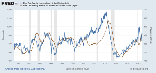
Finally, in the case of new houses, prices lead inventories. The below graph compares sales with new homes for sale (brown), minus the most recent months:


Here is a close-up of the past five years:


The inventory of new single family houses for sale increased to 407,000 in February, the highest number since summer 2008, and before the housing bubble previously exceeded only during the 1970s.

The housing market has begun its turn downward. In keeping with my mantra, we should expect the continued rise in mortgage rates to lead to a renewed decline in new home sales and construction, continued deceleration with price increases (and an increasing chance of outright price *decreases*), and a continued increase in the inventory of new houses for sale.

Finally, the double whammy of continued price increases, and the sharp rise in mortgage rates has major ramifications for overall housing affordability. I wrote about this already over a month ago, and mortgage rates have only continued to rise since. How close are we to housing-bubble style nosebleed territory? I plan on addressing that on Friday.

Tuesday, March 22, 2022

The US Treasury yield curve is on the verge of inverting


 - by New Deal democrat


My graphing issue hasn’t resolved yet. Fortunately there is no big new economic news today, and there is something I’ve been following with particular interest in the past week that doesn’t require any graphing: namely, the Treasury bond yield curve is on the verge of inverting.

Normally, we should expect to see increasing yields the longer the maturity. This is pretty simple stuff: if I lend you money for a longer period of time before you have to pay it back, I’m taking a bigger risk, so I should get paid more in interest to take that risk. An inverted yield curve means that there are shorter maturities yielding higher interest than longer maturities. It’s well-documented that when the yield curve inverts, especially over a broad range from a few months out to 10 or more years, it is a harbinger of an economic downturn, typically 12 to 24 months later.

As of this morning, here are the yields on US Treasuries from 3 months to 30 year maturities. The curve is inverted at 3 maturities, marked with asterisks:

30 year: 2.570%
20 year: 2.693%*
10 year: 2.337%
7 year: 2.381%*
5 year: 2.360%
3 year: 2.365%*
2 year: 2.170%
1 year: 1.364%
6 month: 0.973%
3 month: 0.563%

I’m not terribly concerned about the 20 year (paying less than the 30 year) or 7 year (paying less than the 10 year) inversions. Neither the 7 nor 20 year bonds are heavily traded. At the moment we’re having a flight to liquidity due to the Ukraine invasion, so the 10 and 30 year bonds have lots of increased buying.

By the way, if you want to see what the yield curve looks like at the moment (since I can’t show you the graph), you can see it at this link.

The 3 to 5 year (and 10 year) inversion will be more concerning - if it sticks. For the past week, the 3 year Treasury has paid more than the 5, or for that matter, 7 or 10 year Treasury multiple times *during* the day, but at the end of the day has always settled at a yield lower than the longer maturities. I am writing this during the morning, so once again there is an intraday inversion.

A 3 to 5 year inversion has historically been one of the earlier maturities to invert, and more often than not, heralds an inversion spreading out along the midrange of the curve. This means, basically, that buyers expect Treasuries to pay more over the next several years than the anticipated long term norm, i.e., the Fed will continue to tighten, credit will be tight, and interest rates will ultimately recede due to slackening consumer demand, typically brought about by higher unemployment and a recession.

We’re not there yet. But stay tuned.

Monday, March 21, 2022

Coronavirus Dashboard for March 21: the likely course of BA.2 in the US


 - by New Deal democrat

[Note: I am having a major issue with formatting photos today, which will be readily apparent. I will fix this as soon as I am able.]

This is the second part of my discussion of the likely US trajectory of the BA.2 Omicron subvariant. Part one was Friday, and if you missed it, here is the link.

First, a brief update. Cases in the US are now slightly below 30,000. This is the lowest since last August except for two days after Thanksgiving. Deaths have declined to 866. If deaths, like cases, decline over 96% from their Omicron peak, that will mean there will be only about 100 deaths per day in about a month.

To quickly refresh, there have been many warnings about the new BA.2 wave which has overtaken much of Europe, specifically including the UK, and warning that the same is in store for the US. 

The truth appears to be more complicated.  As I wrote on Friday, “the data she has collected demonstrate that BA.2 is very much an Omicron, rolling in and out like a tsunami. Like BA.1, the BA.2 variant causes peak infections by or very shortly after it approaches 100% of all infections.” To cut to today’s chase, the course of BA.2 in any given area depends on the level of previous infection by BA.1:

- Where BA.2 overtook BA.1 very quickly, there was only 1, more intense and longer lasting, wave. 
 - Where BA.2 only overtook BA.1 after a long time, there were relatively few people left who BA.2 could reach, resulting in a “long tail” of declining cases, but no new wave.
 - Only where BA.2 overtook BA.1 after its peak, but - probably because of better mitigation efforts - there were lots of people left who BA.2 could reach, has there been a new wave. The 

Let’s start with the 26 countries in the EU. Like me, you’ve probably seen the graph showing cases rising sharply in some EU countries. Here’s what the entire Union, plus the UK, looks like:

1. There are a number of countries in the EU - Norway, Sweden, Denmark, Poland, Lithuania, Latvia, Estonia, Hungary, Bulgaria, Czechia, and Spain - where no increase has happened at all, and in fact cases are decreasing.

2. There are 15 countries where cases bottomed and started increasing between February 24 and March 9, the majority of which were between March 1 and March 3.

3. Of those 15, 6 - Ireland, Belgium, the Netherlands, Cyprus, Finland, and Portugal - appear to have already peaked, generally about 2 to 2.5 weeks after the increase began. Their increases varied but generally were in the range of a 75% to 100% increase from a low level (I.e., don’t freak out over the percentages).

4. That leaves 9 of 20 European countries still increasing, less than 3 weeks after the new “waves” began. In several of those - the UK, Germany, Austria, Greece - the rate of increase appears to have slowed substantially. In the remaining 5, notably in France and Italy, the wave is continuing in full force.

So let’s be clear: BA.2 has not started a new “wave” everywhere. And where it has caused a new wave, it appears to be short, as in 2 to 4 weeks from trough to new peak.

Like Friday, I am indebted to Emma Hodcraft, Ph.D. of the Institute of Social and Preventive Medicine at the  University of Bern, Switzerland, on whose data of infection prevalence by variant for many countries and for all jurisdictions in the US is found at Covariant.org, for the below information, including graphs.

Let’s start with Scenario 1: Where BA.2 overtook BA.1 very quickly, there was only 1, more intense and longer lasting, wave.

Here is a graph for Denmark, in which the BA.2 variant almost completely replaced BA.1 no later than the end of February, after only a short time (about 1 month) during which BA.1 was dominant:


Now, here is the graph of cases in Denmark:


As you can see, the uptrend lasted longer than in most countries. But Denmark has had an uninterrupted downtrend since.

Similarly, here is her graph of the US territory of Guam in the Mariana Islands:


And here is Guam’s case graph (note that Guam only peaked at the end of January, and its peak lasted 3 weeks, vs. the shorter, sharper peaks in states that will be discussed below):

G

Similar trends occurred in the Nordic countries of Sweden and Norway, and in India and the Philippines.

But perhaps the poster child for this is South Africa, which famously was the first country in which BA.1 was identified. The wave lasted a slightly longer time, but was supplanted by BA.2 two months ago:


Here are cases for South Africa:


South Africa hasn’t experience a new wave, either; just a “long tail” of a slow decline in cases which remains significantly above their level before BA.1 struck.

This brings us to Scenario 2: Where BA.2 only overtook BA.1 after a long time, there were relatively few people left who BA.2 could reach. A good example of this is Spain:


Spain’s experience with BA.1 has lasted over 3 months, and BA.2 is only gradually taking over:

Here is Spain’s level of cases:


Spain is still experiencing a slow decline, with no sign of a BA.2 wave, even though BA.2 currently makes up over 1/3rd of all cases.

Next, let’s look at Scenario 3: where BA.2 overtook BA.1 after its peak, but - probably because of better mitigation efforts - there were lots of people left who BA.2 could reach, has there been a new wave.

This is best demonstrated by one of the present scary examples, the UK. According to the most recent UK government data I have seen, BA.2 accounts for 90% or more of all new COVID infections. It should be essentially 100% within about a week. Here is the relevant graph:


And here is the UK’s case count:


Here is the week over week change in average daily cases:


As you can see, the rate has slowed already in the past few days. In the last 5 days, cases are only up 10%, vs. 50% 5 days ago.

In other words, the countries of Europe where there is a new, identifiable BA.2 wave are ones where the BA.1 wave did not last as long, or was not as intense, as others. BA.1 had peaked, but had not yet burned through the vulnerable population.

In contrast, the original Omicron wave began in the UK only about 5 days before that in the US. But the UK’s peak began 8 days before the US, and lasted only about 6 days before beginning a sharp decline, vs. 15 days in the US:


And here is the US’s graph of the prevalence of BA.1 and BA.2:


BA.1 hit hard and lasted 3 months before BA.2 started to kick in. In other words, the US’s graph looks closest to Spain’s, where there has been no BA.2 wave, just a long tail of slow decline.

Let’s look at a few US States. BA.2 is already a majority of cases in Connecticut:


After a brief uptick almost two weeks ago, Connecticut has fewer cases than at anytime except for summer 2020 and summer 2021.

Currently BA.2 is running over 33% in NY:


New York has begun to show an increase in cases over the past week:


Finally, here is Florida:


BA.2 has barely begun there, and cases continue very low:


Put this together and I am expecting BA.2 to result in an experience between that of the UK and South Africa: an increase in cases, but not so pronounced as in the UK, where cases doubled in the first half of March. Once BA.2 becomes virtually 100% of all US cases, probably around late April, cases will recede again.