- by New Deal democrat
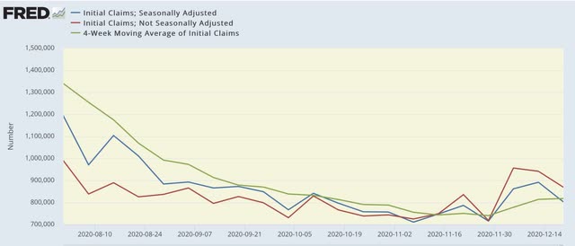
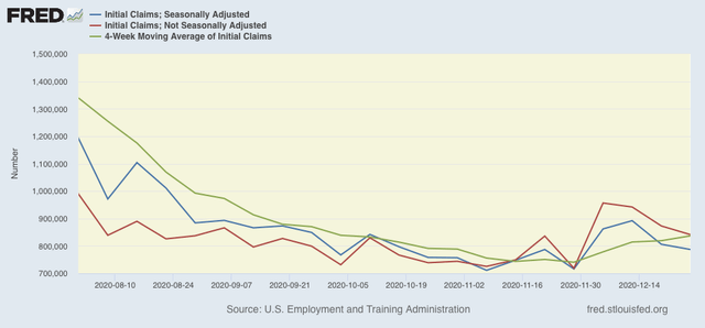
New jobless claims declined for the second week in a row this week, but are still significantly above their recent pandemic lows, while continuing claims, seasonally adjusted, once again made a new pandemic low. There is a sizable but by no means certain likelihood that December’s jobs number will be negative.
On a unadjusted basis, new jobless claims declined by 31,736 to 841,111. Seasonally adjusted claims also declined by 19,000 to 787,000. The 4 week moving average, however, rose again by 17,750 to 836,750. All of these are above their recent lows.
Here is the close up since the end of July (for comparison, remember that these numbers were in the range of 5 to 7 million at their worst in early April):
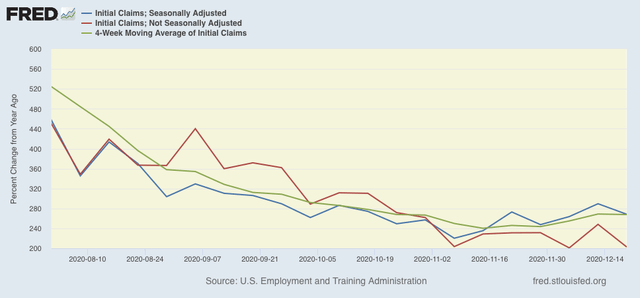
Because of the huge distortions caused by the pandemic in seasonally adjusted numbers, and because we are at a time of year when seasonality causes the most distortions in any event, here are the YoY changes in all of the above metrics:
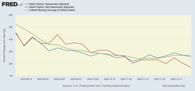
There is now a 7 week trend in the seasonally adjusted data of YoY% increases, while the trend has been rising slowly for the unadjusted data. I still won’t be sure about a renewed upward trend unless and until seasonally adjusted new claims rise over 900,000 and the 4 week average over 850,000, which would take both out of the range they have been in over the past 4 months. We’re not quite there yet.
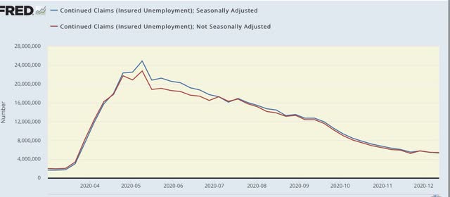
The story is different with both seasonally and non-seasonally adjusted continuing claims, which historically lag initial claims typically by a few weeks to several months. Seasonally adjusted continuing claims declined again by 103,000 to a new pandemic low of 5,219,000. On an unadjusted basis, they declined by 171,035 to 5,258,073, still about 10,000 above their recent pandemic low:
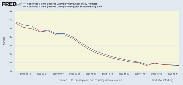
Because these lag initial claims, I continue to suspect we will see an upward reversal in the next few weeks.
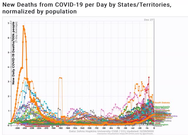
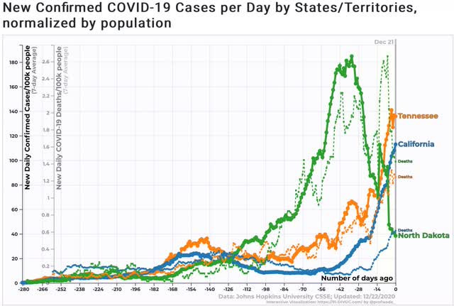
Both initial and continued claims remain at or above their worst levels from the Great Recession.
Finally, for the month of December new jobless claims were about 95,000, or 13%, higher than in November. That much of a spike has only happened 4 times previously in the past 50 years outside of a recession - in March 1967, April 1979, September 2005, and October 2013. On 3 of those 4 occasions, either that month’s or the following month’s jobs report showed actual job *losses.* In the exception, 2005, September showed only a 68,000 gain. As I have written for the past 2 weeks, because we are in uncharted territory all I really feel comfortable saying is that I suspect that the December jobs report is going to be the weakest since May. A negative number is very possible, and if there is a positive number, it looks likely to be well under 200,000.
This winter looks like it will be uniquely bleak. If there is a bright side, it is that George Harrison’s “Here Comes the Sun” is likely to be equally uniquely appropriate for the coming vaccination spring.