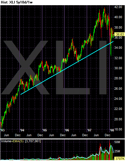
The 5 year chart of the XLIs shows an average that is still above its long-term trend line. However, note the average is close to testing that line. Also note the possibility of a double top in late 2007.

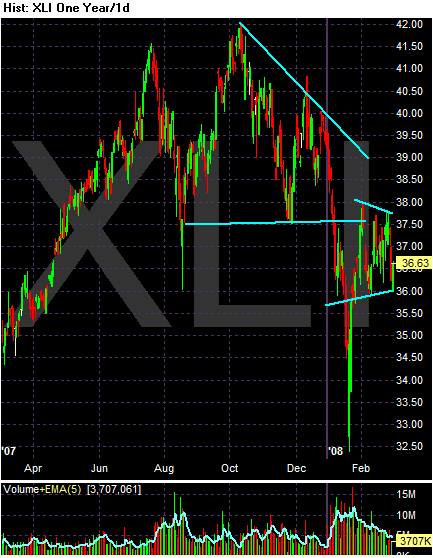
Above is a year chart of the XLIs in daily increments. I found this chart to be very perplexing because I couldn't find clear patterns. However, I do think the descending triangle (the first shape on the chart) followed by the consolidation sector over the last month are pretty much on target. Also note the decreasing volume over the last month or so. This is a sign the consolidation is coming to and end and the chart will move in one or the other direction.

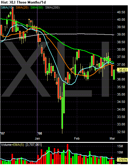
With the SMAs, notice the following:
-- Prices are just below the 200 day SMA, indicating a bear market. But prices aren't that far below.
-- The rest of the SMAs are bunched together, indicating a clear lack of direction. Also note that prices have been bouncing around between the SMAs for the last month or so.
The bottom line with this chart is it's looking for where to go.