Saturday, December 26, 2020

Weekly Indicators for December 21 - 25 at Seeking Alpha


 - by New Deal democrat

My Weekly Indicators post is up at Seeking Alpha.

While there have been some signs of softening in a few of the high profile metrics, overall the economy continues to remain surprisingly resilient.

As usual, clicking over and reading should bring you up to the moment, and put a little coin jingle in my pocket.

Thursday, December 24, 2020

Jobless claims continue to show sideways to upward trend


 - by New Deal democrat

New jobless claims declined this week, but are still significantly above their recent pandemic lows, while continuing claims, seasonally adjusted, made a new pandemic low. The downward trend in claims has clearly ended for now, although whether the current trend is sideways or upward remains unclear. In particular, there is a sizable but by no means certain likelihood that December’s jobs number will be negative.

On a unadjusted basis, new jobless claims declined by 71,512 to 869,398. Seasonally adjusted claims also declined by 89,000 to 803,000. The 4 week moving average rose by 4,000 to 818,250. All of these are above their recent lows. 

Here is the close up since the end of July (for comparison, remember that these numbers were in the range of 5 to 7 million at their worst in early April): 


Because of the huge distortions caused by the pandemic in seasonally adjusted numbers, and because we are at a time of year when seasonality causes the most distortions in any event, let’s also take a look at the YoY changes in all of the above metrics:


There is now a 6 week trend in the seasonally adjusted data of YoY% increases, while the trend looks sideways for the unadjusted data. It remains likely that the renewed explosion of the pandemic has indeed caused new jobless claims to break into an upward trend due to the rampaging pandemic. Nevertheless, as I have written for the past 2 weeks, I won’t feel certain unless and until seasonally adjusted new claims rise over 900,000 and the 4 week average over 850,000, which would take both out of the range they have been in over the past 4 months. We’re not quite there yet.

Seasonally adjusted continuing claims, which historically lag initial claims typically by a few weeks to several months, declined by 170,000 to a new pandemic low of 5,337,000. On an unadjusted basis, they declined by 5,552 to 5,444,281, about 200,000 above their recent pandemic low:


Because these lag initial claims, I continue to suspect we will see an upward reversal in the next few weeks.

Additionally, although I won’t bother with a graph, both initial and continued claims remain at or above their worst levels from the Great Recession.

Finally, in the past month the 4 week moving average of new jobless claims has been  about 75,000 higher than it was in the 4 prior weeks. In “normal” times in the past, that has typically meant an actual job loss being reported in the next month’s payrolls report. As I wrote last week, b
ecause we are in uncharted territory all I really feel comfortable saying is that I suspect that the December jobs report is going to be the weakest since May.  A negative number is very possible, and if there is a positive number, it looks likely to be well under 200,000.  

The next 8 weeks are likely to be the very worst of the entire pandemic, because it is raging completely out of control, because it is winter, and because the current Administration has absolutely zero interest in doing anything about it. It will probably take at least a month for the Biden Administration’s efforts to begin to make a difference, and there won’t be enough people vaccinated until the end of the winter for that to make a significant difference.

Wednesday, December 23, 2020

Decline in personal income and spending adds to evidence of reversal of economic rebound


 - by New Deal democrat

This morning’s release of personal income and spending for November adds to the evidence that the economic recovery from the onset of the pandemic has stalled, and potentially reversed.


Real personal income declined -1.3% in November, the first decline since April. Real personal spending also declined -0.4%. Real personal spending is now down -2.7% from its February peak, while income remains higher by 2.0% (an important reason why the economy has not suffered more):


When we factor in “government transfer receipts,” i.e., things like unemployment and supplemental pandemic benefits, income also declined for the first time since April, and is down -1.5% compared with its February peak:


Between the cold weather curtailing outdoor activities, renewed lockdown-type restrictions, and increased caution by many due to the most recent surge in the pandemic, income becomes the latest metric, after restaurant reservations and jobless claims, to show a reversal. I expect more to come until winter ends and/or the pandemic begins to abate.

Tuesday, December 22, 2020

Coronavirus dashboard for December 22: the pain threshold


 - by New Deal democrat

Total US infections: 18,035,209*
Past 7 days average daily infections: 215,429
Total US deaths: 319,364
Past 7 days average daily deaths: 2,655

Source” COVID Tracking Project

*Because many asymptomatic cases in particular have probably not been diagnosed, I suspect the truer number is on the order of 25 million, or 1 in every 13 Americans.

Here is the latest overall look at new infections and deaths countrywide (note separate scales):


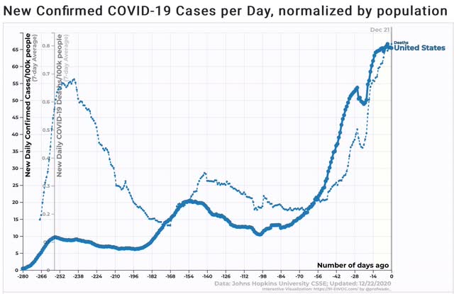
Each wave of new infections has been bigger than the one preceding, but deaths only in the past month have risen on a per capita basis to and exceeding the early peak from March and April. In the past 2 weeks, the rate of new infections has stabilized. We can expect deaths to stabilize in the next week or two at the level of one 9/11 each and every day.

Unfortunately, there is a behavioral feedback loop bordered by complacency and panic. The former means that voluntary measures alone will never defeat the pandemic. The latter has meant that patent and visible danger leads to a period of serious scaling back of risky activities by the majority of individuals.

Given the recent huge surge in cases, is there still a “pain threshold?” I think so, and it probably has been triggered most cogently by news reports of hospital ICU’s that are already at full capacity and most turn away patients, accompanied by a continuing rise in deaths.

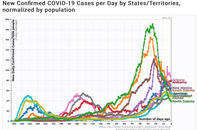
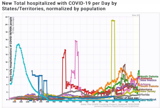
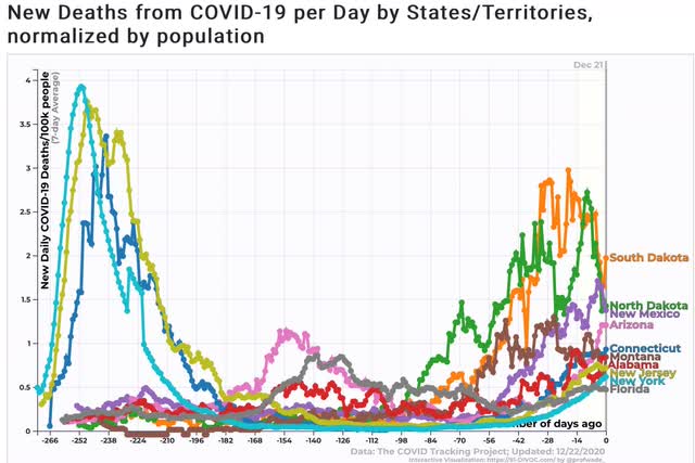
In the below graphs, I break out new infections, hospitalizations, and deaths by those States which at various times have been the “poster children” for out of control outbreaks: NY and NJ in March and April, AZ and FL during the summer, ND and SD about a month ago, and TN, AL, and MT now.

New infections:


Hospitalizations:


Deaths:


Obviously there is no set threshold for when infections start to change behavior. No doubt part of this is the differing demographics of the successive waves of infection, as well as improvements to medical treatment.

There does seem to be a “pain threshold” for deaths at roughly the level of 2.5 deaths per 100,000 population daily, but note that in summer public behavior changed in AZ and FL well below that level.

The rate of hospitalizations seems to correlate most closely with a “pain threshold.” At the level of 4 to 8 hospitalizations per 100,000 population, there is a palpable change in the public’s behavior.

Because the large majority of infections do not lead to hospitalizations, it is likely that the level of infections itself does not sufficiently alarm the public so as to change their behavior. But once serious, life-threatening cases become noticeable enough, as indicated by the level of hospitalizations, and additionally by a big rise in reported deaths, people’s behavior begins to change. That even North and South Dakotans changed their behavior once the situation became dire enough seems like the best proof for the existence of such a “pain threshold.” 

The newest “poster children” are Tennessee and, alas, California (shown with North Dakota for comparison): 


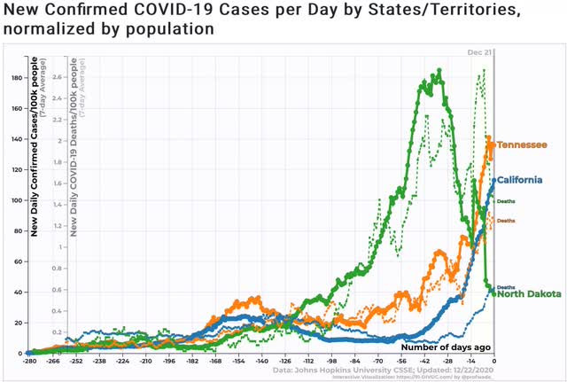
Based on the above, they are probably a week or two away from hitting their “pain thresholds.”

Monday, December 21, 2020

The 2004-2020 political red/blue shift: the intersection of geography, the economy, and ethnic migration


 - by New Deal democrat

It’s a very slow, holiday-shortened economic week. We’ll get new home sales, plus personal income and spending Wednesday, and jobless claims as usual Thursday.


In the meantime, here is something I found revealing. It’s a map, created by Nathan Jordan,  a college student from Alabama (I think), showing the county-level change in Presidential voting countrywide (except Alaska) from 2004 through 2020:


What was fascinating to me (because I am a nerd) is how closely the changes track some geographical features. The spine of the Appalachians stands out clearly, plus the Ozark mountains, and the red-shaft also appears to closely follow the Mississippi-Missouri-Ohio River valley system.

On the first pass, this certainly looks like an “It’s the economy, stupid!” story. But it’s more complicated than that.

First of all, here is a county-level map of Black population density:


It closely matches the “black belt” - named for the soil color that supported the plantation economy not the skin color - in the Southeast over to Texas. In addition to the Northeast megalopolis, the blue shift matches up pretty well with this map as well.

But what about Hispanics? Well, here are two maps. The first, again, shows Hispanic population density by county:


With the exception of east Texas and Wyoming, again the map appears to closely match up with the blue shift, especially in the West and Southwest, but also in the Northeast megalopolis.

This second map show the *change* in the Hispanic population by county between 1990 and 2018:


This shows that there was a big increase in the Hispanic in-migration to the upper Mississippi and Missouri valleys, but also to the Southeast and the Appalachians and Ozarks. 

In other words, the areas of the country that have shown the biggest red-shift in the past 16 years shared two characteristics:

1. They were relative economic backwaters, with relative outmigration to the coasts, BUT
2. They experienced significant IN-migration of Hispanics (even if in relatively small *absolute* numbers - see the 1st map of Hispanic population density).

In short, these have been areas of significant economic malaise, where there is increased competition for jobs by a new “other” ethnic group. This is a potent recipe for a racial backlash.

I believe a substantial number of White voters can put racial animus aside if the economic pie is visibly growing for them. But when their economic condition is stagnating or worse, that racial animus is going to be a potent motivator for voting. I think this gets to the heart of why the Democratic Party has so badly lost in the whole Mississippi watershed area.