Saturday, May 25, 2024

Weekly Indicators for May 20 -24 at Seeking Alpha


 - by New Deal democrat


My “Weekly Indicators” post is up at Seeking Alpha.

While the inverted yield curve and negative money supply growth keep the long leading indicators negative, both the short leading and coincident indicators have almost all turned neutral or positive.

As usual, clicking over and reading will bring you up to the virtual moment as to the state of the economy, and bring me my lunch money for the coming week.

Friday, May 24, 2024

Real disposable personal income per capita is also hoisting a yellow caution flag


 - by New Deal democrat


To reiterate my Big Picture theme for this year, now that the supply chain tailwind has ended, will the effects of the 2022-23 Fed rate hikes drag the economy down towards recession at last, or will there be a “soft landing” (or no landing at all) instead, because interest rates have not increased in the past 12+ months? As a result, I am focusing most heavily on the leading sectors of manufacturing production and construction.


Last week and earlier this week I wrote of the importance of the downturn in building units under construction. Here it is compared with total (nominal) residential building construction spending, which has turned flat since last October:


Several weeks ago I also mentioned that the weighted average of the ISM manufacturing and services indexes had dipped below 50 (the equilibrium point between expansion and contraction, to 49.4, in April.

But there is at least one more data series which is flashing caution signals, and it is one that is fraught with political ramifications: real disposable personal income.

I had noticed this about a month ago, but didn’t write about it. I was prompted to look again when Dan Guild, who is an excellent source for reading polls, retweeted Carl Quintanilla of CNBC that “personal disposable income per household [is] at an all time high,” to the effect that Biden has a good economic record.
 
Here’s Quintanilla’s graph:


The most important thing to notice right off the bat is that this is *nominal* income. Below I show real personal spending (red), real personal income (blue), and real disposable personal income per capita (black), all normed to 100 as of December 2020, just before Biden took office:


All three are higher. In particular, we can see how the 2021 stimulus payments caused a real spike in spending, which has since subsided. But unlike Quintanilla’s graph, which shows nominal disposable income up over 10% since 2020, real income is up 3.7% since then, and real per capita income is only up 2.0%.

Further, personal savings amounted to $671 Million in April. With the exception of a number of month in 2022, that is the lowest level in just over 10 years:


Now let’s see how that compares historically. Below I show real disposable personal income per capita since the inception of the series over 60 years ago:


Notice how flat the line is in the past year. This is similar to the flattening that has taken place before almost every recession since 1959 (1970 and 1973 being the exceptions).

Let’s look at this same data YoY. First, here is the post-pandemic record, subtracting -0.85% so that the current level shows at the zero line:


Now let’s look at the past 60 years, similarly subtracting 0.85% so that equivalent situations also show at the zero line:


Before 2000, with only two exceptions (1987 and 1994), YoY gains in real disposable personal income per capita as low as they are now only occurred just before or during recessions. Since then, they have occurred more frequently, but mainly due to tax changes regarding Social Security withholding being changed for calendar years 2005 and 2013.

In other words, excepting tax law changes, gains in real disposable personal income per capita as low as they have been recently have generally been associated with economic downturns.

And, per Jame Surowiecki, especially in election years, they are particularly salient metrics forecasting presidential election outcomes. It will be updated next Friday.

Thursday, May 23, 2024

New home sales: all of the shoes have dropped except one . . .


 - by New Deal democrat


I am departing from my typical recap of new home sales this month, because of the important turn that was revealed in last week’s report on building permits and starts. I usually point out that, while new home sales are the most leading of the housing construction metrics, they are noisy and heavily revised. This is true, and was true this month as well. But there is another aspect of the report that is assuming additional importance - if the outcome of the Fed rate hikes since 2022 turns out to be a recession after all.

Got your attention?

In April sales (blue in the graph below) declined -4.7% m/m to 634,000 annualized, after March was revised downward by -28,000 to 637,000. Again, very noisy, big revision.  As the five year graph below shows, beginning in 2023 sales have stabilized in the 650,000 +/-50,000 range. For comparison I also include the much less noisy, but slightly less leading single family housing permits (red), which as anticipated have started to follow sales down from their peak:


Last month I wrote that “because mortgage rates have risen somewhat in the past few months (from 6.67% to 7.10%, I expect this range in new home sales to continue, with a slight downward bias in the immediate months ahead.” As indicated above, that is what happened in April. Although mortgage rates have pulled back to 7.02% from 7.22% two weeks ago, they remain elevated, so downward pressure will continue to be placed on new home sales and construction.

As I always point out, prices follow sales, and that has continued to be the case as well. The median price of a new home in April was $433,500, continuing in the range it has established since at least February 2023:


But let me also harken back to all of my earlier inflation and housing posts this week, because, just like the Case Shiller repeat sales index (brown in the graph below), the median price of new homes as of April was up 4.7% YoY, continuing its recent higher trend:


Unlike existing home sales, where inventory is being constrained by would-be sellers trapped in 3% mortgages and thus prices remain near all-time highs, the median price of new homes had declined as much as -16% from peak at their lows last year, but now are only down -5.8% (per the graph 2nd above).

Which brings me to the special sauce of this month’s (and perhaps the next number of of months’) report: new homes for sale.

Because in addition to the most leading metric of “new single family houses sold,” the report also includes the metric of “new single family houses for sale” (red in the graph below). As you can easily see, the former has always led the latter, and by a significant margin:


Now, let’s bring back last week’s new residential construction report into the discussion. Because new home sales are the most leading (but noisy) metric, followed by building permits, followed by building starts. Followed by housing units under construction, which have decisively turned down at last in the past two months.

Which led me to ask, what is the relationship between building units under construction, and new single family homes for sale? And that is what is answered by the below graph:


With only one exception (the 1981 “double-dip” recession), housing units under construction have always led new homes for sale, by varying time frames but most usually the peak in the former has led the peak in the latter by about 6 months.

Further, as you can also see from the above - and this is most important - new homes for sale have *always* also turned down before a recession, at least by 3 months (1970 and 1973) but usually by a significantly longer period of time.

In fact, with the exception of the 1970 recession, they have always turned negative YoY shortly before a recession has begun (in 1970 it was one month later):


And as is easily seen by the above graph, at present new homes for sale are not just increasing, but at an increasing rate YoY.

To bring this around to my Big Picture for this year, I am watching the manufacturing and construction sectors especially closely to see if, with the tailwind of supply chain un-kinking gone, the Fed has pulled off a “soft landing,” or whether a recession is going to occur in response to their aggressive rate hikes after all.

When it comes to construction, with the exception that new building units under construction are not down 10%, all of the shoes have dropped but one. And that one shoe remaining is new homes for sale. If that reverses and turns down, it means Trouble.

After a two week excursion, initial claims fall back into range; the “quick and dirty” forecast model stays positive


 - by New Deal democrat


Initial claims declined -8,000 last week to 215,000, well within its recent nine month range, after a two week elevated excursion. The four week moving average, reflecting that excursion, increased to a nine month high of 219,750. Continuing claims, with the usual one week delay, rose 8,000 to 1.794 million, also well within their recent nine month range:


As per usual, the YoY% change is more important for forecasting purposes. There, initial claims are lower by -5.3%, and the four week average lower by -1.3%. Continuing claims, however, remain higher YoY, by 4.9%:


Continuing claims have been higher YoY for well over a year, and relative to that, they are close to the bottom of that YoY range.As per the first graph above, if there is no significant higher movement in the next three months, they will again be lower YoY.

Turning to the Sahm Rule forecast, the recent two week excursion higher means that the monthly average for May is likely to be higher than previous eight months, while continuing claims will be right in line. Since the unemployment rate lags initial claims by a number of months, and continuing claims by a shorter duration, there is no further pressure upward, and some downward pressure, on the unemployment rate for the next several months. It should remain rangebound between 3.7% and 3.9%. To trigger the Sahm Rule, the unemployment rate would have to average 4.1% in the next several months. That should not happen:


Finally, here’s a graph I haven’t posted in awhile - the quick and dirty easy economic forecast, using initial claims YoY and the stock market YoY. If the former is lower and the latter higher, all is well in the immediate future:


Not only is the stock market higher YoY, but those YoY gains have been increasing. The quick and dirty forecast for the economy in the next few months remains positive.

Wednesday, May 22, 2024

April existing home sales remain deeply depressed, continuing the chronic shortfall in housing supply


 - by New Deal democrat


Let me tie this morning’s report on April existing home sales into my two last posts, which concerned the huge role that shelter prices, and the underlying shortfall in housing capacity, have in the continued elevation in overall consumer prices.


So let’s start by looking at the last 10 year history of existing home inventories [note: all graphs in this article are from the site Trading Economics, because the NAR only allows FRED to have the last 12 months’ data]:


Most importantly, note that even before the pandemic, housing inventory had been falling almost relentlessly YoY since 2014, the only exception being early 2019. the pandemic exacerbated this trend, which appears to have finally bottomed out in 2022-23. There in a nutshell is most of the story about the shortfall in housing in this country - which as I wrote yesterday means that the Fed’s rate hikes have probably been self-defeating, given the way shelter costs are measured in the CPI.

The good news, then, in this morning’s report is that inventory rose 9% (not seasonally adjusted) in April to 1.21 million units, and more importantly was up 16.3% YoY. This is nowhere near enough to resolve the issue, but at least it’s a solid start.

Unsurprisingly, existing home prices rose consistently since 2014, and accelerated when COVID hit and much of the market shut down. Similarly to the trajectory of the FHFA and Case Shiller repeat sales indexes, the median price for existing homes briefly turned negative in early 2023, troughing at -3.0% YoY in May. Thereafter YoY comparisons increased to a peak of higher by 5.7% in February, followed by 4.8% In March, and rebounding to a 5.6% YoY increase in April:


As I wrote yesterday, this affects that trajectory that the CPI’s shelter component “aims” for. Over the next 12 to 18 months, this suggests a much more gradual decline in that component to roughly 2.5% YoY - or roughly a 0.1% YoY deceleration in the CPI for shelter monthly over that time.

Finally, because unlike existing homeowners, house builders can vary square footage, amenities, lot sizes, and offer price and/or mortgage incentives to counteract the effect of interest rate hikes, new home sales have relatively speaking held up, while existing home sales have declined much more sharply. Specifically, even with the 1.9% month over month increase in existing home sales, and the same 1.9% increase YoY, existing home sales remain down -37.3% from their peak of 6.60 million units annualized at the beginning of 2021, at 4.14 million in April:


Existing home sales will likely remain range-bound at their recent levels until the Fed moves on interest rates, whenever that may be.

Which means that the chronic shortfall in housing is not going to be resolved any time in the immediate future.

Tuesday, May 21, 2024

A closer look at inflation (Part 2 of 2): how the Fed’s rate hikes actually *exacerbate* inflation in shelter


 - by New Deal democrat


Yesterday I discussed how virtually the entire issue of inflation remaining above the Fed’s target was the housing sector. Let me start today’s post where I left off yesterday: namely, that the net level of divergence between total headline inflation and shelter inflation of 1.15% is one of the highest such divergences in history, and the longest such big divergence. Here again is the graph:


Today I want to discuss how the Fed’s reaction to the surge in shelter prices  post-pandemic has probably actually *exacerbated* the continued elevation in the official measure of shelter inflation.

Let’s start with the YoY% change in house prices (gold), official shelter inflation (dark blue), and add in the Fed funds rate (red). Finally, I also include what consumer inflation would be if house prices were used instead of “owners equivalent rent” (light blue):


Notice how at least three times in the past 30 years - 1998, 2002-04, and 2020-21 - the Fed ignored the increase in house prices until it showed up in the official shelter component. And the latest example is by far the largest such disconnect.

Between January 1998 and June 1995, house prices went up 9.5% before the Fed reacted (in 1998 the Fed briefly cut rates in reaction to the LTCM crisis). Between January 2002 and June 2004 house prices increased 27.9% before the Fed reacted. And between July 2020 and February 2022 house prices increased 32.9% before the Fed finally took action - the largest of the three such increases. 

In each of the first two cases, a recession ensued. The second, the Great Recession, was the most severe since the 1930s. Contrarily, had the Fed paid attention to house prices, it would have seen the necessity for action many months earlier in the cycle. Which also means that rate hikes would probably not have had to be so severe in order to end the price spike.

But that is only part of the issue. Because housing, like food, is a necessity. Would we entertain a “market equilibrium” in food prices which meant that a certain percent of the population must starve? Hopefully not. And yet there is evidence that we have allowed a chronic housing shortage to develop which forces people into cramped and unwanted living arrangements, like “boomerang” adult children, adult apartment roommates, and even outright homelessness.

Perhaps the most straightforward way of showing this chronic shortage is simply to compare the Case Shiller repeat sales house price index to median household income:


As of 2022, the last full year for which official data is available, since 1987 median household income rose 186%. But the median price of a new home rose 335%, and the increase for repeat home sales rose 350%!

How much housing needs to be built to fill this affordability gap? Per the below chart by the Harvard Joint Center for Housing Studies, it has been estimated that there is anywhere between a 1.5 million to 5.5 million shortfall in housing units:


Now, here is an excerpt from a speech made just the other day by Fed Vice Chair Philip Jefferson:

The cumulative effect of a higher interest rate on aggregate mortgage payments grows over time as more new loans are originated at the higher rate. . . . The housing sector is where many households have made, or will make, their largest investment. Therefore, the prices that families pay for that housing can affect their overall well-being” [i.e., they will have to cut back on purchases elsewhere]

In other words, Fed rate hikes act by shifting the demand line to the left - which creates a new market equilibrium with a smaller *supply* as well.

But if there is already a shortage of a necessity, then shifting the supply line to the left actually *exacerbates* that shortage. In other words, prices will be bid higher than otherwise by those competing for the fewer remaining items being supplied.

And that is what has happened with existing homes. According to both the Case-Shiller and FHFA Indexes, after a brief pause, prices this year started to rise again, at an accelerating rate:


And the median price for existing homes, after briefly turning negative in early 2023, turned around and  increased to a 5.7% YoY increase in February, before decelerating to 4.8% in March.


The Fed's decision to delay cutting rates may be contributing to stubborn housing inflation, said Rakeen Mabud, chief economist of Groundwork Collaborative, a progressive advocacy group that is urging the central bank to start cutting rates.

"’When the Fed raises interest rates, mortgage rates rise too,’" Mabud said in a social media post. "’That means that many prospective homebuyers are priced out of the decision to buy a home. Where do these potential buyers go? Back into the rental market, increasing demand among renters and pushing up rent costs.’"

Indeed, while they were unable to find a significant effect on pricing, the FHFA itself concluded earlier this year that the “golden handcuffs” of 3% mortgage rates on existing homeowners were keeping a very large percentage, possibly over half, of prospective home buyers and sellers out of the market:

“We find that the impact of mortgage lock-in on home sales and find that for every percentage point decrease in rate delta (increase in market rates relative to the fixed rate of an existing mortgage), the quarterly probability of sale decreases by 17.7 basis points or 18.1%. We esti- mate that lock-in decreased sales of homes with fixed-rate mortgages by 57% in 2023Q4 and prevented 1.33 million arms-length sales between 2022Q2 and the end of 2023.”

Here’s their estimate in just how much golden handcuffs restricted the housing market through Q3 of last year:


I should note in addition to Rakeen Mabud, above, Barry Ritholz of The Big Picture has been hammering this point a number of times over the past year. For example, he recently wrote:

“61% of all homeowners have a mortgage; of those homeowners with mortgages, 78.7% have rates at or below 5%. Consider also 59.4% are at or below 4%. It should be well understood by now that these rates have become golden handcuffs, locking people in place who might want to move (trade up, new location, etc.).

“… [This means that] moving up to a more expensive house — one that might be larger or in a nicer neighborhood[ ] would double or event triple your mortgage expenses even for a modest increase in price.

“This is why single-family house inventory is down 75% from its peak of 4 million annually to about 1 million today. That lack of supply has kept prices elevated. Higher rates not only are affecting existing home supplies, it is limiting new home construction, and making that more expensive as well.”


In other words, by keeping mortgage interest rates high and exacerbating the housing shortage, the Fed is in effect perniciously maintaining a cycle of higher shelter inflation. Put another way, the “target” at which CPI for shelter is “aiming” over the next 12-18 months has shifted higher as it will chase these YoY housing price increases as reflected in the Case Shiller and FHFA Indexes.

If the Fed wants to get to 2% targeted inflation including housing, it should lower rates, probably by at least 1%. Yes that will increase housing demand, but it will also free many more homeowners from their golden handcuffs, and gradually alleviate the longer term housing shortfall that is one of the root causes of this problem in the first place.

Monday, May 20, 2024

A closer look at inflation (Part 1 of 2): all of the slicing and dicing comes down to shelter


 - by New Deal democrat


There’s no economic news of significance until Wednesday’s report on existing home sales. But in the meantime I’ve read a number of takes slicing and dicing last week’s inflation report that I thought missed the mark, so let me take the opportunity today and tomorrow to discuss the essence of the US’s consumer inflation situation.


Basically it is almost *all* about shelter. 

Take almost any of the graphs, charts, and commentary you’ve read about inflation in the past week, and they all boil down to one variable: if however you slice and dice includes shelter, inflation is running too high. If it doesn’t include shelter, inflation is at or close to the Fed’s target.

That point is made by this first graph below, showing headline inflation (blue), shelter inflation (black), and inflation ex-shelter (red):


Inflation ex-shelter is currently 2.2% YoY. Even more importantly, it has been under 2.5% for the past 11 months, and under 2% for 9 of them. This is crucially important, and I’ll come back to this theme tomorrow.

Further, we know that shelter follows house prices with a 12 to 18 month lag. Here’s the latest update of the graph I’ve been running at least twice a month for almost 2 years now:


Obviously it’s not a perfect relationship. House price inflation rose - and has fallen - more sharply than CPI for shelter; and had a one year plateau that the CPI component did not. But almost certainly shelter inflation is going to continue to gradually decline for the near term future.

And even further, note that CPI ex shelter includes all the rest of our current problem children. For example, here is food away from home:


As I wrote last week, this issue appears to be fading, although it has a ways to go.

And the other big problem child is transportation services, which is primarily motor vehicle repairs and insurance, currently higher by 11.2% YoY. Here it is compared with new and used motor vehicle prices, both normed to 100 as of just before the pandemic:


As vehicle prices rose by over 25%, the cost of parts to repair vehicles, as well as insurance payments necessary to cover the cost of losses would normally increase by the same amount. And with a lag, they have (note that historically transportation services have risen faster than vehicle prices, as partially shown by the years leading up to the pandemic).

Much of the slicing and dicing I have seen in the commentary deals with inflation in the services component. As you can see below, inflation in both durable (-3.2% YoY) and non durable (+1.8%) goods has met the Fed’s target, while services (red, +5.2%) clearly has not:


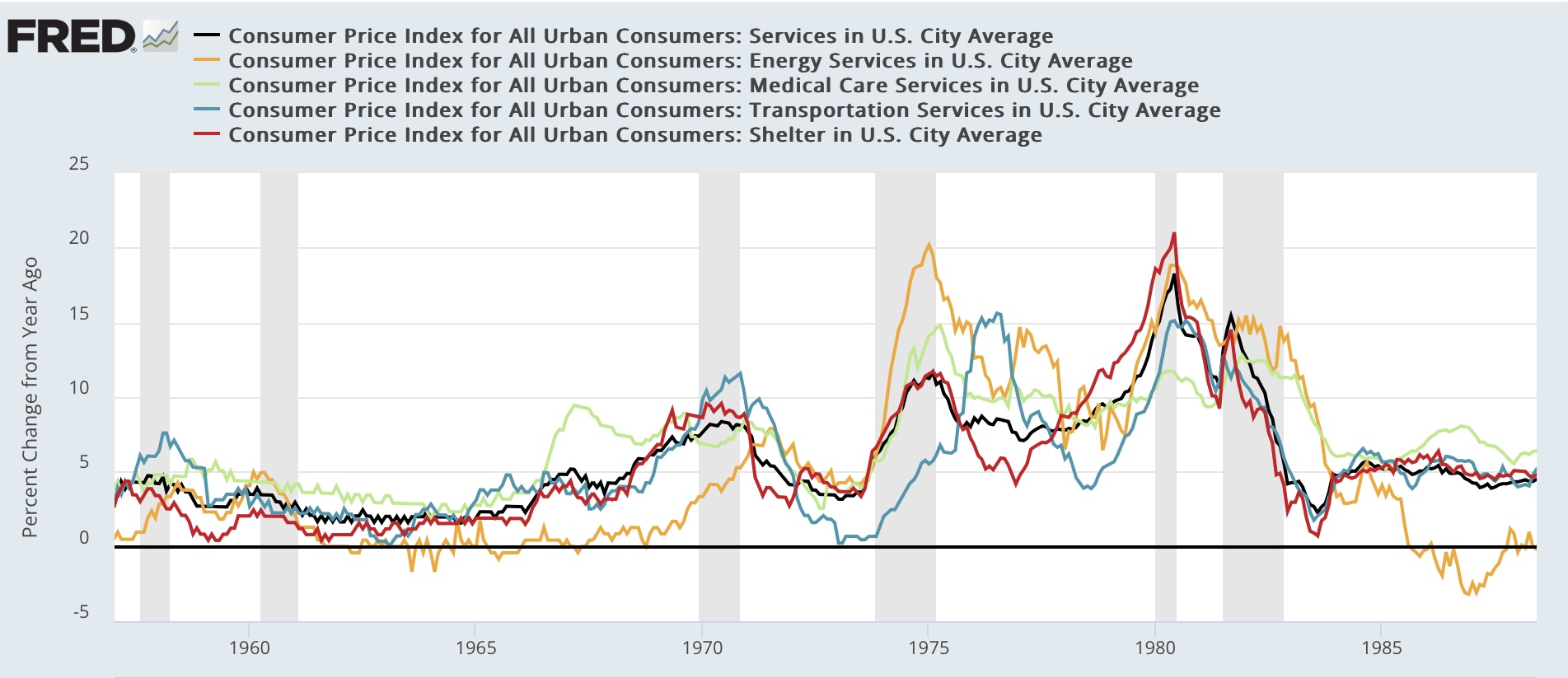
But again, remember that shelter -surprisingly - is treated as a service rather than a good. So in the below graphs, I split out from total services (black) the subgroups of energy services (yellow), medical services (light blue), and transportation services (dark blue), as well as shelter (red). Here’s the post-pandemic look:


Both energy and medical services are relatively well-behaved. As shown above, transportation services are generally about insurance and repair costs catching up with the prior steep climb in vehicle prices. But most importantly, note that the red and black lines stay very close together. In other words, services inflation is primarily about shelter.

Here is the historical look, divided into two parts for better viewing:


Note that services inflation has almost *always* tracked closely with shelter inflation. Note also the point that transportation services costs have frequently lagged the other measures, even shelter inflation, particularly as insurers raised rates for several years to make up for increased repair costs.

So, to recapitulate: while there remain several other problem children, when all the slicing and dicing is done, it depends upon whether your favorite slice includes shelter or not as to whether consumer inflation is close to or at the Fed’s target or not. And because shelter inflation lags house prices, it should continue to gradually decelerate from its still-lofty levels.

Which leads me to today’s final point. Below is a graph showing historically the net level of divergence between total headline inflation and shelter inflation. Currently shelter inflation YoY is 1.15% higher than headline inflation - one of the highest such divergences in history, and the longest such big divergence:


This is what I will be exploring tomorrow. And the Fed’s role in bringing about - and failing to resolve - this discrepancy.