Saturday, January 2, 2021

Weekly Indicators for Dece3mber 28 - January 1 at Seeking Alpha


 - by New Deal democrat


My Weekly Indicators post is up at Seeking Alpha.


In a sparse data environment, it continues to stand out how surprisingly well - under the circumstances - the economy is doing, and how primed it is to really take off once the pandemic is brought under control.

As usual, clicking over and reading brings you up to the virtual moment, and puts a penny or two in my pocket.

Friday, January 1, 2021

Happy New Year 2021!


 - by New Deal democrat

Wishing all of my readers a happy, healthy, and better 2021!

I started writing online 17 years ago, and have been here over a decade. This past year was easily the worst of all of them, and at least tied with 1968 if not worse for the worst year historically of my entire life.

The pandemic upended everything, so this year for the first time in a long time there’s no point in taking a look back to see how the year-ago economic forecast panned out, and only limited value in a new forecast even now, although I agree with Paul Krugman that once the pandemic has been brought under control, the economy looks likely to spring back strongly.

In the meantime, here is one last chuckle about 2020, The Year From Hell - in this ad from match.com, literally!


Thursday, December 31, 2020

Final jobless claims of 2020 continue to show lack of progress


 - by New Deal democrat

New jobless claims declined for the second week in a row this week, but are still significantly above their recent pandemic lows, while continuing claims, seasonally adjusted, once again made a new pandemic low. There is a sizable but by no means certain likelihood that December’s jobs number will be negative.

On a unadjusted basis, new jobless claims declined by 31,736 to 841,111. Seasonally adjusted claims also declined by 19,000 to 787,000. The 4 week moving average, however, rose again by 17,750 to 836,750. All of these are above their recent lows. 

Here is the close up since the end of July (for comparison, remember that these numbers were in the range of 5 to 7 million at their worst in early April): 


Because of the huge distortions caused by the pandemic in seasonally adjusted numbers, and because we are at a time of year when seasonality causes the most distortions in any event, here are the YoY changes in all of the above metrics:


There is now a 7 week trend in the seasonally adjusted data of YoY% increases, while the trend has been rising slowly for the unadjusted data. I still won’t be sure about a renewed upward trend unless and until seasonally adjusted new claims rise over 900,000 and the 4 week average over 850,000, which would take both out of the range they have been in over the past 4 months. We’re not quite there yet.

The story is different with both seasonally and non-seasonally adjusted continuing claims, which historically lag initial claims typically by a few weeks to several months. Seasonally adjusted continuing claims declined again by 103,000 to a new pandemic low of 5,219,000. On an unadjusted basis, they declined by 171,035 to 5,258,073, still about 10,000 above their recent pandemic low:


Because these lag initial claims, I continue to suspect we will see an upward reversal in the next few weeks.

Both initial and continued claims remain at or above their worst levels from the Great Recession.

Finally, for the month of December new jobless claims were about 95,000, or 13%, higher than in November. That much of a spike has only happened 4 times previously in the past 50 years outside of a recession - in March 1967, April 1979, September 2005, and October 2013. On 3 of those 4 occasions, either that month’s or the following month’s jobs report showed actual job *losses.* In the exception, 2005, September showed only a 68,000 gain. As I have written for the past 2 weeks, because we are in uncharted territory all I really feel comfortable saying is that I suspect that the December jobs report is going to be the weakest since May.  A negative number is very possible, and if there is a positive number, it looks likely to be well under 200,000.  

This winter looks like it will be uniquely bleak. If there is a bright side, it is that George Harrison’s “Here Comes the Sun” is likely to be equally uniquely appropriate for the coming vaccination spring.

Tuesday, December 29, 2020

Coronavirus dashboard for December 29: a final look back at the pandemic disaster in 2020


 - by New Deal democrat

Total US confirmed cases: 19,132,726*
Average cases last 7 days: 184,005
Total US deaths: 333,118
Average deaths last 7 days: 2,207 

Total vaccinated: 2,127,143 (per CDC via Bloomberg)

*Because many asymptomatic people probably never get tests, actual cases are probably more like 26 million, or about 8% of the US population

Source: COVID Tracking Project

The good news is, we finally have started the process of vaccination, and 1% of the population should be vaccinated by the end of this week. The bad news is, at the current rate, it would take over 4 years to vaccinate everyone in the US. I do expect this to ramp up, both as more States get more efficient at administering the vaccine, and because the Biden Administration will be much more activist and competent at ramping up production and improving the supply chain.

As we end 2020, let’s take a look at total infections and deaths per capita so far.

Here are infections and deaths for the US as a whole (note separate scales):


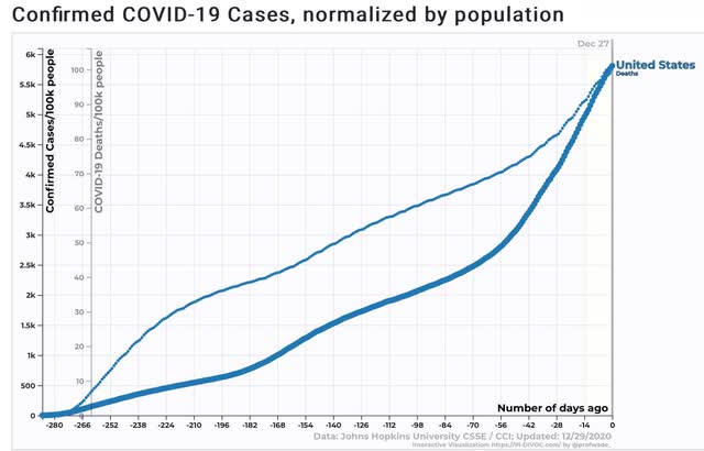
Roughly 1 in 16 Americans has had a *confirmed* infection; 1 in 1000 Americans has died from COVID this year.

Here are total infections by State:


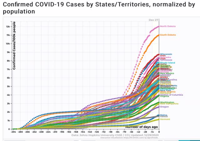
12% of North Dakotans and 11% of South Dakotans have had *confirmed* infections. Between 8% and 9% of the total population of Wisconsin, Iowa, Nebraska, Utah, and Tennessee have also had *confirmed* infections.

At the other end of the distribution, only about 1% to 2% of the populations of Maine, Hawaii, and Vermont have been infected. That is a success story.

Here are total deaths by State:


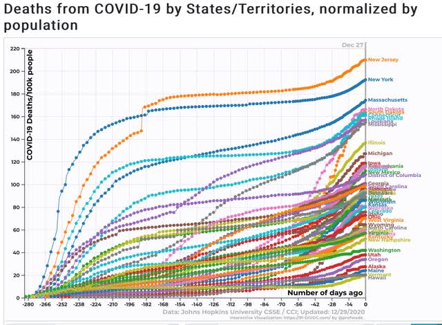
New Jersey and New York, which had horrible outbreaks early, still lead the pack, with about 1 in every 500 residents having died of the disease this year. About one in 600-700 of the entire populations of Massachusetts, North and South Dakota, Connecticut, Rhode Island, Louisiana, and Mississippi  have also died of the disease. 

Maine, Vermont, Alaska, and Hawaii have the best record, with only 2 deaths per 10,000 population. 

Looking at the 7 day average rate of infections shows that the wave that began in early November utterly dwarfs the two prior waves, with North Dakota having the worst result of any State:


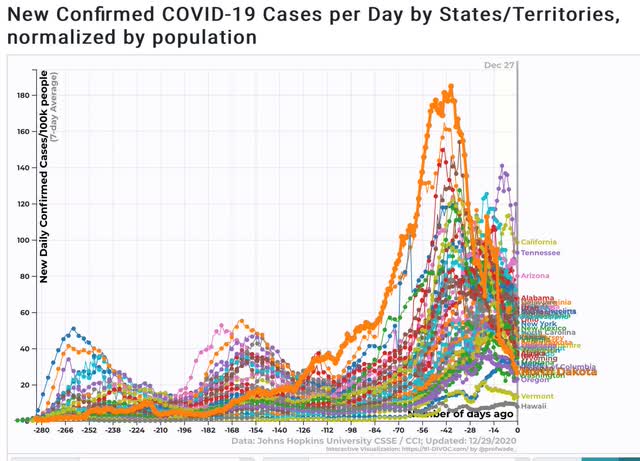
Note that North Dakotans were apparently sufficiently terrified that their infection rate is now one of the 10 lowest in the entire country!

The 7 day average of deaths shows that the initial outbreak in the NYC metro area remains the most lethal:


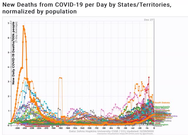
Although Iowa and South Dakota’s recent spikes are in the same ballpark.

I expect the recent horrific rates of infections and deaths to continue throughout the winter, although there will be alternating waves of panic and complacency, depending on the recent experience of each State. Between vaccinations, warmer weather, and a competent new Administration in Washington I expect a real subsidence to finally begin by about late March or early April.

Monday, December 28, 2020

The Four big coincident indicators as of the end of 2020


 - by New Deal democrat

All of the important economic data for 2020 has already been released. In this final week only November house prices and one last week of jobless claims remain.


So this is a good time to take a look at the current state of the economy as it has unfolded in this pandemic year.

The 4 most important components in the NBER’s toolkit for calling recessions and expansions are real sales, real income, production, and employment. With the exception of manufacturers’ and wholesalers’ sales, all of the above components, including retail sales, have already been released through November. Let’s take a look:


The onset of the pandemic in March is really obvious, and the outsized distortions, first to the downside, and then to the upside, continued through July. In the last 3 months, the gains have slowed dramatically, and in November two of the four components went negative.

Norming each of the four components to 100 as of February shows that sales have actually made new highs since then, and income (thanks to the emergency stimulus) is only slightly below February’s level. But production and employment are still at quite depressed levels:


As of this morning, Trump finally signed the supplemental stimulus passed by Congress, but only after the unemployed lost one week of benefits.

While it is a mistake to project coincident trends forward, my expectation is that with the pandemic at its worst, more deterioration of the 4 coincident components of the economy is likely before the effect of vaccination and coherent Federal policy under the incoming Biden Administration make their mark.