Decreasing Job Growth
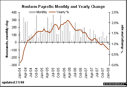
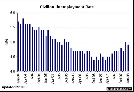
The chart above has the year over year percentage change in employment growth graphed as a line. Notice it has been dropping since the end of the 1Q2006. Also note the gray lines -- which represent the monthly payroll change -- have been decreasing in size as well, indicating the monthly change in payrolls is decreasing. As a result, the unemployment rate is ticking up (although it is still at solid levels).
Decreasing Home Values
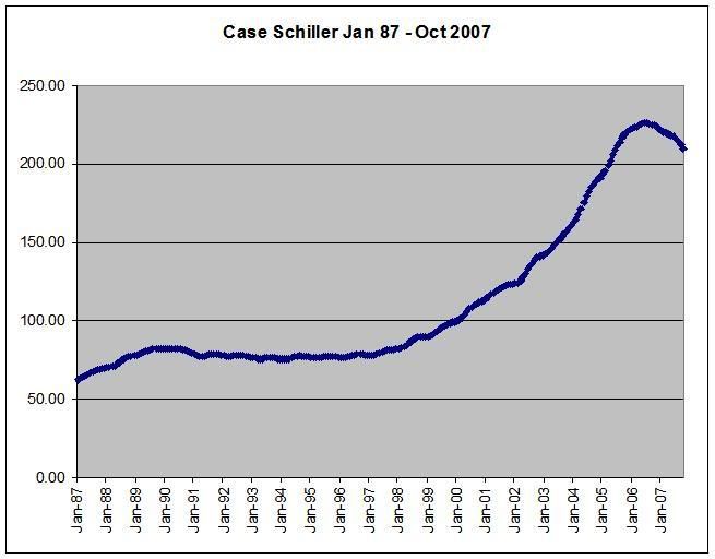
The chart above is the Case-Schiller home price chart. Notice the following:
-- During the last expansion home prices were very stable.
-- Home prices double in the first 6 years of the 2000s.
-- Home prices are now dropping:
That comes on top of the hit homeowners are taking from the drop in housing prices, which fell 7.7 percent in 20 metropolitan areas during November from a year earlier, according to the S&P/Case-Shiller price index.
Inflationary Pressures
Consumers are seeing high price increases:
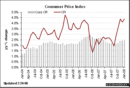
Above is the year over year percentage change in inflation.
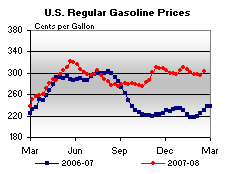
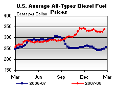
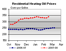
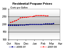
In addition, here are some charts of fuel prices from This Week in Petroleum
A Ton of Debt
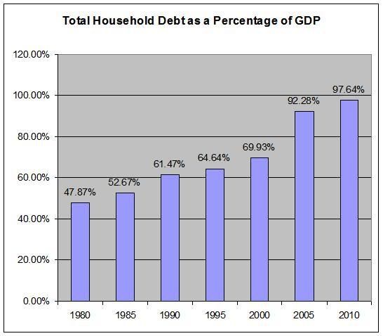
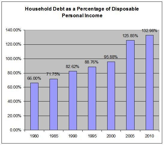
Above are two charts. They use the total outstanding household debt number for the Federal Reserve's Flow of Funds and information on GDP and disposable personal income from the Bureau of Economic Analysis.
There is no economic magic line which says, "over this line is a bad amount of total household debt and below this line is good household debt." It's really more of a sliding scale. Notice that the total household debt number has been increasing for thirty years. At some point, that will start to cause problems.
I have no idea how much stress is too much for the consumer. However, the facts above indicate he is under a tremendous amount of stress right now.
-- Job growth is dropping,
-- Home values are dropping,
-- Inflationary pressures are increasing and
-- He has a ton of debt to deal with.
Charts are from Economday