Wall Street advanced sharply Tuesday as investors interpreted minutes from the Federal Reserve's last meeting as indicating the central bank is ready to keep cutting interest rates to boost the economy.
The minutes from the Federal Open Market Committee's Sept. 18 meeting, when Fed governors voted unanimously to cut rates a half percentage point, also showed that officials were concerned that the weakness in the dollar could lead to higher inflation. But the Fed -- signaling it is more willing to intervene -- also said that the economic outlook was uncertain because of the summer's credit crisis, and that there were still risks to growth that justified lower rates.
Whether this is true or not, I have no idea. The Fed's stance on the economy did a 180 over the last two months, so I am not taking them at their word right now.
Be that as it may ....
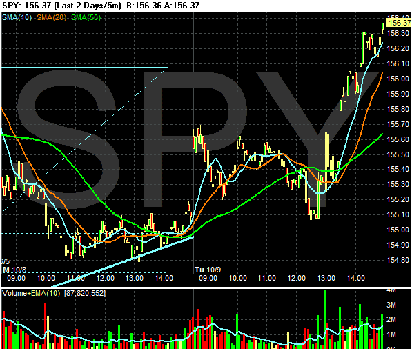
The market traded in a range until the Fed Minutes came out. Then the market jumped and closed near its daily highs. Notice the big jump in volume after the Minutes came out. Traders were obviously excited by the news and felt compelled to buy into the rally.
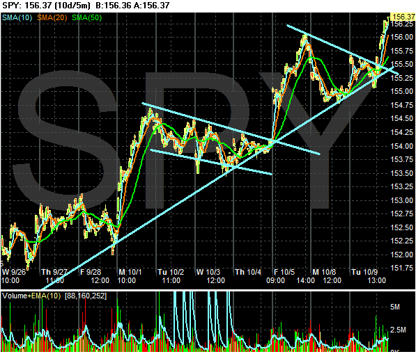
The 10-day chart shows a nice rally taking place. The market is advancing then consolidating. This is a very bullish chart.
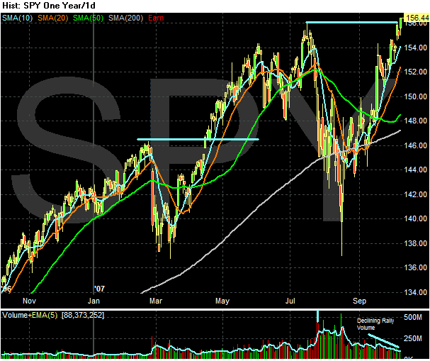
My main gripe with the daily chart is the declining volume on the latest rally. This usually indicates declining investor interest as the market advances, which is not a positive development. It's not a rally killer, but it is a warning. Think of it as a yellow flashing light (that we all speed through instead of slowing down for).
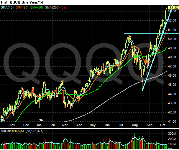
The QQQQ's daily chart shows a nice advance that is still progressing. Technology has the distinct benefit of not being mortgage or housing related.
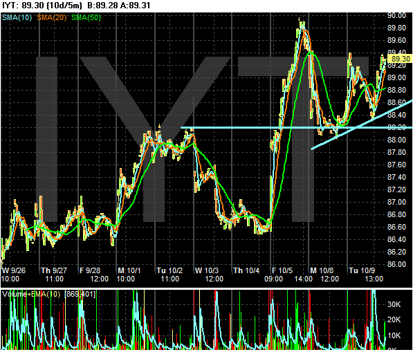
Finally, we have a 10-day transport chart, which shows very mixed trading. The Ryder news from a few days ago is obviously still important and weighing on the market.
I should add that aside from the Transports not confirming, all buy signals are pretty much green at this point. The market is clearly advancing, the moving averages are moving up and prices are above the moving averages. These are bullish charts.