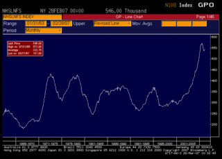
This graph is from
Interest rate roundup a great blog that everybody should read. Not only does it make me miss a Bloomberg terminal, it also shows just how out-of-whack the current inventory level is with historical norms.
I resized the chart. It goes back to 1963.

