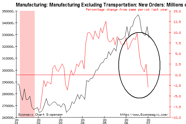
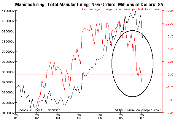
Business is ordering less and less new "stuff". Here is a chart of new orders, seasonally adjusted. The black line is total orders. The red line is the percentage change from year ago levels.
Transportation orders can really skew these numbers, so let's take them out of the graph. The same color scheme applies: