Sunday, March 30, 2014

Satiation, imitation, human error, and variable reinforcement: 4 lessons from psychology for economic theory


 - by New Deal democrat

(You know the drill.  It's Sunday, and I take a break from graphs and data and voice some opinions.  Regular nerdiness will resume tomorrow.)

Noah Smith ignited a discussion this past week with a post about the backlash against behavioral economics. He wrote:
There are two main knocks against behavioral econ. These are:

1. There is no "grand unified theory" of behavioral econ; instead it's a bunch of specific little theories for different situations. What we want is a widely applicable, unified theory of economic behavior.

2. The behaviors produced in a psychology lab are extreme effects produced by extreme, coordinated manipulations; in the real world, lots of stuff is going on, and what we care about is the average.
 Brad DeLong had a repost here. [Update:  Tim Harford's original post is here.  Cullen Roche's succinct, and devastating, rebuttal is here.]

This feeds into one of my long time grudges against the imperialism of economic theory.   Once upon a time I took my B.A. in psychology and was accepted into a hifalutin "public policy" Ph.D. program at a top ranked school.  I very quickly discovered that, despite claims of an "interdisciplinary" approach, in fact it taught "theoretical economics uber alles."  When I confronted a professor with my knowledge that the claimed outcomes contradicted actual, empirical psychological studies, he simply said "it all randomizes out."  I transferred out of the program.

So, let me briefly discuss 4 specific routes towards a "grand unified theory" of behavioral econ.

1.  Satiation.

Econ theory starts out with an assumption that drives are insatiable.  We all know that's not true (well, ok, sex might come close).  I may thoroughly enjoy steak, but not at every meal all the time.  Once we start from the proposition that drives are satiable, demand curves in particular change their shape. Once I have enough of something, I don't want any more at that or any price.

There is a very real world manifestation of this in the demand curve for labor.  Econ teaches that the more you pay someone, the more they will work.  If anything, over the long term, the reverse is true. Most people work in order to save for one or more purposes: whether paying this month's rent or feeding the kids for the poor, to saving for a house for the middle class, to saving for the kids' college education and retirement for the affluent middle class.

Once all of the targets have been achieved, there is no more economic reason to work (although there may be strictly social reasons in terms of keeping active and interacting with others).  If I have decided that I will retire once I have $500,000 set aside, and you double my pay, you have just halved the time I will continue to work.  Far from increasing my labor, you have decreased it.

2.  Variable reinforcement.

One of the oldest and most durable results from psychology is that the way to maximize a behavior is *not* to reward it all the time.  Once the behavior is learned, you decrease the number of times you reward it, and reward it on a random,  non-regular schedule.  Since your subject is working for a reward, you will get lots more of the behavior if it takes many repeated cycles to get the reward than if the reward is given every time.

I once pointed this out to Prof. Greg Mankiw on his blog.  He was not amused.

This point fits in very well with the discussion of satiation above.  If my lab rat can press one of two bars in order to get food, and one bar gives out food every time, and the other on a variable schedule, my rat is going for the bar that always rewards him.  He'll get satiated quicker, and then he'll stop.

But if I am an employer, or a casino, (of even Kos of DailyKos), what I want is to maximize the behavior that rewards *me.*  Casinos are an obvious example, but that's also why so many employers gradually reduce perks over time once an employee is hired, and why they are instituting variable annual bonuses.  Once they have the employee trained, variable reinforcement maximizes the employee-equivalent of bar-pressing, and complex bonuses dependent on many metrics increases the employees' performance on each, since they don't know which one will give rise to the biggest reward.

And if you participate in a big bulletin board like DK, the comment system ensures that you will keep coming back for interaction, and the comment recommendations that add up like pinball scores serve exactly as variable reinforcement.  I have no doubt that if we could hook up most Kossacks to an fMRI, we'd see endorphins released into the brain every time they see the number of recommendations for a comment increase.  It does wonders for Kos's page views.

3.  Imitation

"Monkey see, monkey do."  Much of, and maybe most, human learning takes place by imitation.  You imitate your parents.  You imitate your older siblings. You imitate your 'cool' classmates.  You imitate your professors and mentors.  You imitate a successful profit-making strategy.

In psychology, it is known as "modeling."  You model your behavior on others.  Economists really haven't explored this at all.  I once asked Prof. Mark Thoma about whether economists had ever thought to study learning, and got back a response indicating that some economists had used a system of successive approximation.  But brute force practice is not imitation.  The closest economists have come to discussing imitation is in the concept of herd behavior.

Imitation shows how a strategy, once novel, becomes commonplace and sometimes overshoots with catastrophic results.  A great example of the former is franchising.  Pioneered by McDonald's, and by Harlan Sanders, the founder of Kentucky Fried Chicken, franchising was quickly imitated and now there are probably thousands of franchising corporations, explaining why virtually any mall and any large plaza or strip mall looks virtually identical anywhere in America.

The problem arises when a behavior can only be imitated by a limited number of people without turning toxic.  A great example of this was house-flipping a decade ago.  Originally it was  a great success.  The flipper buys an old property, fixes it up, and resells it for a profit.  During the housing boom, then bubble, the number of flippers probably grew at an exponential rate.  At some point the market reached satiation, and then went right past it.  A successful profit strategy for some became a disaster for a far larger group of people.  Modeling as a psychological concept explains how that happens over time.

4.  Human error

It is a trite truth that all humans have different skill levels.  And probably everybody engages in some self-destructive behavior.  Even in a perfectly competitive market, different participants will better react to changes, or even to extended periods of stability.  If there are no barriers to entry, the less skillful (or lucky) participants leave the market, and newer ones come in.

But over time, most businesses tend to become oligopolies.  And oligopolists can engage in poor or unlucky decision-making as well.  When they do (Arthur Anderson in the Enron scandal, Circuit City), the oligopoly shrinks, tending further towards monopoly.

Too often even the most prominent economists seem to assume that the "free market" participants always make the most "optimal" decisions.  We know this isn't true, and the impact of poor human decision-making over time in conditions other than perfect competition appears to have been totally neglected by economists.

TO SUM UP:  Psychology isn't just about a bunch of discrete tiny behaviors that randomize out.  It is about human variation, how we learn, and how we engage in large systematic behavior patterns.  Satiation, imitation, human error, and variable reinforcement are general concepts that have major implications for any "grand unification" economic theory.


Saturday, March 29, 2014

International Week In Review

This is up over at XE.com

Weekly Indicators for March 24-28 at XE.com


 - by New Deal democrat

OMG it's 'green shoots'!!!

There's been a definite "spring-ing back" in the indicators in the last two weeks.

Friday, March 28, 2014

Why I disagree that real private fixed residential investment forecasts economic improvement this year


 - by New Deal democrat

Bill McBride a/k/a the nicest blogger in the econoblogosphere has forecast a strong 2014, which is in contrast to my forecast for deceleration (i.e., positive but at a declining rate).

I wanted to lay out factually why, even though I have the utmost respect for Bill, I have disagreed.  The first post, dealing with real private fixed residential investment, is up at XE.com.

Brazil ETF Breaks Through Resistance


UK Economy Hitting Its Stride

This is over at XE.com

Thursday, March 27, 2014

My housing bet with Calculated Risk: February results


 - by New Deal democrat

As most readers know Bill McBride a/k/a Calculated Risk and I have a charitable bet about the direction of housing in 2014.

In his forecast for 2014 residential investment, CR said, "I expect growth for new home sales and housing starts in the 20% range in 2014 compared to 2013."

By contrast, several months ago, in a post at XE.com, I said that "If the typical past pattern is followed, we will shortly see permits running 100,000 less than one year previously."

Here are the terms of our bet:  If starts or sales are up at least 20% YoY in any month in 2014, I will make a $100 donation to the charity of Bill's choice, which he has designated as the Memorial Fund in honor of his late co-blogger, Tanta.    If housing permits or starts are down 100,000 YoY at least once in 2014, he make a $100 donation to the charity of my choice, which is the Alzheimer's Association. 

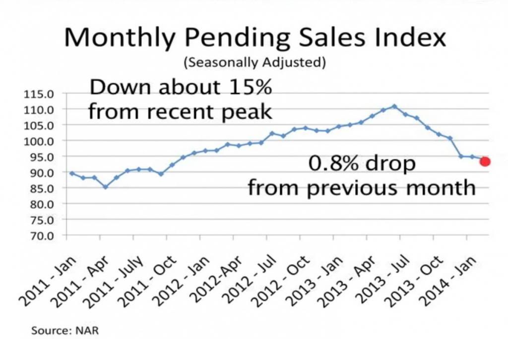
This morning the final monthly report on housing for February, pending home sales, was reported by the NAR.  The index was down -0.8% m/m from January, but down -10.2% YoY, and in fact was the lowest reading in over 2 years:

 photo image_zps69db4910.jpg
[h/t Business Insider]

So, with February 2014 in the books, how do we stand?  Below are two graphs.

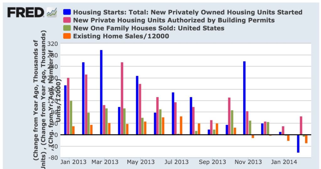
First, here is a graph of the change, in thousands, YoY of starts (blue), permits (red), new home sales (green), and existing home sales (orange) (note that the St. Louis FRED does not track pending home sales):

 photo a9ef90b0e3555950ba644fd5a2fd39b8_zps99c667b5.jpg

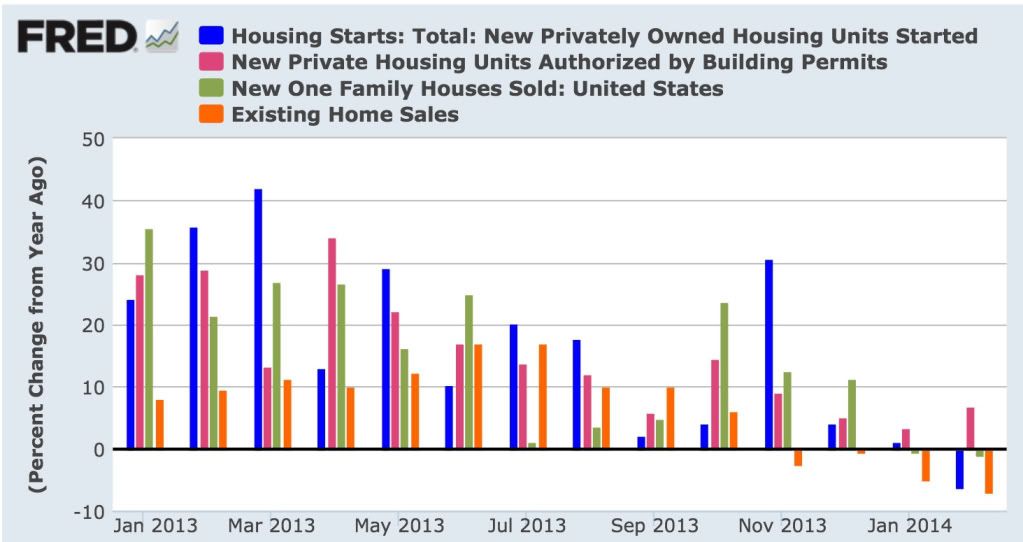
Next, here is the YoY% change in the same four statistics:

 photo 17eff756d16f3a69677d8ab18a64f3d2_zpsc133e50e.jpg

Both of these graphs show the clear deceleration in the housing market through 2013 and further into February 2014, to the point where 4 of the 5 monthly reports have turned negative YoY.  The strongest metric is housing permits, which rebounded slightly from a +3.3% YoY reading in January to a +6.5% rYoY eading in February.  Nevertheless, the graphs make clear that except for permits, deceleration has turned into outright YoY decline.

Bill's forecast of 20% annual growth will take a real reversal of momentum (housing starts and sales will have to be up about 25% on average YoY for the next 10 months), although there are some individual months where there are some easy YoY comparisons.  Obviously I am expecting some further deterioration, concentrated between now and mid-year.

Most people seem to be either surprised by or ignoring the housing slowdown.  And yet there is no doubt that the trend has turned negative as I forecast it would.

Initial claims return to post-recession lows; gross domestic income improves


 - by New Deal democrat

Just a couple of quick hits about data released this morning.

First of all, initial claims, at 311,000, caused the 4 week moving average to decline to 317,650, which is the lowest reading since the Great Recession with the exception of 3 weeks last September (and before that, October 2007!).  This bodes well for the unemployment rate in the March or April jobs report, since initial jobless claims tend to lead the unemploymeet rate in the payrolls report.

In the rear view mirror, fourth quarter gross domestic income was reported at +2.7%.  Gross domestic income is the mirror image of gross domestic product, and it is generally thought that GDP resolves in the direction of GDI.  Although "old" information, it confirms that we have not been on the verge of contraction.

The good initial claims report in particular is potent evidence that the wintertime slump has ended.


More Signs Of A Short-Term US Equity Market Top


The IWMs (top chart) have moved through the 117 level, although the longer-term uptrend is still in place.  The real concern now is the QQQ chart, where prices are right at long-term support with decreasing momentum and negative volume flow.


And finally, the DIA double top is still in play.


Wednesday, March 26, 2014

Chinese Rebalancing: A Work in Progress

This is over at XE.com

India ETF Breaks Through Resistance


The Indian ETF above had been hitting resistance in the upper 56-upper 57 region since 4Q of 2013.  However, prices have now moved through that level and are advancing higher.  The reason is hope the new government will be more business friendly:

On Wednesday, India’s two benchmark stock indexes, the Sensex and the Nifty, each rallied to their third new high this week. The foreign funds coming in to buy Indian stocks have shored up the rupee, which has risen nearly 14 percent as of Tuesday since hitting the record low.

India’s economy remains stagnant, but much of what is driving investor optimism is the rising expectation that the opposition Bharatiya Janata Party will replace the government, led by the Indian National Congress. A B.J.P. victory would be expected to install Narendra Modi, the chief minister of Gujarat, as the new prime minister, and in a country that has a reputation of being difficult to do business in, Mr. Modi has welcomed foreign investment in his home state.

In February, a survey by the Pew Research Center showed that 63 percent of Indians polled would prefer the B.J.P. to form the next government, compared with 19 percent who picked the Congress party.

‘‘Expectations are very high that Mr. Modi will lead the new government in India, and investors are viewing that as quite a game-changing event for India going forward because of his economic track record in Gujarat,’’ said Sam Mahtani, a director of emerging market equities at F&C Investments in London, which invests $3.3 billion in emerging markets, about 10 percent of which is in India. ‘‘He is viewed as a very pro-reform leader, and that is effectively what the market is anticipating and wants.’’

Tuesday, March 25, 2014

New home sales now *also* down YoY


 - by New Deal democrat

This morning the Census Bureau reported that seasonally adjusted February new home sales were 440,000, which is -1.1% lower than last February's 445,000.

January's number was revised down by -13,000  to 455,000, and not only is no longer a record, but as revised was *also* down YoY by -3,000.

That means that the only two measures of housing which were not negative YoY in January were permits and, as revised, starts.  So far this month, only permits are YoY positive.  (Admittedly I regard permits as the best, most forward looking measure).  The last important series, pending home sales, will be reported Thursday, and I'll update all of my graphs then.

While I haven't won my bet with Bill McBride a/k/a Calculated Risk, how many of you, dear readers, believed that  by this time so many measures of the housing market would be negative YoY?  If I haven't specifically been proven correct on my -100,000 YoY forecast for permits or starts, I got the trend of the housing market at the beginning of this year correct.

Latin Amercan ETFs Underperforming


Above is a one year comparison chart for 6 Latin American ETFs.  With the exception of Argentina, all are in negative territory.  There are two underlying reasons for this.  The first is the negative impact of China's economic re-balancing, which is negatively impacting countries like Peru and Chile.  Consider this chart of exports from those two countries:

While exports from both countries picked-up after the great recession, both have seen a stalling since roughly mid-2010.   This has also hurt Brazil, another net exporter.  Mexico's economic fortunes are tied to the US' so as concerns about the US economy built, Mexico's equity index underperformed.   

Monday, March 24, 2014

Can We Please Start Fixing Our Infrastructure Now?

From the NY Times:

It is a danger hidden beneath the streets of New York City, unseen and rarely noticed: 6,302 miles of pipes transporting natural gas.

Leaks, like the one that is believed to have led to the explosion that killed eight people in East Harlem this month, are startlingly common, numbering in the thousands every year, federal records show.

Consolidated Edison, whose pipes supplied the two buildings leveled by the explosion, had the highest rate of leaks in the country among natural gas operators whose networks totaled at least 100 miles, according to a New York Times analysis of records collected by the federal Department of
Transportation for 2012, the most recent year data was available.

The chief culprit, according to experts, is the perilous state of New York City’s underground network, one of the oldest in the country and a glaring example of America’s crumbling infrastructure.

In 2012 alone, Con Edison and National Grid, the other distributor of natural gas in the city, reported 9,906 leaks in their combined systems, which serve the city and Westchester County. More than half of them were considered hazardous because of the dangers they posed to people or property, federal records show. (There are more than 1.2 million miles of gas main pipes across the country. Last year, gas distributors nationwide reported an average of 12 leaks per 100 miles of those pipes.)

Saturday, March 22, 2014

Weekly Indicators for March 17 - 21 at XE.com


 - by New Deal democrat

This week's edition is up at XE.com.

Appropriately for the week of the vernal equinox, the high frequency indicators sprung to life.

International Week in Review; More of the Same Edition

This is up over at XE.com

Friday, March 21, 2014

Chinese Yuan Moves Higher

This is up over at XE.com

No Oil Premium For Ukraine Situation


Above is a chart for West Texas Intermediate Crude.  It rallied a bit in the first part of the year, but prices broke support and are now trading right around the 200 day EMA.  Notice the sell-off occurred during the heightened tensions in the Ukraine, indicating the oil market is not pricing in a "Ukraine" premium.


Thursday, March 20, 2014

Soft patch in production may be over, but beware outright losses in employment in coming months


 - by New Deal democrat

I have a new post up at XE.com.

While the important February data all looks positive so far, the 1% decline in real retail sales caused in part by the cutoff of extended unemployment benefits is likely to feed through into employment in the next few months, and may include significant outright monthly declines.

Grains and Softs Break Out On Weekly Charts


Above are the weekly charts for grains (top chart) and softs (bottom chart).  Both show clear downward trends for most of the past three years.  However, starting in late January, both started to rally strongly, breaking downside resistance. The grains have moved through the 200 week EMA as have the softs, although the latter are consolidating recent gains. 

The MACD indicates both of these ETFs have plenty of room to run this spring.

Wednesday, March 19, 2014

Fed Acknowledges Potential Deflation Problem

This is over at XE.com

The loosening Oil choke collar, declining unemployment may give us a new high in real wages by year end

- by New Deal democrat

 Not surprisingly, the loosening of the Oil choke collar appears to be having a number of virtuous side effects. The price of gas continues to be lower than it was in 2013, 2012, and even 2011 at this time.

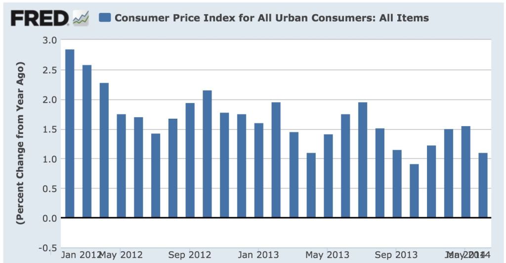
Since changes in the price of gasoline are almost entirely responsible for the month to month deviations from the "core" inflation rate of roughly 1.5% a year, the YoY slow decline in gas prices has caused YoY consumer inflation to decline from nearly 3% 2 years ago, to between 1% and 1.5% recently.

Here's the graph of YoY CPI siince January 2012 showing that decline:

Photobucket Pictures, Images and Photos

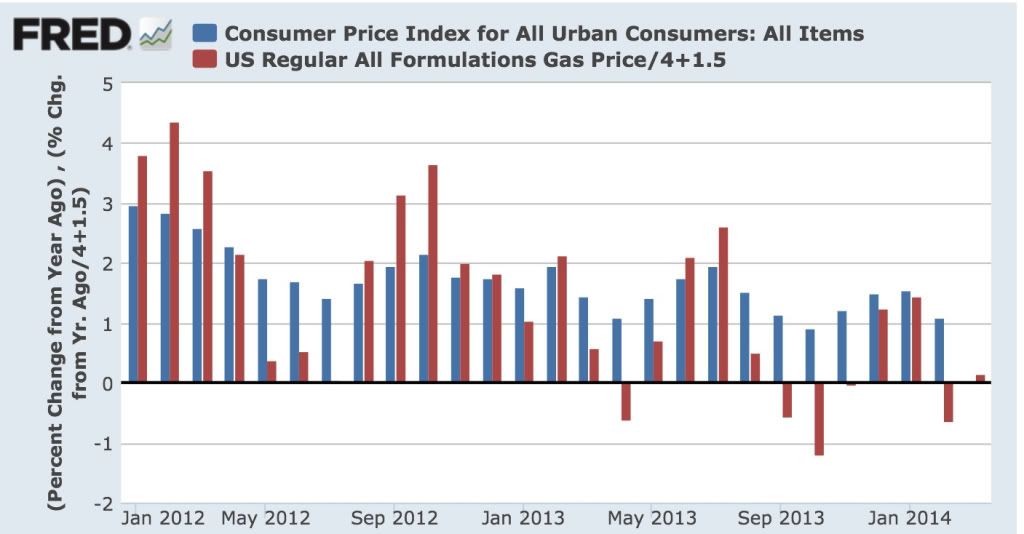
 And here is an overlay of gas prices (red), adjusted by 1.5% core inflation and scaled for easier comparison:

Photobucket Pictures, Images and Photos

The correlation between the slow fade in gas prices and the deceleration in the CPI is obvious.

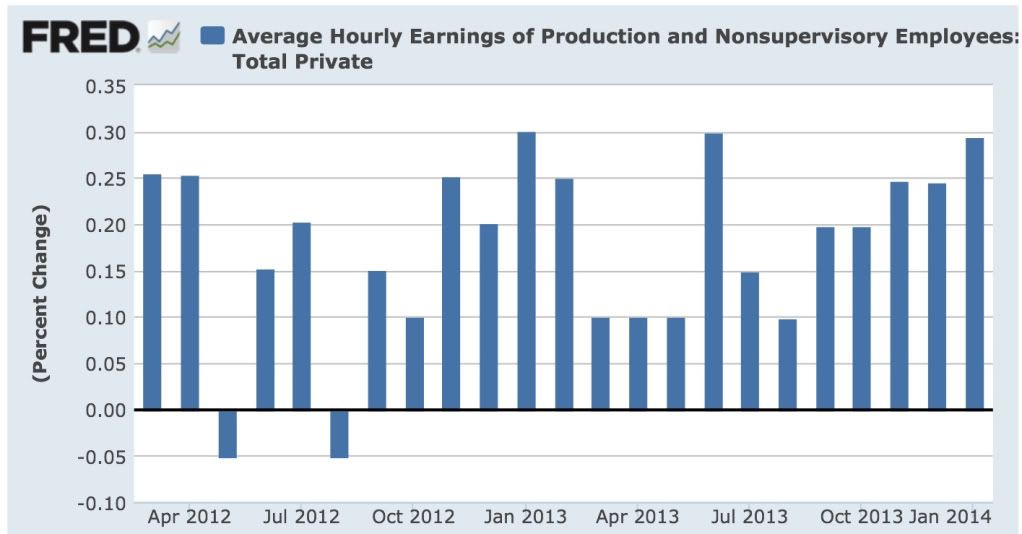
Now, let's take a look at the month over month percentage change in the nominal (i.e., not inflation adjusted) average wage of nonsupervisory workers over the last 2 years:

Photobucket Pictures, Images and Photos

Over the last 5 months in particular, the monthly increase in average wages has signficantly picked up.  This suggests that the decline in the U3 unemployment rate to nearly 6% is real, since there is evidence at last of some slight upward pressure on wages.

This upward pressure on wages (to a whopping 2.5%, still over .5% less than at its worst point before the last recession), is evident on this next graph, which shows the YoY% change of  both the CPI and average nonsupervisory wages since October 2010:


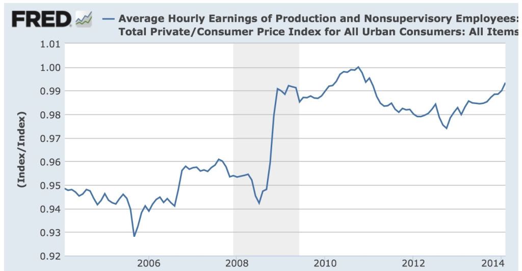
Finally, as both a result of the deceleration in consumer inflation due to the loosening of the Oil choke collar and the recent acceleration in nominal nonsupervisory wages, here is average wages for nonsupervisory workers, normed to 100 at their peak in Octrober 2010:

Photobucket Pictures, Images and Photos

Since last summer there has been marked improvement in the trajectory of real wages.  We are within 1% of the October 2010 peak, and if the current trend continues. we may finally set a new record high for real wages by the end of this year.

Maybe not worth 3 cheers, but 1 1/2 cheers at least.

Industrial Metals ETFs Trading Near Yearly Lows


Above is a chart of the industrial metals ETF.  Since midway through last summer, it has been trading in a descending triangle formation.  Prices have not only hit resistance at the upper descending boundary, but also at the 200 day EMA, indicating the chart is remaining in a bear market.  Prices broke through the downside in mid-March when Chinese export data dropped sharply.   

Tuesday, March 18, 2014

The Russian Central Bank Faces A Nightmare Scenario

This is up over at XE.com

Cattle ETF Rallying Strongly


Above is the weekly chart for cattle.  The ETF was in a downtrend for two and a half years, continually printing lower lows and lower highs.  However, prices broke through resistance in October of last year, fell back to trend, then moved higher in February of this year.  Over the last 6 weeks, we've seen an incredibly strong rally, moving from 28.5 to 32.5.  Several of the weekly bars are incredibly strong, indicating very strong demand.

Housing permits and starts for February: permits up, starts down -62,000 YoY


 - by New Deal democrat

As you all know, based on 60 years of history, almost always when interest rates have moved up 1%, housing permits at some point soon thereafter have been -100,000 lower YoY.

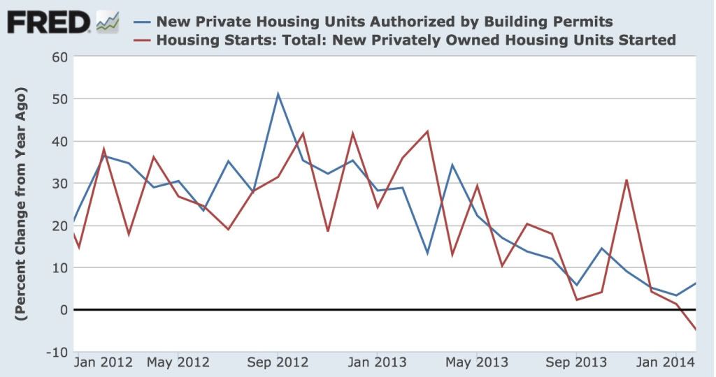
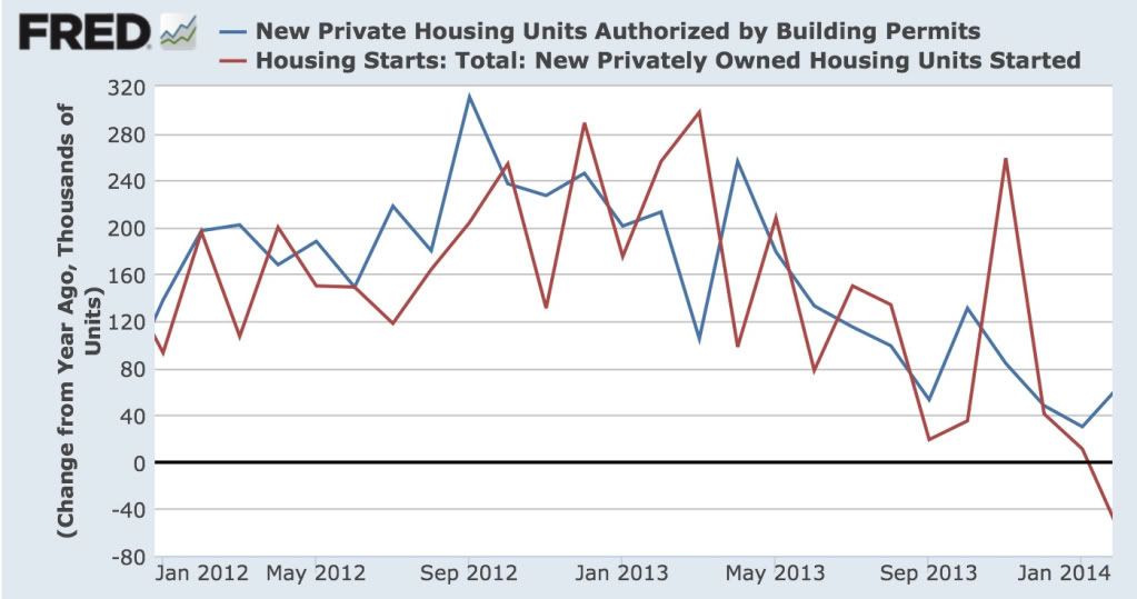
This morning permits rose 63,000 from January to 1.012 million, for a YoY 6.3% increase.  Starts fell -2,000 to 907,000 from January, but are -62,000 less than they were a year ago, or -6.4% YoY.  Here's the graph, starting from January 2012, of the YoY% changes in permits and starts:

Photobucket Pictures, Images and Photos

Here is the same information, represented by 100,000s of units:

Photobucket Pictures, Images and Photos

Finally, here are both permits and starts, normed to 100 as of September 2012 (when the decelerating trend began):

Photobucket Pictures, Images and Photos

At first blush, it looks like the decelerating trend in housing has continued (granting that permits are at the top of their trend channel), and in the case of starts, we have had an outright YoY decline.   While we haven't hit my -100,000 target, I wonder how many people thought there would be a -62,000 YoY decline a few months ago when I first made my forecast?


Monday, March 17, 2014

BRICs All In The Red


Above is a chart of the BRIC indexes and ETFs.  All are in the red for the last year, some in a big way.

Russian ETF Tanks


Even before the Crimean situation, the Russian ETF was in trouble.  After peaking at 29.47 in October of last year, the ETF has been continually moving lower.  Price broke the 200 day ETF for the first time in December of last year and again in January 2014.  As the situation in Eastern Europe has intensified, so has the strength of the downward move.

Sunday, March 16, 2014

The missing Malaysia airliner: an intriguing "hybrid" possibility


 - by New Deal democrat

I just wanted to follow up my post yesterday, in which I indicated that once a mid-air explosion is ruled out, only 3 possibilities appear to be left.

There's been some interesting discussion today that opens up a "hybrid" of the three.

First of all, the abrupt changes in altitude have been suggested to indicate a struggle for control in the cockpit.  Secondly, it has been suggested that an aborted 9/11 style attack against a city in India fits the evidence.

I don't buy that a pilot would go through all kinds of exquisite machinations just to let the plane go 5 hours on autopilot till it ran out of fuel as a means of committing suicide. But if, after the plane was intentionally diverted, some passengers and/or remaining crew struggled for control of the cockpit, as happened on flight 93 on 9/11, in the course of which the cockpit and passenger cabin were suddenly decompressed, then the flight might very well have continued on its most recent setting, a la the case of Payne Stewart, until it ran out of fuel.

If so, once the "black box" is found, then all we will hear over the 2 hours of tape is, literally, dead silence.

[P.S.:  But I still hope the world's anti-terrorist agencies are preparing against the worst case scenario I laid out yesterday.]


A thought for Sunday: society is most vulnerable to those things of which it has no firsthand memory


 - by New Deal democrat

A theme of several political and economic articles I have read in the past few days is the notion of an inflection point, where suddenly the paradigm shifts.

For example, Atif Mian and Amir Sufi wrote that there was a increase in household credit debt before the Great Depression, a discovery sufficiently profound that Mark Thoma included it in his daily links.  Which is interesting, because I wrote all about the 1920s credit bubble over six years ago, explaining how changed social attitudes about credit led to an explosive increase in installment debt in the 1920s, whereby furniture and appliances were purchased on time, where even one missed payment would give rise to repossession. When the downturn of 1929 hit, households cut back on purchases en masse in order to protect their existing possessions -- which only created a vicious cycle.

Similarly, the New York Times today has an article applying game theory to the Crimea/Ukraine crisis, in which it is explained that
In a recent blog post, Jay Ulfelder, a political scientist, noted that for the last 25 years the world has seen less violent conflict than might have been expected, given local conditions. Lately, though, peaceful settlements have been harder to find. This change may just reflect random noise in the data, but a more disturbing alternative is that conflict is now more likely.
Why? The point from game theory is this: The more peacefully that disputes are resolved, the more that peaceful resolution is expected. That expectation, in turn, makes peace easier to achieve and maintain. But the reverse is also true: As peaceful settlement becomes less common, trust declines, international norms shift and conflict becomes more likely. So there is an unfavorable tipping point.

Back when I blogged at Economic Populist, Rob Oak used to tell me that my posts on the Kondratiev cycle drew the least reads.  Which is a shame.

Because the Kondratiev cycle, the credit bubble of a the last several decades, and the Ukraine crisis are all demonstrations of the same long term phenomena.  That is, that society is most vulnerable to shocks of  the type of which it has no firsthand memory.  

World War 1 occurred after a century of nearly complete European peace.  The only major war after the Napoleonic War that ended in 1815, was the Franco-Prussian War of 1870, and that was both brief and decisive.

By the time 1914 came around, nobody in Europe had any living memory of a protracted, destructive, major war.  Since the living memory was gone, governments made all the mistakes that those who actually lived through a major war would have avoided.

Similarly, by the 1990s and 2000s, the living memory of the 1920s credit bubble was gone.  Yes, there might be some old codgers who would lecture their grandchildren about the evils of too much debt, but what did they know?  Times had changed.  Except of course, as it turned out in 2007-09, they hadn't.

Back in the 1970s, graphs showing how the sky-high interest rates then current "demonstrated" that the Kondratiev wave had no value, were published in investment books.  Except right on time in 1981 interest rates peaked,  almost exactly 60 years after their prior secular peak.  This is treated by most as strictly chance, although since then we probably had a secular low in 2012, 64 years after the prior secular low in 1948. We won't have a serious threat of inflation until the 2030's, by which time those of us who remember the 1970s will be old codgers shouting at clouds, or will have passed this mortal coil.

And the last naked major land-grab in Europe took place in 1945, as Stalin de facto annexed Eastern Europe to the Soviet Union.  Of course, it was Hitler's land grabs in Austria, the Sudetenland in Czechoslovakia, and finally Poland, which ultimately caused World War 2.  That was 70 years ago, and nobody under the age of 75 has any living memory of that event.

Which means I disagree with Jay Ulfelder.  Peaceful resolutions beget peaceful resolutions only up to the point that enough of the prior generation which remembers a major war is gone.  Once that point has been reached, many or most of the players will put their collective guards down, leaving them flatfooted in the face of the first major old-fashioned aggressive annexation. Now that Putin has successfully annexed several smaller pieces of the old Soviet Union without meaningful consequence, and is about to annex Crimea, Europe and the US are shouting about economic sanctions.  If I were Putin, I would be thinking, "they are already going to their maximal response.  I have nothing to lose by also annexing part or all of the remaining (militarily helpless) Ukraine."

The Millennial generation well understands the problems of excess credit and of laissez faire capitalism.  Those problems will not advance further and are likely to be pushed back dramatically during their watch.  But they don't remember inflation.  And no living generation today except for the very old remember World War 2.

Which is exactly why the world is becoming increasingly vulnerable to  acts of naked aggression, and  a resulting conflagration.


International Economic Week In Review: China and Russia Start Screwing Things Up Edition

The is up over at XE.com

Saturday, March 15, 2014

Weekly Indicators for March 10 - 14 at XE.com


 - by New Deal democrat

My Weekly Indicators column is up at XE.com.  The recent trends appear to be continuing.

The missing Malaysian airliner: while the world is obsessing on Act 1, somebody may already be beginning to implement Act 2


 - by New Deal democrat

[regular nerdy economic blogging will resume shortly]


'...when you have eliminated all which is impossible, then whatever remains, however improbable, must be the truth.'
Sherlock Holmes Quote
-The Blanched Soldier

Several days ago I started citing the above in connection with the missing Malaysian jetliner.  I pointed out that the sea underneath the area where the airplane stopped communications had been searched thoroughly, without a trace of debtis being found from any supposed mid-air explosion.  That left open 3 possible scenarios:

1. The Payne Stewart scenario, where a failure of the cockpit window killed or rendered unconscious the pilot and copilot immediately, and the plane kept flying for hours on autopilot until running out of fuel.

Except that looks impossible.  You need a decompression severe enough to take out the pilots, take out the transponders, and yet leave everything else intact.  Oh, and the plane switches to a new course.

2.  Pilot suicide. This is supposedly what happened to EgyptAir flight 990, where a "deadheading" pilot was allowed to take control of the plane and then deliberately crashed it after it took off from JFK Airport.

But if  the pilot intended to commit suicide, why bother turning off the transponders?  Do you continue to fly it for a long time (perhaps 4 or 5 hours) off course before deliberately crashing it?

Since scenarios 1 and 2 are eliminated, then scenario 3, however improbable, must be what happened:

3.  The plane was deliberately diverted by a pilot or hijacker and landed somewhere else, with a further act having already been planned.

What we have learned in the last several days has only strengthened the likelihood of scenario number 3.  Most importantly, the plane was equipped with a beacon that would send a signal if the plane was about to crash into the ocean.  The beacon never went off.

In the last 24 hours, more and more officials are saying outright that the disappearance of the airplane was a deliberate act.  In fact, as of this morning it appears to be emerging that a series of deliberate acts were undertaken to minimize the likelihood that the plane could be tracked on radar.

So the narrative seems to be focusing more and more in the direction of scenario 3.

But if scenario 3 is correct, then the persons who planned it are not the underpants gnomes.  You know the meme:  Step (1) steal underpants.  Step (2). ????  Step (3) Profit!

No, these persons already have a plan for Step 2. The did not simply park the plane in a hangar somewhere, high five one another, and over a round of celebratory drinks, start discussing what they might be able to do with the plane at some later date.

IF scenario 3 is the correct scenario, then the preparations to carry out Act 2 are already in motion.

What would be a big enough Event planned for Act 2 to justify all of the planning necessary to actually commandeer a commercial airliner in the manner that took place one week ago?  Whatever it is, it must be really Big.

If I'm wrong, I'm wrong, and I will have the appropriate egg on my face.  But still, while the world media is still obsessing with Act 1, I certainly hope that there are some very smart people in some bunker somewhere analyzing the possibilities for Act 2, and how quickly it might occur.

I know, rampant speciulation.  And Act 2 might involve any number of targets in that part of the globe, but under the heading of better safe than sorry, if there are any areas of the US coast that have very limited radar coverage offshore, it wouldn't hurt to make sure that they are covered by some kind of heightened alert combat patrols.

UPDATE:  To make my point as succinctly as possible, I sincerely hope that anti-terrorism authorities worldwide at this point are operating under the assumption that a commercial airliner is being converted into a flying bomb for malign purposes right now.


Friday, March 14, 2014

More Signs of A Short-Term US Equity Market Top


The 30 minute DIA chart shows a rounding top, declining momentum and a sharp sell-off yesterday.


The 30-minute IWM (top chart) and QQQ (bottom chart) show declining short-term momentum


The daily IWM (top chart) and QQQ (bottom chart) show a bearish MACD crossover.

None of these developments is fatal.  In fact, it's to be expected considering the market has rallied for awhile.  But when this information is combined with the DIA forming a double top, the bearish implications are difficult to ignore. 

Thursday, March 13, 2014

Should We Worry About the Latest Chinese Data?

This is over at XE.com

http://community.xe.com/forum/xe-market-analysis/should-we-worry-about-latest-chinese-data

Junk Bond ETF Far Outperforming Other Bonds


Above is a one year comparison chart of several major bond market ETFs.  Keep in mind that some are total market (JNK, MBB and MUB) and some are duration specific (IEF and VCIT), making the comparison a little weak but not entirely moot. 

The point of the above is that junk bonds are the only sector in the fixed income market that has really done well over the last year.

Wednesday, March 12, 2014

Double Top For the DIAs?


Above is a chart of the DIAs.  Consider the following points.

1.) Prices have topped out in the upper 164s twice.
2.) Volume is weaker on the second  top
3.) The MACD is declining

The EU Is Still Very Sick

This is up over at XE.com

The REAL "real unemployment rate" for February 2014


 - by New Deal democrat

In order to be counted among the unemployed for purposes of the monthly jobs survey, a person must have actively looked for a job during the reference period.  Several sources, including Mish and the Economic Policy Institute, have attempted to measure the number of "missing workers", which EPI in their press release describes as:
potential workers who, because of weak job opportunities, are neither employed nor actively seeking a job. In other words, these are people who would be either working or looking for work if job opportunities were significantly stronger.
The monthly household jobs survey measures exactly this in a statistic called "not in labor force, want a job now."  Despite this, the EPI's "missing workers" metric uses the household report's measure of the unemployed, and measure of the civilian labor force, but then ignores the "not in labor force, want a job now" statistic in the exact same survey, in favor of an extrapolation from the forecast of a 2006 Fed study.  There has been no explanation from EPI as to why they have overlooked this actual, monthly-updated obvious metric in favor of an 8 year old study.  Mish has published a rate that assumes the 2007 participation rate would have continued, i.e., that there is no such thing as the Baby Boom, whose oldest member was 61 in 2007, but nearly 1/3 of whom have now hit at least the early retirement age of 62. (To be fair, this month he dropped that and focused only on younger workers).

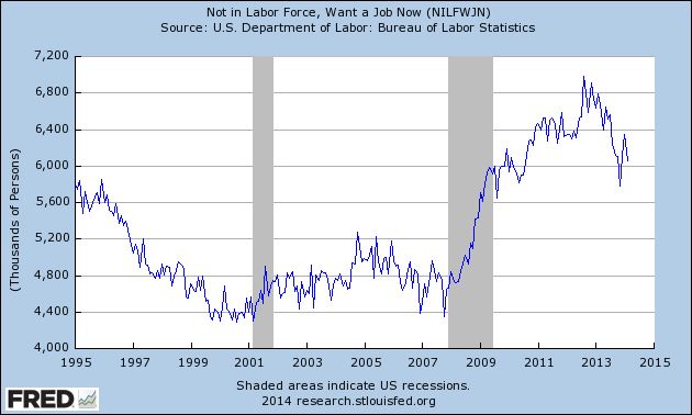
There really is no reason to look further than the monthly report, which measures precisely this number in a series called "not in labor force, want a job now."  Here's what that metric shows for the last 20 years:

Photobucket Pictures, Images and Photos

The number of discouraged workers rose by nearly 2,000,000 in the wake of the great recession, but has declined by about 1/3 of that number in the last year or so.

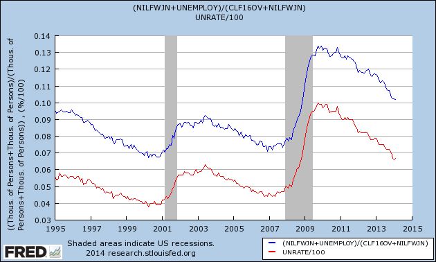
In order to find out what the "real" unemployment rate is, including such discouraged workers, we simply add the number of people shown above to both the numerator (unemployed) and denominator (civilian labor force, which excludes those adults not interested in jobs, like retirees) of the statistics used for the unemployment rate.  Here's what that shows:

Photobucket Pictures, Images and Photos

The usually reported unemployment rate (U3, in red) is currently 6.7%.  The "real" unemployment rate including those who want a job but haven't looked (blue) is 10.1%.

While this is by no means good, it is important to compare apples to apples.  Note that the current rate is only slightly above that of 1995, and even at the height of the late 1990's tech boom, the best economy the US has seen since the 1960's, this rate was 6.7%.

We can perform a similar calculation to get the "real underemployment rate," i.e., which adds those who are working part time for economic reasons or are otherwise marginally attached to the workforce:

Photobucket Pictures, Images and Photos

The "real" underemployment rate is 16.1% (blue) vs. 12.6% (red).  Again, note that even in the 1990's tech boom, this rate never got below 9.9%.

Ironically, because I have been critical of both the EPI's and Mish's methods, the above "real" rates for February 2014 are similar to their conclusions.  It appears that both EPI and Mish seriously undercounted the number of "missing workers" earlier in the post-recession period. The calculation above is in accord with recent papers by the Atlanta Fed , researchers at the IMF, and Shigeru Fujita of the Philadelphia Fed that, while most of the increase in the "missing workers" initially was due to discouragement, in the several years there has been a relative increase in the number of retiring Boomers, thus reducing the number of those who are "not in the labor force, [but] want a job now."

It is also in accord with a recent study by the St. Louis Fed showing that that the older age cohorts have seen a much bigger bounce in their net worth, on average, than younger age cohorts, due to the increase in house prices in the last two years.  This means that more older workers have hit their finacnial "target" and felt able to retire.


Are Traders Beginning to Question the Japanese Rebound?


Above is a chart of the Japanese ETF.  For the last year, the equity has had a very difficult time getting past the lower 12s.  Notice the sharp rally in April and May of last year which was rebuffed at 12.28.  Then for the rest of the year the ETF formed a rising wedge pattern with prices hitting resistance in the lower 12s on 5 occasions, with the 5th lasting for half of January.  But notice that as that was occurring, momentum (the MACD) was declining.  At the beginning of February prices dropped sharply, falling below the 200 day EMA.  Now prices are above that bull/bear demarcation line but are losing upward momentum again. 

Tuesday, March 11, 2014

Agricultural ETF Still Rallying


The daily chart of the agricultural ETF shows a nearly parabolic rise over the last most.  Prices have moved from ~24.25 to 28.75 -- a rise of about 18.5%.  Also notice the very bullish nature of the underlying technical -- a rising MACD, strong money flow into the security and rise in all the short term ETFs.  Prices are now clearly above the 200 day EMA.

 
On the weekly chart, we see the strength of the rise relative to the nearly 2-years gradual sell-off in the security.  Prices have moved through all the Fibonacci retracement levels from the peak of mid-2012.  Also note the MACD has plenty of room to run.


Monday, March 10, 2014

US employment is much weaker than suggested by February's headline jobs number


 - by New Deal democrat

I have a new post up at XE.com, taking a look at aggregate hours worked in the economy.  When we look at employment by using this more granular measure, the US employment picture is much weaker than the headline jobs report.

Short Term Top For the TLTs?


Above is a chart of the TLTs -- the ETF that tracks the long end of the bond market.  The chart has hit the lower 109 level twice in February; the first top occurred in early February at the 109.07 and the second occurred in late February/early March at the 109.18 level.  Also note that volume spiked on the first top, but was much weaker on the second.  Finally we have a declining MACD, telling us that momentum is declining.

Sunday, March 9, 2014

A thought for Sunday: I struck a nerve


- by New Deal democrat

My post this past week about the impact of Congress's terminating extended unemployment benefits certainly hit a nerve.  There were a slew of google recommendations. At Business Insider, it drew about 25,000 reads and nearly 100 comments.  Another site that cross-published it forwarded me emails, one of praise, and several scathing criticisms.

All because of the single paragraph I added at the beginning.

Take out that first paragraph and the concluding line, and the post is nerdy, straight economic commentary,  relying on sources to calculate via simple multiplication the likely impact of the government action particularly as to recent consumer spending.

When I read the nearly-finished piece, I was satisfied with the analysis.  But as significant as the economic impact is, it seemed to me it was a molehill compared with the contextual moral mountain. Ignoring that moral mountain might have subjected me to criticism from other progressives, and I considered that they would have been right.

So I added the first paragraph of moral context. And at Business Insider and other places, the right-wingers went nuts. It's unprofessional. It's not civil. Socialism!  Personal responsibility!

 You see, you're not supposed to rub their noses in the mess they make.  Like the controller in the US who controls a drone halfway around the world that drops a bomb from 40,000 feet, you're not supposed to call to their attention the carnage at the wedding party their mistake has caused on the ground.

Knowing now the reaction that introductory paragraph caused,  if I were writing that post instead of this one, I would still include it.

Saturday, March 8, 2014

International Week in Review; Peering Into the Mind of A Central Bank Editioin

This is up over at XE.com

Weekly Indicators for March 3 - 7 at XE.com


 - by New Deal democrat

This week's edition of Weekly Indicators is up at XE.com.  Behind the decent February jobs report, a lot of the data is quite weak, if not actually negative.

Friday, March 7, 2014

February jobs report: surprisingly decent


- by New Deal democrat

In February 175,000 jobs were added to the US economy.  The unemployment rate rose slightly, up 0.1% to 6.7% . December and January were both revised upward by a total of +25,000.  Given the relatively poor data in a number of sectors that we have seen in the last couple of months, this was a surprisingly decent report - although there are a few cracks in the facade. 

As usual, first, let's look at the more leading numbers in the report which tell us about where the economy is likely to be a few months from now. These were either positive or neutral.
  • the average manufacturing workweek was unchanged at  40.7  hours (but is down 0.3 hours from several months ago). This is one of the 10 components of the LEI.

  • construction jobs increased by 15,000. YoY 152,000 construction jobs have been added.

  • manufacturing jobs rose by 6,000.

  • temporary jobs - a leading indicator for jobs overall - increased by 24,400.

  • the number of people unemployed for 5 weeks or less - a better leading indicator than initial jobless claims - fell to 2,373,000, the second lowest post-recession reading compared with December's 2,255,000 low.

Now here are some of the other important coincident indicators filling out our view of where we are now:
  • The average workweek for all nonsupervisory workers declined by -0.2 hours from 33.5 hours to 33.3 hours.

  • Overtime hours decreased from 3.4 hours to 3.3 hours.

  • the index of aggregate hours worked in the economy fell by -0.4 from  106.8 to 106.4. This is -0.8 off its post-recession high set four months ago.

  • The broad U-6 unemployment rate, that includes discouraged workers declined from 12.7% to  12.6%, a post-recession low.

  • The workforce rose  by 264,000. Part time jobs fell by -210,000.
Other news included:
  • the alternate jobs number contained in the more volatile household survey increased by 42,000 jobs.  The household survey jobs numbers had been lagging the establishment survey numbers, but as expected this difference has now been almost entirely made up, with the household survey showing a 1.8 million increase in jobs YoY.

  • Government jobs actually rose by 13,000.

  • December's poor jobs reading got slightly less poor, revised up from 75,000 to 84,000.  January was revised up from 113,000 to 129,000.  Upward revisions happen in expansions, so this is good.

  • average hourly earnings increased  $.09 to $24.31. The YoY change is +2.2%, meaning that YoY average real wages probably also rose in February, given the expected slight rise in consumer prices due to the weakening of the Oil choke collar.

  • the employment to population ratio was steady at 58.8%, and has risen 0.2% YoY. The labor force participation rate also remained steady at 63.0%, and has declined -0.5% YoY..  The usual  caveats about discouraged workers and Boomer retirements apply.
  • the number of people who are not in the labor force but want a job now (the best measure of long time discouragement) fell by -751,000 from 6,842,000 to 6,091,000.

To reiterate, this was a surprisingly decent report, both in the headline and in most of the internals.  But as indicated above, there are some cracks in the facade:  the manufacturing workweek appears to have peaked, as has the number of aggregate hours worked in the economy.  Further, although seasonality is supposed to be removed from these reports, typically since 2009 wintertime has produced the best reports, and this year the best that has been managed is this "average" report, so the YoY comparisons in growth are declining.  Plus, the decline in real retail sales in the last couple of months argues for a softening in the labor market in the next few months.

So, all in all, positive, but with some cyclical worries.


Wednesday, March 5, 2014

Euro, Yen and Pound Technical Update

This is up over at XE.com

The cutoff in extended unemployment benefits by Congress wasn't just vile, it explains much of the economic weakness so far this year


 - by New Deal democrat


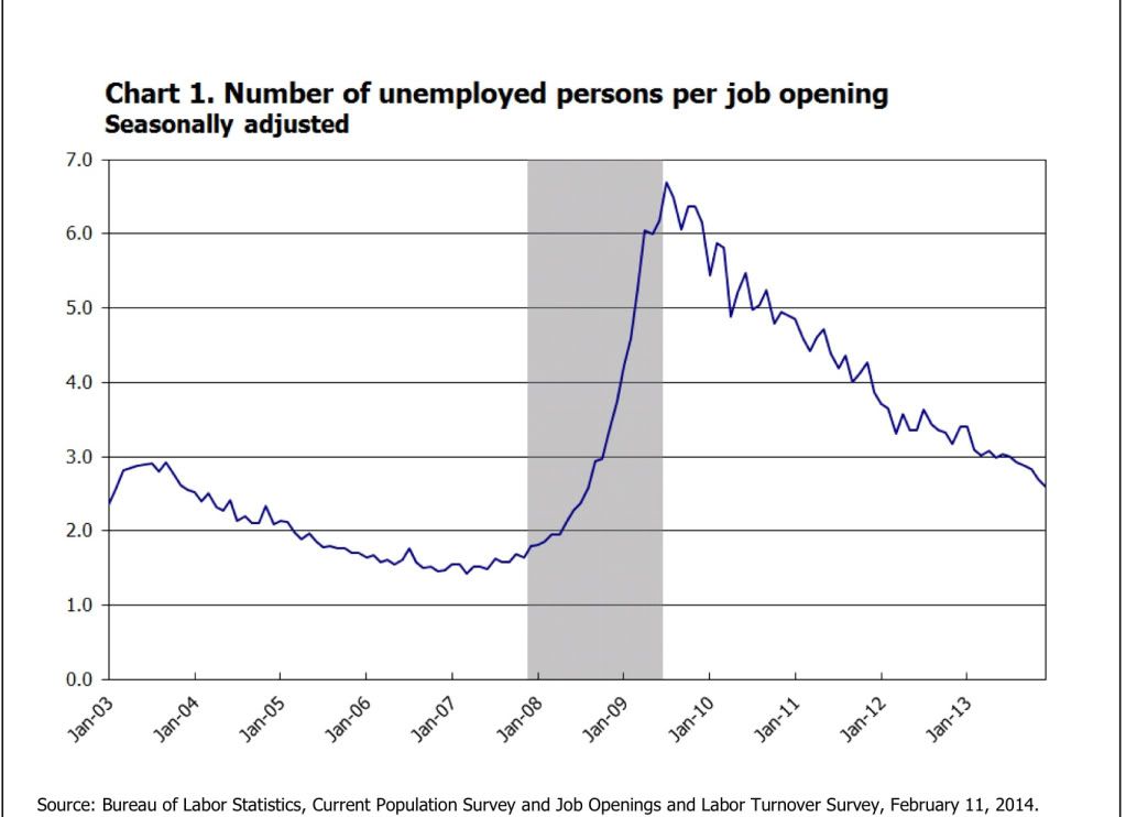
Before getting to the main subject of this post, let me say that I consider it an act of moral depravity to have cut off extended unemployment benefits when both unemployment and underemployment remain so high.  Even if I were to accept the critique that such benefits create a "hammock" making certain people comfortable in their unemployment, the fact is that millions of the unemployed are *not* comfortable in their unemployment. There simply aren't enough jobs to absorb the millions of people who have looked for a job and cannot find one.  That ought to be obvious from the fact that there are still nearly 3 unemployed people actively looking for work for every one job opening: 

Photobucket Pictures, Images and Photos

cutting off benefits to those people is an act of unconscionable cruelty, leading as it must to privation and maybe even homelessness for some.

But cutting off extended unemployment benefits at the beginning of this year wasn't just vile, it is actually harming the economy.  It appears to be the primary additional factor beyond the unusually severe winter weather in the raft of relatively poor data we have seen so far this year.

To begin with, let's quantify the scope of the lost benefits:
Federal unemployment benefits that continue for 26 weeks after a person uses up the 26 weeks of state unemployment benefits ended Saturday, so now some 1.3 million people won’t be getting their $1,166 (on average) monthly check. By June, another 1.9 million will be cut off.
It is believed that another 600,000 or so lost benefits in February, which  brings us to 2,000,000 people having lost unemployment benefits roughly equalling $1200 a month so far this year.  Simple multiplication means a loss of $2.4 billion in spending ability per month, or $28.4 billion for the whole of 2014.  It is ultimately estimated that about 4,000,000 people may be affected.  That's a loss of $56.8 billion annually.

But it gets worse.  Let's stick with just the 2,000,000 people affected so far.  When a similar cutoff was being debated in 2011, the Department of Labor  noted tha

  • A study commissioned by the Labor Department under the Bush administration showed that for every dollar spent on unemployment benefits, two dollars are pumped back into the economy.

This is because, as Business Week noted in an article in December, "the unemployed reliably spend that money, creating a multiplier effect in the economy." As a result, the Labor Department estimated that there would be a net negative effect of $62 billion in 2012 from a cutoff then.

Applying the multiplier to the present situation gives $1200/mo * 2 million people * 12 months * 2 multiplier =$50-$60 billion loss in 2014.

With GDP running at $16 trillion in 2013, that translates into a -0.3% to -0.4% hit to GDP this year.

The Business Week article cited above indicates that a smaller, but similar multiplier of 1.55 was calculated by economist Mark Zandi of Moody's Analytics. 

More recently the Congressional Budget Office estimated that:

the proposal would increase outlays relative to those under current law by nearly $26 billion—by about $19 billion in fiscal year 2014 and by $6.5 billion in fiscal year 2015. The net increase in deficits over the 2014–2023 period would amount to about $25 billion because the proposal would also boost revenues by $0.5 billion over that period.CBO estimates that extending emergency unemployment benefits would raise gross domestic product (GDP) and employment in 2014 relative to what would occur under current law. Recipients of the additional benefits would increase their spending on consumer goods and services. That increase in aggregate demand would encourage businesses to boost production and hire more workers than they otherwise would, particularly given the expected slack in the capital and labor markets. 
However, those positive effects on output and employment in 2014 would be partially offset by ... [the belief that] in response to the extension of benefits, some unemployed workers who would be eligible for those benefits would reduce the intensity of their job search and remain unemployed longer—which would tend to decrease output and employment. CBO estimates that those negative effects would be modest, though, in 2014 because most of the jobs that would not be taken by some of the people receiving the additional benefits would instead be taken by some of the many people searching for work who would not be eligible for those benefits.
 Combining the ... effects ..., CBO estimates that extending the current EUC program and other related expiring provisions until the end of 2014 would increase inflation-adjusted GDP by 0.2 percent and increase full-time-equivalent employment by 0.2 million in the fourth quarter of 2014. Those figures represent CBO’s central estimates ....  The full ranges that CBO uses for those parameters suggest that, in the fourth quarter of calendar year 2014, GDP could be increased very slightly or by as much as 0.3 percent, and employment could be increased very slightly or by as much as 0.3 million.

It appears that the CBO did not address the spending multiplier issue, since its $26 billion estimate is close to the raw $28 billion estimate we obtained by simply multiplying the number of people affected by the average amount in monthly benefits received.

Even at a multiplier lower than 2, for example the 1.5 multiplier proposed by Mark Zandi, gives us a likely negative affect of GDP of about -0.3%.

Since almost 1/3 of all of the people who would be affected in all of 2014 were cut off in January, it is in the January and February consumer spending numbers that we would expect to see the biggest hit.  And so far, that is indeed what we have seen.

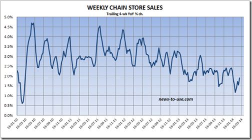
For example, here is the 4 week moving average of same store sales going back to the end of the recession (h/t Bearnobull):

Photobucket Pictures, Images and Photos

Note that the YoY% increase in spending since the turn of the year is the lowest during the entire period.  For the last two weeks, including the week reported just yesterday, the ICSC same store sales index recorded YoY gains of only +1.4% and +1.5%, respectively, so the effect is continuing right up until the present.

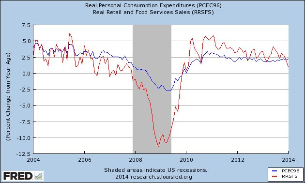
Now here is a graph comparing real personal consumption expenditures (blue) and real retail sales (red).  Since PCE's are the broader measure, and encompass "wants and needs" vs. the narrower measure of retail sales, which are more focused on "wants," this comparison tells us how confident or pinched consumers feel:

Photobucket Pictures, Images and Photos
As I have previously shown, in every business cycle since World War 2, YoY retail sales have declined further than YoY PCE's prior to the onset of a recession.  January 2014 marks the first month since the beginning of the 2009 economic expansion that YoY retail sales are significantly below YoY PCE's.

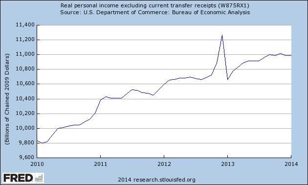
Real personal income minus transfer payments (such as food stamps and unemployment insurance) has also turned flat for the last several months:

Photobucket Pictures, Images and Photos

There has been much commentary that the relatively poor winter weather only explained part of the slump in much of the economic data these last several months.  The sudden elimination of $1200 a month spending power to 2 million people since January first is an excellent candidate for explaining that slump.

So the cutoff in extended unemployment benefits isn't just vile, it is counterproductive as well. 

A Quick Check of Where the Markets Are

With all of the political unrest over the last few days, let's take a look at the SPYs to see how the equity markets are reacting.


On the 5-minute, 5 day chart, we see three primary movements.  The first is a two-day upswing on Feb. 27-28, which included a big move on the 28th.  This was followed by Monday's gap lower.  But looking more closely at Monday's price action, we see a morning sell-off followed by a decent rebound in the afternoon.  Finally, yesterday prices gapped higher, recovering Monday's losses.  Prices also closed near the high of the day.


On the 30-day chart, we see prices have an upward curve.  Starting on Feb. 24, prices moved more sideways, consolidating gains.  On this chart, the last two days of activity appear as more of a blip.


Finally on the daily chart we see the primary uptrend that started in late June 2013 is still firmly intact.  Also note prices have moved through key resistance in their latest rally, with the sell-off showing prices simply moving to the 10 day EMA.  But the underlying technicals are still solid: the MACD is rising and the CMF shows a strong inflow of money, especially yesterday.

Tuesday, March 4, 2014

Paul Krugman agrees with me!


 - by New Deal democrat

(about gas prices essentially determining the inflation rate).

Oh, yeah, and gas prices are cheaper than they were 1, 2, and now 3 years ago.  I've got the full post up over at XE.com.

Monday, March 3, 2014

Markit Manufacturing Numbers Point to EU Growth

This is up over at XE.com

Junk Bonds Continue to Rally; Junk Spreads Continue to Narrow


The above chart of the junk bond ETF shows that investors are still reaching for yield.  The above chart is still very bullish.  Let's place that information into the following context:


Above is a graph of the CCC yield minus the 10-year CMT Treasury spread, which has been declining for the last 2 years.


The graph above places this data into a 2-year time frame.