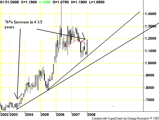
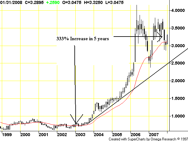
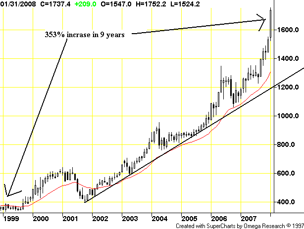
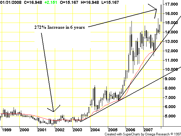
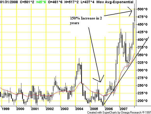
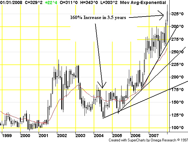
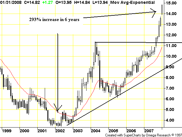
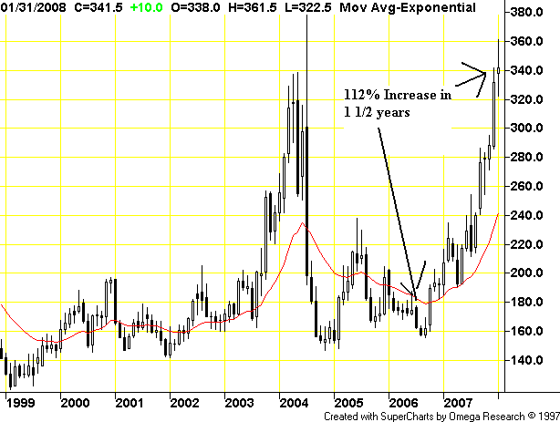
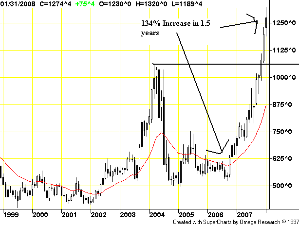
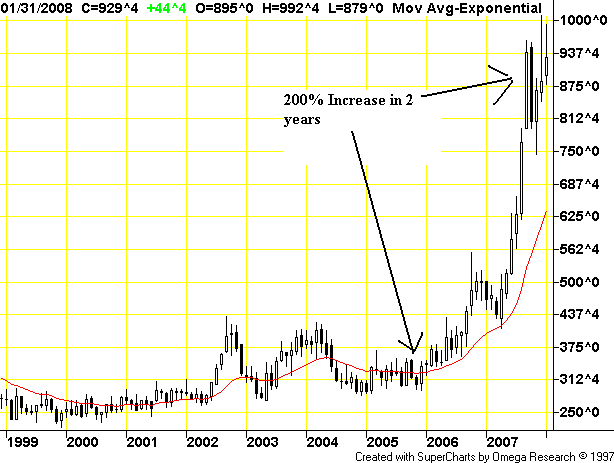
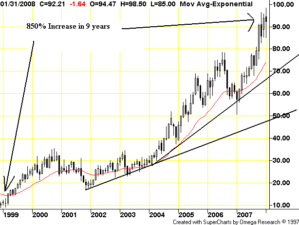
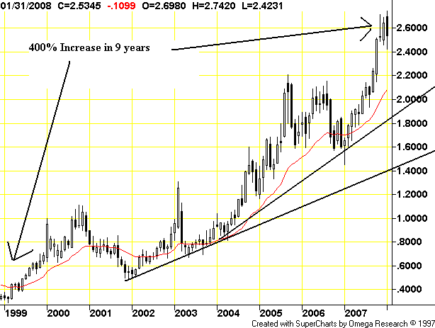
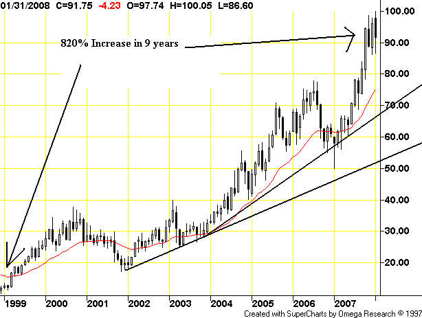
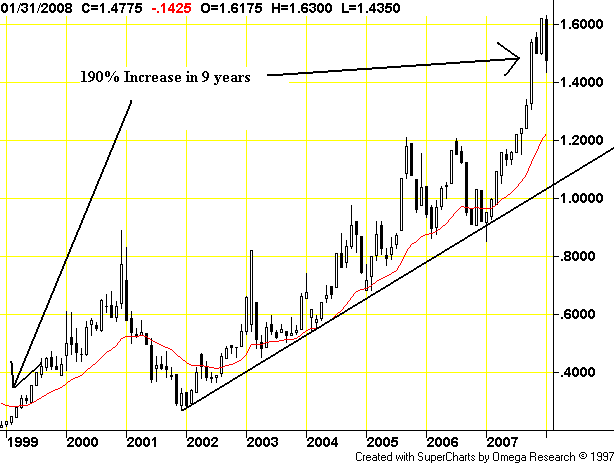
First I went to Futures Trading Charts. Then I looked at their futures charts for agricultural and energy commodities. I found 18 charts that show major price moves. All of them are listed below.
If this were one commodity I would dismiss it as a commodity specific price disruption. However, we're looking at major league price spikes across the spectrum of goods. That's a huge deal and it indicates a fundamental development in the markets. I stand by my standard explanation 101: with India's and China's standard of living going up, it's only natural the demand curve gets moved to the right. That means increasing prices.
I eyeballed the gains, so they might be off by a few percentage points either way but you get the rough idea.
Aluminum
Copper
Platinum
Silver
Gold
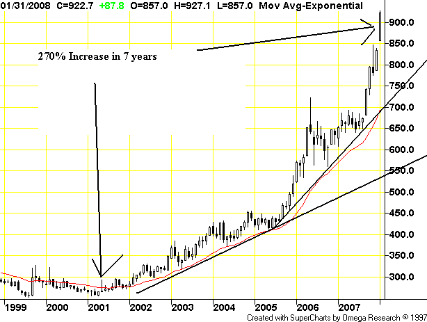
Canola
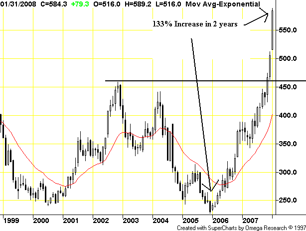
Cocoa
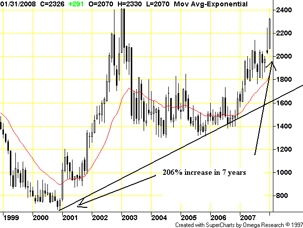
Coffee
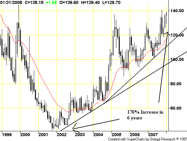
Corn
Oats
Rough Rice
Soybean Meal
Soybeans
Wheat
Brent Crude Oil
Heating Oil
Light Crude
Propane
Now for the final question. Here is a graph from Martin Capital of Productivity.
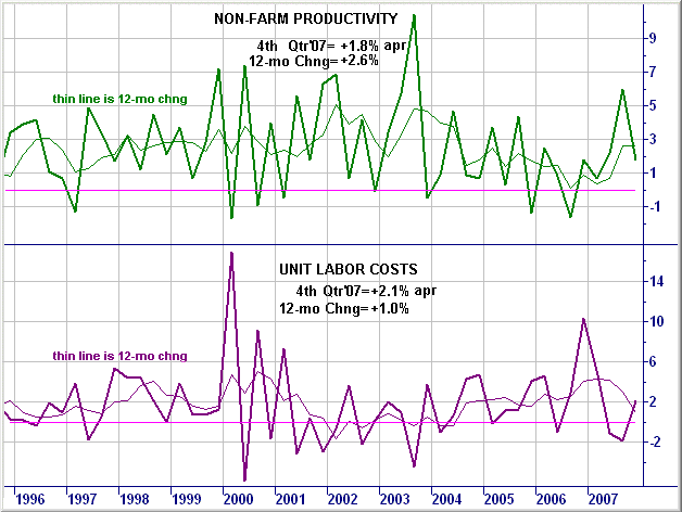
Are the gains on this chart enough to absorb all of the cost increases demonstrated in the charts above?
Finally, given what the charts above show (who are you gonna believe -- government statistics or your lyin' eyes?) is this really a good environment to start lowering rates?