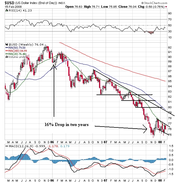
Above is a long-term chart of the dollar. Notice the chart is in a clear bear market pattern of lower lows and lower highs. Remember that most commodities are priced in dollars, so as the dollar drops in value the value of these commodities by definition increases.
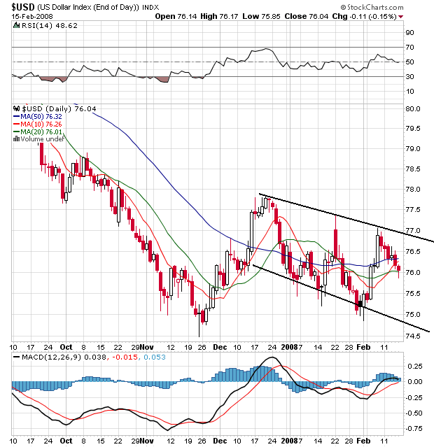
Above is a daily chart of the dollar. There is some good news here. Notice the dollar is consolidating above its recent lows, indicating traders have bid up the dollar a bit. Also note the simple moving averages are bunched, indicating a lack of direction. This is better than all the SMAs moving lower. It looks as though traders are wondering of the dollar is fairly priced right now, or whether it was fallen enough and should be higher.
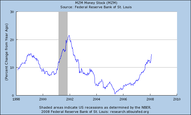
Finally, above is a chart of the percentage increase from the previous year in MZM which is defined as:
A measure of the liquid money supply within an economy. MZM represents all money in M2 less the time deposits, plus all money market funds.
That's a big damn increase.