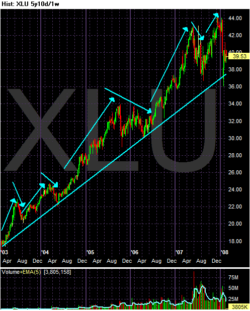
This is a five year weekly chart if the sector. Notice the clear pattern of higher highs and higher lows. Also notice the increased volume, although the latest volume is less than that from roughly mid-2007.

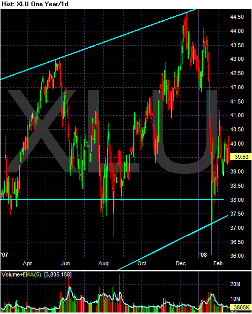
This is a one year daily chart. While the bottom is arguable, there is a pretty clear broadening formation. We don't know whether this is a consolidation pattern or a topping pattern. The index is still about the long-term (5 year) trend line.

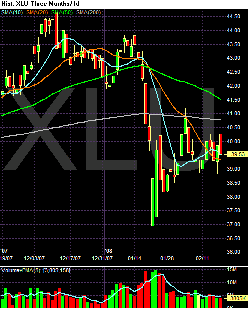
The SMA picture is a bit confusing; there is no clear trend one way or the other. Notice the following.
-- Prices are just below the 200 day SMA
-- The 50 day SMA is clearly in a downtrend, but the 200 day SMA is has a very slight downtrend.
-- Prices are right at the 10 and 20 day SMA
-- The SMAs are within 2 points of each other.