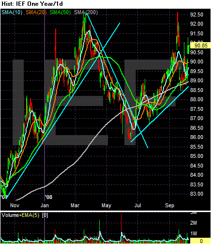
On the yearly chart, notice the following:
-- Prices rallied from the end of October to March of this year as a reaction to the credit crisis.
-- Treasuries sold-off from March until the end of June. This corresponds to a stock market rally that occurred after the Federal Reserve back-stopped the Bear Stearns deal
-- Treasuries started rallying again at the end of June as it became apparent that the credit crisis was deepening an spreading.
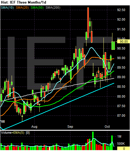
On the three month/daily chart, notice the following:
-- Prices have been in a general uptrend for the last three months
-- Prices recently bounced off the 200 day SMA
-- All the SMAs are moving up
BUT
-- They are bunched together withing 1 point of one another. This is a sign of confusion on the part of market participants.
Compare this to the SHYs (short-term paper market)
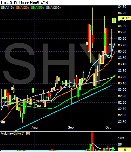
-- Prices are above the 200 day SMA
-- The 10 and 20 day SMA are above the 50 and 200 day SMA and both are moving higher
-- Prices are above all the SMAs
-- The 50 day SMA has just crossed over the 200 day SMA
This is a much more bullish chart. The main problem is yields are incredibly low -- there is only so far a fixed-income security can rise before yield starts to limit further upside potential.