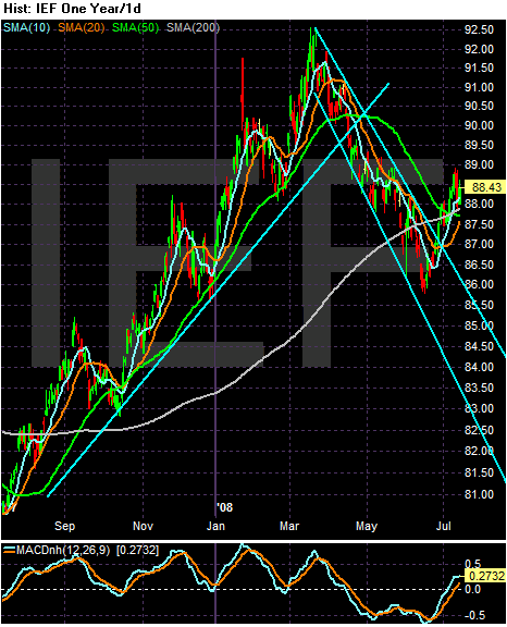
Above is a 1 year chart of the 7-10 Treasury ETF. This part of the market rallied from the end of last summer to March of this year. The credit crisis started last summer, which was a natural stimulus for the Treasury market because of its safe haven status. In March of this year the Fed back-stopped the Bear Stearns deal which indicated the Fed was going to be far more open to the idea of intervention. This made Treasury bonds less attractive. However, over the last month or so we've seen a the Treasury market start to advance again.

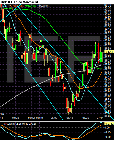
Above is a three month chart of the 7-10 year Treasury market ETF. Notice the following.
-- Prices have moved above the 200 day SMA, indicating a move into bull market territory
-- The short term SMAs (the 10 and 20 SMA) are both moving higher
-- The 10 day SMA has just moved over the 200 day SMA
-- Prices are above all the SMAs
This is a chart in transition. Traders are obviously more confident about the future price prospects of the Treasury market -- or are more interested in the short-term safety of these bonds. Considering inflation is higher than we would like, the safety argument is probably the primary reason for the rally.

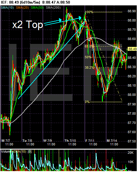
On the 6 day chart, notice the following:
-- Prices rallied from Monday until Thursday as the market fell.
-- The market formed a double top and then fell hard on Friday, largely as a reaction to the news of Freddie and Fannie. A federal bail-out means more government spending.
-- Prices rallied yesterday as traders realized the Fed plan might actually help.