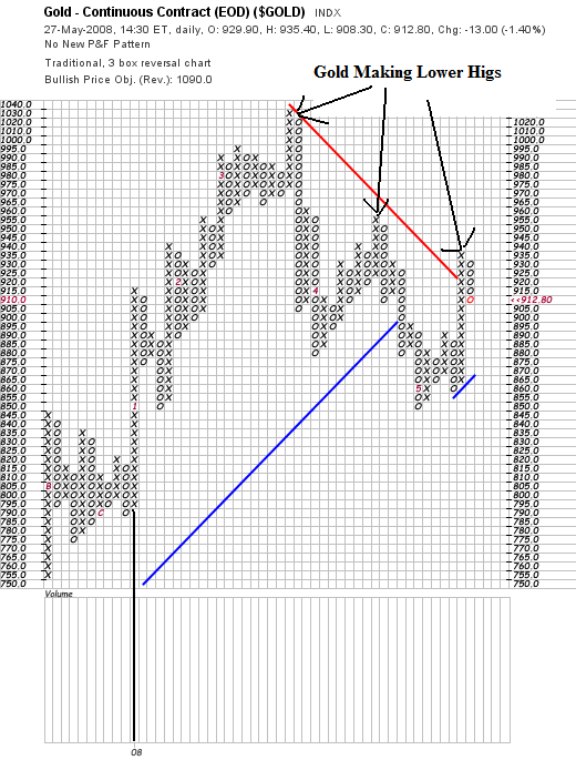
Let's start with the Gold PF chart. Notice the following:
-- The black vertical line at the left is the beginning of 2008. Notice that prices have moved a ton since then. That means there's a lot of volatility in the market fight now.
-- Notice that prices have made a three lower highs. Assuming the gold is a proxy for future inflation expectations, that means investors are looking ahead and thinking prices will eventually come down.
I mention the last point because I've had a long-running email debate going with New Deal Democrat over at Economic Populist. He and I have a bet about end of the year inflation. I think 2008 inflation will be higher and he thinks it will be lower. This signals that inflation may be coming down.

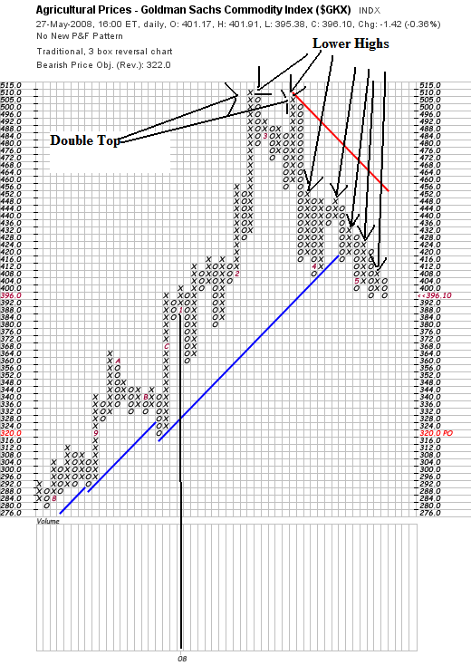
Here is a PF of agricultural prices. This is an area of commodities that I have been concerned about as being inflationary. Well, it looks as though some of those prices are coming down as well.
Notice the pattern of lower highs. That's good news for the coming months.

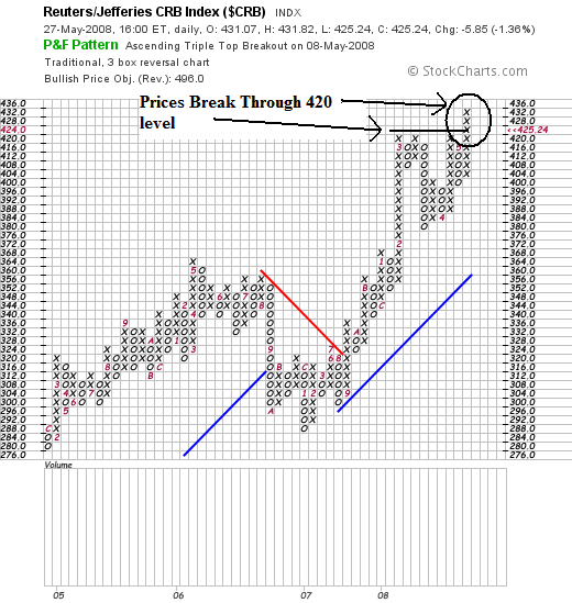
But here is a chart that runs counter to the "inflation is going lower" argument. Overall the CRB is still rising. Notice that prices recently broke through key resistance.
The reason for the continued increase in the CRB is oil, which I'll over tomorrow.