Is Kevin Phillips right that something funny is going on in the economy? Yes, although just how funny is less clear.
The numbers do suggest he's correct about one thing at least: public and private debt has indeed reached unprecedented levels.
Recently, we described Phillips' thesis, in his new book "Bad Money: Reckless
Finance, Failed Politics, and the Global Finance of American Capital" that the U.S. economy has been run by a Washington-Wall Street mercantilist alliance for the benefit of the finance sector. See column.
Phillips doesn't flat-out predict that the resulting distortions will result in a crash. He says it's too early to say. But he meaningfully quotes a number of authorities, such as Yale economist Robert Shiller, to the effect that it will.
Phillips relies heavily on charts, which we like.
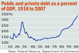
In this column, we look at one that is at the heart of his book: public and private debt as a fraction of Gross Domestic Product.
It looks like a barbell, with peak debt of 299% in 1933 falling to below 150% from the 1950-1980s, spiking again to a recent 353%. We've checked the numbers -- updating them to 2007 -- and he's right.
Let's look at a few charts to see what we're talking about.
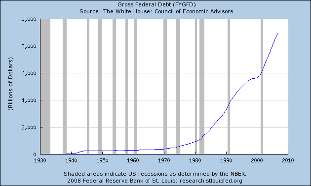
Total federal debt is huge.
Consider the following numbers from the Bureau of Public Debt:
09/30/2007 $9,007,653,372,262.48
09/30/2006 $8,506,973,899,215.23
09/30/2005 $7,932,709,661,723.50
09/30/2004 $7,379,052,696,330.32
09/30/2003 $6,783,231,062,743.62
09/30/2002 $6,228,235,965,597.16
09/30/2001 $5,807,463,412,200.06
09/30/2000 $5,674,178,209,886.86
The current total is $9,393,275,739,477.56
The the government isn't the only one borrowing.
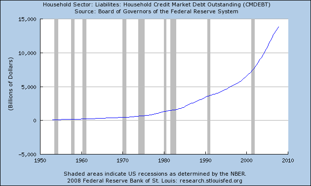
Total household debt is spiking, leading to
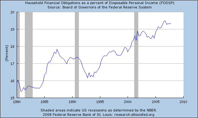
An increase in the household financial obligations ratio.
This has led to the following chart, which is from the original story above:
That can't be good.