Now, consider these points which I posted yesterday:
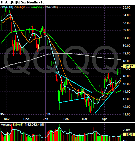
This is the chart that originally caught my attention a few weeks ago. It led me to believe we may be in the middle of a turnaround. Notice the following:
-- Prices have increased almost 10% since mid-March
-- Prices are above the shorter SMAs
-- The shorter SMAs are above the longer SMAs
-- All the shorter SMAs (10, 20 and 50) are moving higher.
There is one problem with the rally theory. Market breadth on the NASDAQ stinks:
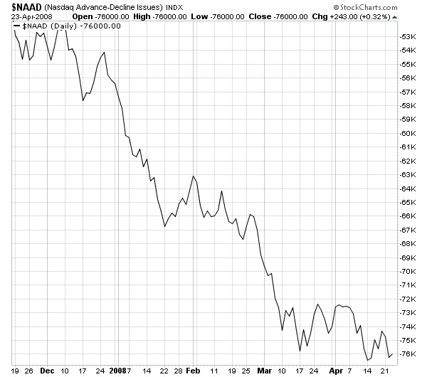
Market breadth hasn't moved higher with the market, and
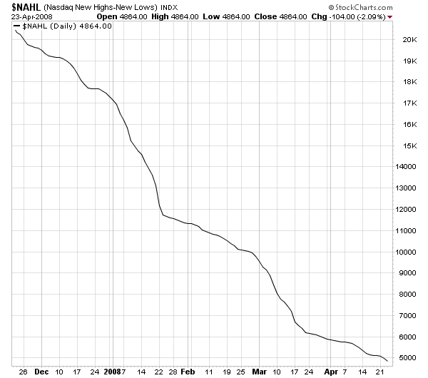
The new highs/new low number has been decreasing as well.
Why isn't NASDAQ breadth improving? Fundamentally it should be.