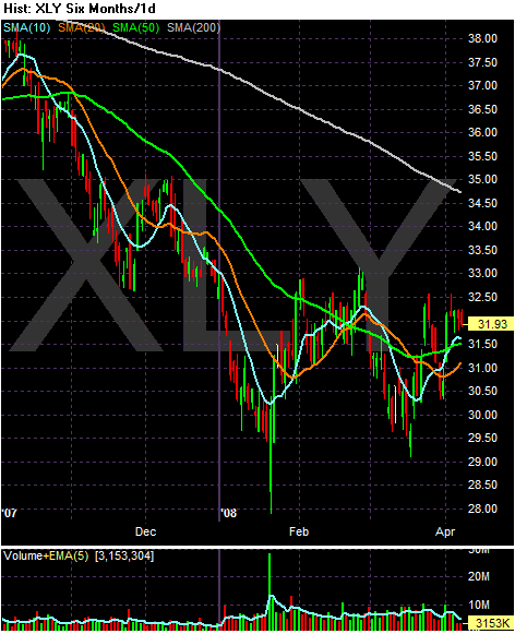
On the XLY's (Discretionary Income) notice the following:
-- The ETF has been in a 2.5 point trading range since the beginning of the year. This could be indicating the sector is bottoming out.
-- Before 2008, sector was in a clear downtrend
-- The index is (approximately) 10.6% below the 200 day SMA, indicating we're in a bear market.
-- The 200 day SMA is heading lower
-- The 10, 20, and 50 day SMAs are bunched up within a point of each other. While all of these SMAs are headed higher, the fact they are bunched-up like this indicates there is an overall lack of conviction among traders to move the sector in either direction.
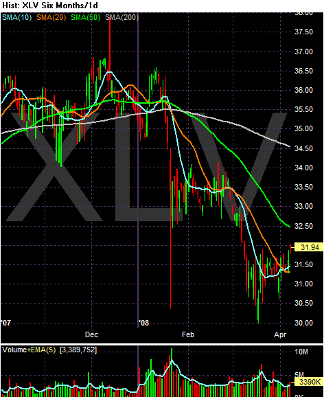
The Health Care sector is oddly enough declining. I say oddly because health care issues are typically a safe haven investment that gets cash inflows when times are hard. But the chart says otherwise. Notice the following:
-- Prices are 7.4% below the 200 day SMA
-- Prices have dropped hard twice since the beginning of the year.
-- The 20, 50 and 200 day SMA are both headed lower
-- While the 10 day SMA has crossed over the 200 day SMA within the last few days, this is not the greatest event because of the general downward trajectory of the other SMA
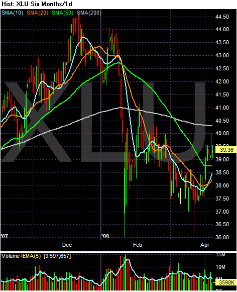
The utilities have also taken a hit. Notice the following:
-- Prices are about 2.6% below the 200 day SMA -- just barely in negative territory.
-- The shorter SMAs are below the longer SMAs (which is bearish) but --
-- The 10 day SMA just crossed the 20 day SMA, and
-- Prices are above the 10, 20 and 50 day SMA.
-- The index may have formed a short-term double bottom with the first bottom occurring at the end of January and the second occurring at the end of March.
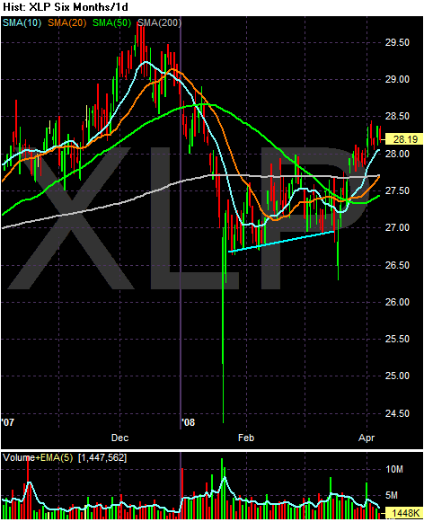
On the consumer staples chart, notice the following:
-- Prices are over the 200 day SMA (although just barely)
-- The 10 day SMA is above the 20 day SMA, which is above the 50 day SMA -- a generally bullish configuration
-- the 10, 20 and 50 day SMAs are all moving higher, although the 50 day SMA is just turning positive.
-- The 10 day SMA crossed over the 200 day SMA and the 20 day SMA is just about to.
-- Prices are higher than all the SMAs which is generall a bullish configuration
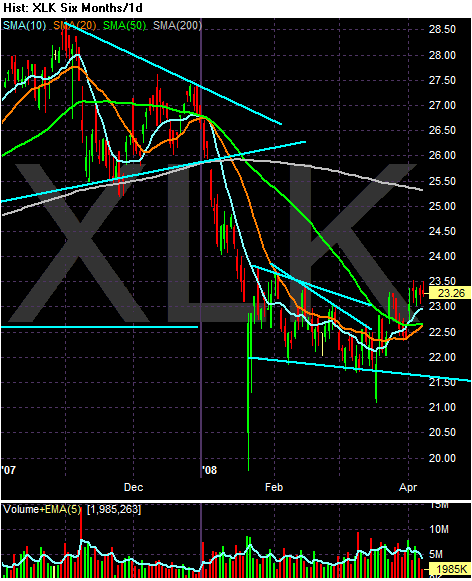
Regrading the technology sector, notice the following:
-- Prices are about 8.4% below the 200 day SMA
-- The 10 and 20 day SMAs are headed higher
-- The 10 day SMA is higher than the 50 day SMA
-- the 20 day SMA is about to cross over the 50 day SMA
-- The index is breaking out of a consolidation pattern it has been in since the end of January
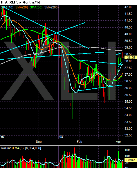
On the industrials chart, notice the following:
-- Prices are just below the 200 day SMA
-- The 10, 20 and 50 day SMA are all increasing
-- The 10 day SMA is higher than the 20 which is higher than the 50 -- a bullish orientation
-- Prices are higher than the shorter SMAs
-- Prices have broken out of a consolidation pattern that started in late January
I dealt with the XLFs yesterday in this post
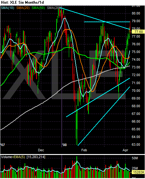
In the energy sector, notice the following
-- Prices are about 5.6% higher than the 200 day SMA
-- The 10, 20, and 50 day SMA are all moving higher
-- The short-term SMAs are above the longer SMAs
-- All the SMA are moving higher
-- The main bad news is the SMAs are bunched together
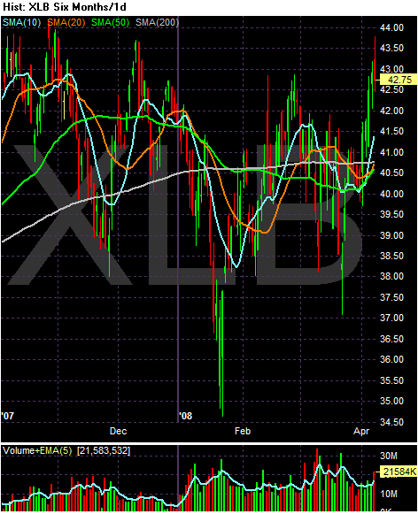
On the basic materials chart, notice the following:
-- Prices are about 3% above the 200 day SMA
-- The 10 day SMA crossed over the 200 day SMA
-- The 20 day SMA is about to cross over the 200 day SMA
-- The 10, 20 and 50 day SMA are all headed higher
-- The 10 day SMA is higher than the 20 day SMA which is higher then the 50 day SMA -- a bullish orientation.
-- The main problem with this chart is the SMAs are bunched together.