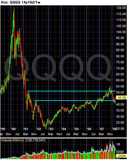
On the 14 year chart, notice how far below the late 2000s tech rally the current prices are -- and this is after 5 years worth of increases. I included this chart to show how far out of whack the the late 2000s bull market was -- and how fast and hard it fell (not that home prices will do the same thing.....)
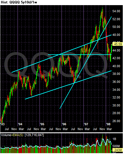
On the 5 year chart, notice the following:
-- There were two trends in place. The first was an upward sloping channel that started early 2004 and a second a sharper rally that started in mid-2006.
-- Prices have broken through two important trend lines -- the upper trend line of the 2004 rally and the sharper upward sloping trend line started in mid 2006.
-- The lower trend line of the rally that started in early 2004 remains intact.
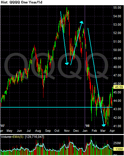
On the yearly chart, notice:
-- Prices have formed a clear downward sloping trend with a clear down, up, down pattern. Also notice that prices are forming lower lows and lower highs.
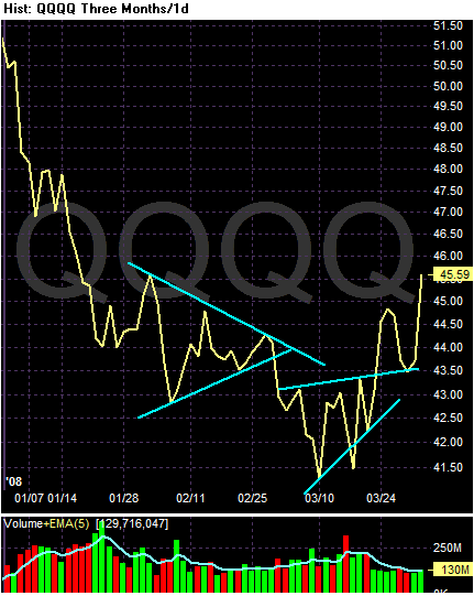
On the three month line chart, notice the following:
-- I used a line graph to clear out the noise.
-- We have two consolidation patterns.
-- Also note how round numbers (41.50, 43, and 43.50) are offering strong support for the index. This is probably the result of program trading.
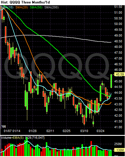
On the three month simple moving average (SMA) chart, notice the following:
-- The 10 day SMA has broken through the 50 day SMA
-- The 20 day SMA is currently neutral. Given the markets action of late this index will turn positive within the next two weeks.
-- Prices are above the 50 day SMA.
Conclusion: The QQQQs could be turning around, at least from a technical perspective. Prices have moved above important technical support lines and there is little upward resistance.