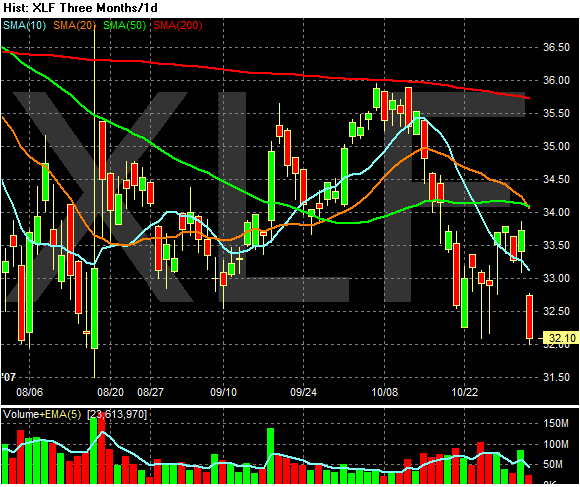
This is the three month chart of the XLF -- an ETF that tracks the largest financial sector stocks. Notice the following.
1.) The ETF is below the 200 day SMA and has been for the last three months. This is bear market territory.
2.) With the 20 day SMA crossing the 50 day SMA yesterday we now have a very bearish moving average picture. The shorter SMAs are below the longer SMAs and prices are below all the SMAs. In addition, all of the shorter SMAs are all heading lower. Add all of these elements together and you get a very negative reading for the financials market.

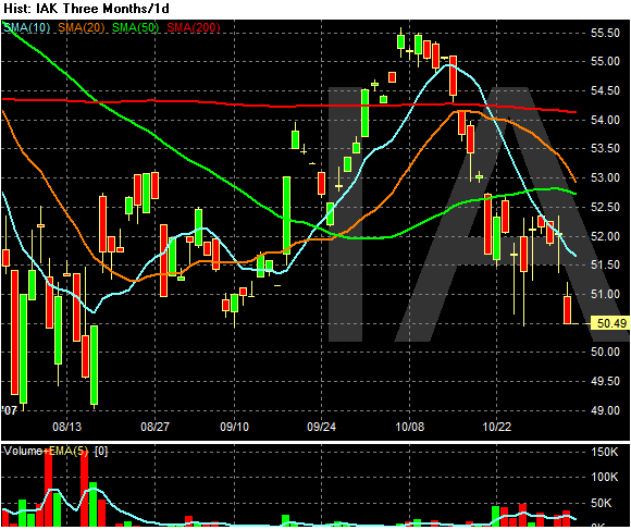
In insurers ETF is also incredibly negative.
1.) The 10 and 20 day SMAs are both heading lower.
2.) The 20 day SMA is about to cross the 50 day SMA.
3.) The index is below the 200 day SMA.
4.) Prices are below the SMAs and prices have been unable to get above the 10 day SMA over the last few weeks.
5.) Starting at the end of October we have a pick-up in volume. That indicates selling pressure is increasing.

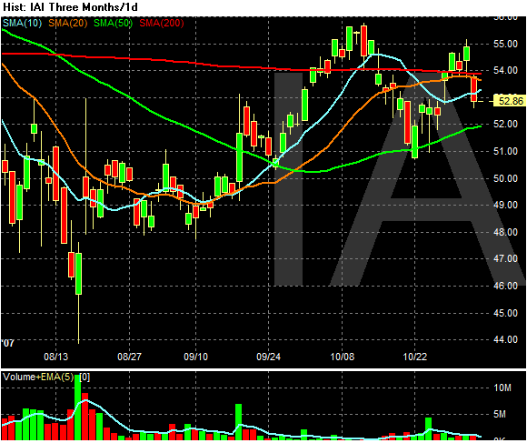
The Broker/Dealers is in a bit better shape.
The 10, 20 and 200 day SMA are bunched up. This indicates a lack of direction from either side of the market. While prices are below the 20 day SMA, they're trading around the index and have for the last month or so. This isn't so bad.
However on the negative side we may have the beginning of a classic downward shifting market making lower highs and lower lows. The key to this possibility is is this leg gets below $49.74 or so.