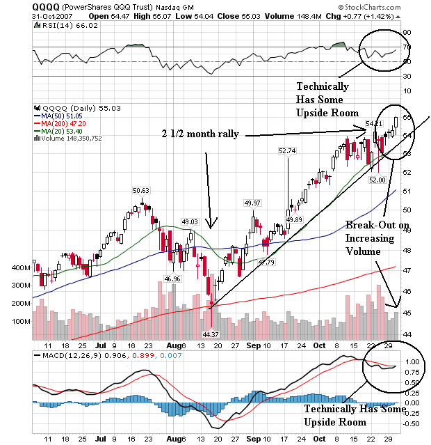
The daily chart is very bullish.
1.) There is s strong uptrend in place that started about 2 1/2 months ago.
2.) All the moving averages are moving higher.
3.) The shorter moving averages are above the longer moving averages.
4.) Although the RSI and MACD are high, both have some upside room to move. Considering the Fed just cut rates this seems possible.
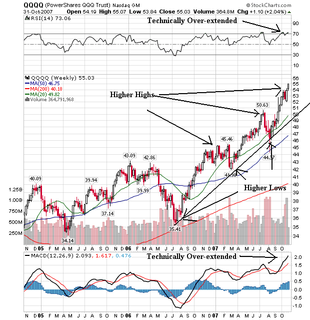
The weekly chart also has some very bullish points.
1.) Note the series of higher highs and higher lows. This is what a classic bull market chart should look like.
2.) The shorter SMAs are higher than the longer SMAs.
3.) All three SMAs are pointing higher.
4.) The only problem is from the technical indicators which are giving overbought indicators. Remember this is not fatal and it does not mean the market is going to drop. It could mean a period of consolidation.
The weekly chart gives us some pause, as it indicates consolidation might be on the horizon. However, with the rate cut, that consolidation might not last to long.