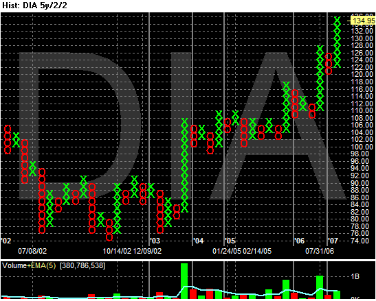
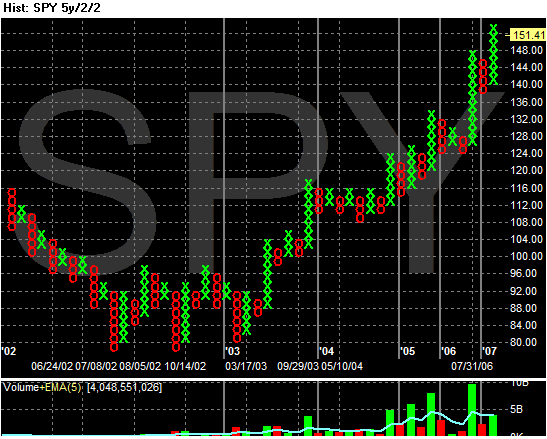
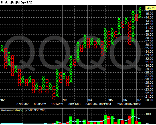
All three of these charts say the same thing: the market is in a bull phase. Also notice the cumulative volume on the up moves (market with the green x's) is higher than the volume of the price declines.
However, the NY and NASDAQ advance/decline lines aren't looking that strong right now.
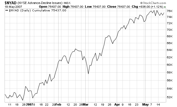
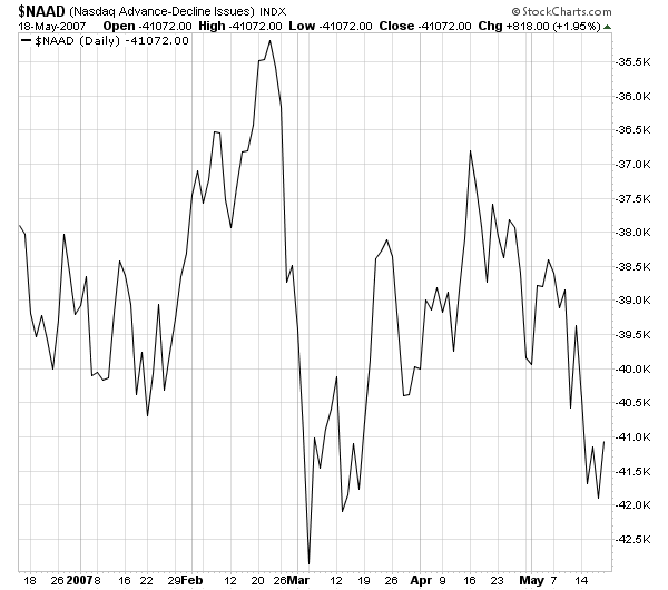
Despite the new highs on the Dow for what seems like forever, the Advance decline line is in a range for most of May. The NASDAQ advance decline line is declining. Both of these charts indicate the market's recent advance is on shaky ground and a pullback should be surprising.